Packaging Design for Writers' Tears Copper Pot Japanese Cask Finish
Designed by Emilia Kleczko at anne+co.
Walsh Whiskey: Client
Emilia Kleczko at AKGraphics: Designer
Boxpak: Printer (box)
The Label Factory: Printer (labels)
Categories: Packaging
Industry: Commercial
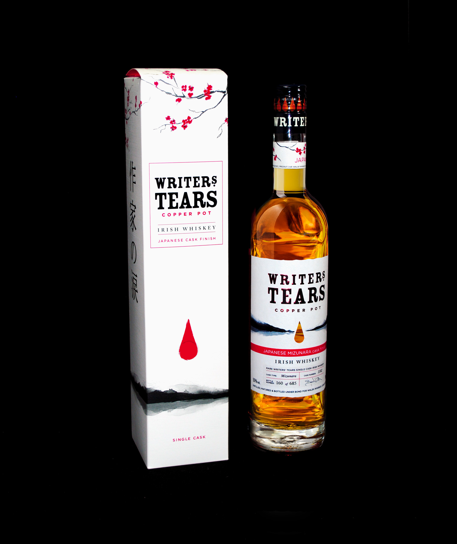
Walsh Whiskey’s Writers’ Tears is a critically acclaimed, award-winning recreation of the fabled 19th century style of whiskey, a truly unique expression that is embedded in history. Walsh Whiskey approached us to design packaging for their Worldwide Exclusive Release which celebrated the marriage of two premium Irish whiskeys - Single Malt & Single Pot Still Irish whiskeys finished in rare Japanese Mizunara Oak Casks at 55% ABV.
The Writers’ Tears Copper Pot Japanese Cask Finish was exclusive to The Irish Whiskey Collection at The Loop in Dublin & Cork International Airport. It was a small batch finish, which specifically targeted customers travelling through The Loop to the 2019 Rugby World Cup held in Japan. The combination of Irish Whiskey finished in the Japanese Mizunara oak barrels was a fitting tribute to mark Japan and Ireland locking horns at the 2019 Rugby World Cup.
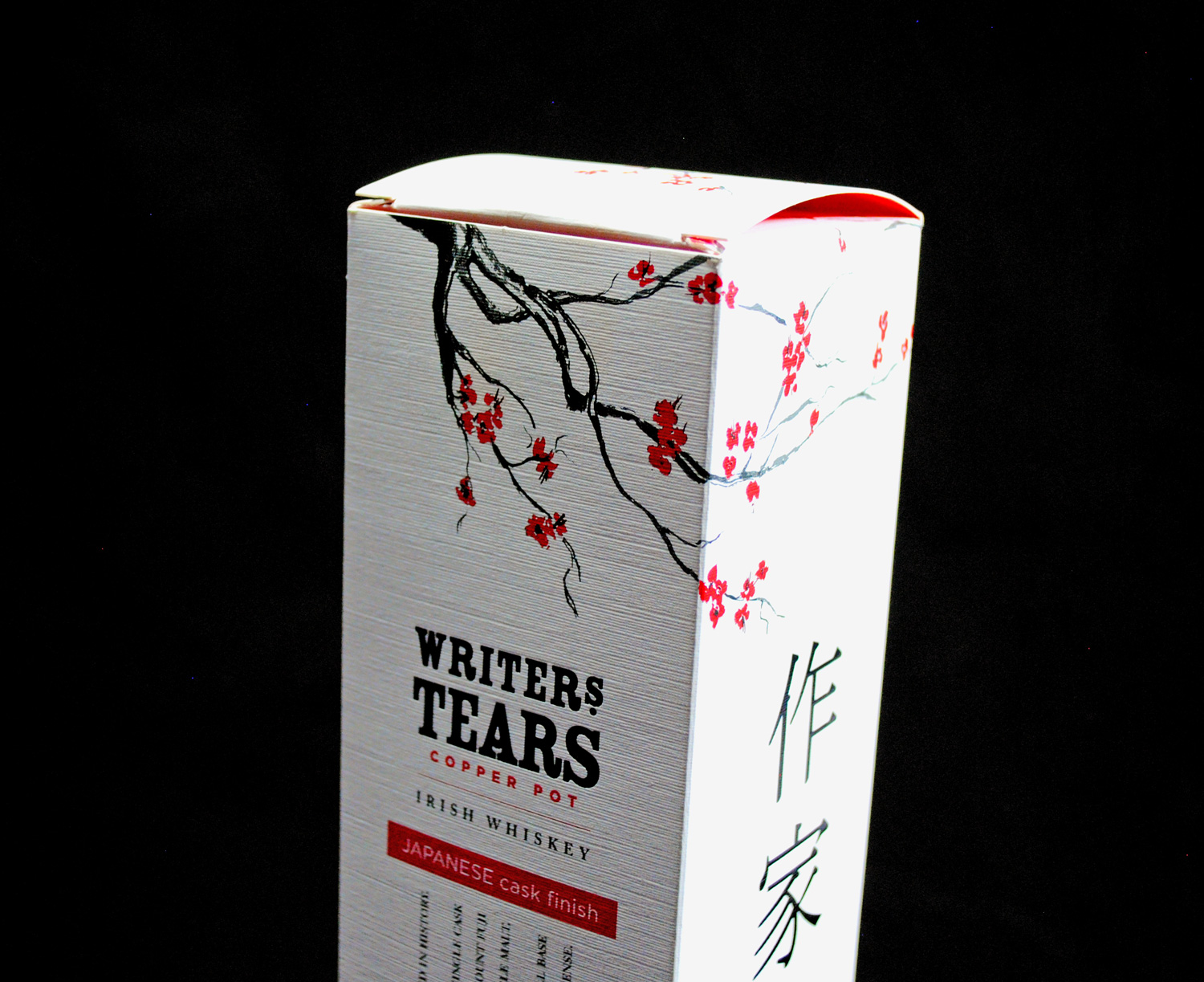
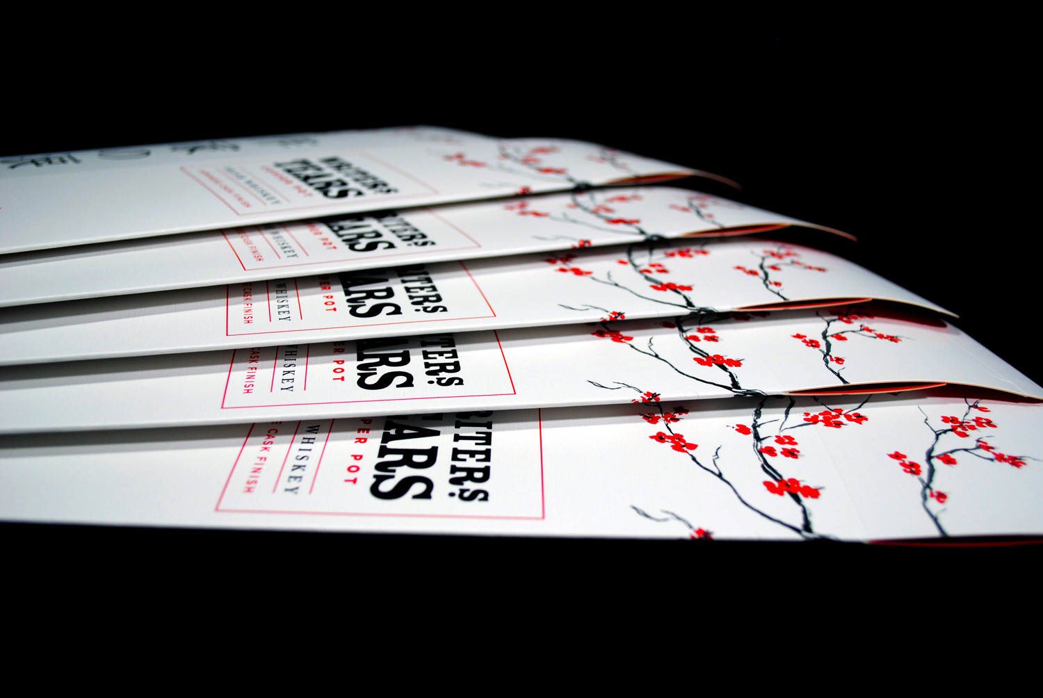
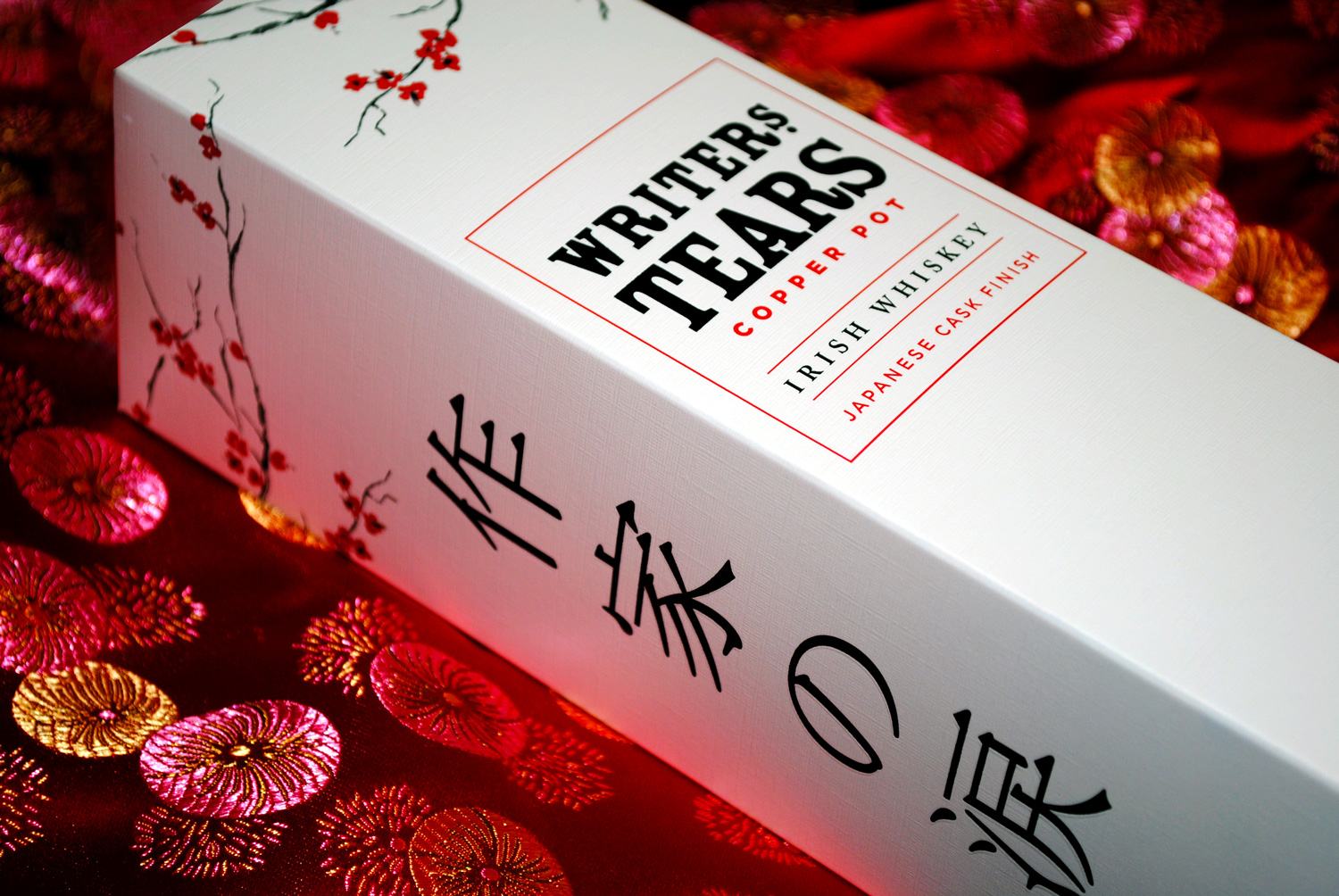
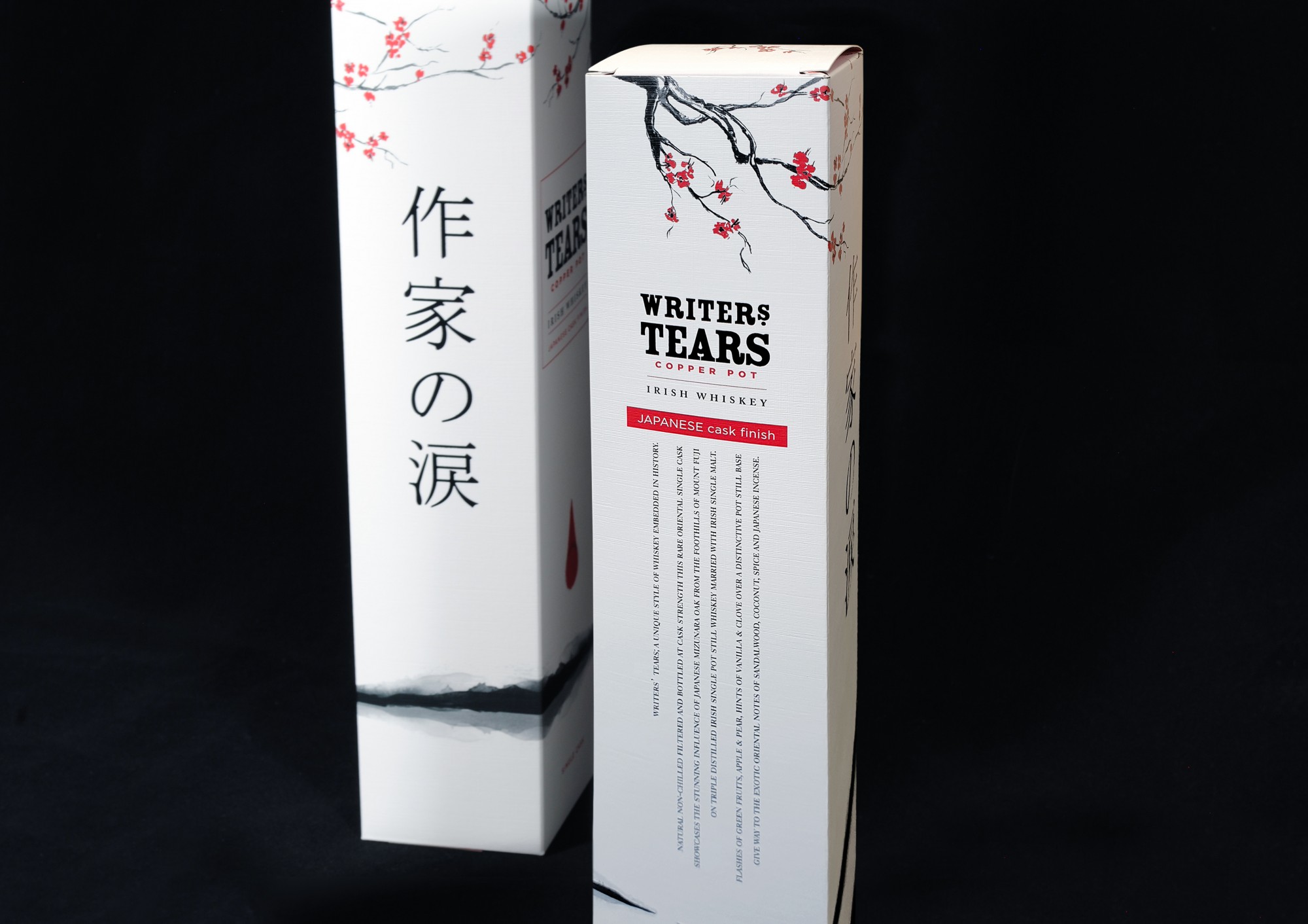
It was important that we designed packaging that truly reflected the exclusive Japanese aesthetics whilst encapsulating the sheer luxury of the premium whiskey. The brief was to create rich packaging that was fully wrapped in Japanese influence using reds, greys and blacks. The aim was to truly capture the essence of Japan taking inspiration from Mt Fuji, Cherry Blossom and Japanese sunsets. There are several editions of Writers’ Tears Whiskey so consideration of that packing was also required.
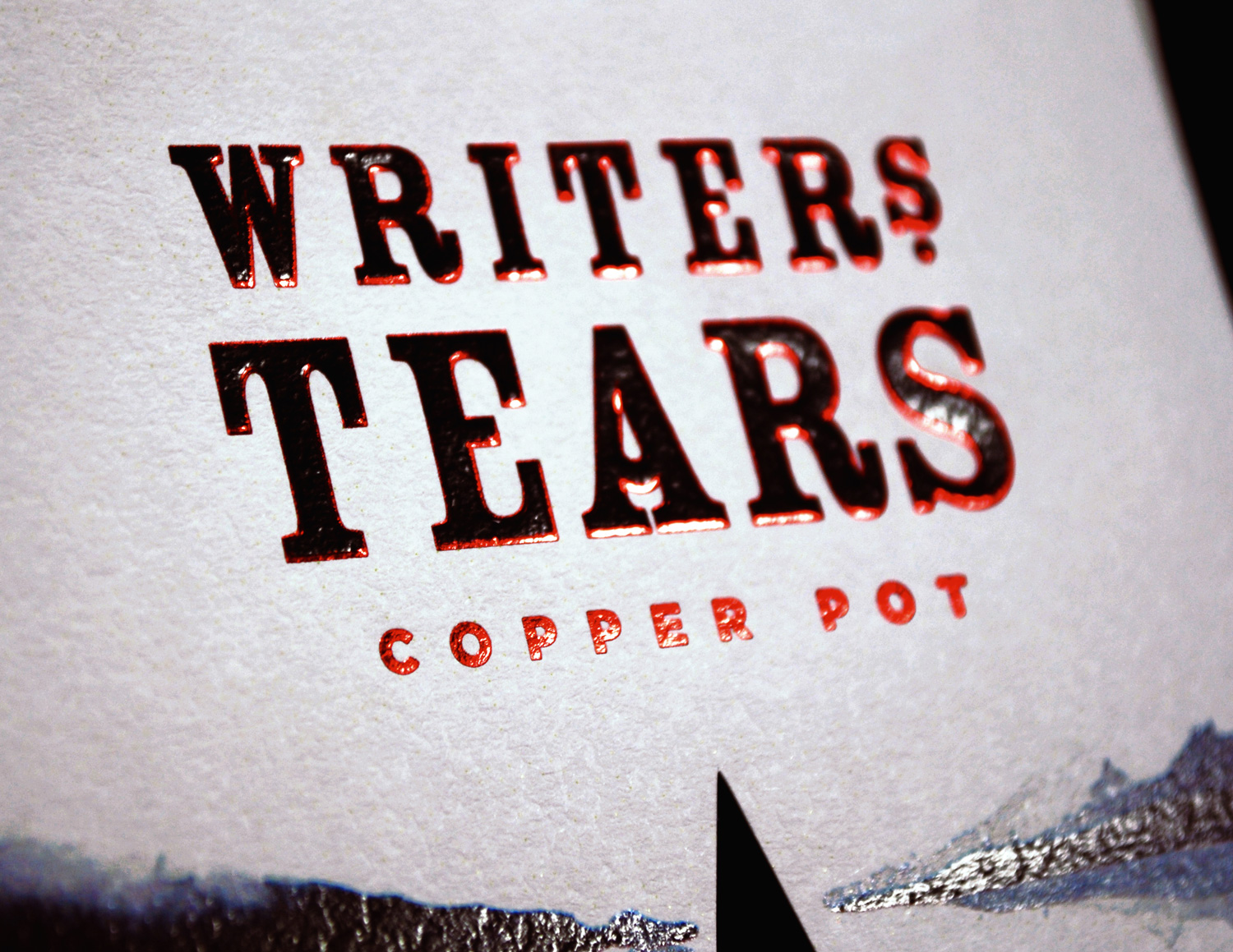
The final result was an elegant but bold Japanese influenced design. A traditional Sumi Painting style was used to ground the design on both box and label. The signature teardrop shape seen in all Writers' Tears designs was given a new dimension so that the base of the teardrop represented a red sun and Japanese flag. A brave decision was made to use Japanese symbols in place of the English text for Writers' Tears on the side panels of the box. Rotation of the descriptive text reflects the traditional Japanese way of writing from top to bottom. Special consideration was given to the position of each cherry tree branch so that when the box lid is closed there is an elegant connection between the panels.
Print finishes included matt varnish, black and metallic red foil blocking and embossing. These finishes worked exceptionally well on Korsnas White embossed board for the box and Martele Blanc for the bottle labels. Design by Emilia Kleczko, box printed by Boxpak and bottle labels printed by The Label Factory.