Print Fusion Identity
2011
Designed by Max Phillips and Gerard Whelan at Brandcentral
Printer: Print Fusion
Categories: Identity
Industry: Corporate
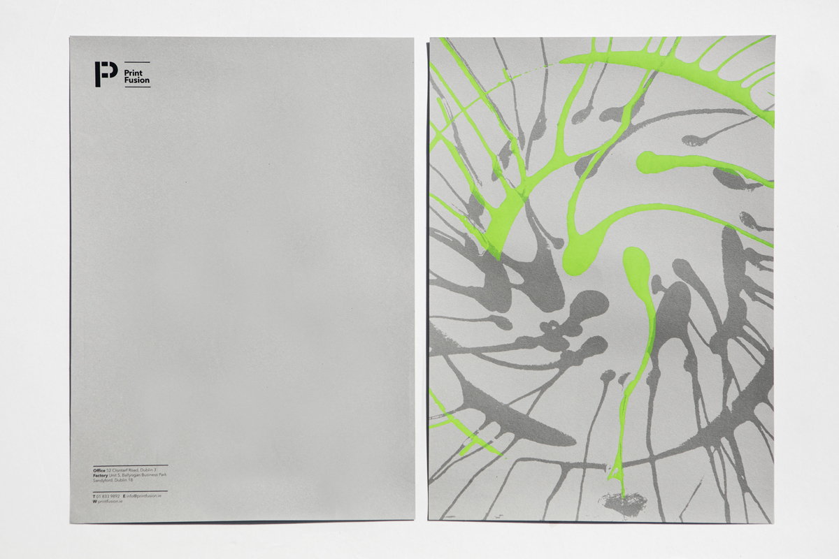
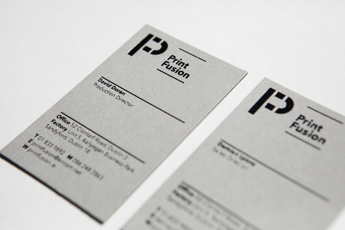
Print Fusion approached us about revamping their brand identity
our approach is distill whats unique and equitable then amplify.
After reviewing the current print Fusion identity we felt it lacked distinction and did not properly convey what was unique
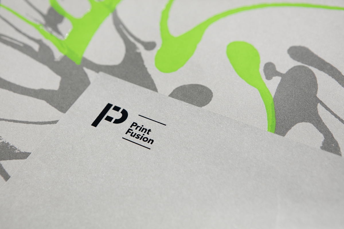
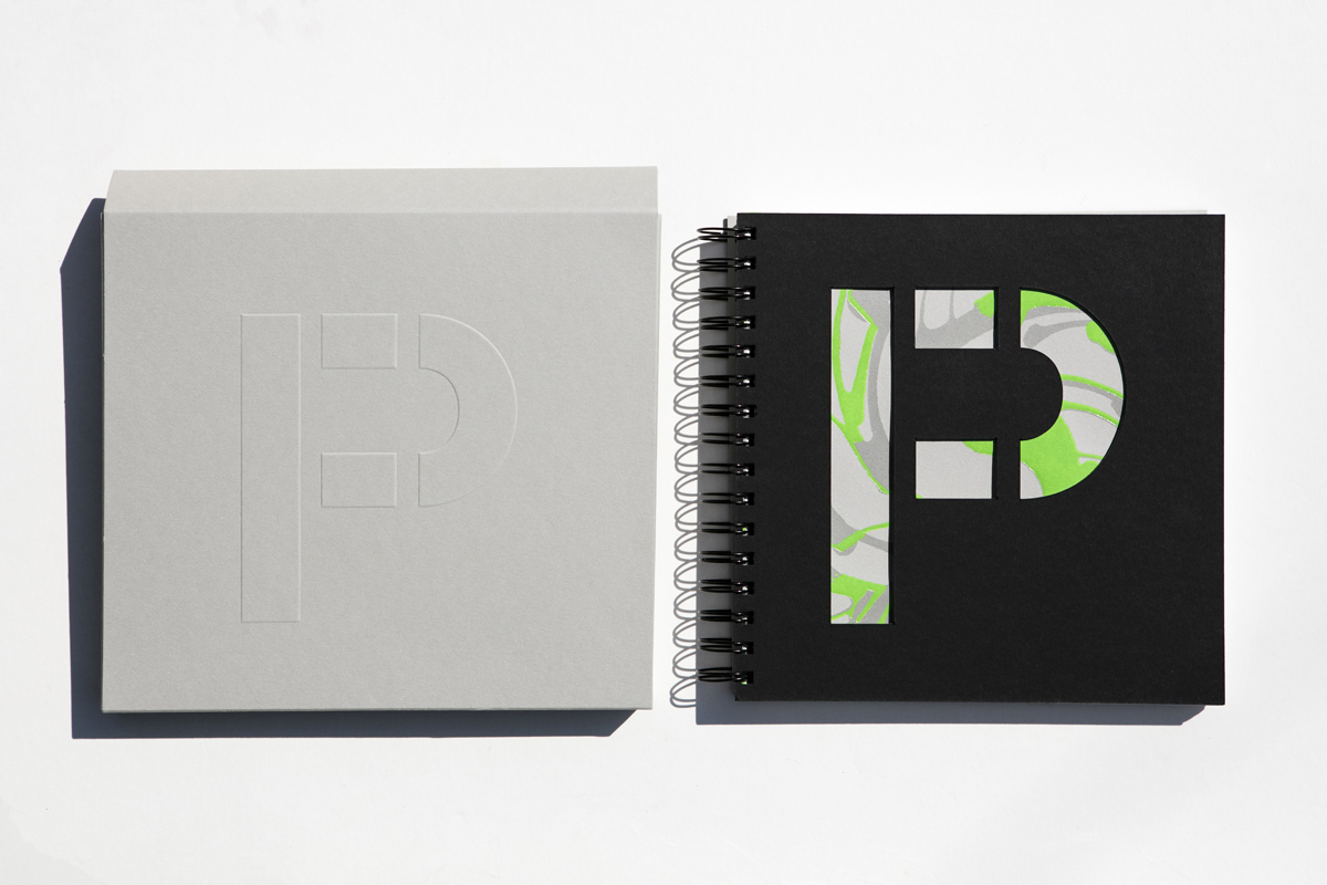
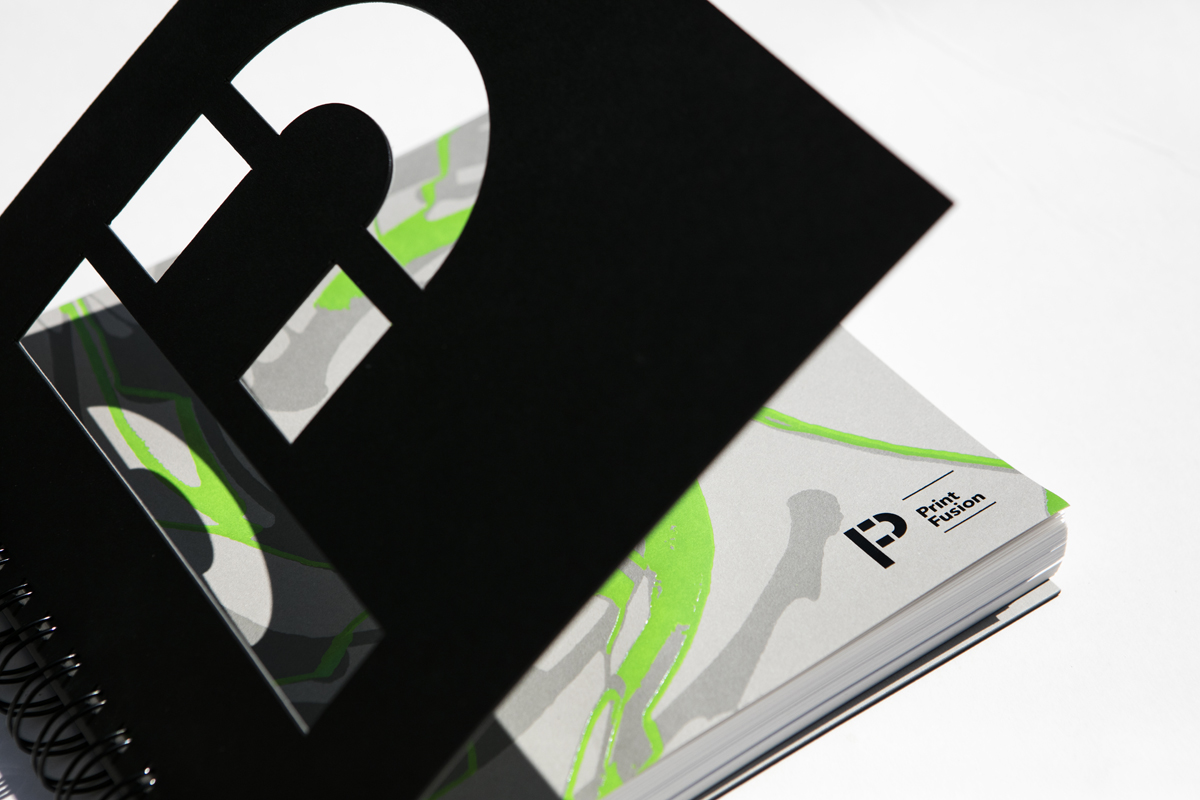
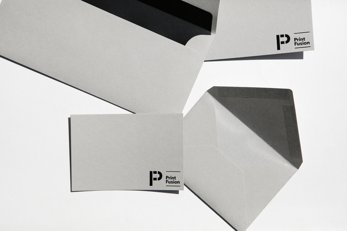
about Print Fusions brand essence “a passion for print”
We started with the logo focusing on producing a monogram that fused the letters "P" and "F". The styling references geometric Bauhaus typography, leveraging a heritage based on the foundation of modern print. We contrasted this with a fluid organic ink pattern.