Project A New Future
2020
Designed by Eleonora Bigi at bigO
Art Direction: Eleonora Bigi
Art Direction: Karl Davis
Director of Photography: Eli Braun
Production: Miriam Fayne
Production: Ian Lamont
Photography: Ellius Grace
Composer: Dunk Murphy
Project Manager: Ricky Harris
Categories: Printed Publication / Print / Editorial / Screen
Industry: Cultural
Tags: Contemporary art / Photography / Art direction / Campaign / Festival / Theatre
Website: fringefest.com/
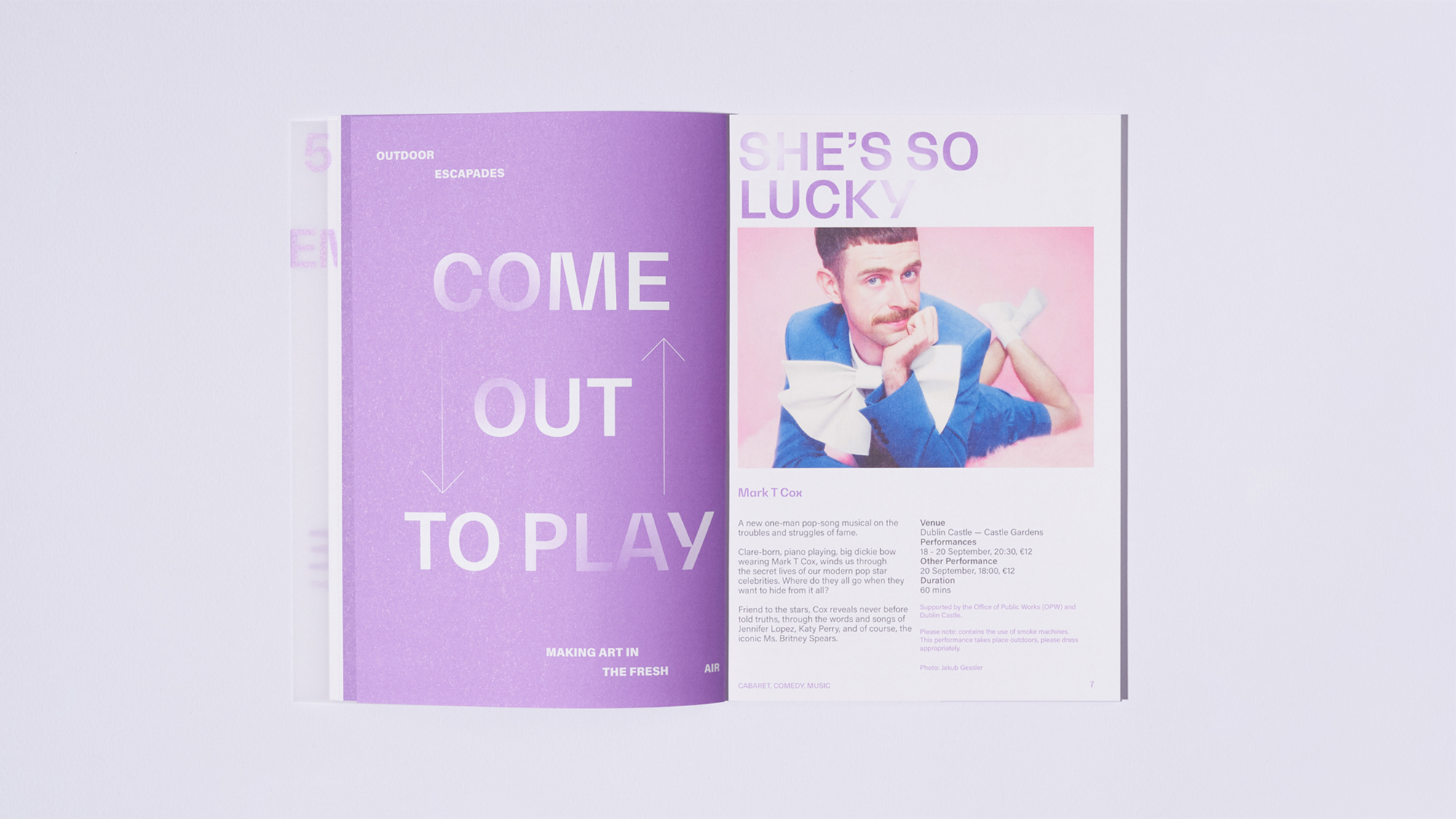
In a year of desperate uncertainty, Dublin Fringe Festival persevered as only Dublin Fringe Festival and its artists could. Fringe dubbed 2020 their Pilot Light Edition and pledged to Keep Her Lit. Restrictions placed on artists became creative constraints rather than barriers and Ruth McGowan and her team put together a festival full of intimate physical performances and novel approaches to digital theatre and art.
To embody this spirit of defiance, our treatment, “Project A New Future”, used a light —an enduring metaphor for creativity— that was transmitted through the darkness of uncertain days and dramatically illuminated the faces of the artists and performers used in the campaign.
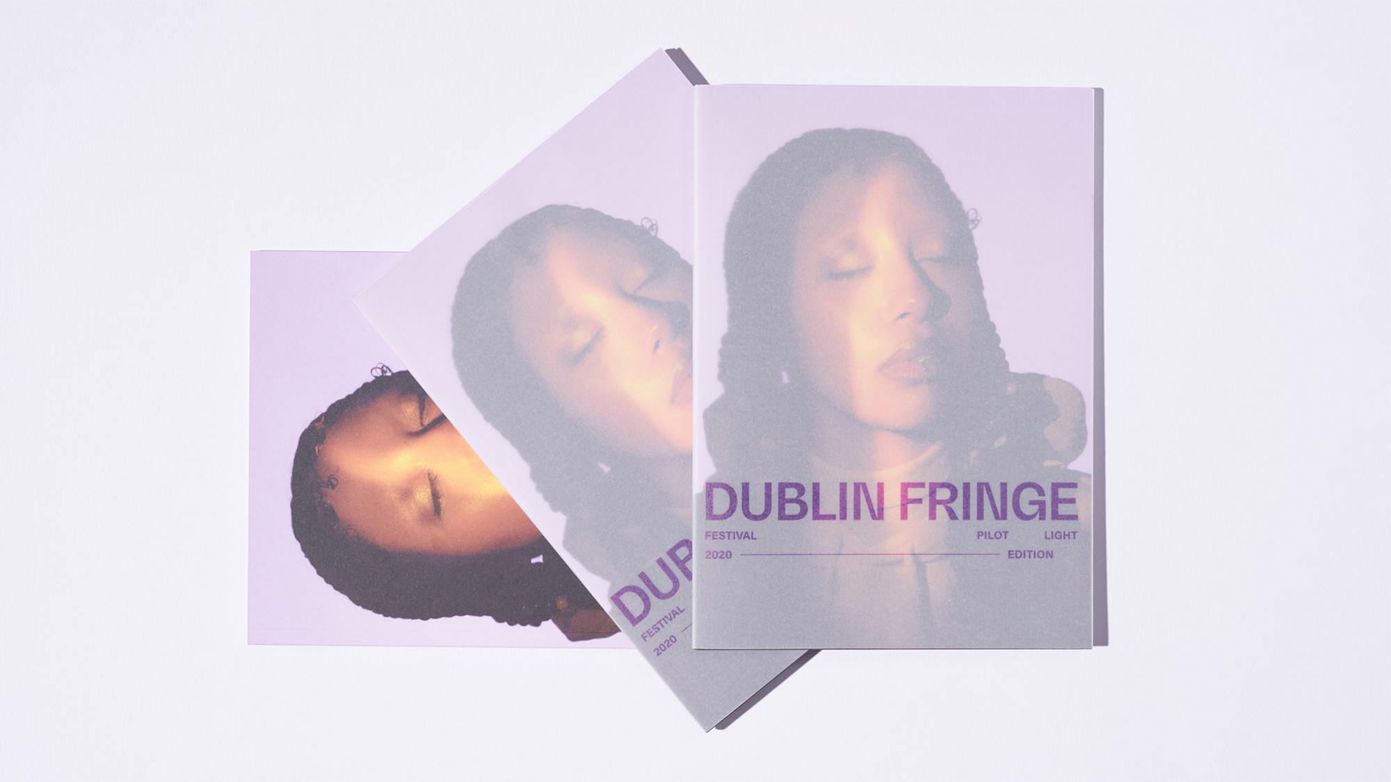
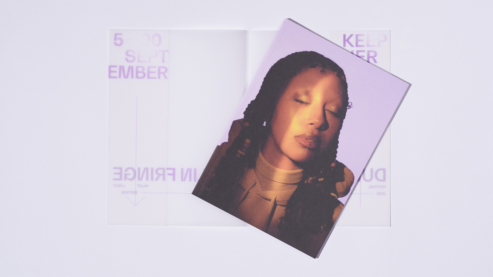
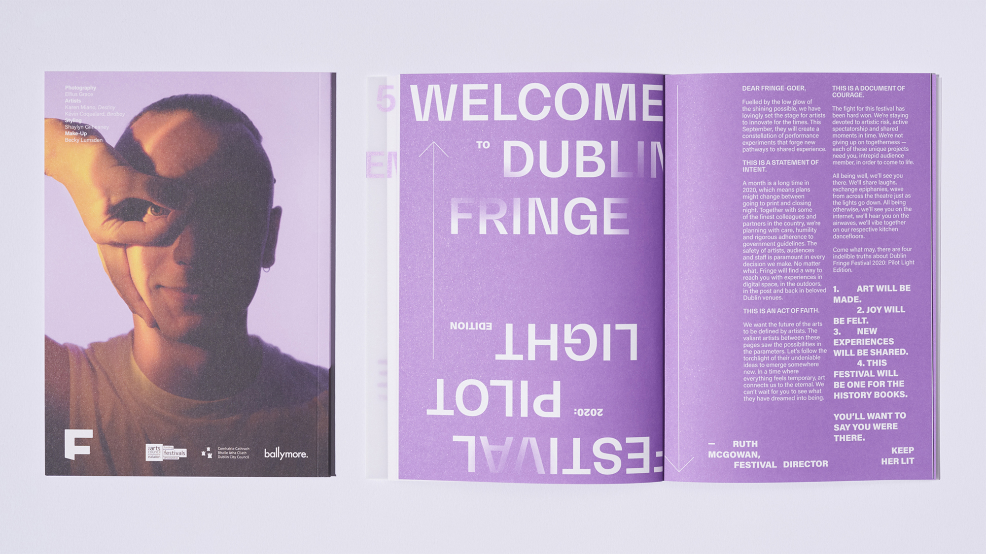
As with so much of 2020, what went before went out the window. Dublin city, the festival’s own stage which has played such a vital role in previous Fringe campaigns, was omitted. Instead our artists —Karen Miano of queer POC collective Origins Eile and dancer Kévin Coquelard— were suspended in a lilac limbo, symbolic of the empty stasis of the year. They were the faces of the festival’s physical and digital content.
Photographer Ellius Grace created portraits in extreme close-up suggesting an intimacy missing in a year defined by distance, capturing the subjects in the vulnerable states of bliss and play. bigO’s production team recreated that same imaginary creative space in moving image; artists illuminated by the flickering pilot lit, tension amplified by rhythmic cuts, set to a coruscating soundtrack by composer Dunk Murphy.
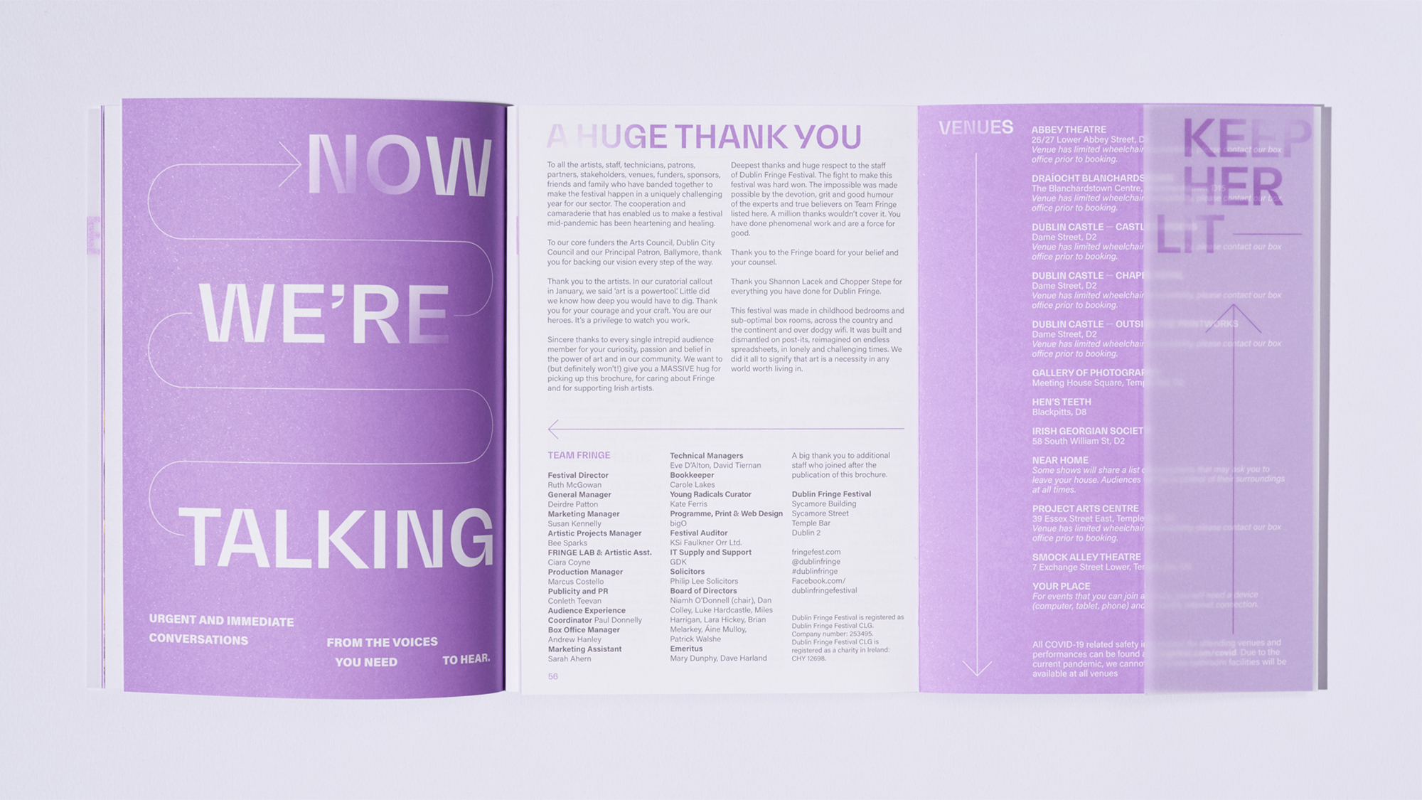
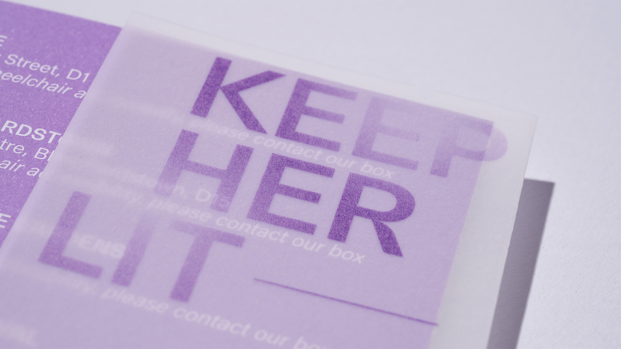
Karen and Kévin’s portraits graced the front and rear of the print brochure respectively, which was otherwise unadorned. Instead, the festival’s title was printed on a transparent dust jacket, a semi-opaque veil through which the artists’ light shone. The brochures are a beautiful and unique artefact of the festival’s most challenging year, and followed a strict three-colour minimalist palette throughout: purple, dark grey and white.