Quinlan Financial Brand Refresh & Website Design
2022
Designed by Aislinn McGrath at The Smart Group
Project Manager: Aoife Gainsford
Categories: Website / Identity
Industry: Commercial
Tags: Typography / Digital / Stationery
Website: quinlanfinancial.ie/
For over 40 years, Quinlan Financial has provided valuable financial advice to clients. Established in 1978 by J. Quinlan, the firm has built a reputation of integrity, honesty and trust that has been instrumental in their longevity.
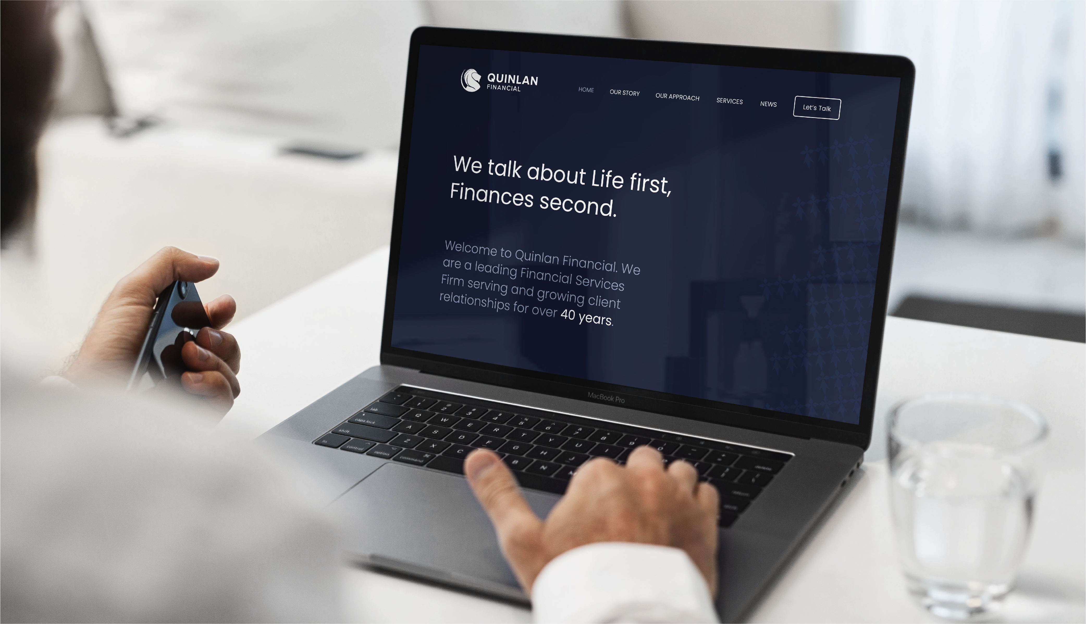
We were approached by Quinlan Financial to refresh their brand identity and develop a website that would attract clients of all ages and backgrounds to engage with them for financial advice and services. The main concern they expressed was that their current identity and website were out-dated and not fully communicating their services. The challenge for us was to create an identity that could last for many years to come but would also respect the heritage of the well-established Quinlan Financial name.
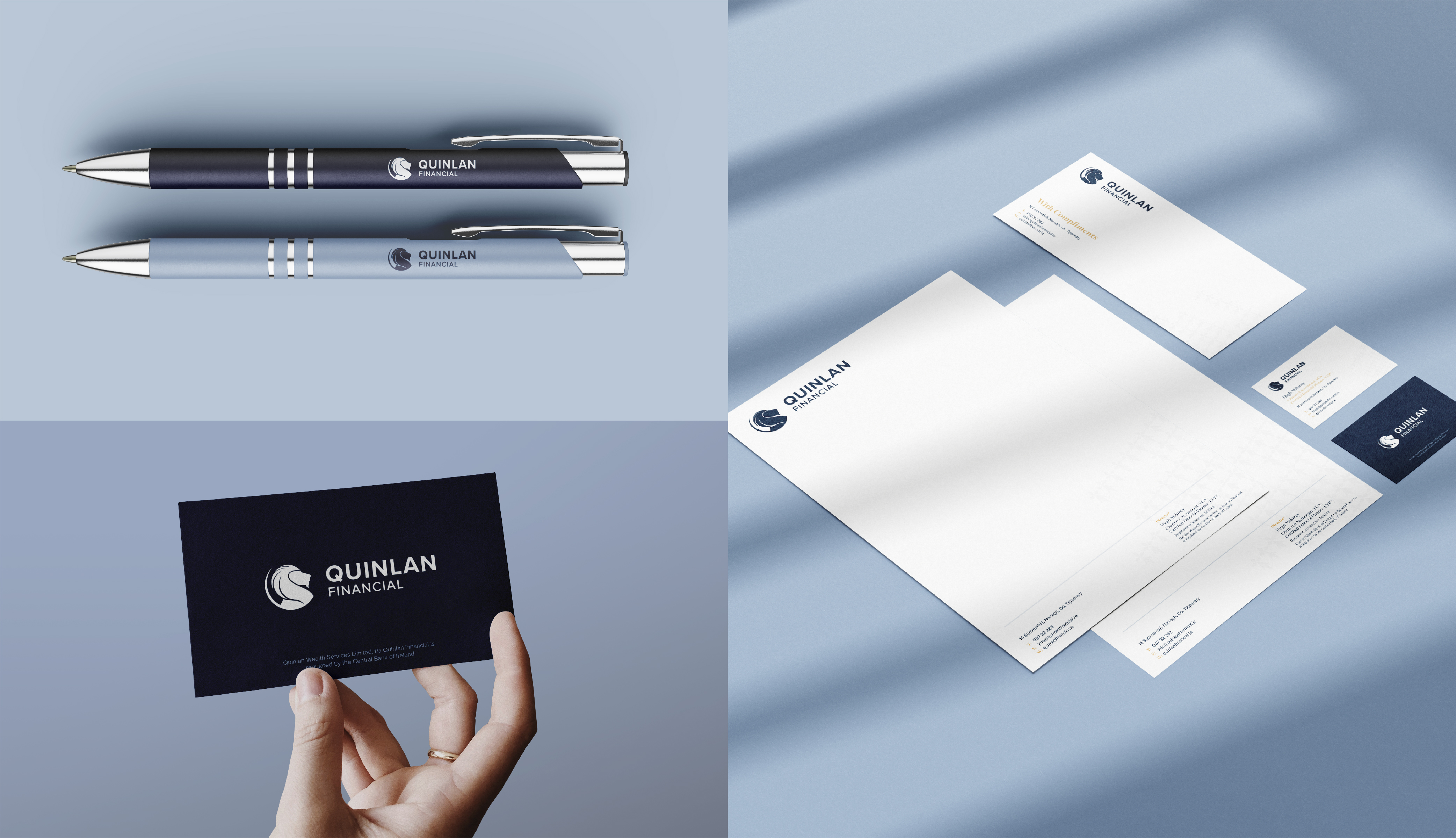
Quinlan is an ancient Irish name which is steeped in symbolism and history. With this in mind, we delved into the history of the name and took inspiration from the Quinlan family crest. The crest features a hand representing justice and sincerity, a star representing virtue and learning, a crescent moon representing enlightenment, honour and sovereignty and two lions representing deathless courage. We deconstructed the crest and re-built it focusing on the lion and the crescent moon. The lion is at the core of this identity, symbolising strength and trust, which reflect the values of Quinlan Financial.
To sit beside the brand icon, we chose the typeface Proxima Nova for its modern feel and variety of weights. Emphasis was placed on the name Quinlan to reflect the legacy of the firm. We gave careful consideration to the brand colour palette as it needed to tie into the values of the firm. With that in mind, we chose 2 contrasting shades of blue, navy representing trust, and light blue representing security. To compliment these colours and further reinforce the firms’ values, gold was chosen to reflect success.
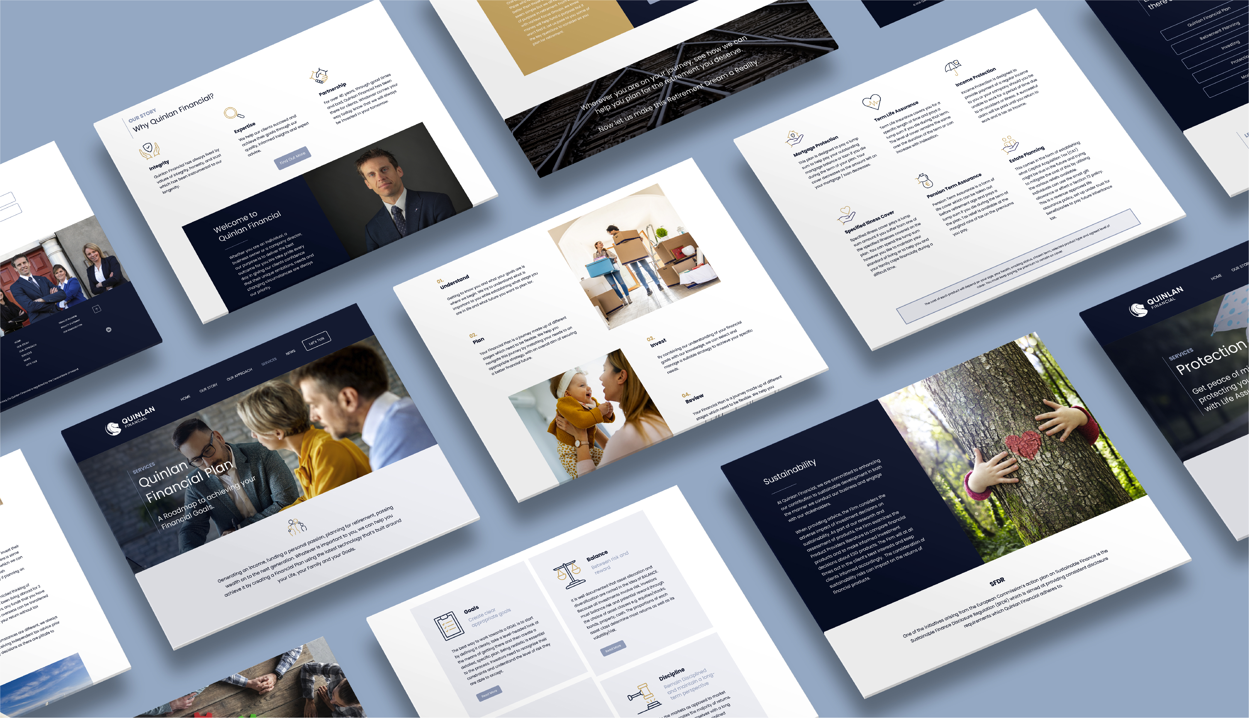
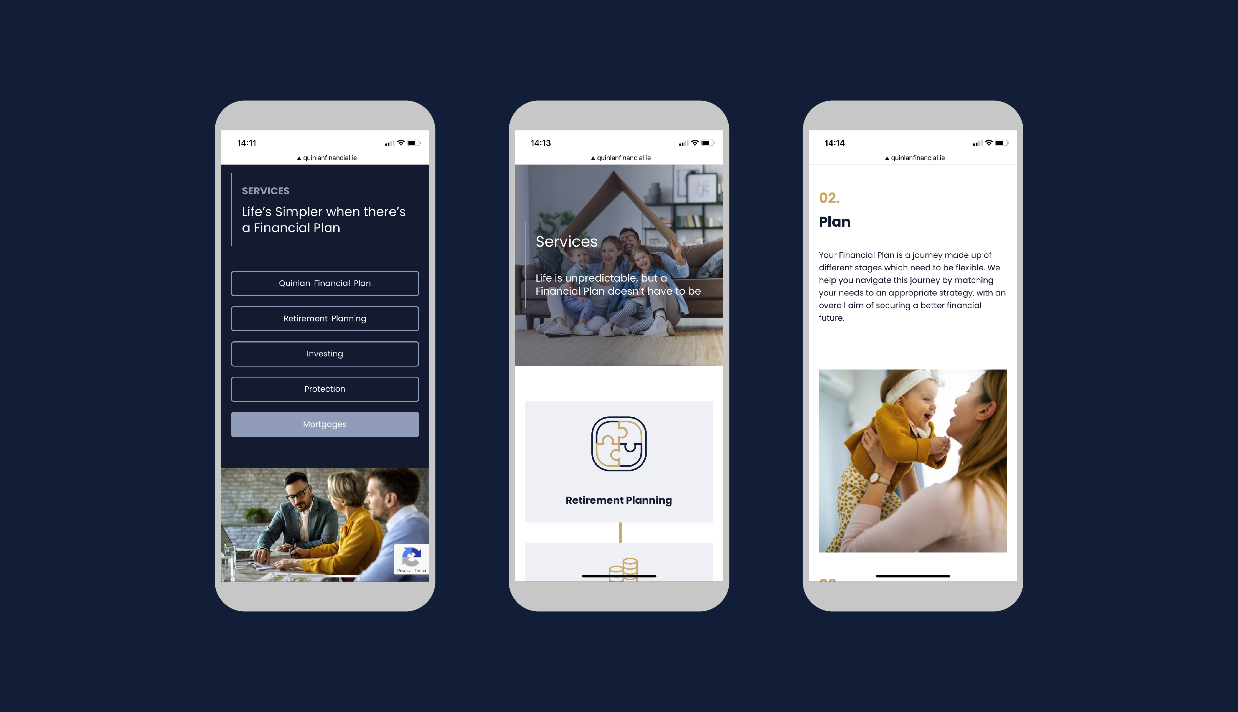
Just like the branding, Quinlan Financial wanted a fresh and modern website design. In terms of user experience and improving SEO, the company services were broken up into separate pages. The goal was to help users find the information they needed in a timely manner. To drive contact form submissions and phone calls, there was a CTA placed at the bottom of each page. This CTA is accompanied by an image of the team as building relationships is important for the Quinlan team.
The brand identity was also rolled out across a suite of stationary for every-day office use.