Rebrand: from Permanent TSB to PTSB
Designed by David Torpey, Éanna O_Shea and Rachel Broaders at Image Now
Designer: Max Kruseman Aretz
Experiential & Retail: David Wilson
Account Director: Amy Herron
Project Management: Eimear Boushel-Payne, Holly Henry, Colin Hogan
Categories: Promotional / Website / Environmental / Print / Identity / Typeface / Signage / Livery / Screen
Industry: Corporate
In a world of multiple currencies, new waves of banks and fintechs, and day-to-day experiences becoming increasingly more digital, it can be easy to get lost. Wanting to keep up with the times and beyond, all whilst retaining their human side, PTSB set the challenge of connecting its strategy to a new identity. We set out to deliver an identity aligned to the bank’s renewed strategic vision; find distinction in the marketplace and position PTSB as a unique hybrid of pillar and neo bank.
Marking the first major overhaul of the brand’s positioning and identity in over 20 years, a new identity encompassing a full brand system across all of the bank’s communications and platforms was developed.
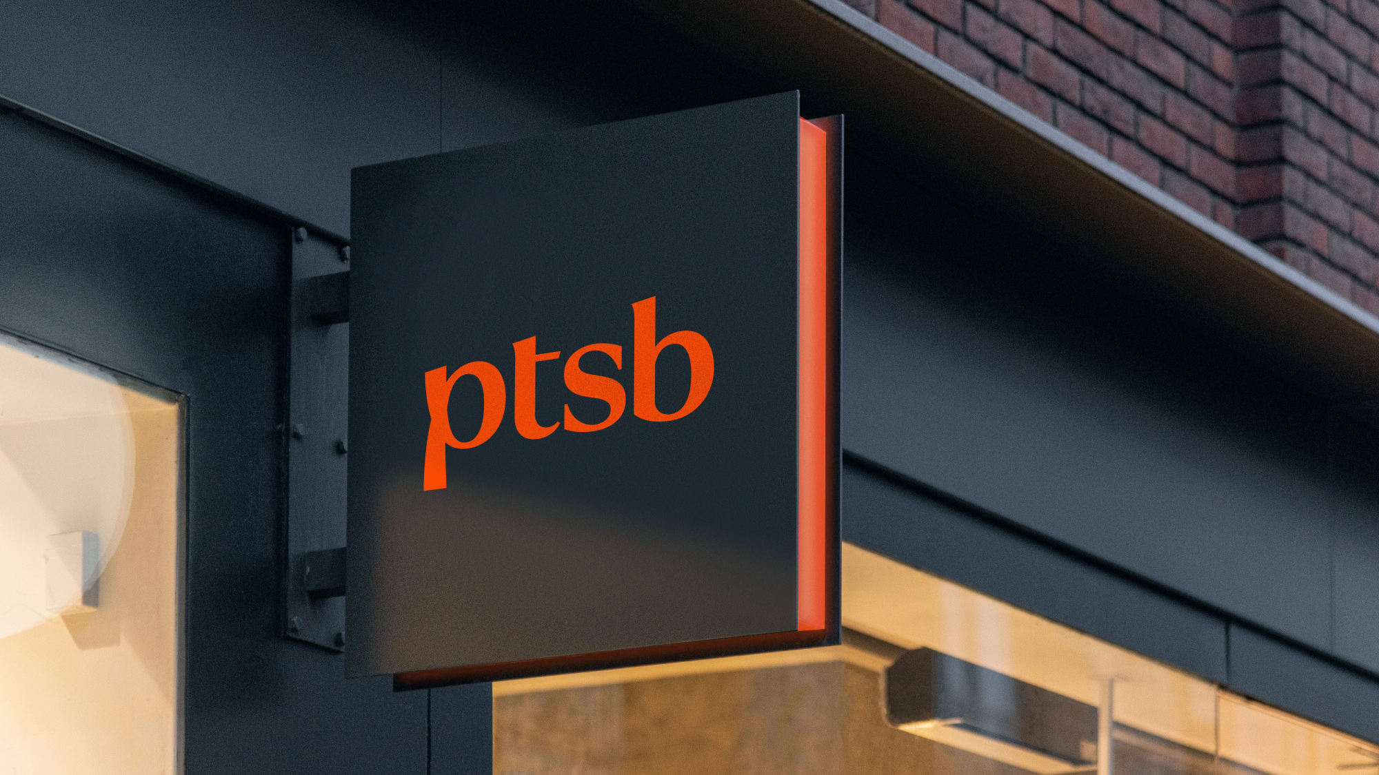
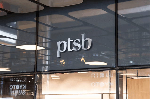
The first key step in achieving and embodying this new approach was a shift in name from “Permanent TSB” to “PTSB”. Shedding the cumbersome combination of half word, half acronym, the shortened name managed to align itself with the general public by adopting their existing nickname of “PTSB”. This change represented an increased efficiency within the business, a more seamless user experience and simply put, less of an awkward URL for customers to type into their internet search bar.
The design of a unique standalone logotype signified a confidence, simplicity and contemporary outlook for the bank. Boldly moving on from the need for a traditional icon and text lockup, the fluid looping ‘p’ injected meaning, ambition and optimism into the wordmark. There is a consistent upward lift created by the angle of the ascenders in the mark which represents cohesion, innovation and a commitment to continuous improvement. Overall the new logo communicates simplicity, positivity and humanity through its fluid, flowing forms and abbreviated structure.
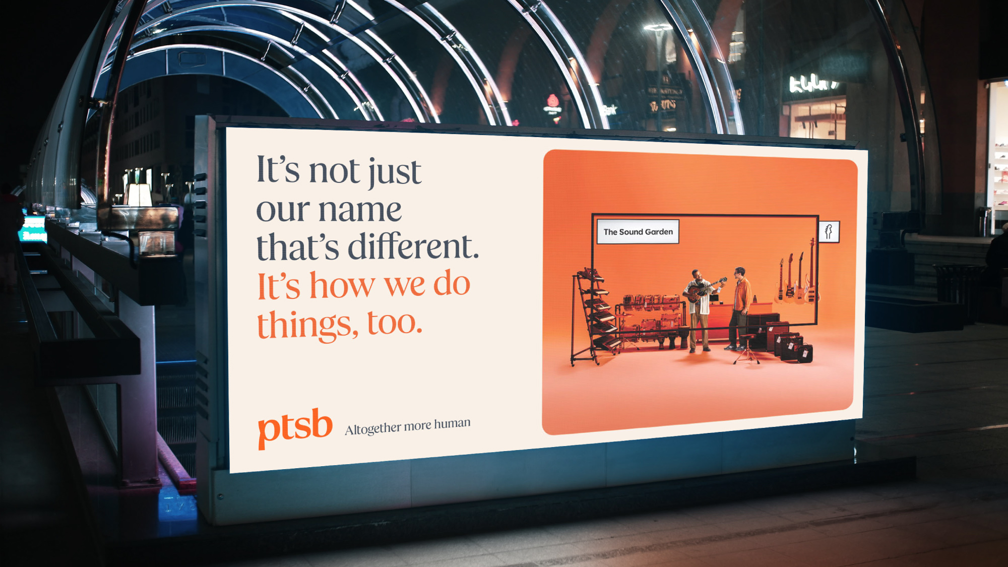
The letterforms themselves initiated the construction of a bespoke serif typeface for the brand that reflects a 200 year heritage, deepening PTSB’s connection to its customers and their communities. The craft displays a natural flow and movement in the letterforms, reflecting a more conversational ‘human’ outlook and synchronicity with the business’ renewed customer-centric focus.
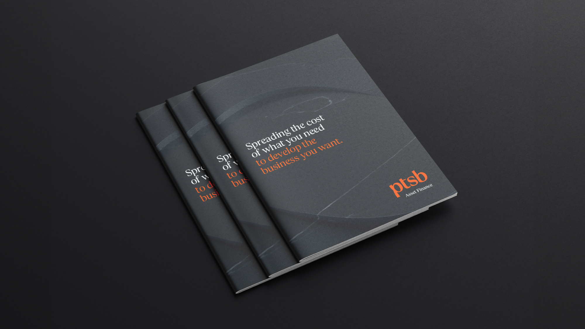
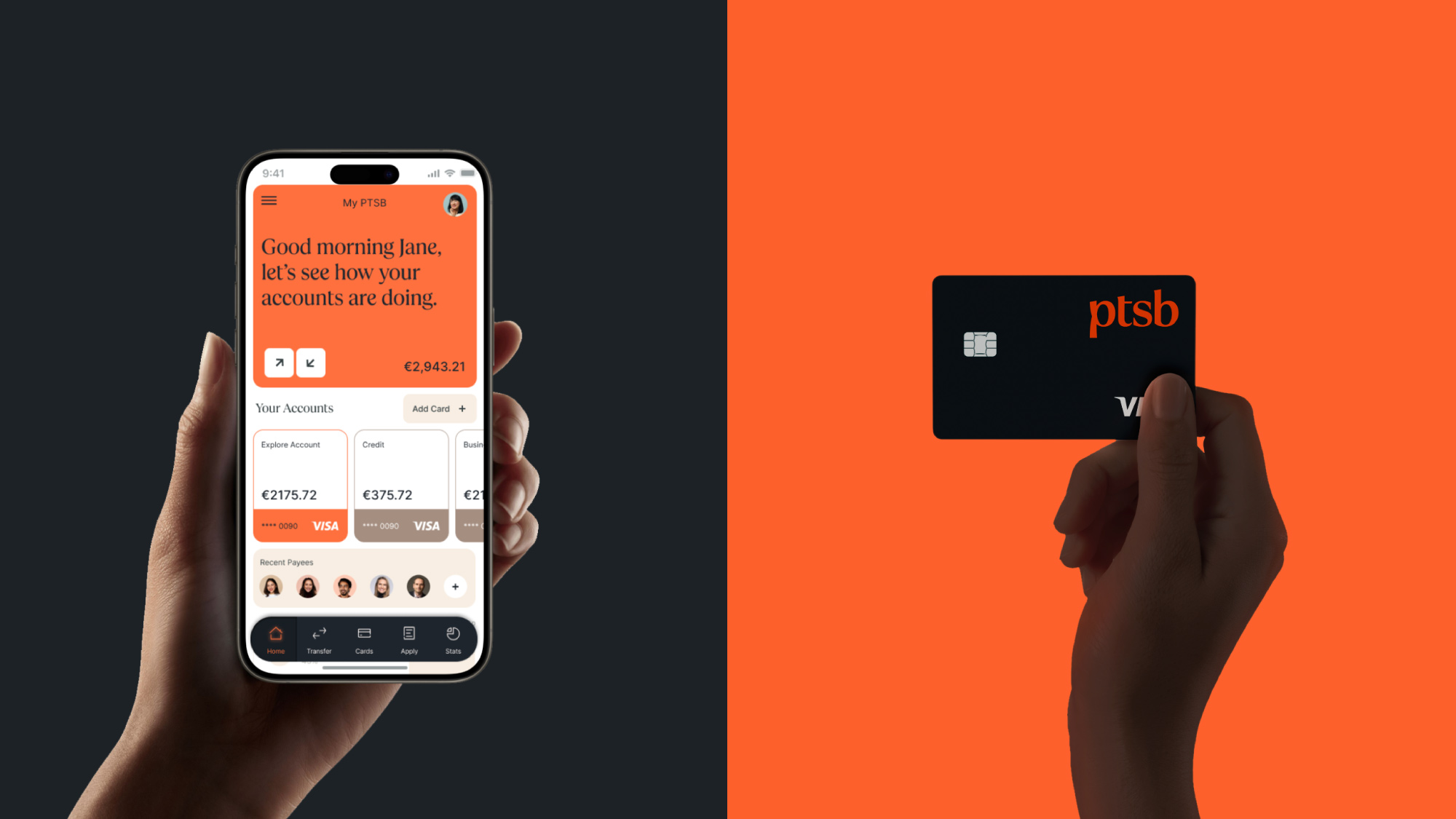
A contemporary colour palette composed of an amped up version of the brand’s signature orange shade, paired with a versatile, sleek slate grey was also developed. The new orange was strengthened by adding warmth, intensity and vibrancy which aligned with the bank’s fresh, friendly, digital-forward approach. The entire palette of primary and secondary colours were chosen to work in harmony with the new typeface, to bring consumers a brand underpinned by a deep sense of humanity and warmth, while also providing clarity and efficiency across all channels.
A suite of atmospheric 3D rendered textures were created as a key part of the brand toolkit. Rich, distinctive surfaces of marble, concrete and plastics were rendered in slate grey, orange, cream and white to showcase our logomark in a new light. The movement of light and shade across the debossed letterforms represented a raw realness and highlighted the importance of human connection and in-person accessibility in an increasingly digital age. These textures acted as interesting backdrops and unique brand signifiers when applied across print, digital and environmental touchpoints, leading to a distinctive and seamless experience of the new identity for its’ customers.
Ultimately the new identity, abbreviated name and brand toolkit aided PTSB in creating a distinct vision of banking for the future – a future with exceptional customer experience, a genuine care for its community and a digitally-optimised approach at the forefront.
With this, the brand is initiating a new era of banking, and a more meaningful “human” experience for all.