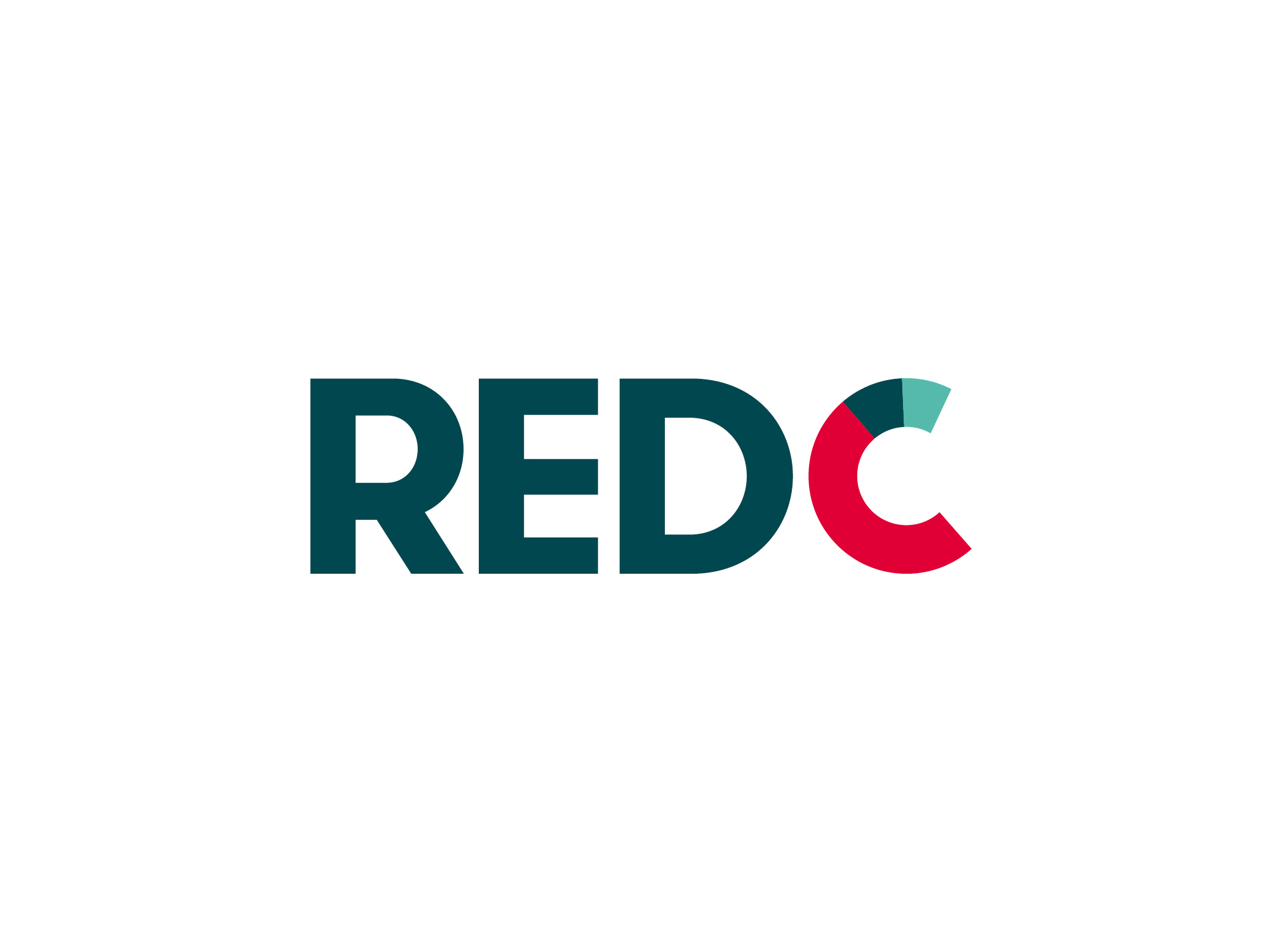
RED C Identity
Designed by Paula McEntee and Ruth Martin at Red Dog
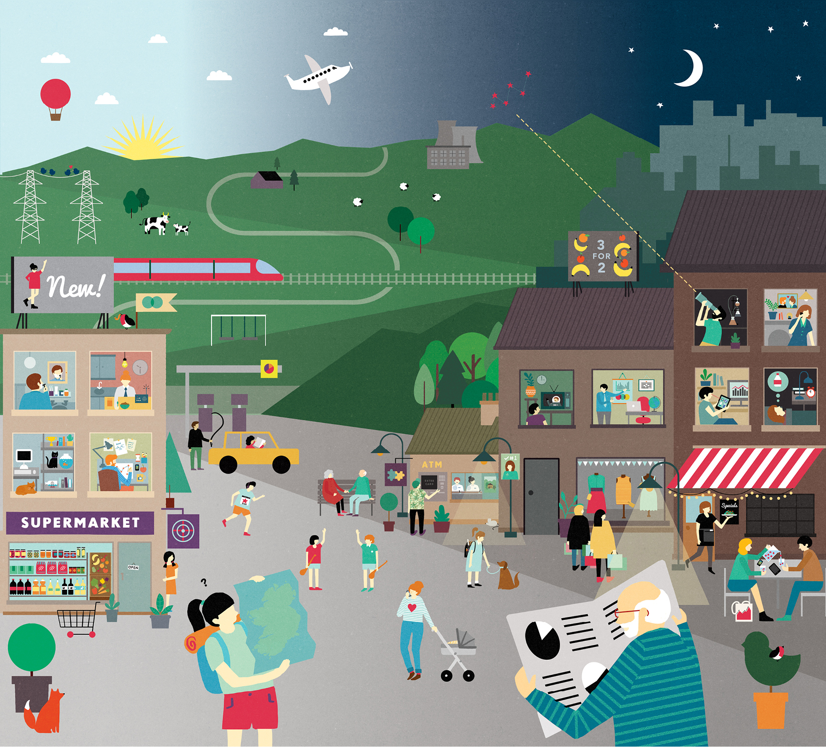
Illustrator: Fuchsia MacAree
Animation: Andrew Warwick
Website: reddog.ie
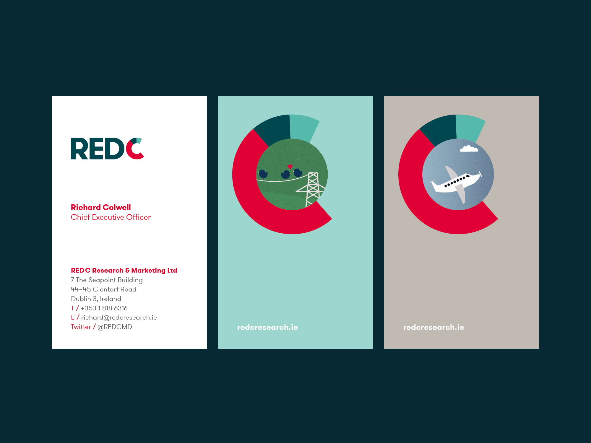
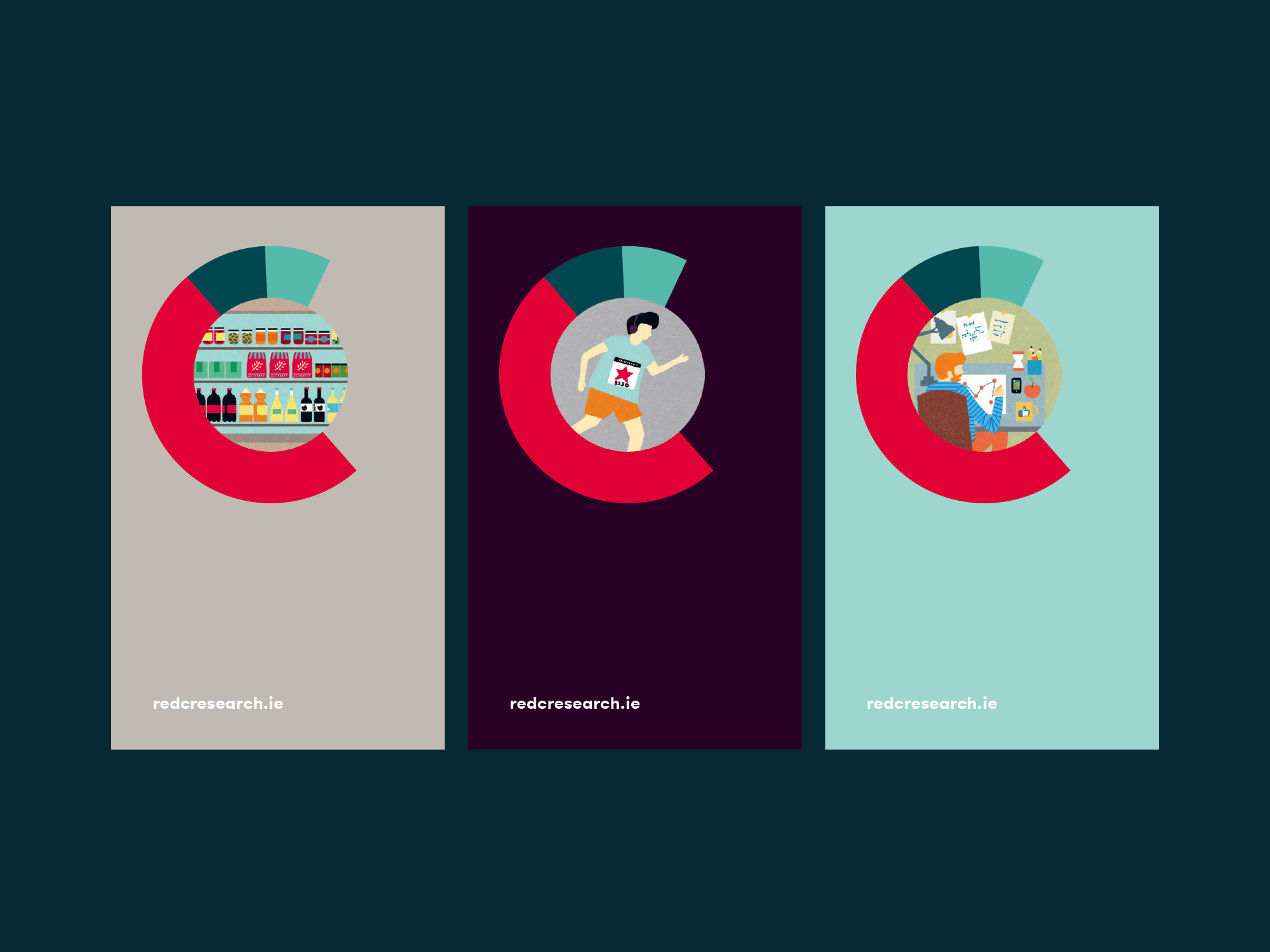
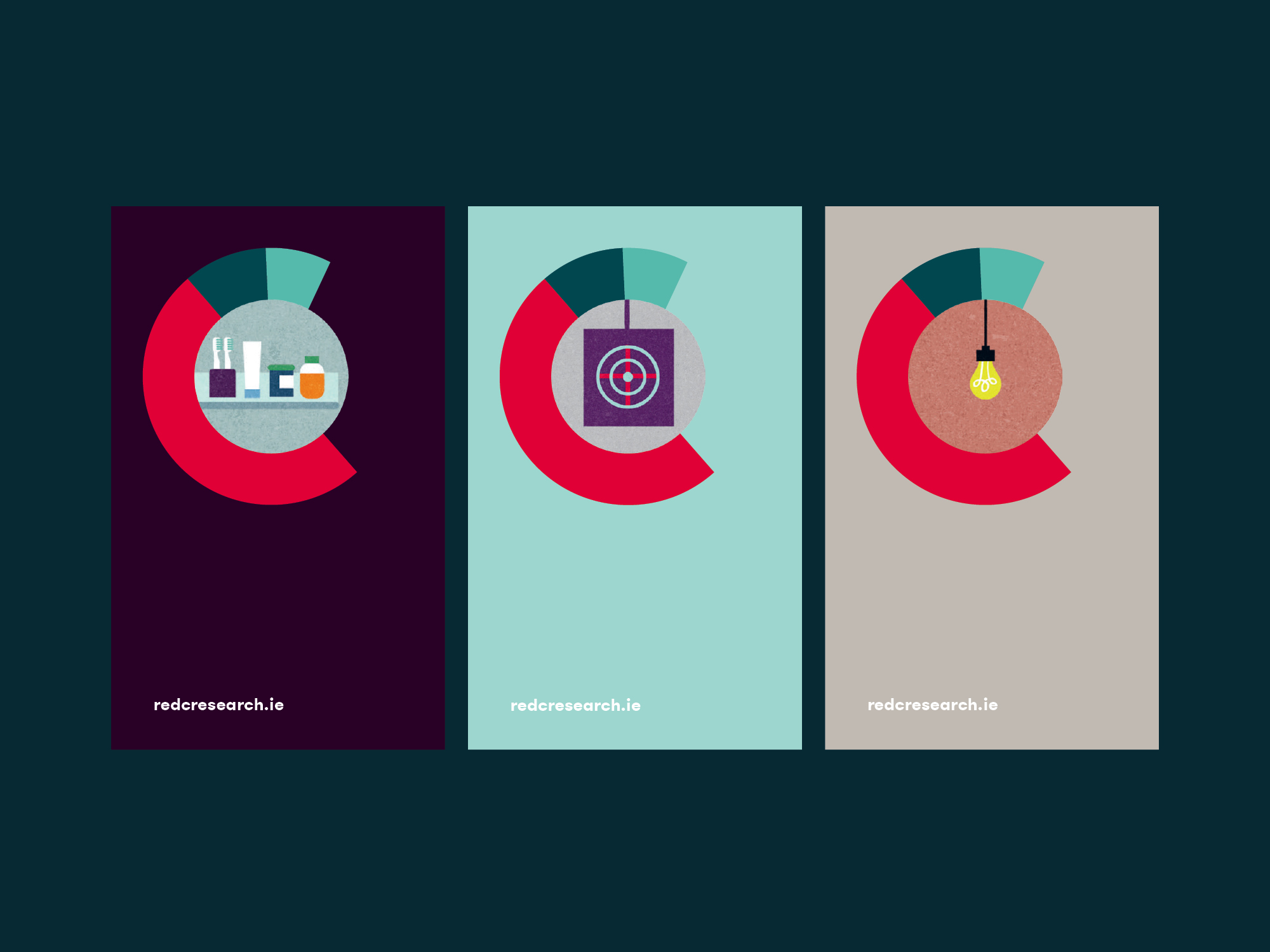
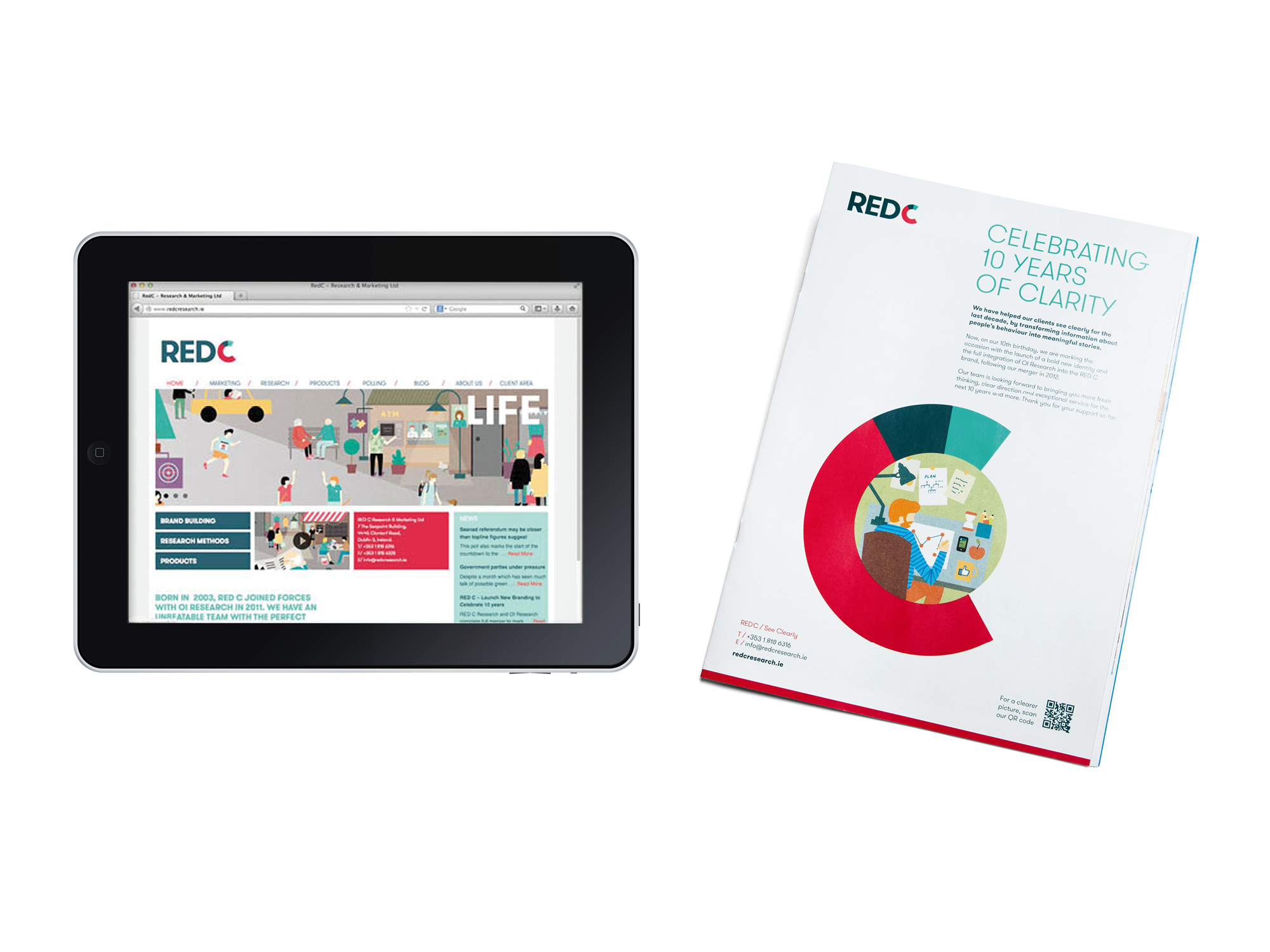
RED C is a market research organisation whose work is rooted in sound statistical science, behavioural observation and listening to the consumer. The RED C marque was designed to reflect their dynamic approaches. The ‘C’ symbol was inspired by the segments of a pie chart, representing measuring, monitoring, analysing and communicating clearly.
As an integral part of the brand expression, We commissioned an illustration by Fuschia MacAree, that quantifies the core of RED C’s work – gathering and understanding the Irish public’s attitudes and behaviours to provide clear insights. The RED C illustration represents people, services, brands, the market place and daily life in general. From this illustration an animation and a suite of 31 icons were developed help support RED C’s communications and reinforce their clarity and innovative approaches.