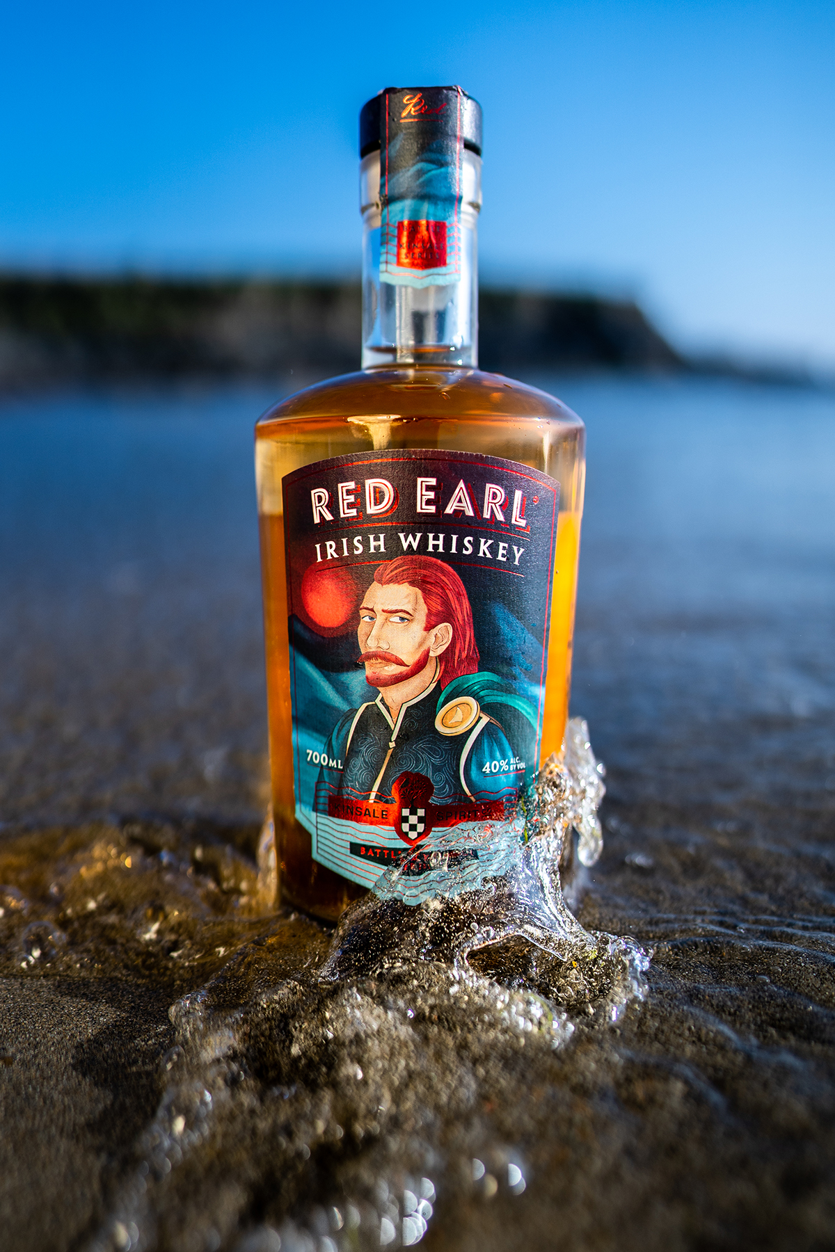
Red Earl
2020
Designed by Brian Wilson at Wilson Creative
illustrator: Katelyn McKenna
Categories: Packaging
Industry: Commercial
There is a rule in spirit labelling to never feature faces on your labels. No one told Captain Morgan, and no one told Red Earl. Tired of the design by number that is whiskey label design, together with Kinsale Spirit Co., we came up with the against the ahem, 'grain' concept of Red Earl. Based on Red Hugh O'Donnell and featuring quirky and charming illustration, it's bright, bold, full of little easter eggs
.jpg)
.jpg)