RTÉ Concert Orchestra Identity framework
Designed by Paul McBride, Keith Byrne and Pierce Cunnane at Detail. Design Studio
Categories: Identity
Industry: Cultural
Tags: System
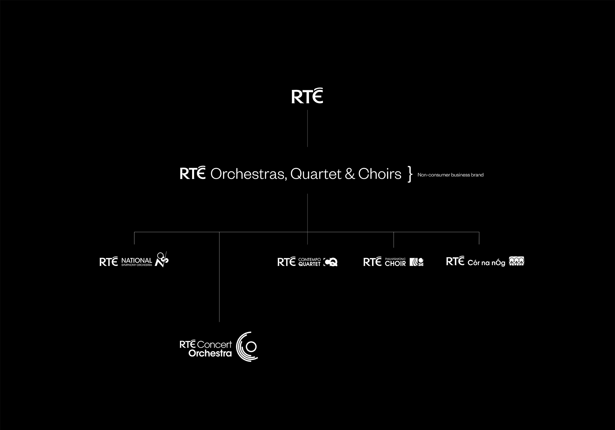
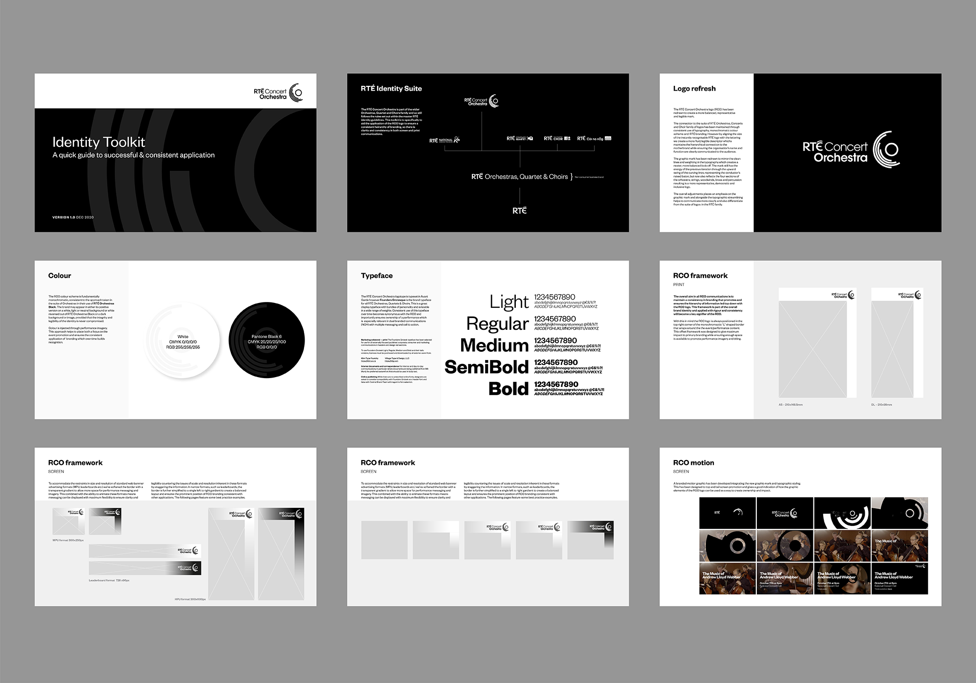
RTÉ commissioned us to review the Concert Orchestra's screen and print communications with a view to providing a graphic toolkit they could use internally. The brand was applied inconsistently, struggling in the hierarchy of multi-layered messaging, competing with partner brands for primacy as well as a challenge in differentiating with their sister orchestra.
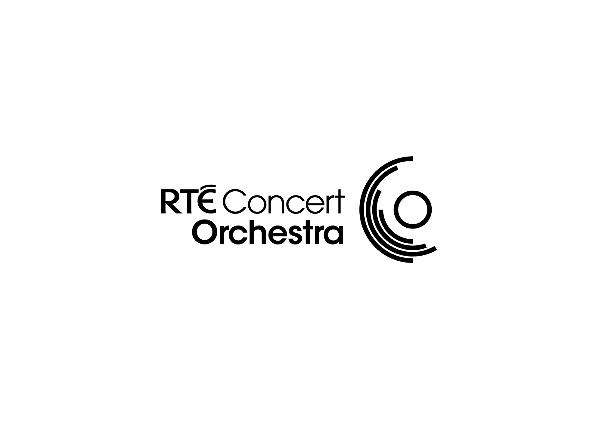
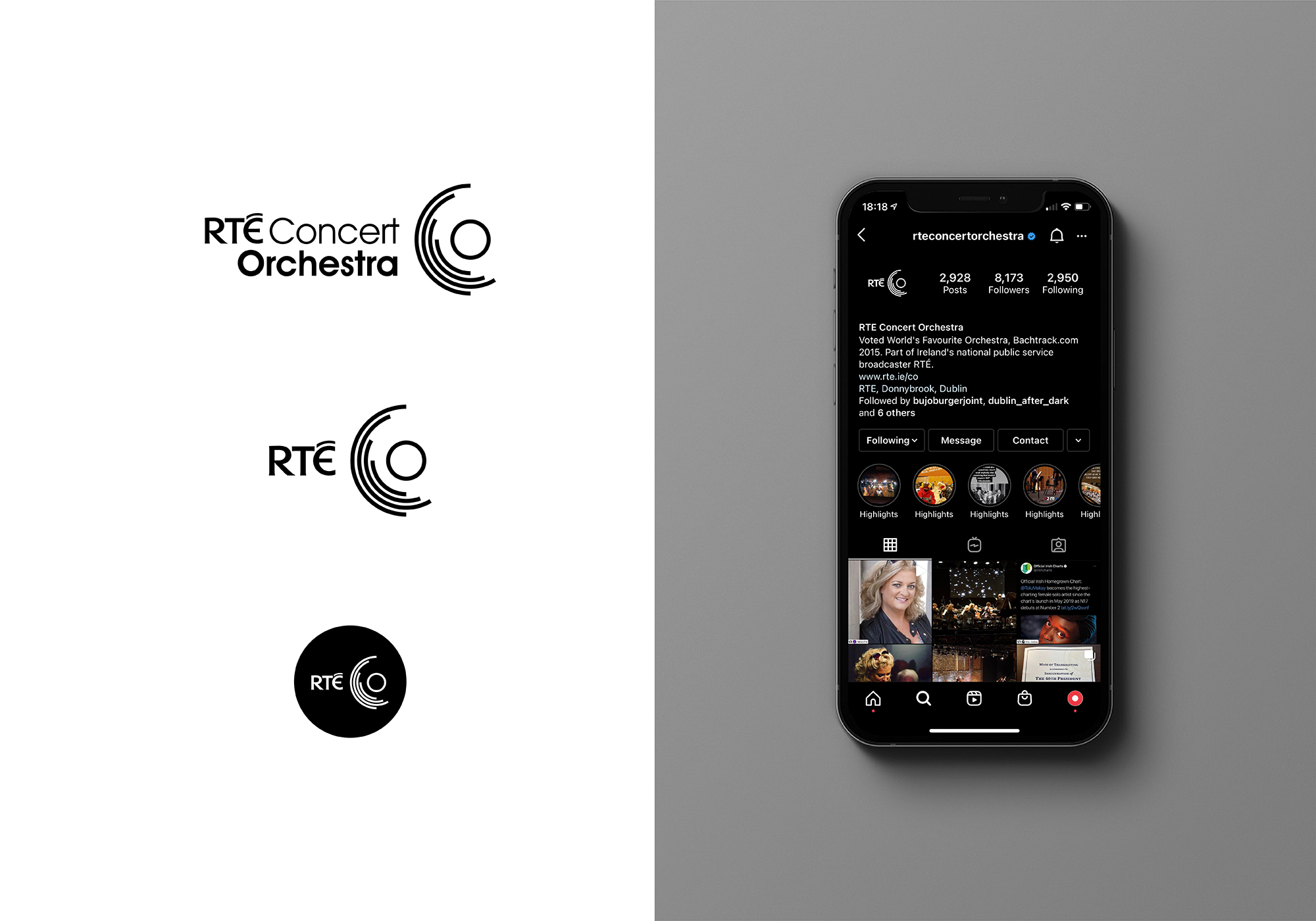
We started with the logo, rebalancing the typographic elements to bring Concert Orchestra to the fore. We redrew the graphic mark to be more representative of the egalitarian structure of the organisation with the four lines reflecting the four sections of the orchestra as well as the conductor but being mindful to maintain the energy and heritage of the original mark as part of the existing RTÉ identities for Orchestras, Quartets and Choirs.
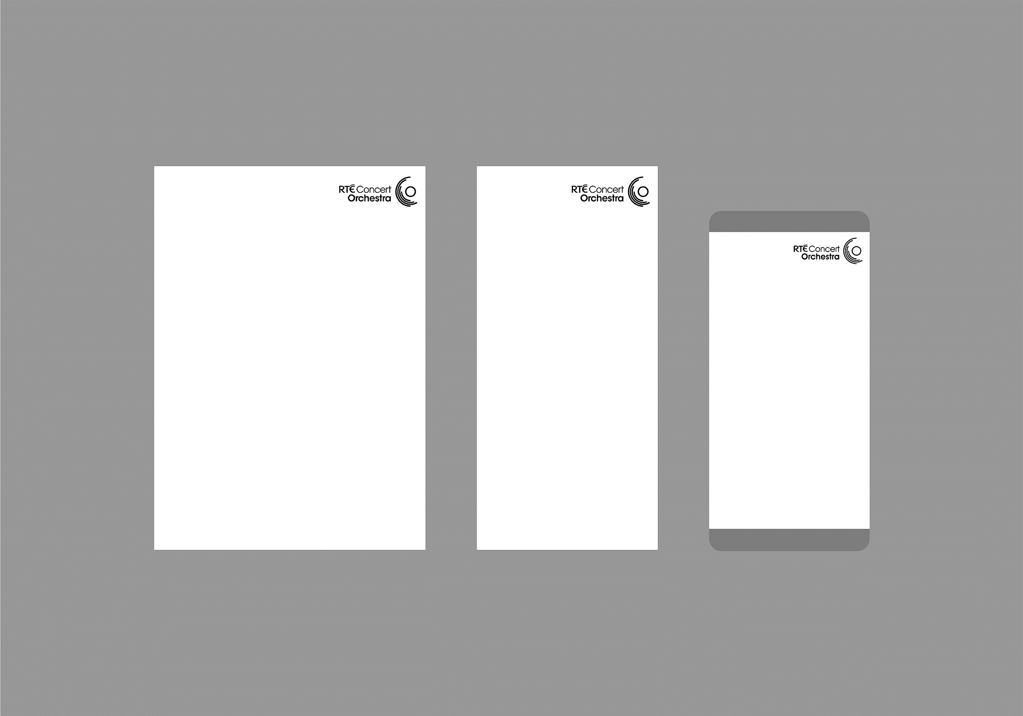
We created a flexible graphic framework that counterbalanced with their partner organisation’s existing identity system to clearly delineate between event, location and branding information. This layered approach, alongside the monochromatic colour palette and consistent use of the RTÉ typeface, assures the correct hierarchy of information ensuring the ownership of the event communications. The system was applied to print, screen and social applications as well as motion graphic manifestation for tv spots that centred on the refreshed logo.