Rye River Brewing Co. Rebrand and Packaging
Ireland's largest and the world’s most awarded independent brewery, Rye River wanted to create a brand that hero’d their brewery. After years of managing sub-brands it was time to celebrate the art of brewing and their talented brewers with a brand that truly represented them.
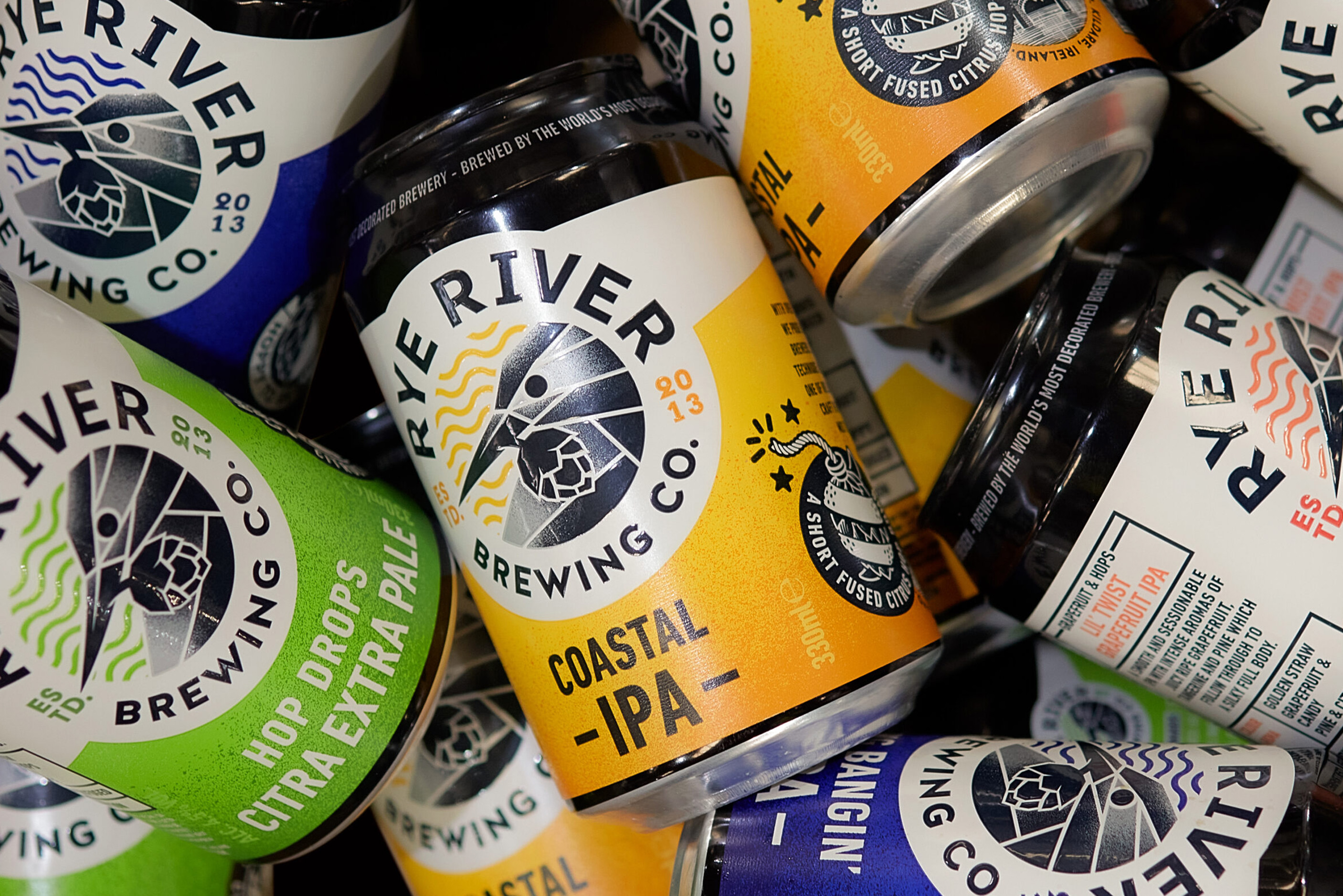
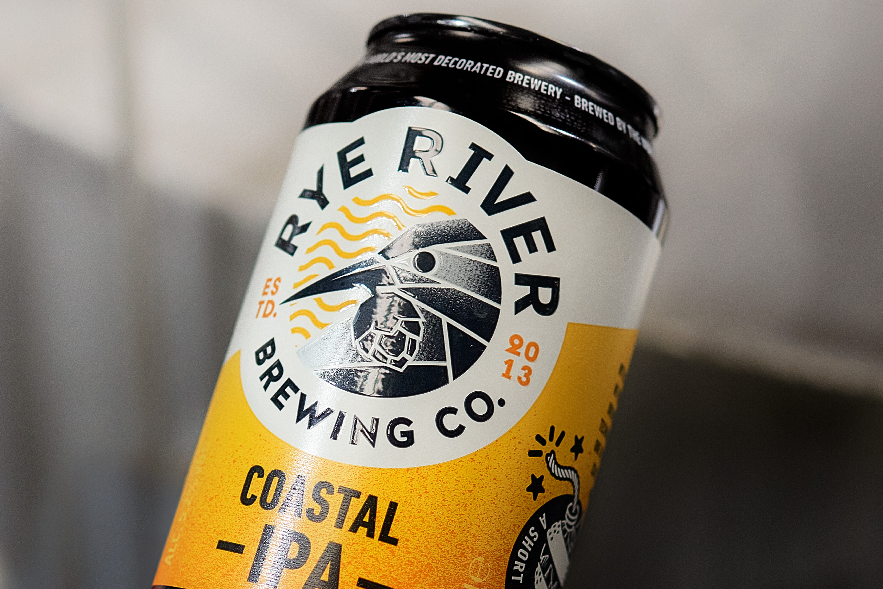
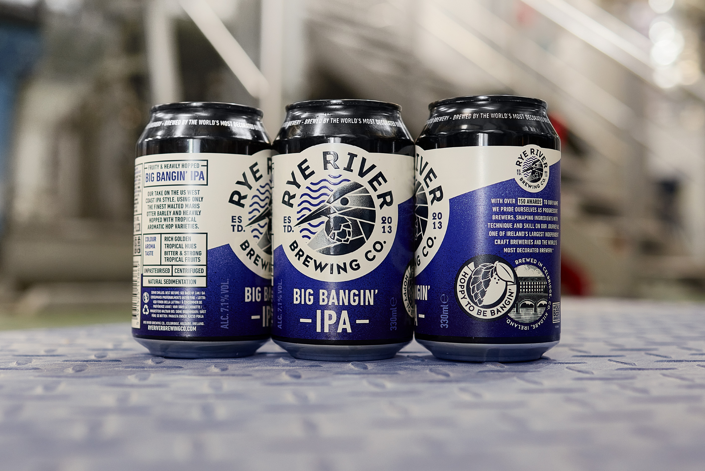
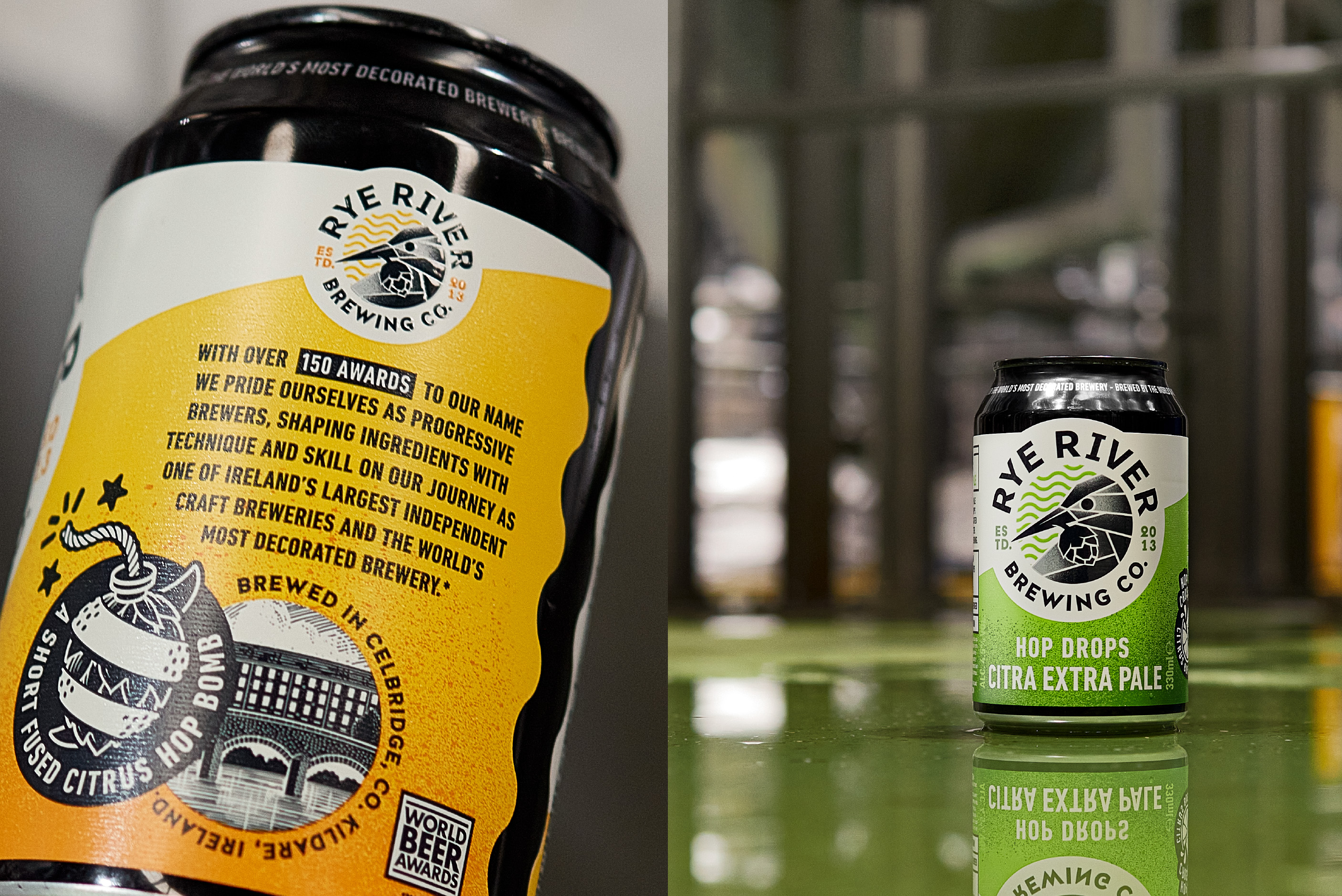
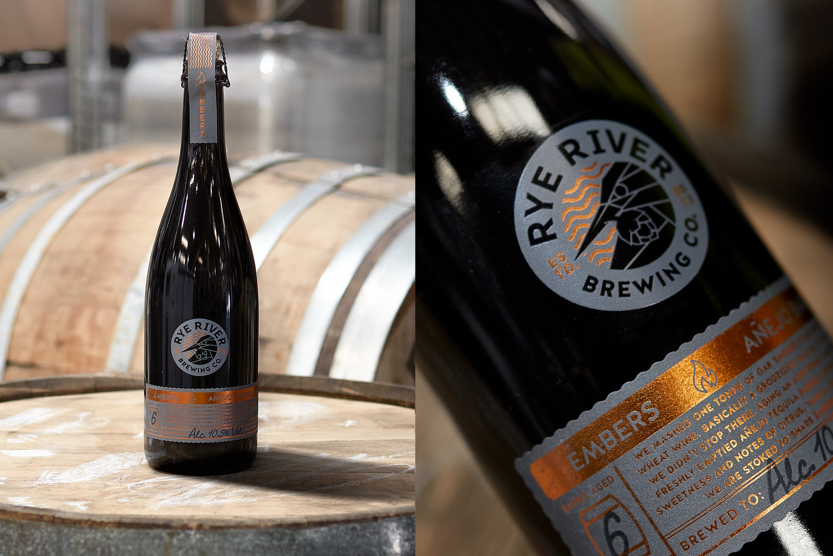
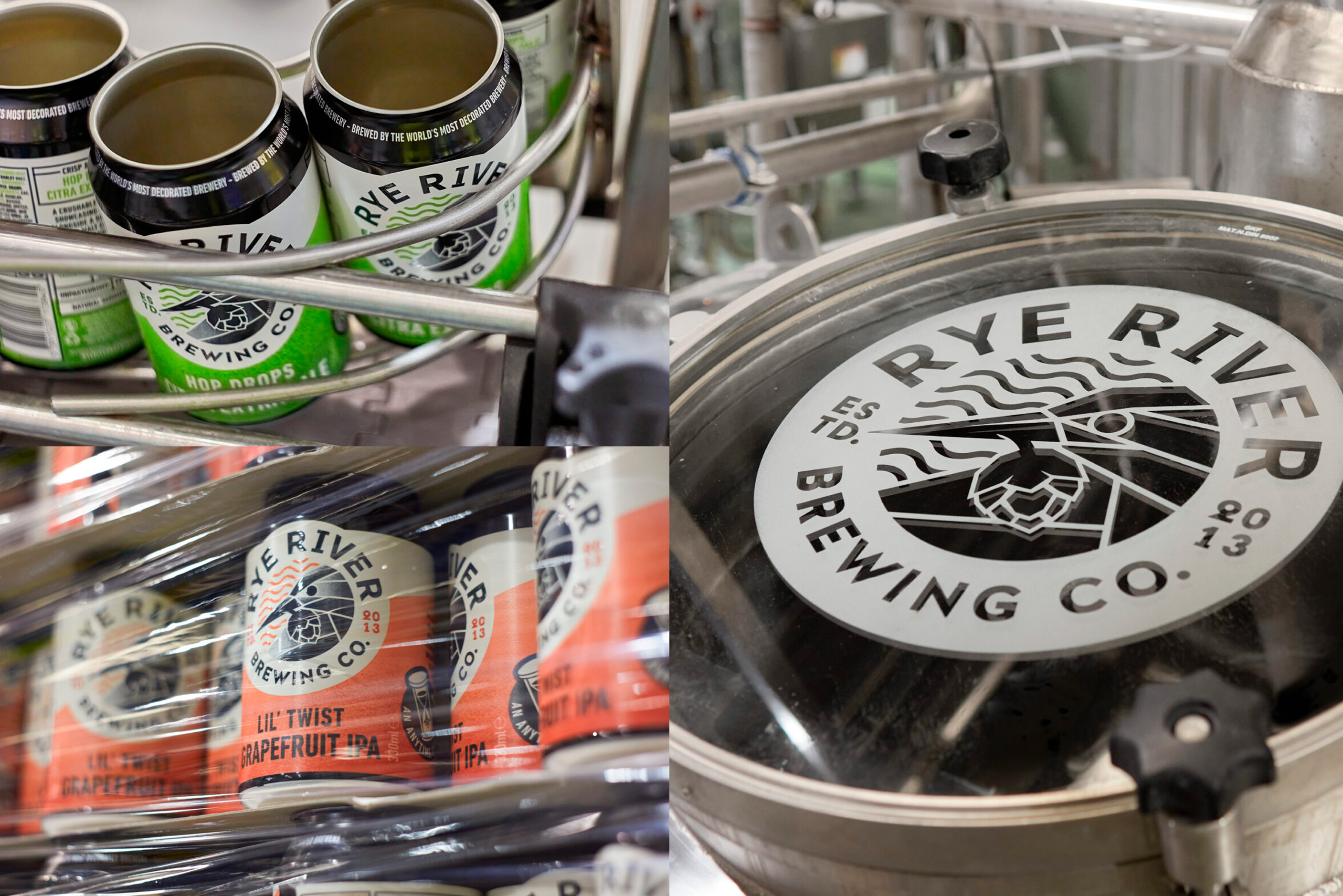
The new branding depicts a radical retake of their current kingfisher, depicted on what was their existing corporate brand marque and a well-known icon of the River Rye – the founding site of the brewery. It was then worked into a roundel echoing the heritage of brewing.
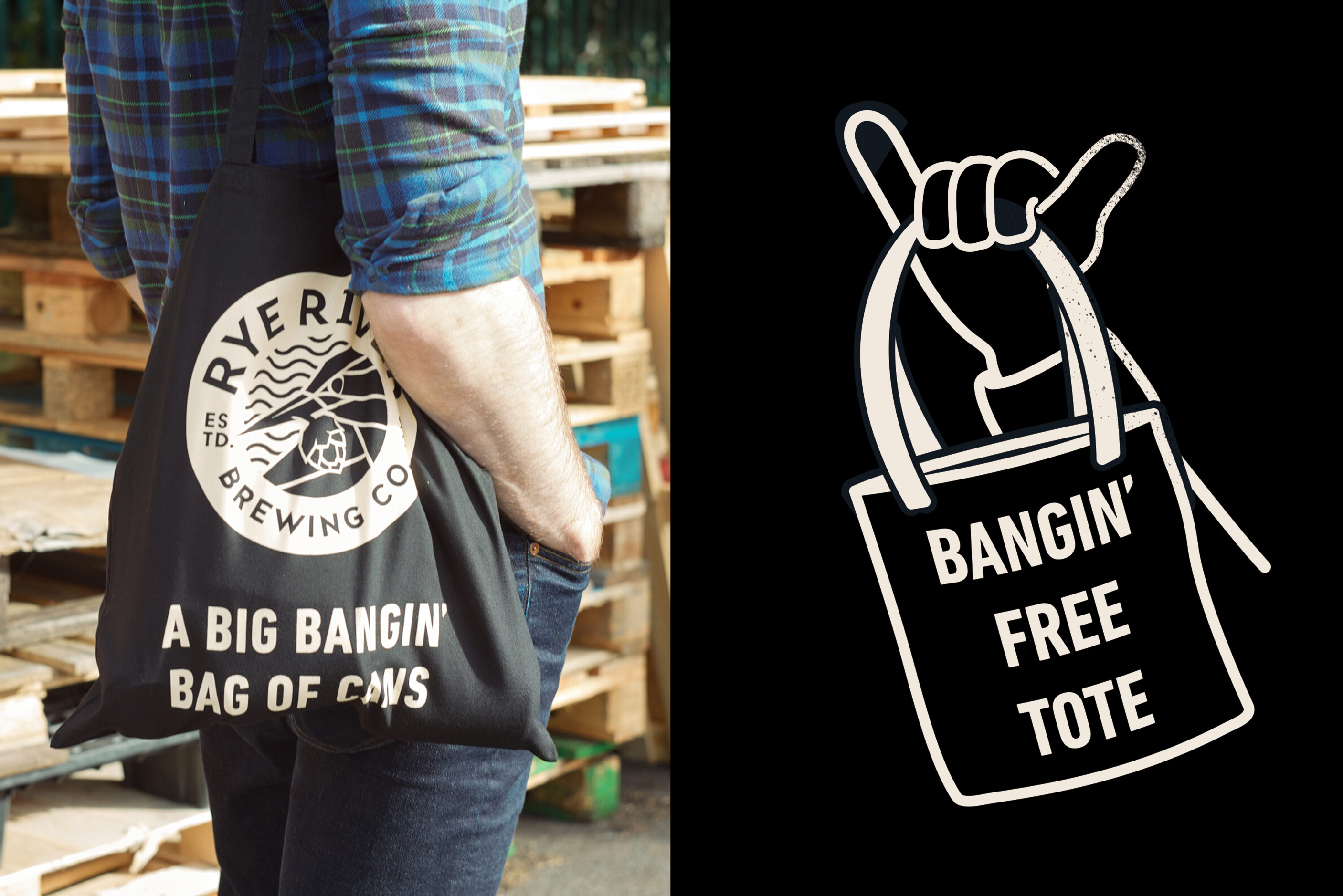
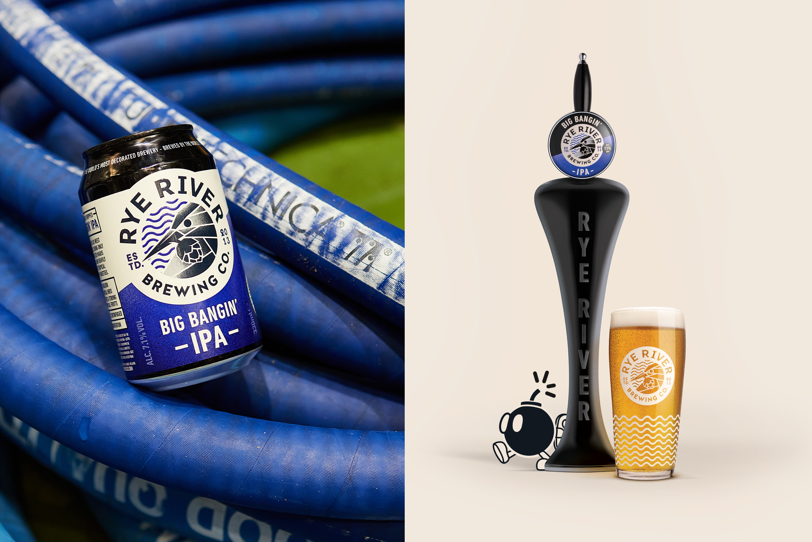
A strong graphic symbol that is eye-catching and robust enough to translate impactfully across a myriad of activations and packaging.
In order to achieve cut through in a more accessible craft beer category a bold, dynamic and striking label design was created consisting of impactful colour coding elevating the brands on-shelf visibility and helping range navigation. Leading to a powerful on-shelf cumulative effect even if the can is not positioned logo-forward on the shelf.
A system of a sensory tactile label applied to a printed black base can and distinctive black lid delivers a very effective, deliberate and considered solution to what is the commercial issue of minimum order quantities.
Every beer has its own personality and range of icons developed specifically to communicate the distinct profiles of the beer and engage with the consumers. The strong visual impact of the design pairs with a brand story informing the consumer of their bold and brave achievements in the brewing world.