Sculpture Dublin
2020
Designed by Eleonora Bigi at bigO
Copywriting: Ian Lamont
Project Manager: Ricky Harris
Art Direction: Karl Davis
Photography: Hazel Coonagh
Categories: Website / Identity / Screen
Industry: Cultural
Tags: Digital / Visual art / Event / Website / Logo
Website: sculpturedublin.ie/
Sculpture Dublin is an initiative to commission high-quality contemporary sculpture in six locations around Dublin city, and to create publix interest and engagement in sculpture in a more general sense. A Dublin City Council initiative developed by the Parks and Landscapes Services and the City Arts Offices, Sculpture Dublin celebrates the wealth of sculptural history around Dublin and addresses the need for new works in a variety of locations around the city.
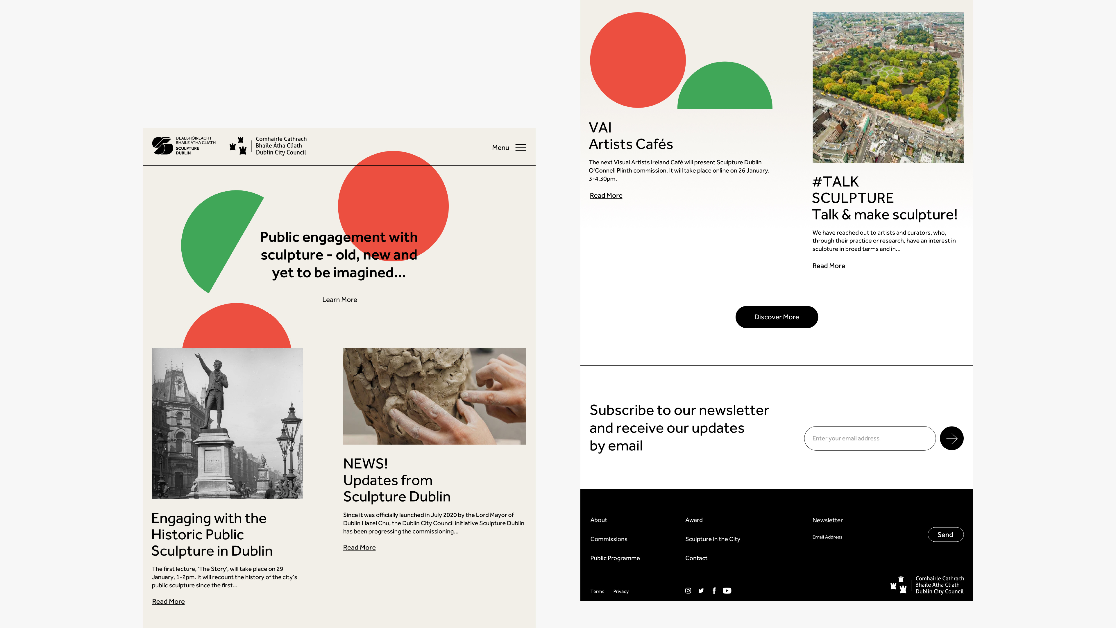
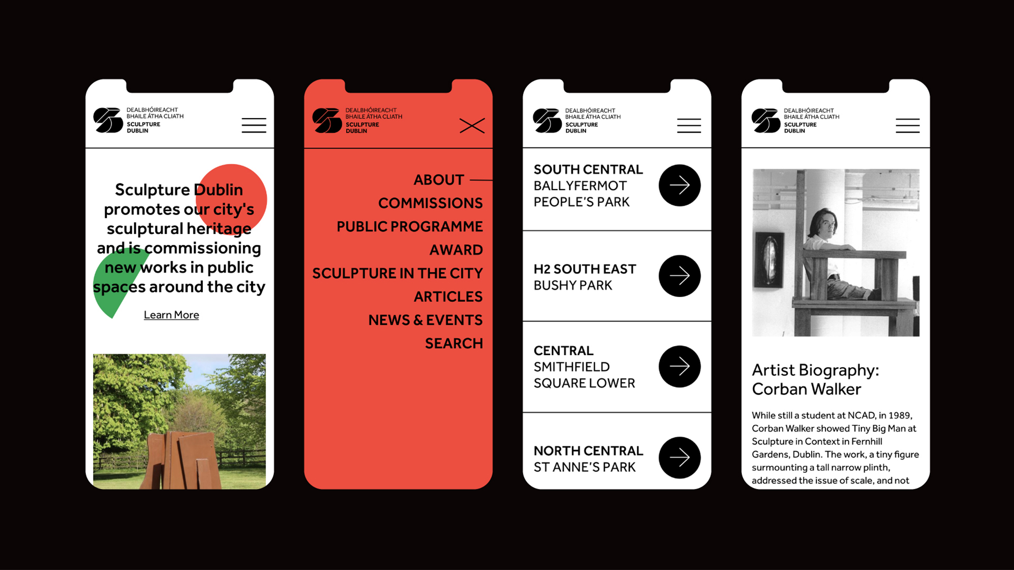
bigO was tasked with creating a visual identity for Sculpture Dublin that would encapsulate the values and the objectives of the initiative using a graphic language that was dynamic, inspiring and accessible. The identity would need to work across a range of physical and digital media. We were also tasked with creating a website presence for the initiative at sculpturedublin.ie which would operate as a hub of information regarding the public programme and the commissioning opportunities for artists.
We collated all the information provided by the steering committee from their initial meetings in 2018 and 2019 as well as significant feedback from a focus group session with Visual Artists Ireland which provided vital perspectives from the artistic community in order to inform our approach. As we were restricted from holding our own branding workshops due to COVID-19, we prepared a number of online surveys for the Sculpture Dublin steering committee and other stakeholders and used their feedback to further refine our ideas.
The core components of our approach were: simplicity, authoritativeness, and a visual reference to geometry or three-dimensional forms. A crucial reference point was modernist-era Irish design in order to create a brand for the city that was both cognisant of its own traditions and outward-looking to the rest of the world. Aesthetic touch points included identities for ROSC, the Smithsonian, MoMA.
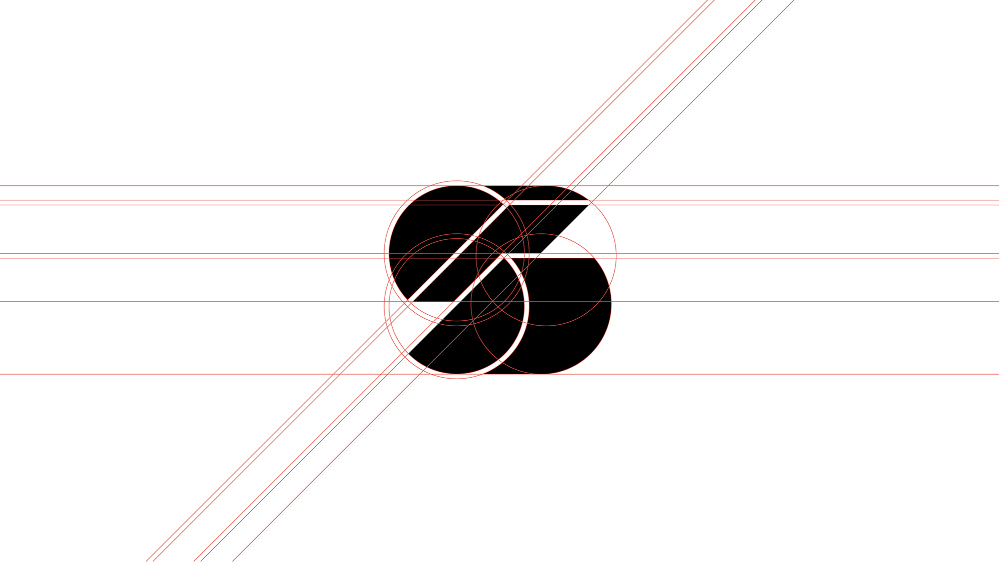
We interpolated these thematic strands to create a brand mark, entitled “Abstract S”. It combined simple geometric shapes rendered in three dimensions —the fundamental language of sculpture— to create a mark that encompassed the “S” and “D” of Sculpture Dublin in an abstracted, stylised manner. Configured as two separate parts of a whole, the mark also suggested construction and an implied sense of momentum which appealed to the ethos of the Sculpture Dublin team. The colour scheme was heavily influenced by bold primary colours and shapes of ROSC ’71 and ROSC ’77 artwork.
For the website, the colour scheme and shapes were utilised as thematic elements in a variety of manners. As it was a new identity, we wanted to reinforce the elements of the brand mark throughout the website, and make use of the simple geometric shapes.
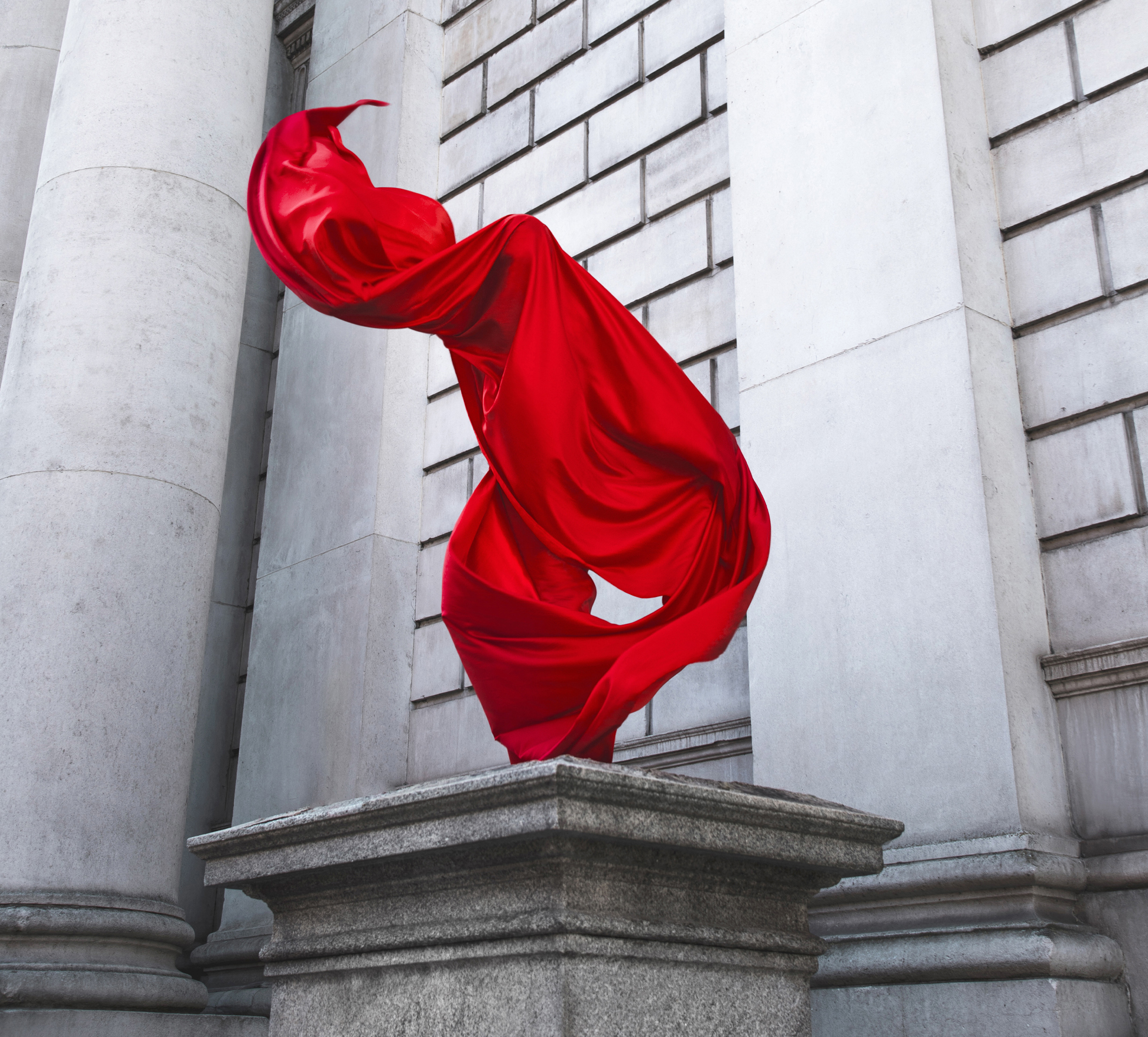
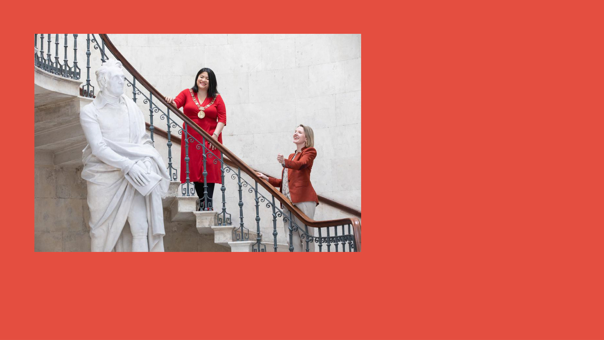
Ahead of the programme’s launch in July 2020 we collaborated with photographer Hazel Coonagh and aerialist Monika Palova to create a stunning series of images making use of the empty plinth at Dublin City Hall. The plinth is one of the sites that will host sculptures created as a part of Sculpture Dublin’s commissions programme. This striking contemporary imagery provided a strong accompaniment for the crisp modern tone of the identity.