SDCC: Typography with Purpose
2025
Designed by Éanna O'Shea and David Torpey
Type Designer: Bobby Tannam
Categories: Typeface
Industry: Civic
Typography was central to South Dublin County Council’s transformation. If the brand promise of Opportunity for All was to be true, then its typography needed to embody it. The Council required typefaces that were distinctive and characterful, yet highly legible and inclusive. Our challenge was to design a system that could serve every citizen across signage, documents and digital platforms while still reflecting the pride and personality of South Dublin.
The Resolution
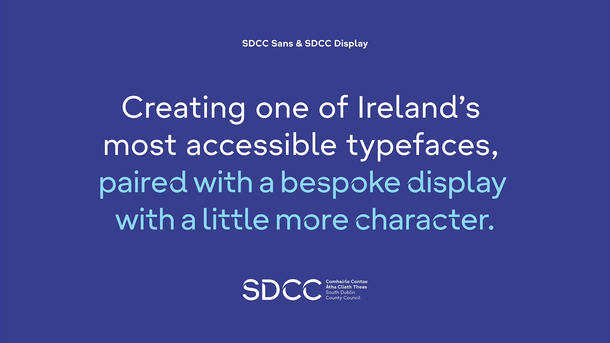
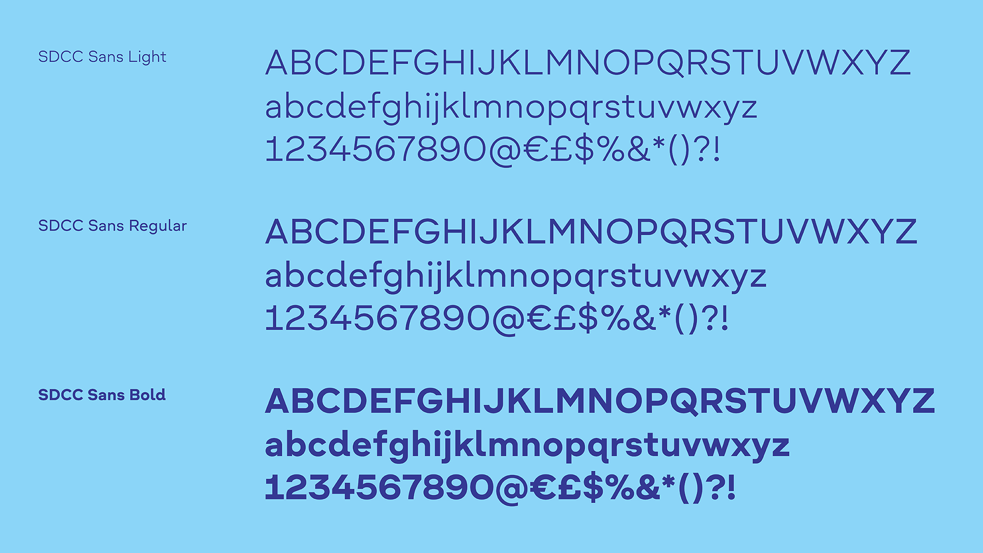
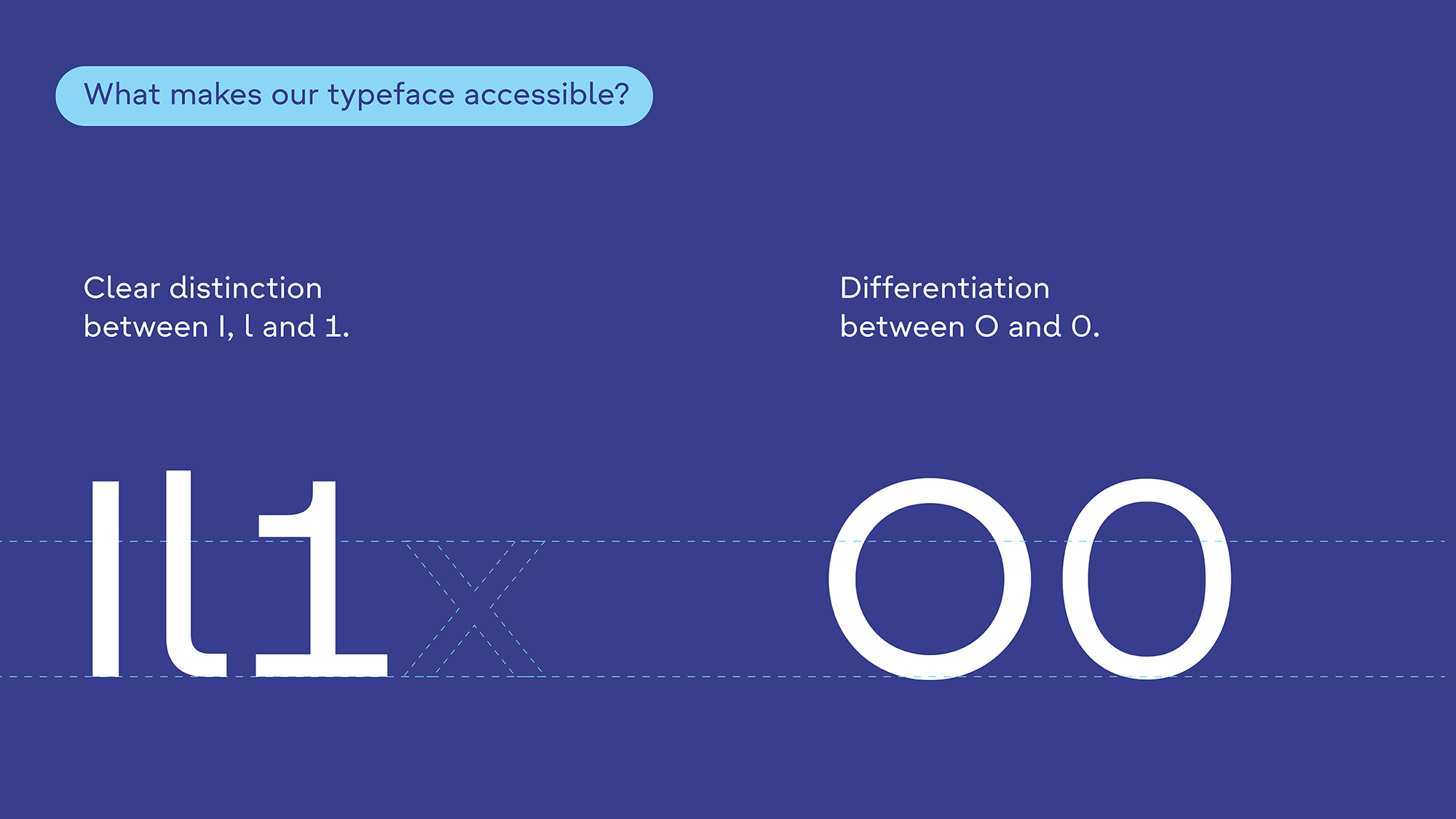
We created two custom typefaces: SDCC Sans and SDCC Display. SDCC Sans was designed to be one of the most accessible fonts in Ireland. With open counters, generous spacing and clear proportions, it maximises legibility in signage, print and screen. Meeting WCAG accessibility standards ensured that every citizen could engage with clarity and confidence.
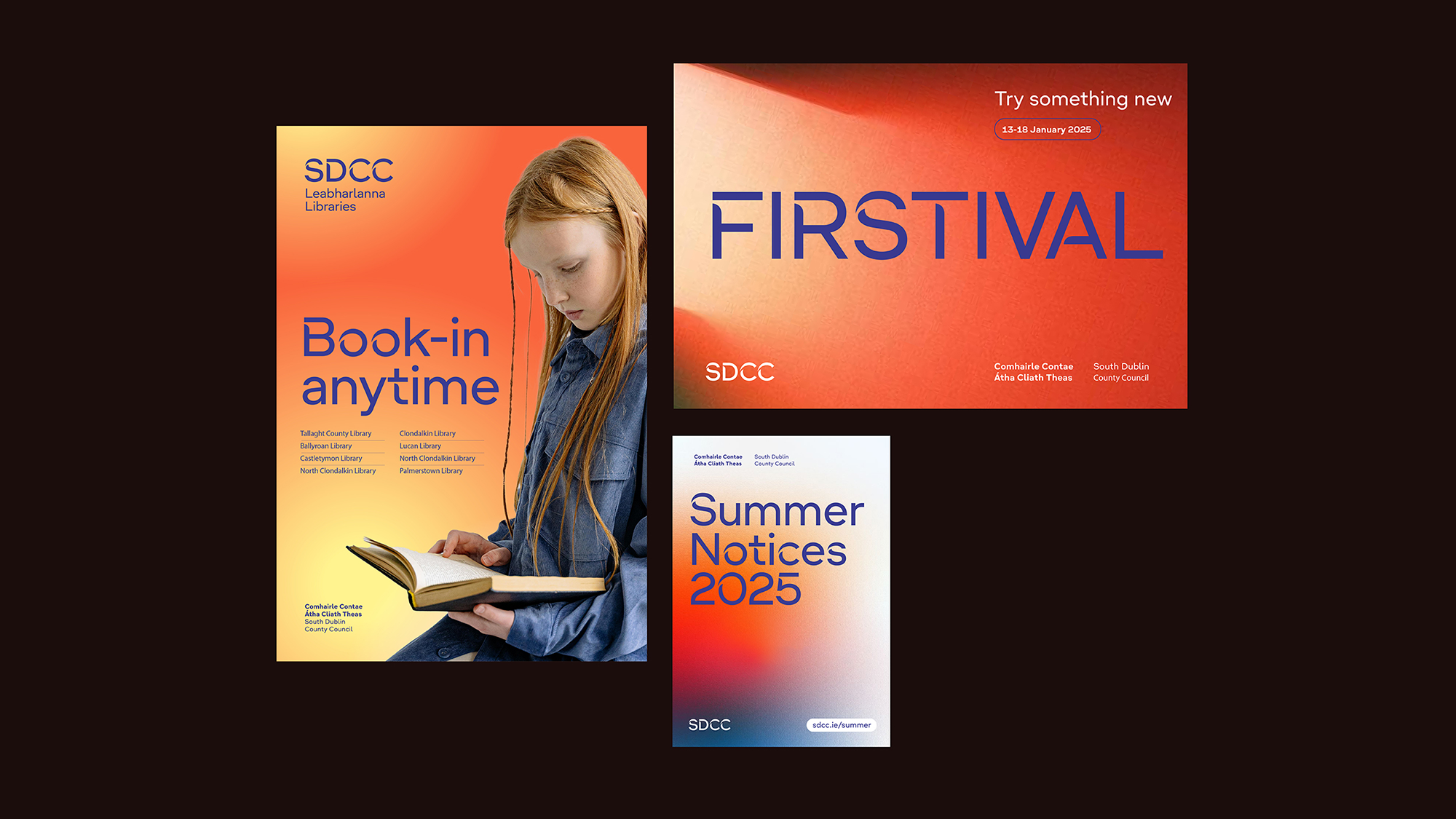
SDCC Display was designed to bring character and strength. Its stencil alternates echo the geometry of the logomark, embedding the contours of South Dublin’s landscape and urban character into the letterforms. It gives the brand a distinctive personality when more expression is needed. Together the typefaces balance clarity with confidence, practicality with flair.
We led the creative direction of the system, working closely with typographer Bobby Tannam who crafted every detail with care. This collaboration ensured the typefaces were technically robust while emotionally resonant.
The result is typography that does more than communicate. It reflects place, purpose and inclusion, turning the strategic promise of Opportunity for All into something people can read, understand and feel every day.