SETU Identity
2022
Designed by Susan Carberry and Elena Stevant at Red Dog
3D Illustration: Cian McKenna
Categories: Identity
Industry: Education
Tags: Illustration
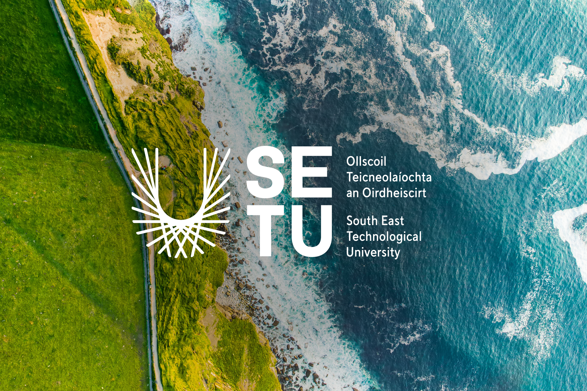
South East Technological University (SETU) is the first technological university in the south-east of Ireland. Through exceptional learning and collaboration, SETU aims to transform the ambitions of learners, researchers, and businesses across the south-east and beyond.
Traditionally, universities favour a coat of arms or crest which speaks to their heritage. However, SETU is an entirely new entity – not simply a merger (Carlow It and Waterford IT) but the creation of something new and exciting for the South East region.
Reflecting this dynamic vision, we created a logo symbolising collaboration and connectedness.
The SETU ‘U’ stands for student-centred, university, and unity.
It represents pathways and connections into education and beyond. Multiple pathways collaborate to create ‘your’ university. The pathways radiate outwards towards future careers and represent impact, both at home and internationally. They are also a nod to light rays symbolising knowledge, inspiration and energy and of course a nod to the 'sunny south east'.
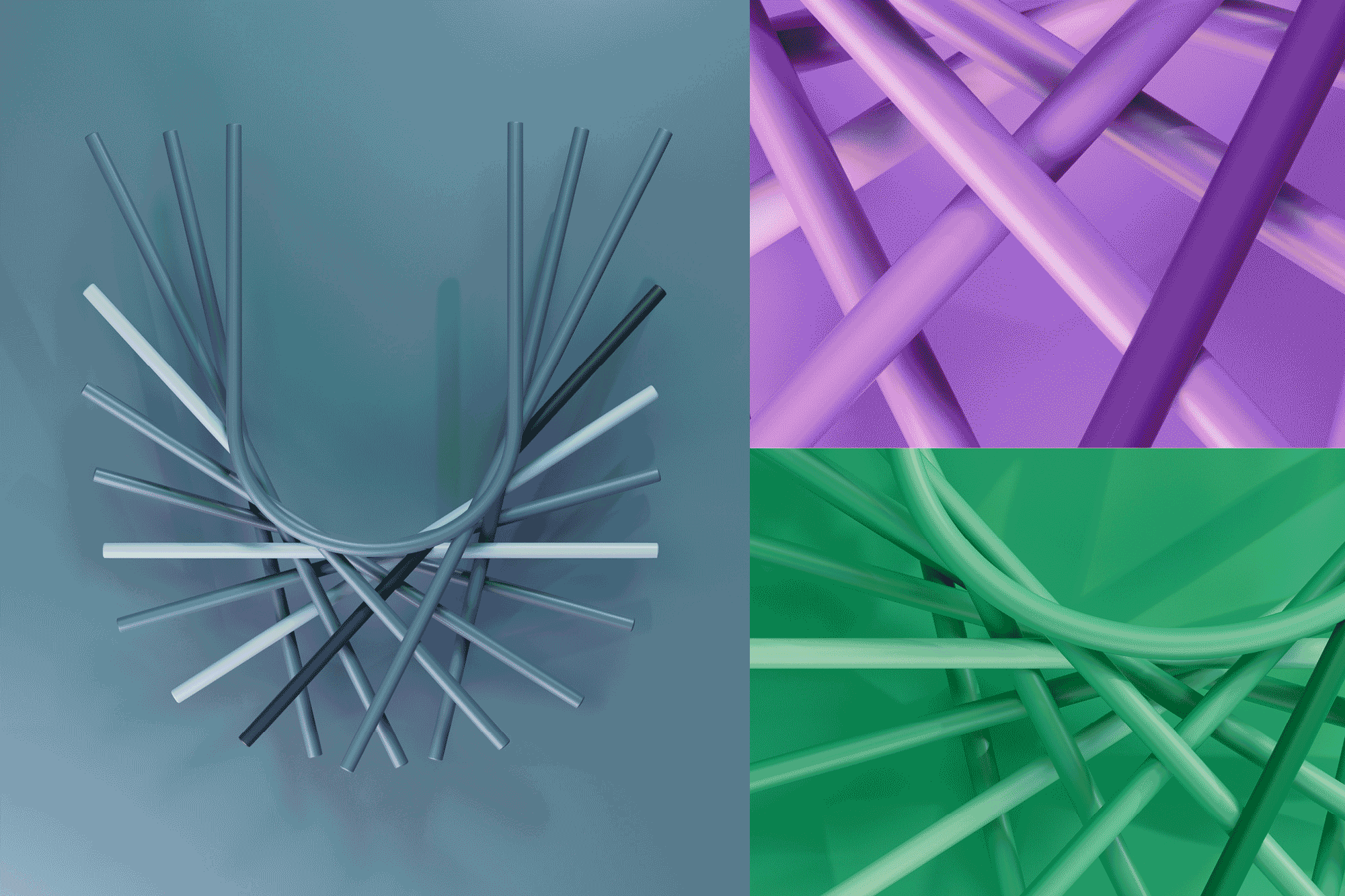
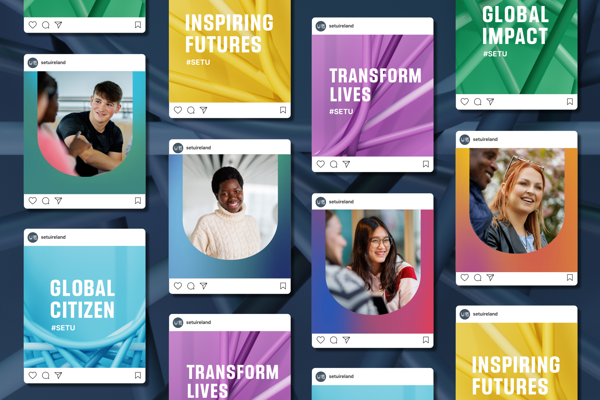
The brand is brought to life through a vibrant and modern visual language, including a colour palette of gradients which help capture the spirit of collaboration as colours flow into each other.
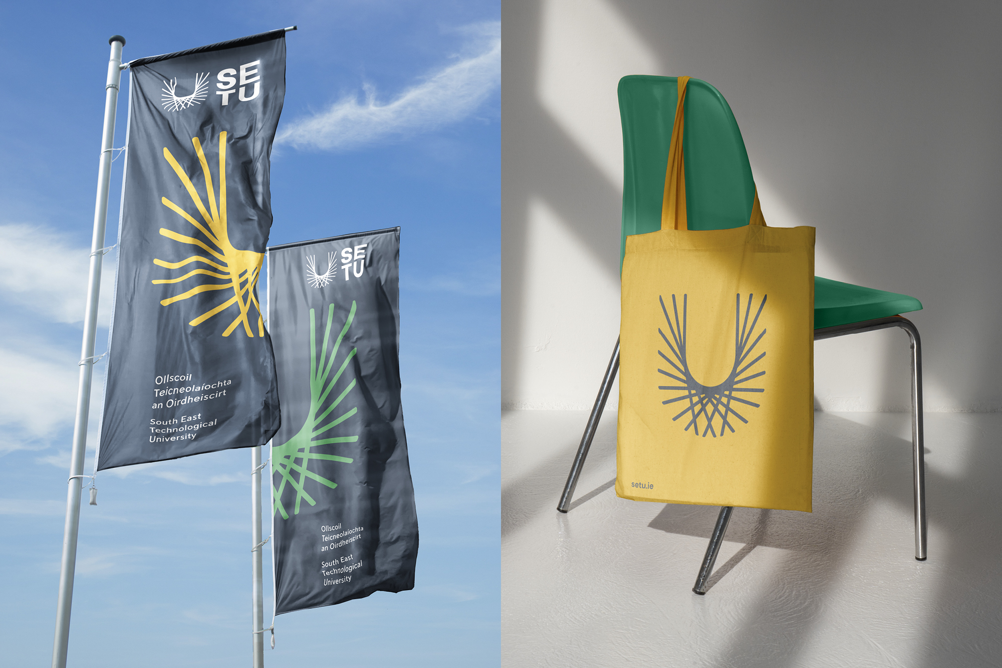
The SETU ‘U’ features as a key graphic element, flexing in size and crop. Used as a shape to hold imagery, text or colour, individual strands can also be used to frame and highlight.
To translate the ‘U’ to a digital environment, we worked with Irish motion designer, Cian McKenna to create big, bold 3D renders in various colour ways. These became versatile graphic elements, adding depth and movement across a broad range of materials.