Solus Brand Refresh
2021
Designed by Orla McAvinue, Helen Lyons and Wes Trumble at True Story
Categories: Identity / Packaging
Industry: Commercial
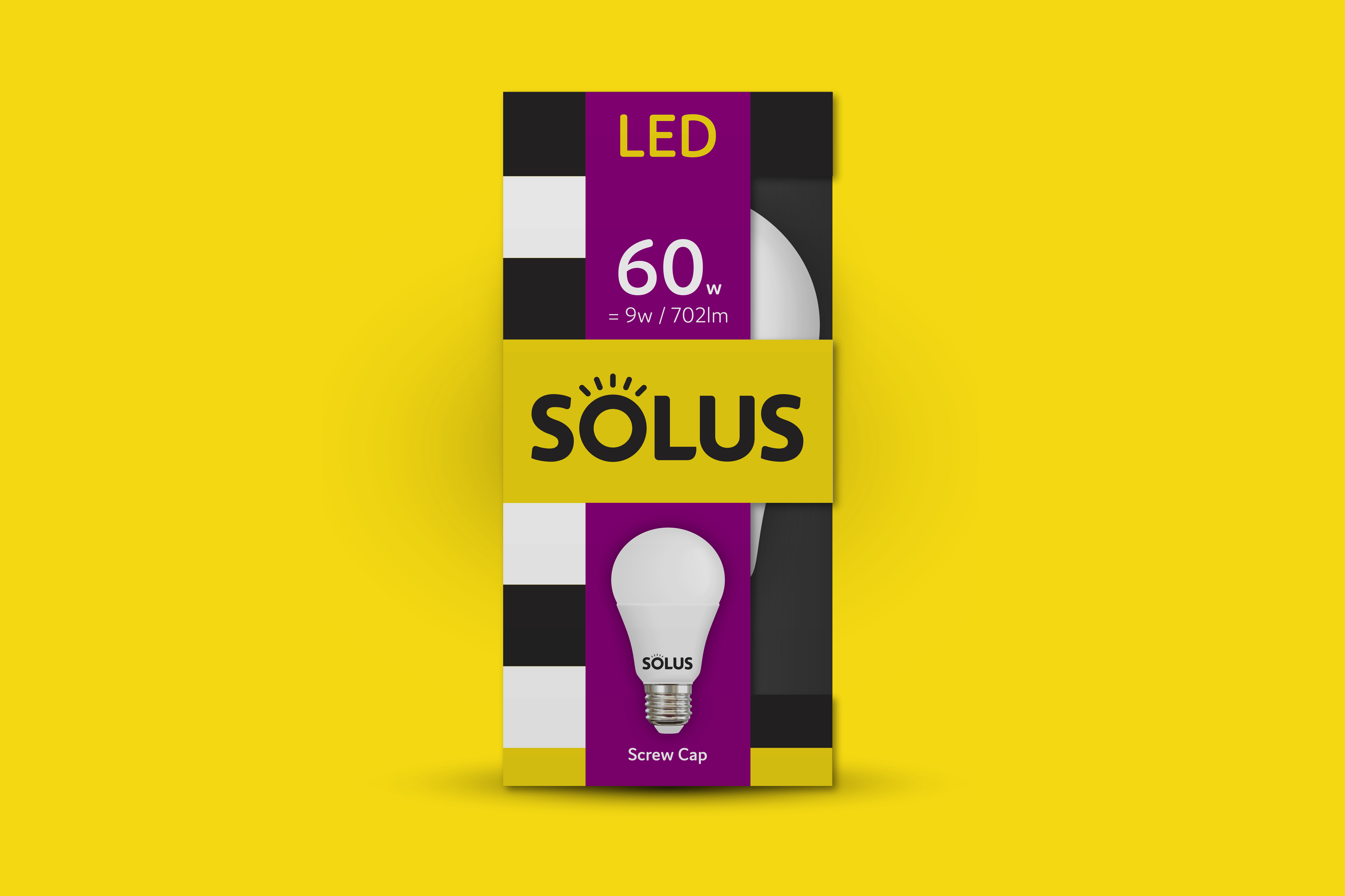
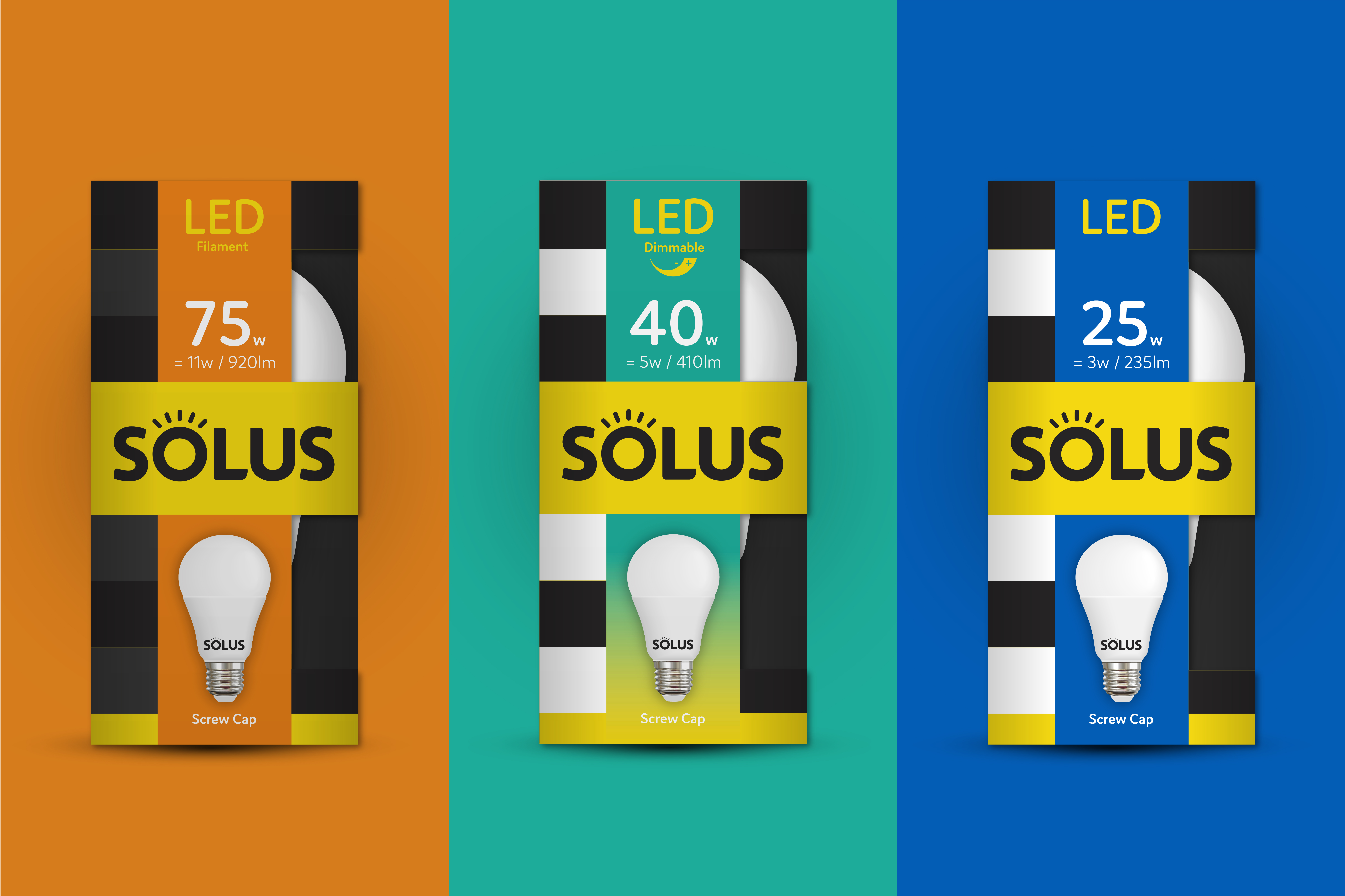
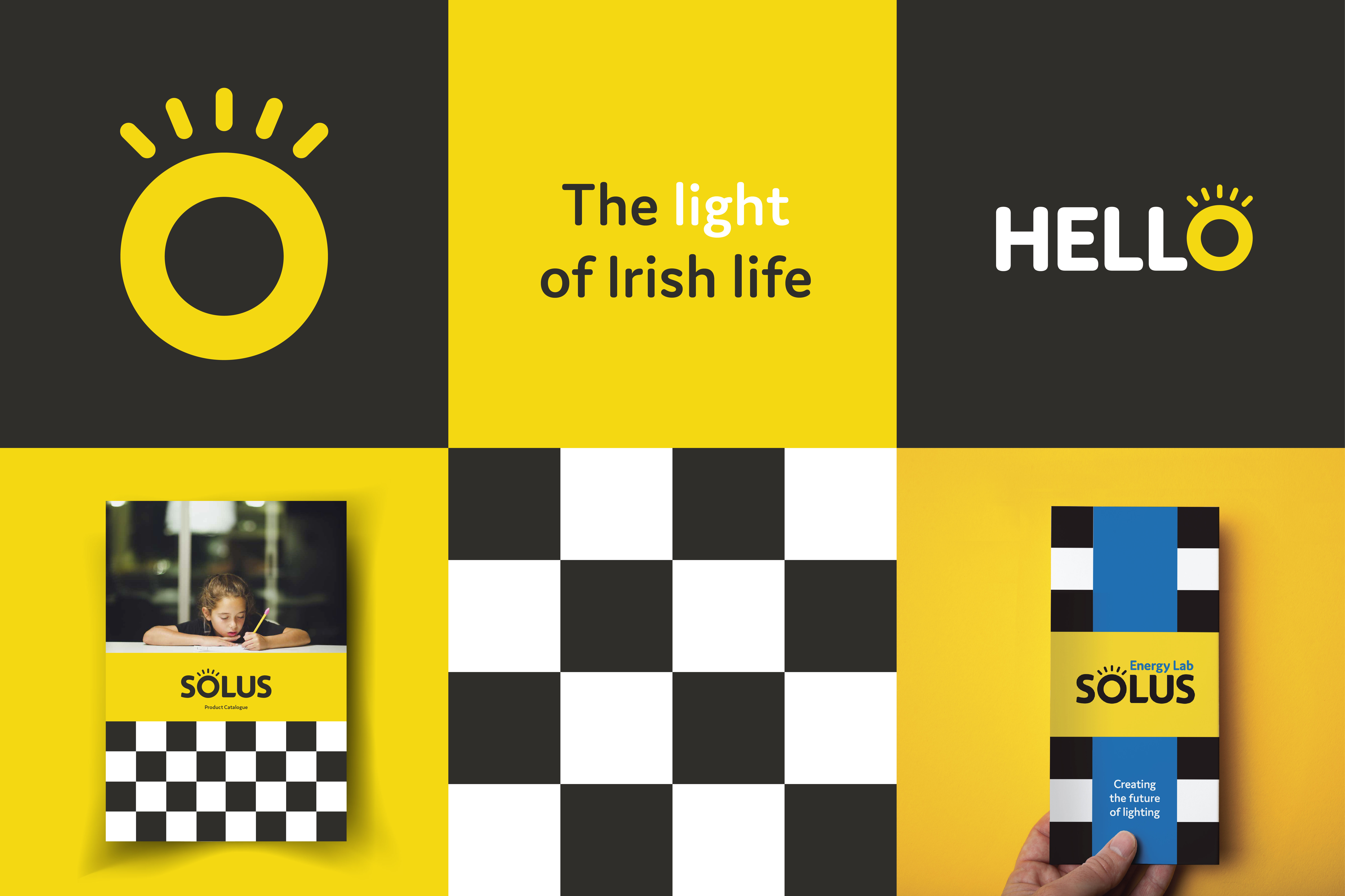
As an iconic Irish brand, Solus has been lighting Irish lives for over 80 years, a shining example of premium quality and total reliability. Unfortunately, in recent years, the brand had started to lose some its powerful visual equity, drifting away from its most iconic brand assets. Our design intent was to bring back what was most recognisable and emotive for the Solus brand, to create a modern packaging system for the brand with powerful range navigation. Specifically we intended to add more distinction and ownability to the brand mark. To modernise the brand colour palette, ensuring use of core brand colour (yellow, black, white) with secondary colours working hard to help simplify a complex range at point of purchase.
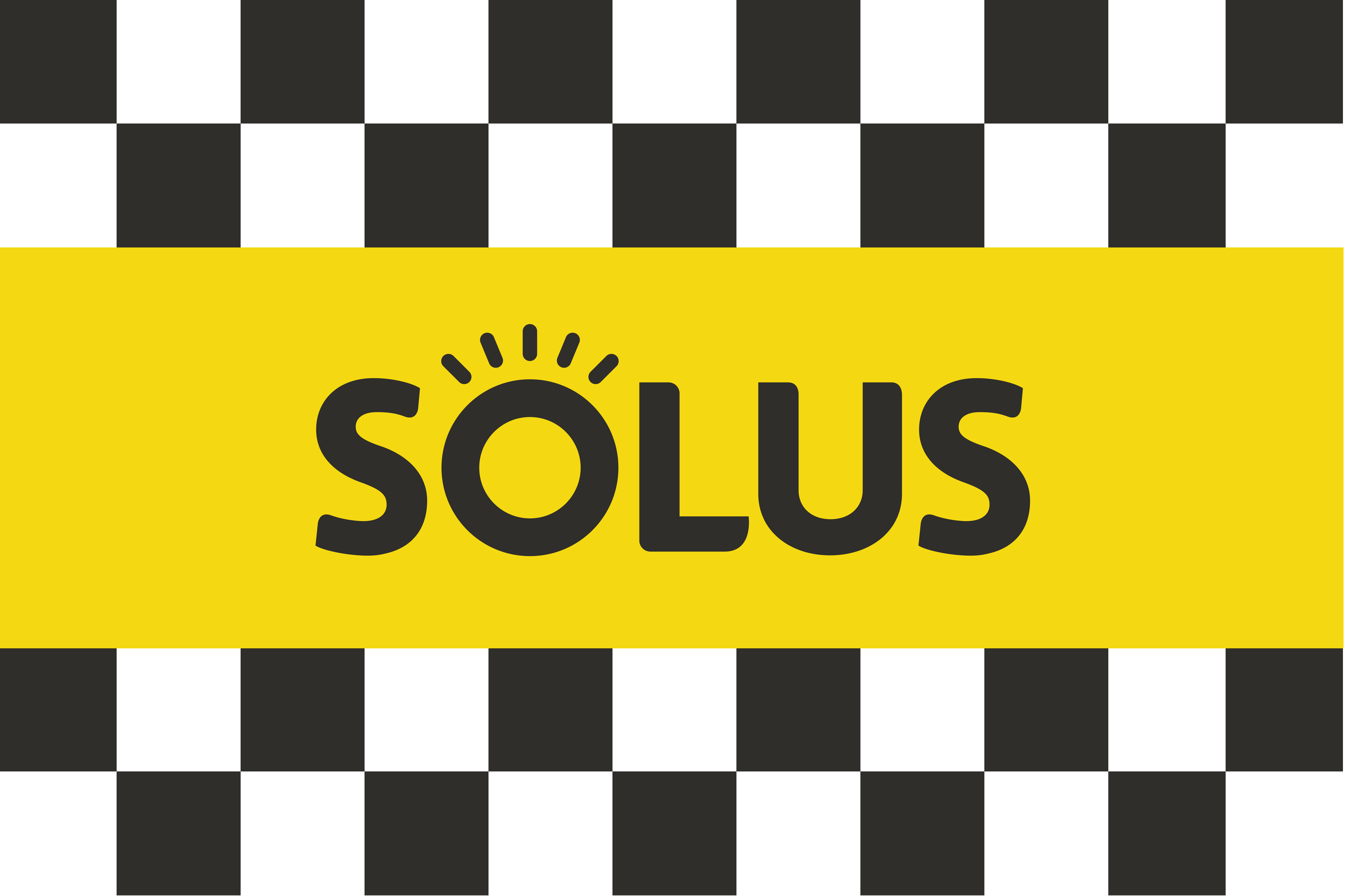
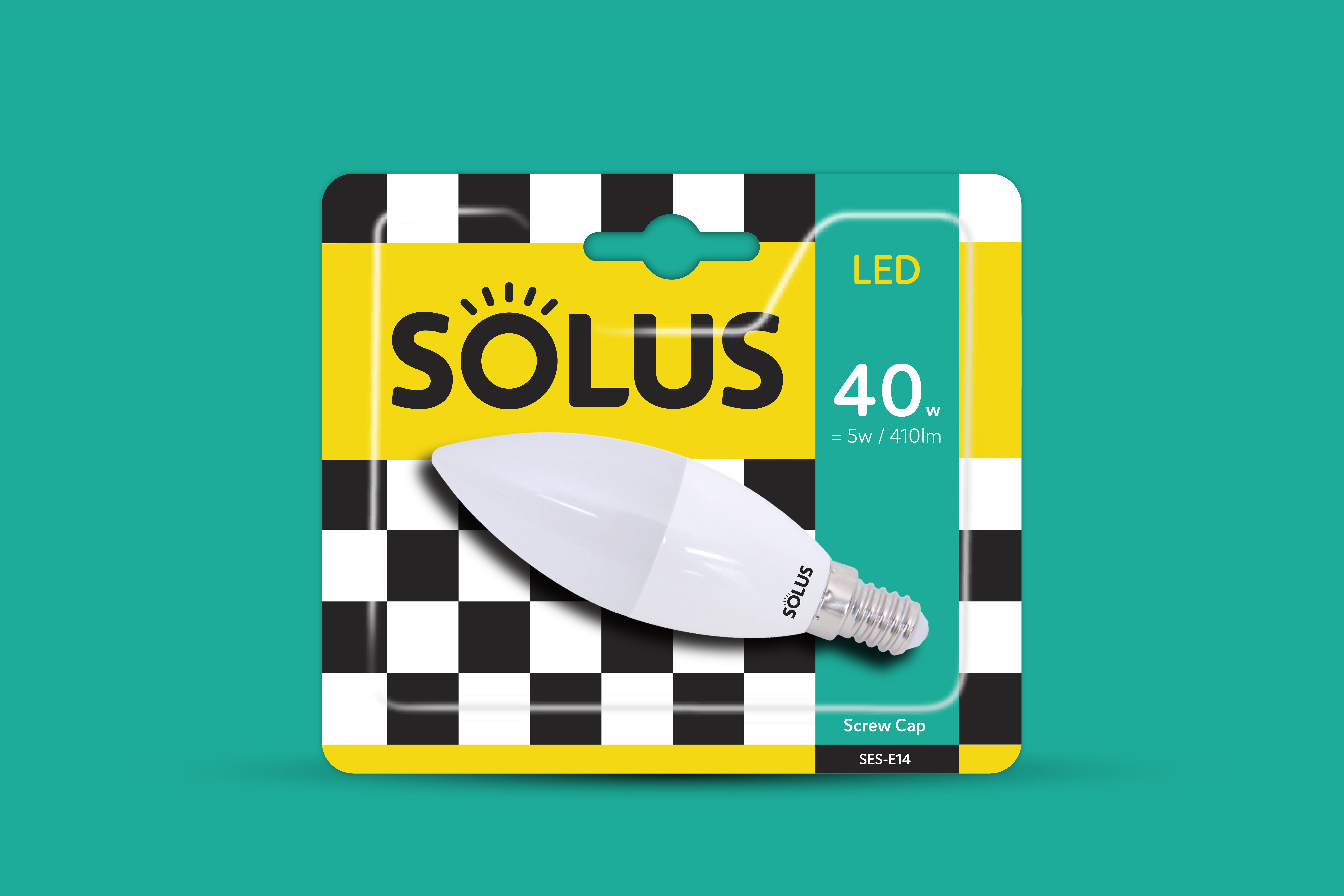
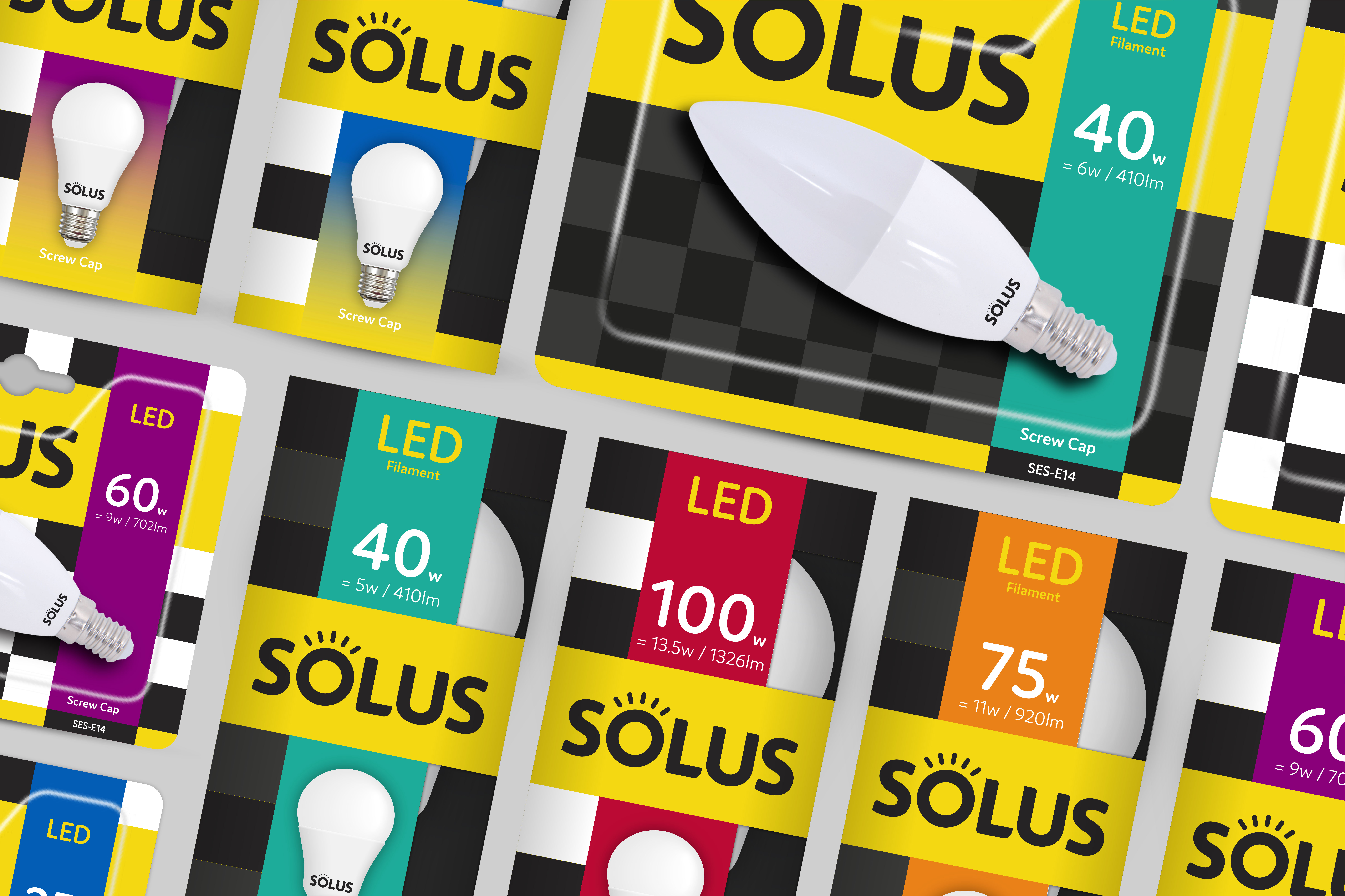
We evolved the brandmark, adding a visual icon to the ‘O’ that can be used a shining light for the brand on shelf. We ensured the new brandmark always had a powerful prominence on pack, to support the trust and expertise the brand delivers. We embraced the re-introduction of the old Solus black and white chequerboard pattern, which we believed was the most powerful brand asset that had been lost in recent times. We used the pattern on pack to create a modern and distinctive system on shelf, that could only be recognised as Solus. Given the breath of the huge Solus range, the complexity of the category and detailed regulatory requirements we focused on making the pack system as simple to navigate to consumers as possible – a complex collection of information, delivered in a simple consistent system across the range, easy to navigate and shop. Colour wise our core colours feature prominently but are supported by strong use of secondary colour to support range navigation. We created a sustainability initiative for the brand that we named ‘Planet First’, and we supported this by reducing pack footprints and ensuring the formats were 100% sustainable and recyclable. We used matte laminate finishes for a premium finish, and spot UV to lift the brandmark on all packs.
