South East Palliative Care
2012
When the HSE contacted us to develop a brand that communicates hope and support for the new Palliative Care Unit in the Southeast, we felt both honoured and somewhat daunted by the task. Palliative care are two words no one ever wants to hear, and we felt we needed to treat this brand with the compassion, respect and dignity it deserved.
After undertaking extensive research, it was clear that a large proportion of the existing palliative care brands are somewhat final and melancholy in nature. We felt there was an opportunity to communicate positive values, while ensuring we didn’t undermine the patients or family’s journey.
Brand Solution
The five counties within the South East were represented with their own distinct colour, brought together by the commonality of a river that runs through each county. The colours chosen represented each county but also emotions of hope, openness, support and acceptance.
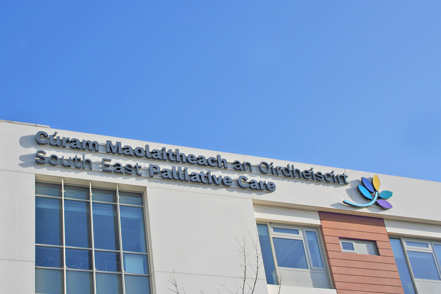
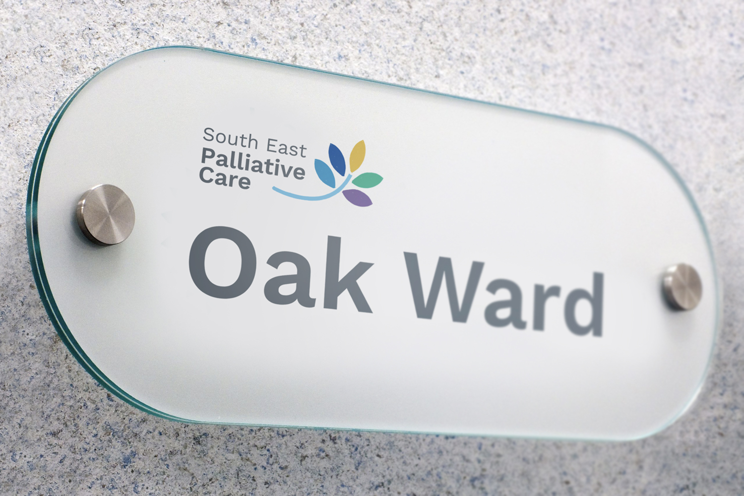
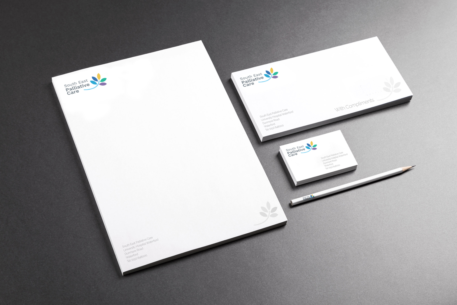
The brand has become an integral element of the internal and external conversation in relation to the Palliative Care Unit, including signage, interior colours and the use of iconic leaves.