Spadetown Brewing Co
2021
Designed by Emma Wilson at Slater Design
Photography: White Cloud Photographic
PR Video: Jcomms
Signage: Trade Signs
Printed Packaging: JH Labels & Bevcraft
Painted Wall Graphics: Jonny McKerr
Printed Merchandise: Signature Works
Web Development: Thought Collective
Categories: Website / Environmental / Identity / Packaging / Signage
Industry: Commercial
Tags: Digital / Food and drink / Art direction / Website / Packaging / Visual Communications / Branding / Identity / Environmental / Brand Identity / Logo Design / Ireland / Brewing / Beer / Merchandise
Website: spadetown.lin04.servers.tc
“Face as long as a Lurgan spade on ye!”
Meaning: To look miserable. To have a big moany head on you. To have a face like a smacked arse. To be a sour puss. To be a po-faced cranky pants. To look like you’re in the pits. To be a big auld misery guts. To be a massive moper. To be a Negative Nancy.
Origins: A longstanding jibe from our client’s hometown of Lurgan Co.Armagh, this commonly used expression’s origin relates to the plight of the over-worked and under-paid workmen who painstakingly dug what is now the Lurgan Park lake.
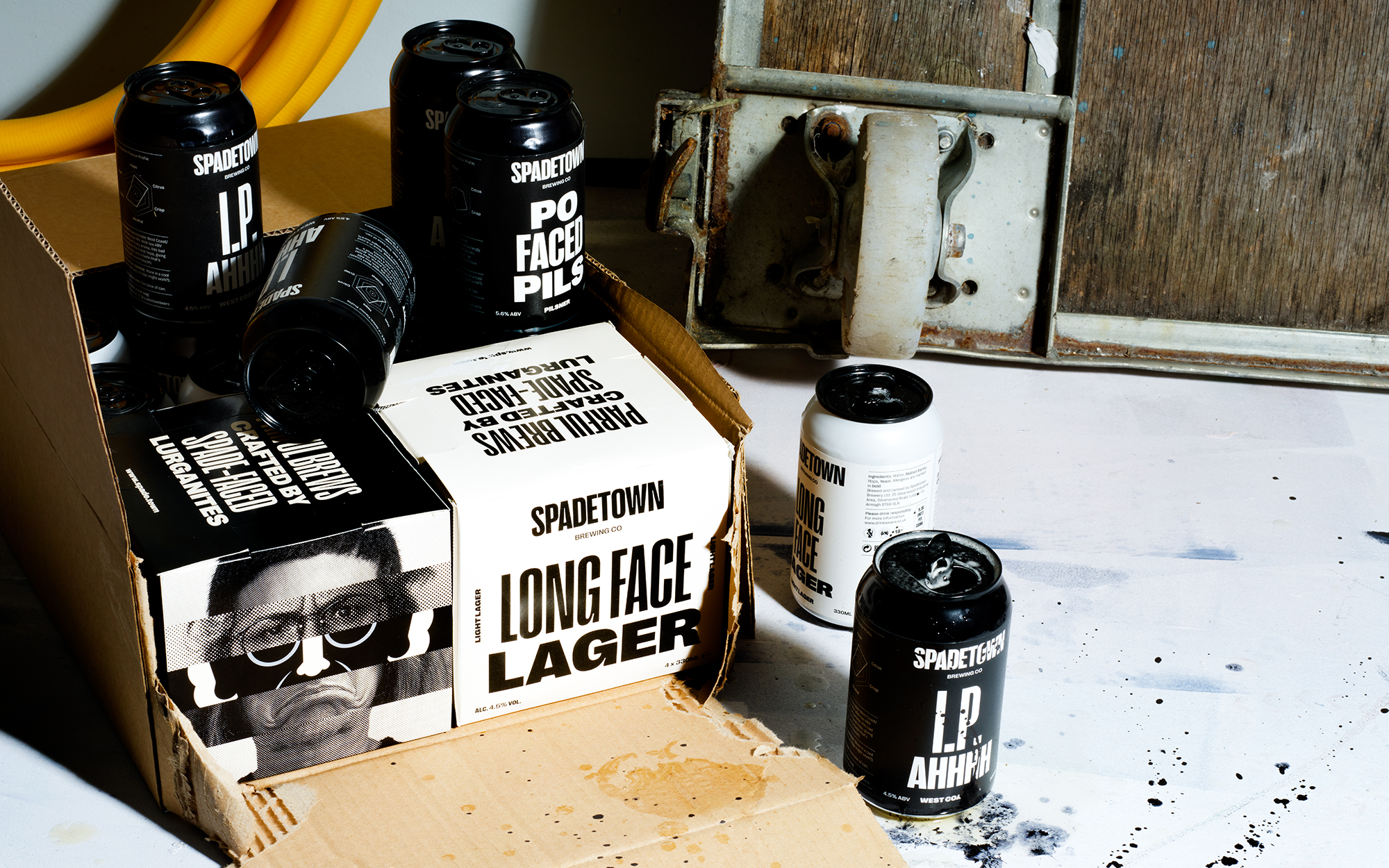
Spadetown: Parful Brews Crafted by Spade-Faced Lurganites
A bunch of spade-faced brewmasters, they came together with one goal— to make long faces short— with a wallop of flavour, a taste for craft and a wry wink and a sprinkle of uniquely Irish je ne sais quoi. They’ve crafted a range of gorgeous brews to remedy those gloomy ‘tudes, brewed and bottled in their home town of Lurgan, Co. Armagh, Northern Ireland.
The Design:
We were engaged by the team at Spadetown to create a brand identity (including the packaging suite, environmental graphics, signage, merchandise, social media style and website) for Lurgan’s first craft brewery. Three friends who had travelled far and wide in their careers, have come back to their hometown with a plan to celebrate all the quirky uniqueness that it offers, through the wonderful medium of some crackingly ‘parful’ craft beers.
With a name like Spadetown already decided, and after a few meetings with the founders over a pint and a Fifteen (a delicious type of Northern Irish cake), it was easy to see that the sense of humour embedded in the Lurgan psyche was something we wanted to dial up and make the hero of the brand. We spent days sifting through groups of Lurganisms on Facebook, crying real tears, trying to understand the essence of what Lurgan is all about. For us, to offer a true Lurgan experience, and to pay homage to the name’s origins, you couldn’t ignore the simply… ‘Irish’ tendency to love a bloody good moan and a good slagging… who doesn’t love a bit of misery? An offbeat link to the colloquial, day-to-day Irish attitude, we hinged the brand upon this so as it can be enjoyed by modern craft beer audiences, both local and international. Essentially, Spadetown’s brand brings a Lurganite in-joke to the wider public…in can form!
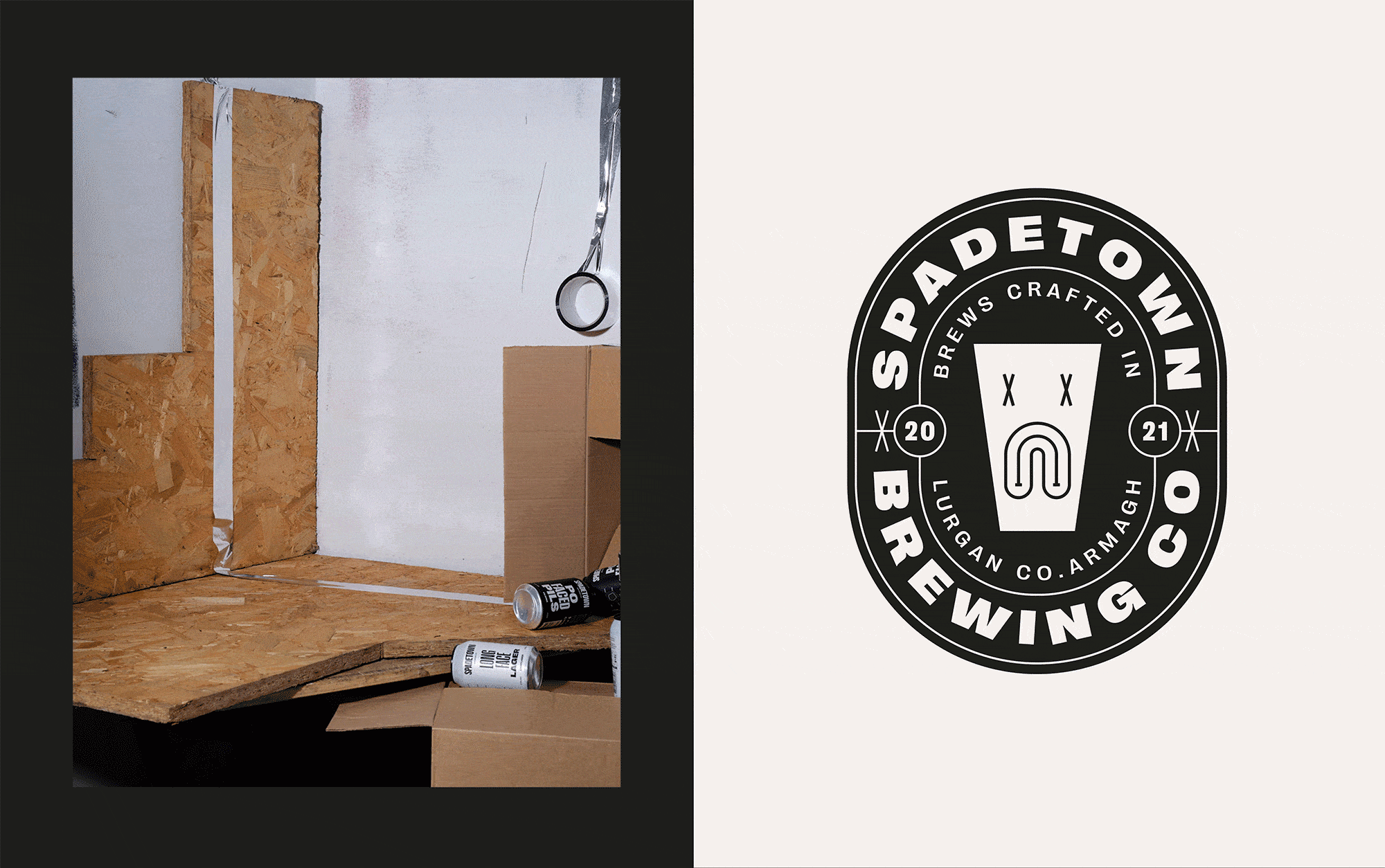
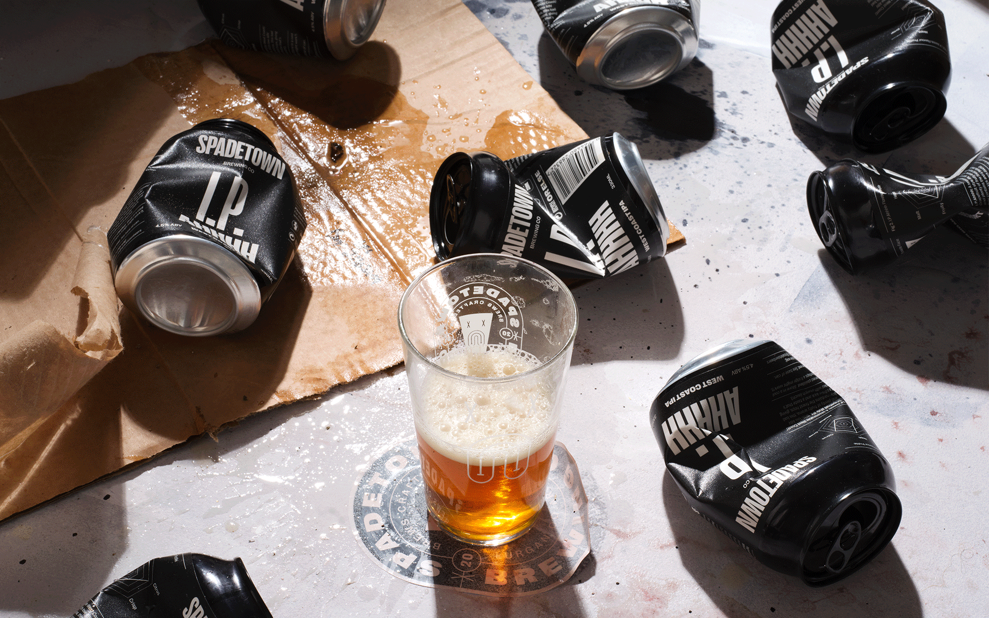
Visually, the brand plays on the concept of ‘long faces made short’ through characterful stretching and shrinking typography, a series of sad faced iconographic illustrations that mimic the shape of a Lurgan spade (and our 1/2 bap glass), with supporting flexible ‘identikit’ style imagery of the variety of mopey ‘bakes’ of Lurgan. Product names and copywriting celebrate the miserable with a Northern Irish twang. A bold, personality-filled typographic pack layout and a minimalist contrasting palette representing a lighthearted darkness was used to create standout on shelf. In the brewery space, we played with scale and created supergraphics of type as texture, with supporting lit signage on the exterior and bar areas. In the digital realm, we developed a website that delivers Spadetown’s story, creating a brand hub and online store for the brewery that’s engaging and fun for users, featuring interactive dynamic typography, and setting the mood with a playlist for all the ‘sad bastards’ out there.