St. John of God Brand Refresh
Designed by Áine McGee, Susan Carberry, David Stanley and Mary Doherty at Red Dog
Strategy: MCCP
Categories: Identity / Website
Industry: Charitable
Website: stjohnofgodhospital.ie/
Saint John of God is a charitable organisation that provides health, social care and education services for children, adolescents and adults in Ireland and beyond. Our task was to develop a brand for Saint John of God that tells a story of a modern organisation that’s fit for purpose in a complex and challenging world, and to celebrate the dedication and devotion of Saint John of God’s people, who make a real and tangible difference supporting thousands of people every day in Ireland.
The work of Saint John of God was started by John Cidade in the 1550s. Inspired by St. John of Avila’s preaching his cruel and harsh treatment in the Royal Hospital in Granada, John vowed to devote his life to those who were suffering and look after them with love and compassion. After his death, his followers were recognised as a religious order and called the Hospitaller Brothers of Saint John of God.
The work that John began continues in 52 countries in the world including Ireland. Every day, St John of God support thousands of people across their services to realise their potential and possibility through hospitality, accessible services, advocacy and leadership across all Saint John of God Services.
St. John of God follows a path of hospitality, compassion, and respect, and these are unshakeable values that underpin everything they do.
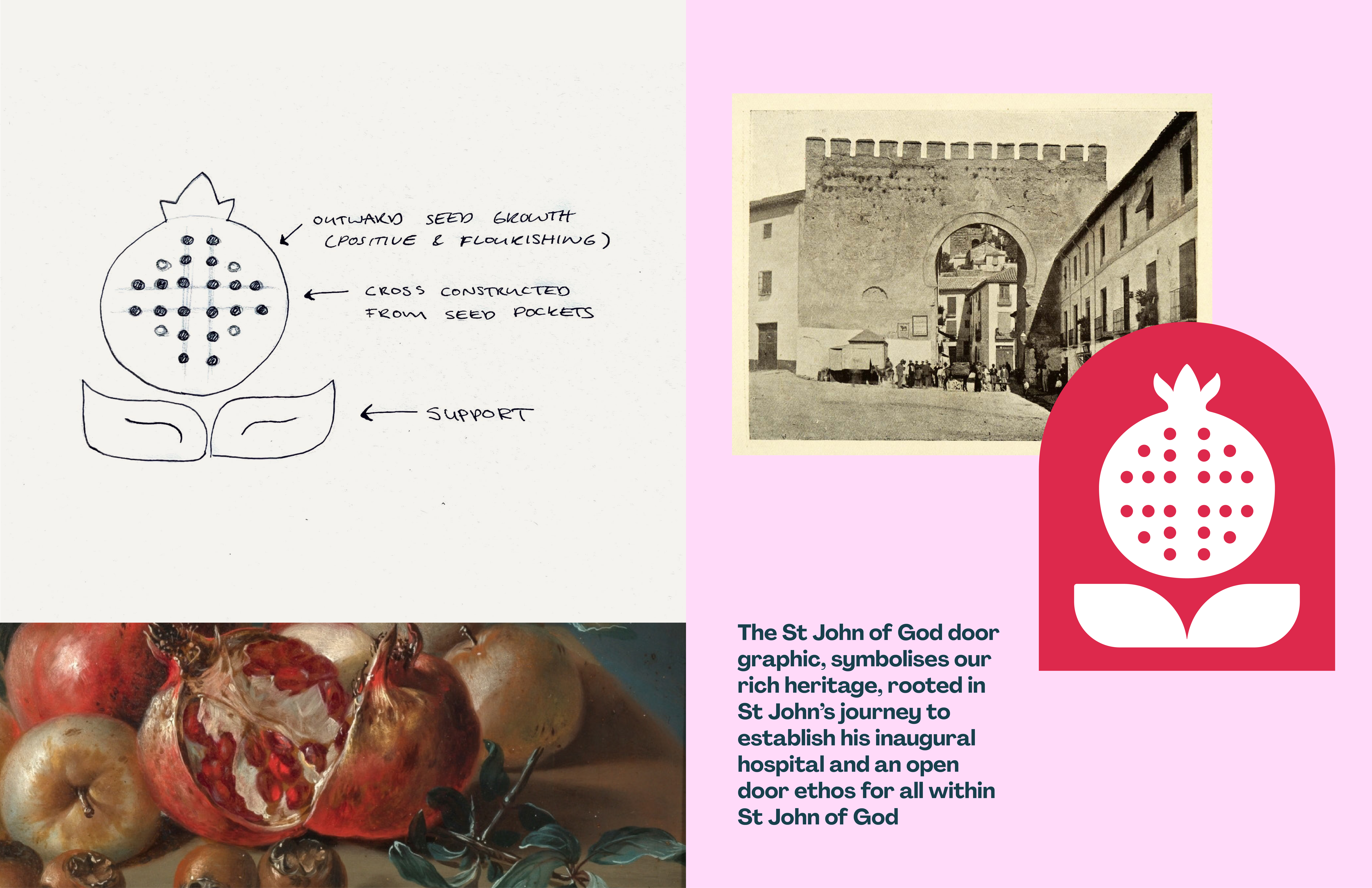
St. John of God was born in the Spanish city of Granada. Granada is the Spanish word for ‘pomegranate’ and the city uses the fruit as its symbol. The pomegranate is also a central element in the St John of God brand as it represents charity and hospitality, and the bursting fruit expresses the need for love to expand. Our task was to reimagine the pomegranate for a contemporary organisation and to further draw out its meaning and how it represents the spreading of love and support.
The support that Saint John of God provide people that helps them realised their potential and possibility inspired our design approach and is conveyed through the pomegranate and the broad, supportive leaves beneath the pomegranate. The inner seeds of the fruit represent both the hospitality that is core to Saint John of God and the range of services they provide. The seeds also form a subtle cross – a link to the organisation’s heritage. Saint John of God is set in a modern, friendly typeface. The characters celebrate the beauty of being imperfect and have a warm, human feel. The lockup is modern and adaptable to multiple platforms.
The new brand has a warm, fresh, contemporary and supportive feel that speaks to an organisation that is reflective of modern society and its attitudes, proud of where it comes from and supports thousands of people across their services to realise their potential and possibility.
The visual language is dynamic and flexible. The seeds of hospitality are used as a graphic element throughout the brand to represent services and to demonstrate stepping stones to reaching full potential. A symbol of growth, compassion and support within St John of God.
We have further emphasised the idea of hospitality and inclusion through the introduction of a new accessible symbol to represent the brand - an open door. The archway created by the open door represents services and support that is open to all – showing Saint john of God as a welcoming, inclusive organisation. The archway of the open door is used as a framing device for images or a pathway for text to follow. The colour palette is modern and vibrant, reflecting potential, momentum and speaking up. There is a range of soft and bright tones to help the brand speak to diverse audiences.


