Stig Bareksten Tonics & Mixers
2021
Designed by Evan McGuinness at Bielke+Yang
Strategy/Concept Development: Aksel Overskott
Photography: Tommy Andresen
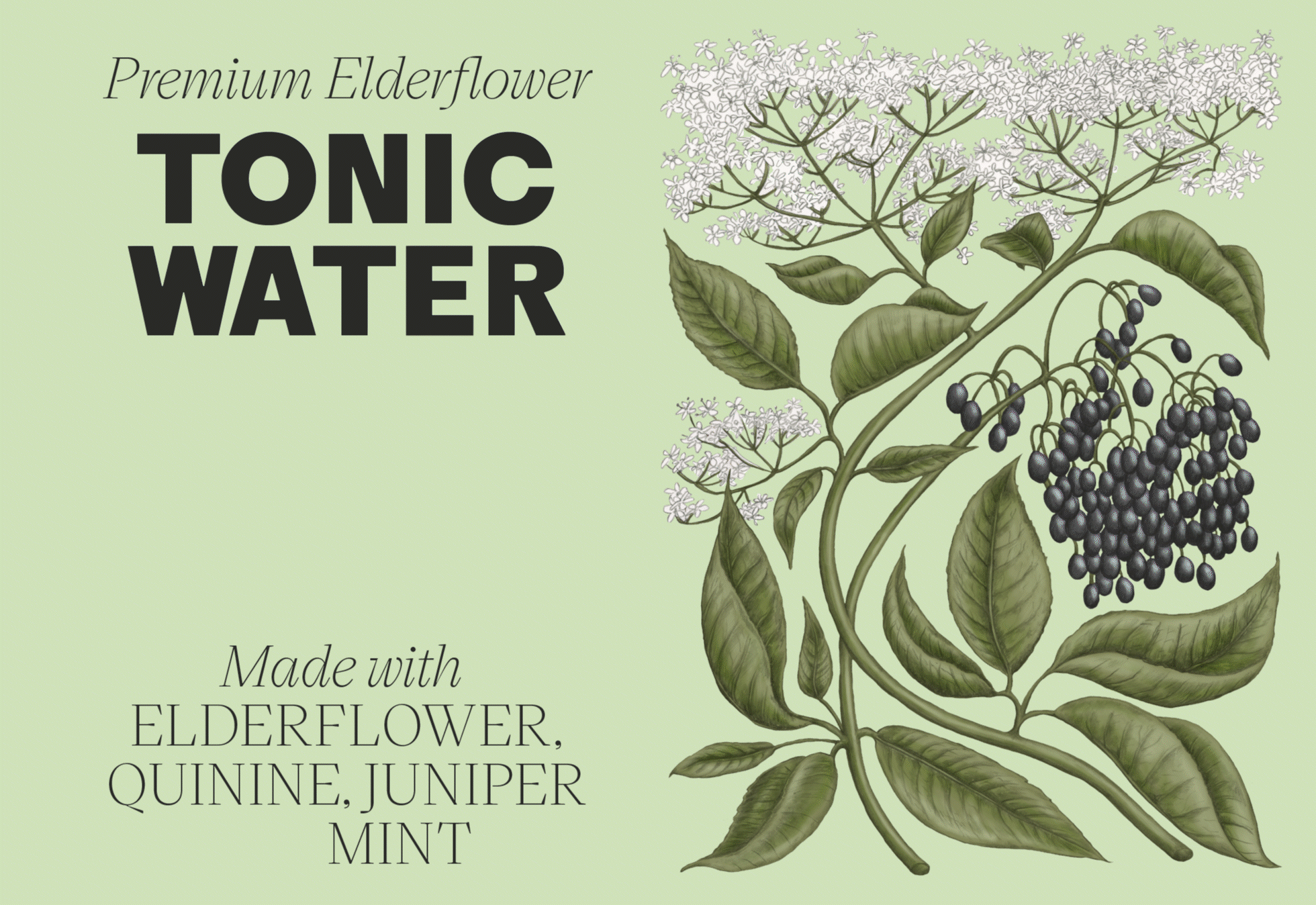
Illustration: Silje Marie Kristiansen
Categories: Packaging
Industry: Commercial
Tags: Illustration / Packaging
Website: norwegiansoda.co
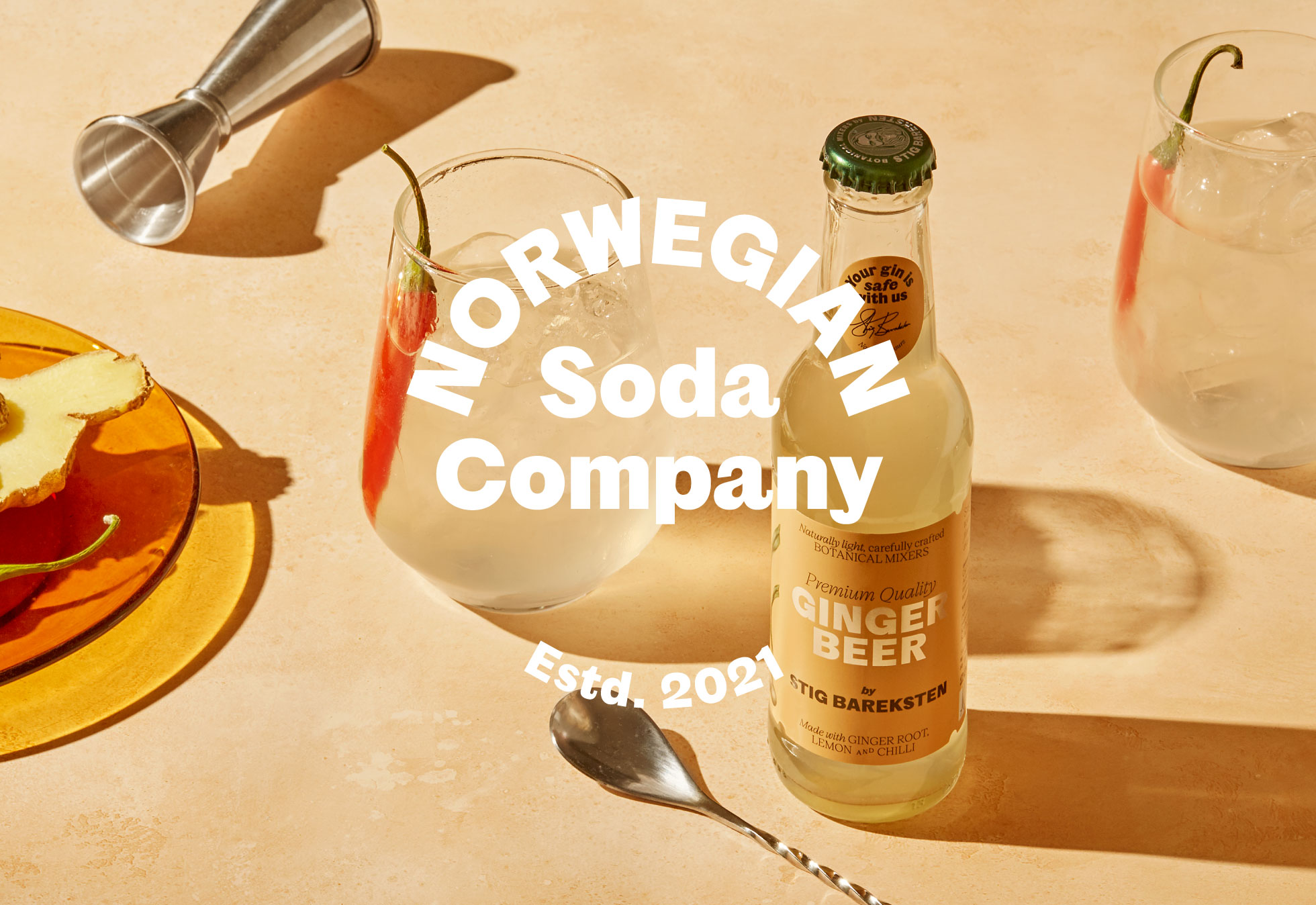
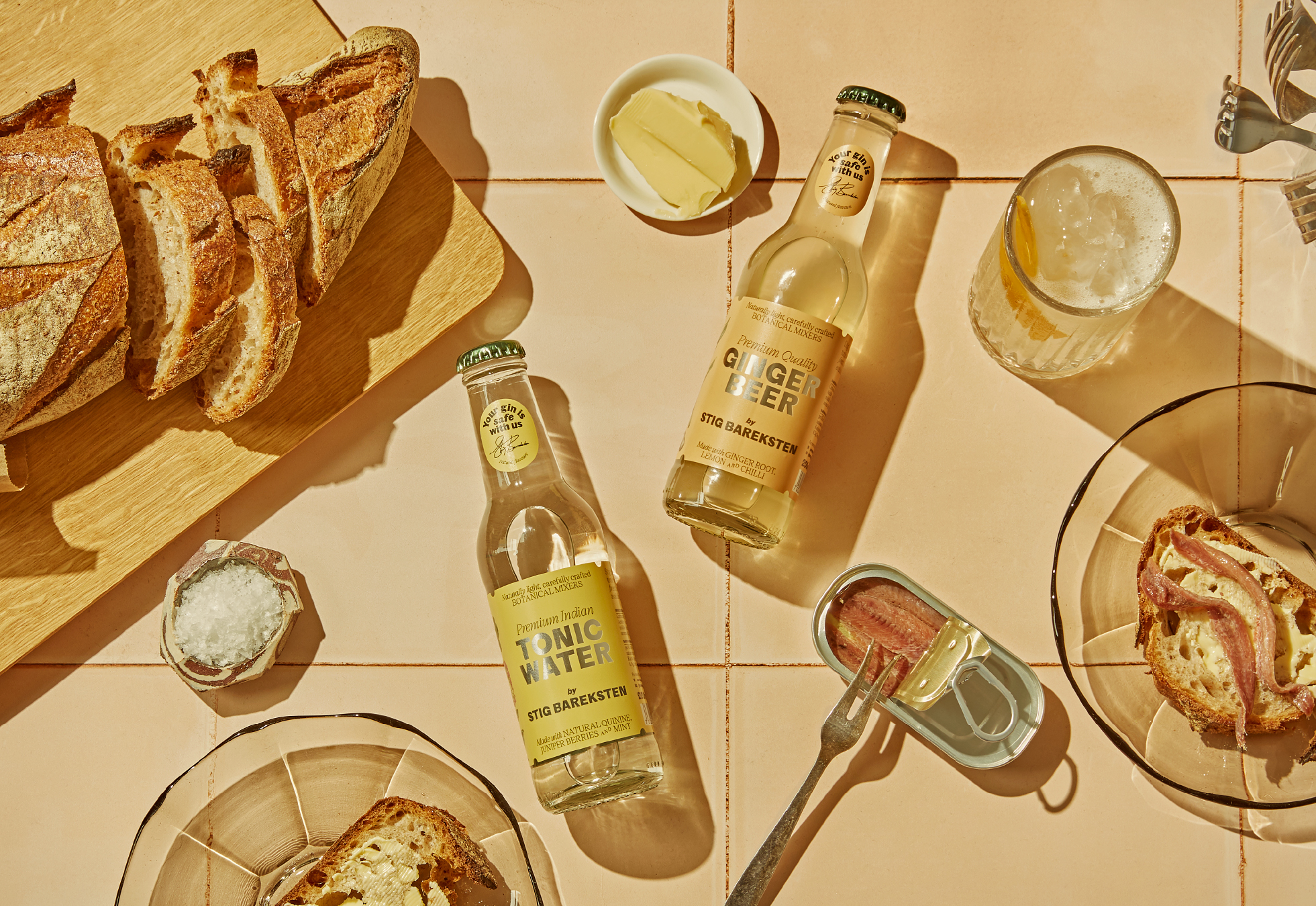
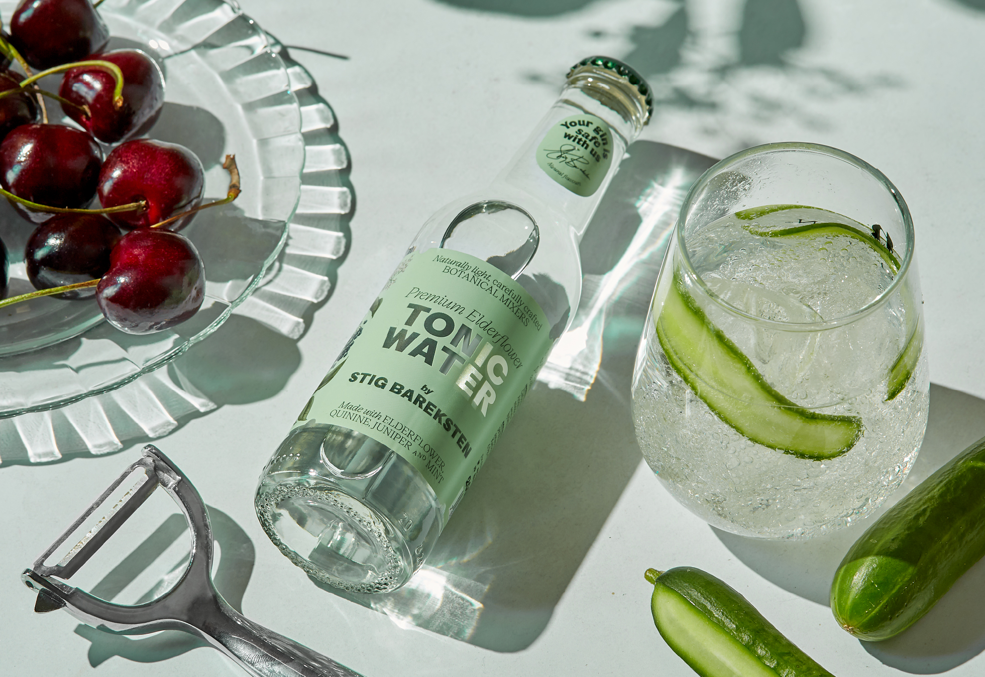
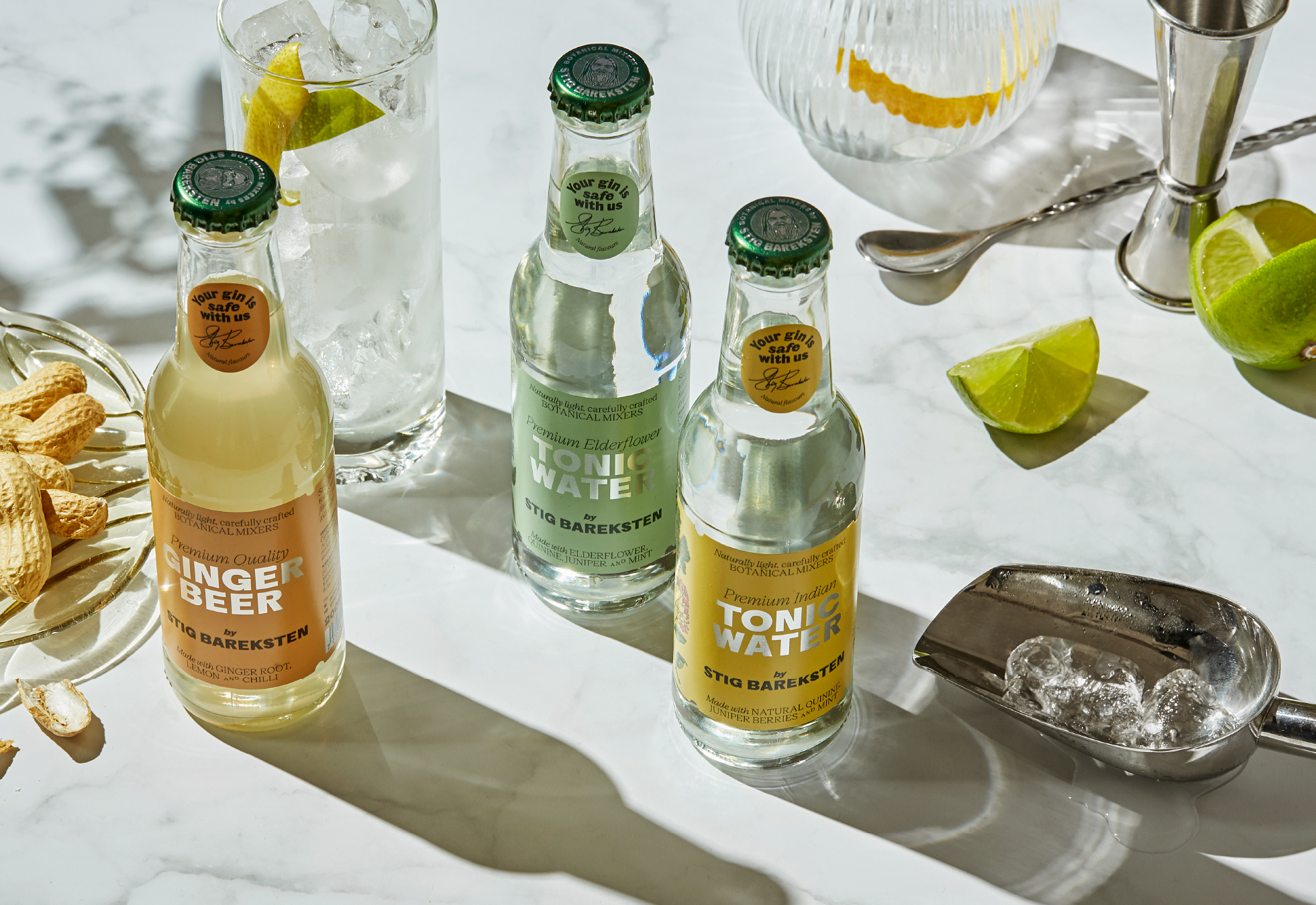
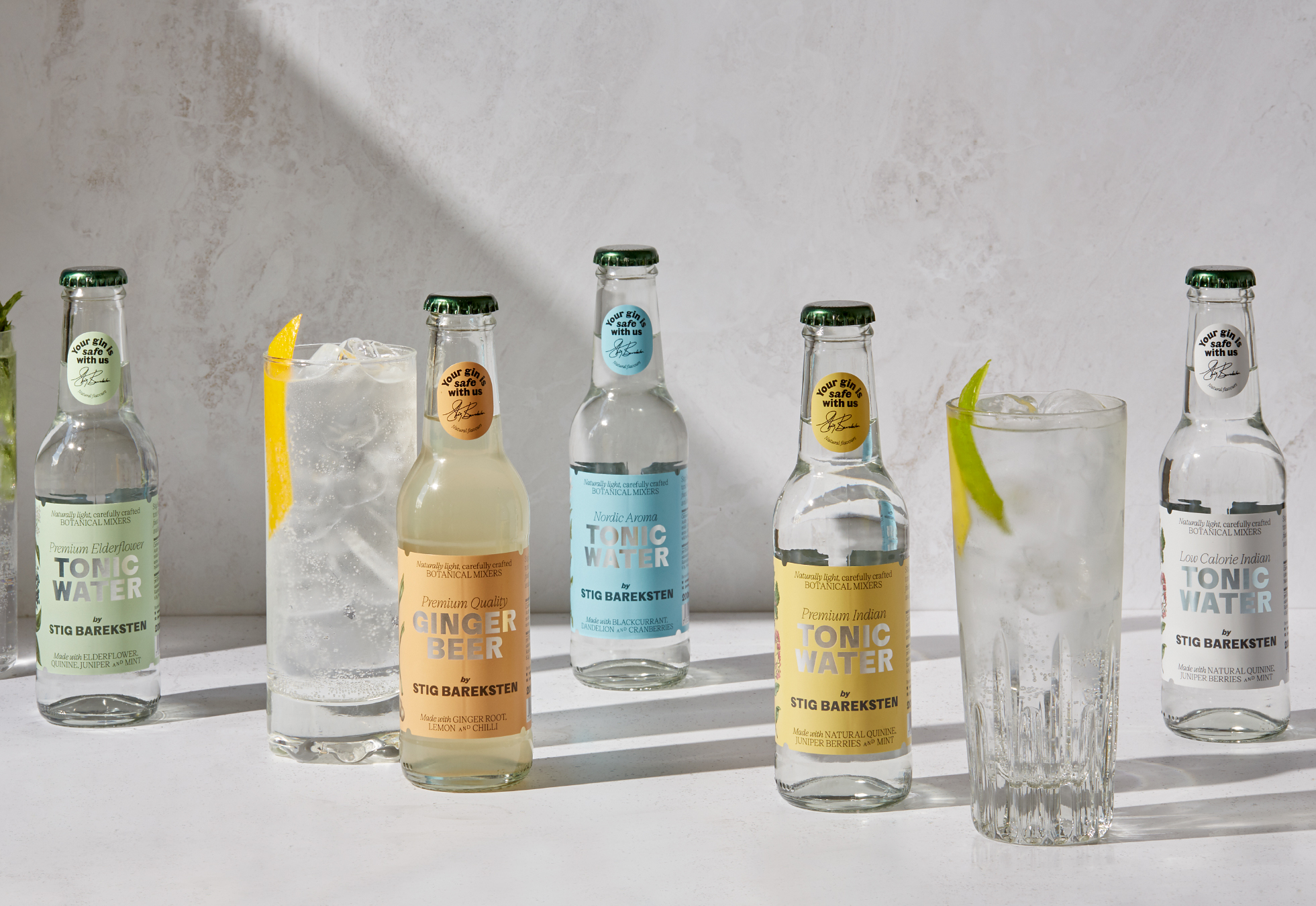
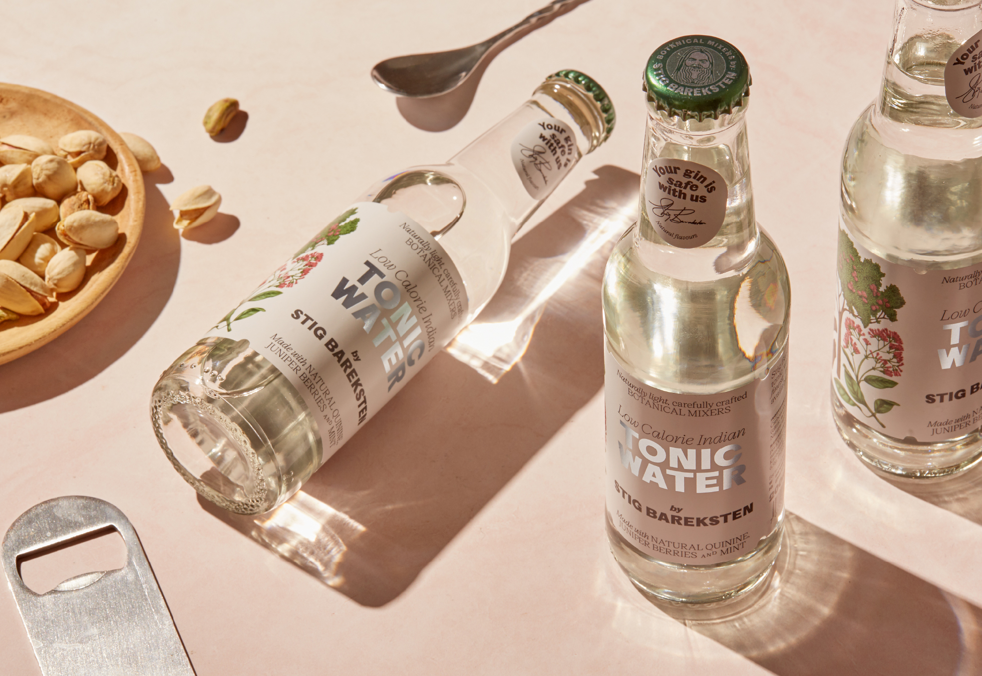
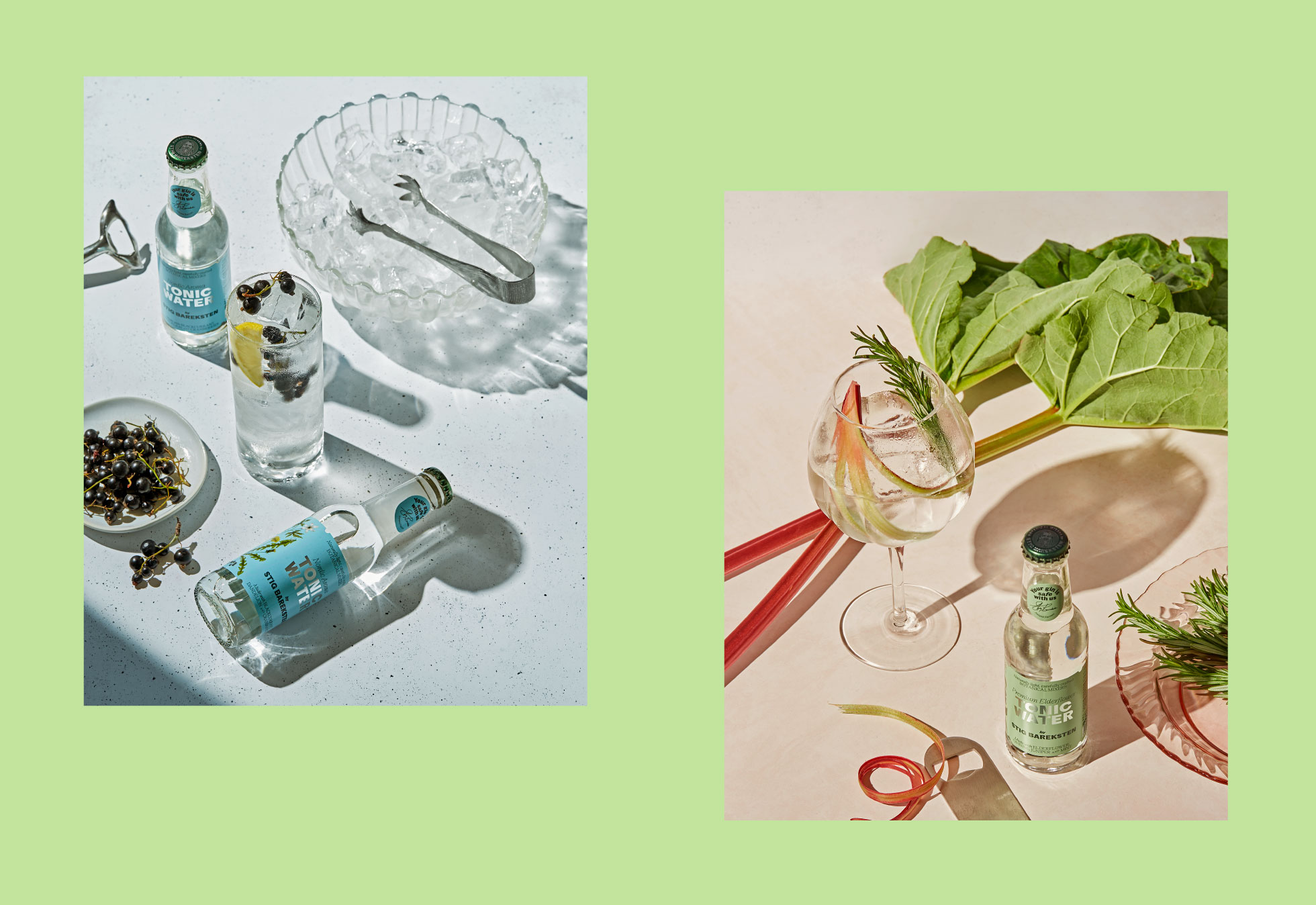
Stig Bareksten makes the world's best gin, and now he makes the world's best tonic. Under the Norwegian Soda Company, Stig has developed a series of tonics of the very highest quality. The five tonics are made from the purest Norwegian water and flavoured only with natural aromas locally sourced from Nordic nature. Earlier, Stig Bareksten has taken the world by storm with his botanical gin, which has received several awards and recognition internationally, including winning gold three times in The San Francisco World Spirit Competition.
Therefore, you can be sure of the quality when choosing tonic from the Norwegian Soda Company.
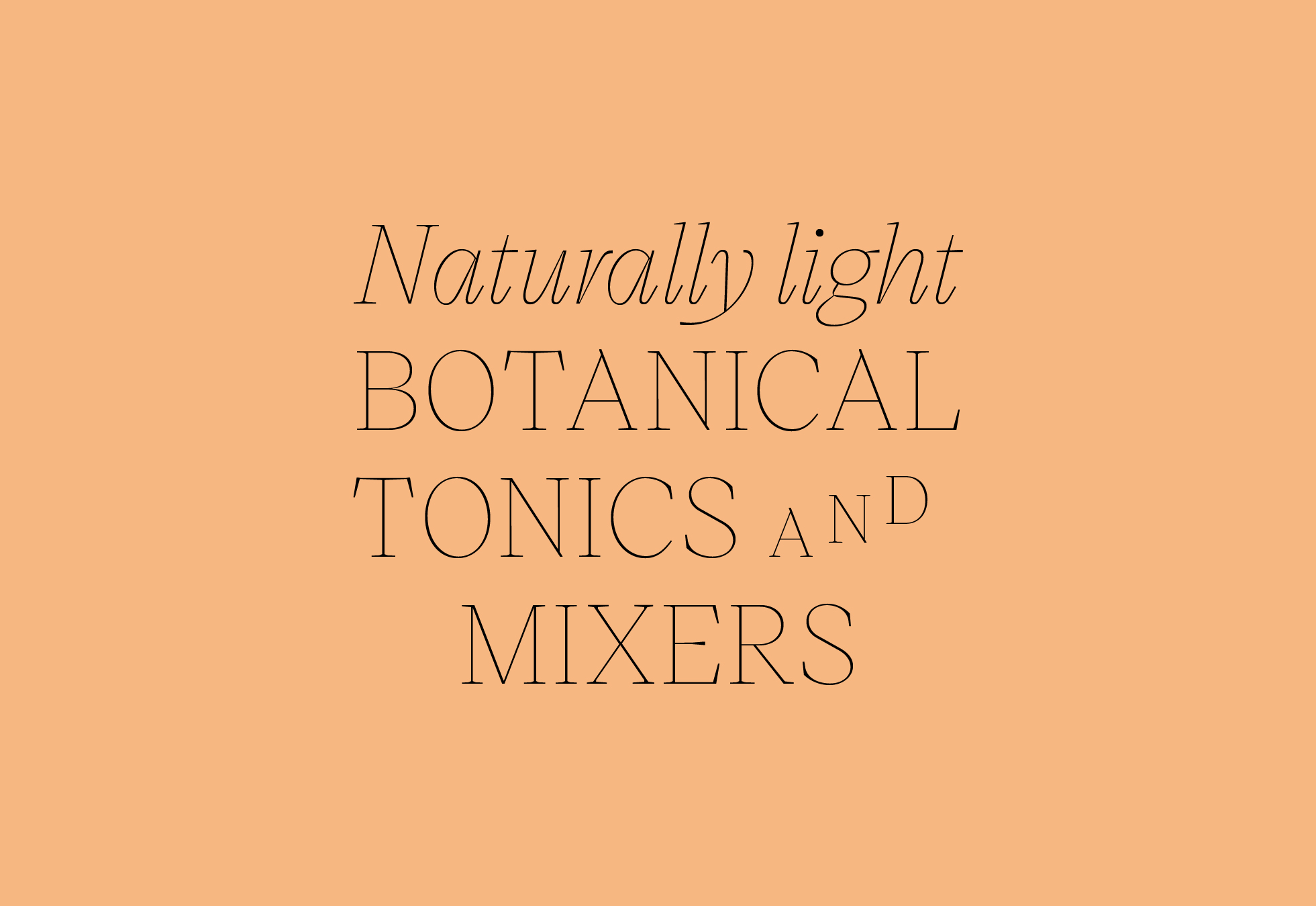
The identity and packaging for Norwegian Soda Company plays on the long tradition of tonic waters and mixers with a contemporary twist. The main brand typeface, Original Sans by Commercial Type from their Commercial Classics series is a bold, brash, characterful typeface based on Vincent Figgins’ first ever sans serifs, which appeared between 1828 and 1832, around the same time the Gin & Tonic was invented by British soldiers serving in India. When combined with the support typeface Victor Serif by KOMETA, which contrasts to the bolder forms of Original Sans, we see a refined feeling to body text while also adding subtle flourishes when needed.
The typography is implemented with subtle references to the typesetting of packaging and newspapers from the 1800s.
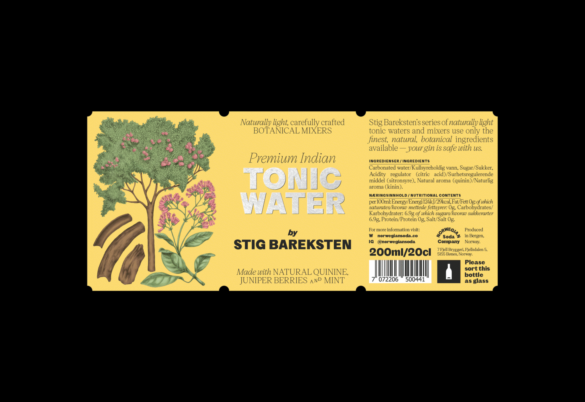
The four custom Illustrations by Silje Marie Kristiansen are also a nod to the past. Each one created to reflect the ingredients of the first five mixers in the range, drawn in a style that is reminiscent of botanical studies from the 1800’s.
A bolder more impactful colour palette was also developed to separate the series from other established brands in the market.
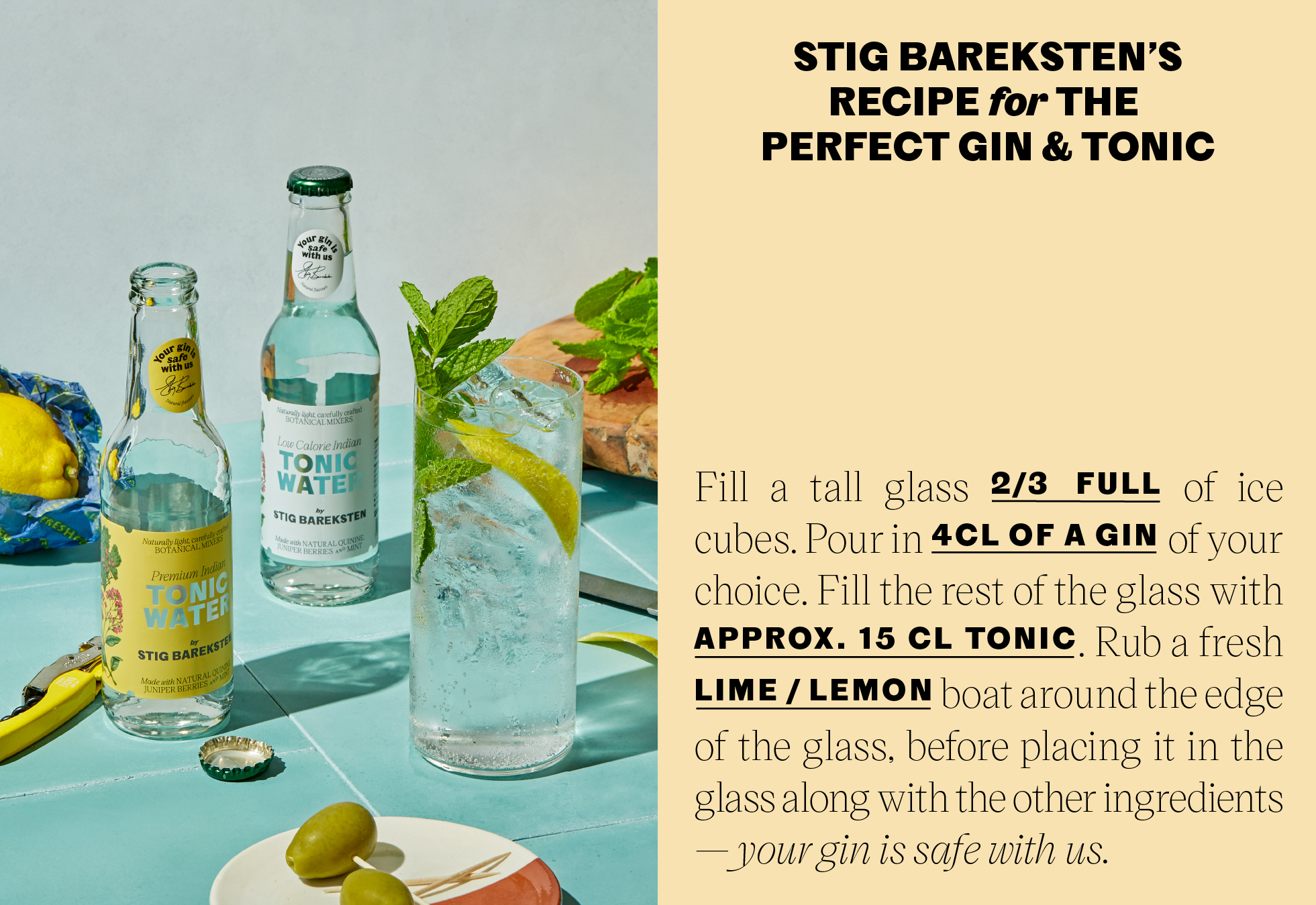
In collaboration with Tommy Andreasen we created a visual universe for the promotion of the mixers, using textured photography featuring ingredients used in the mixers.