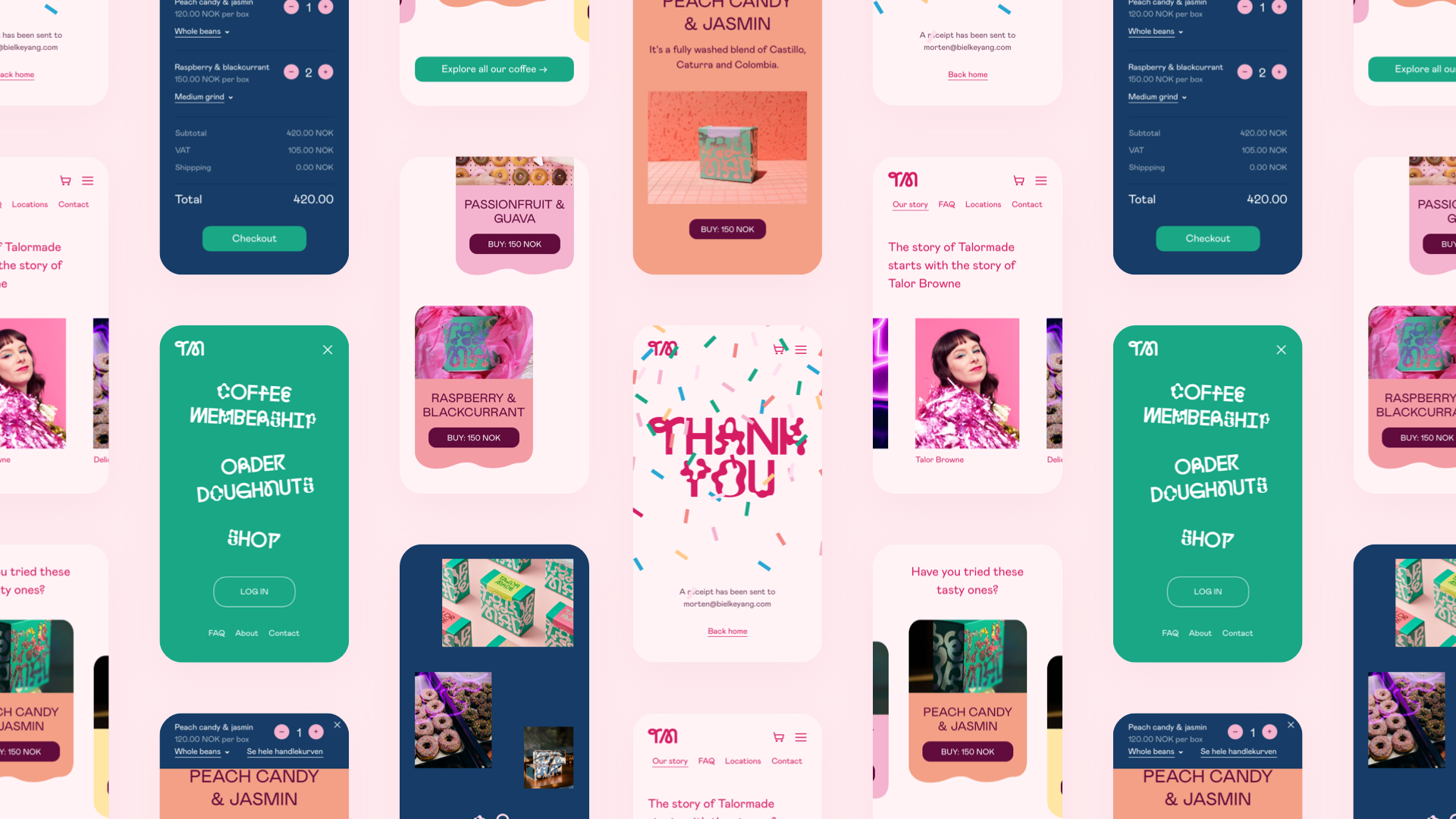
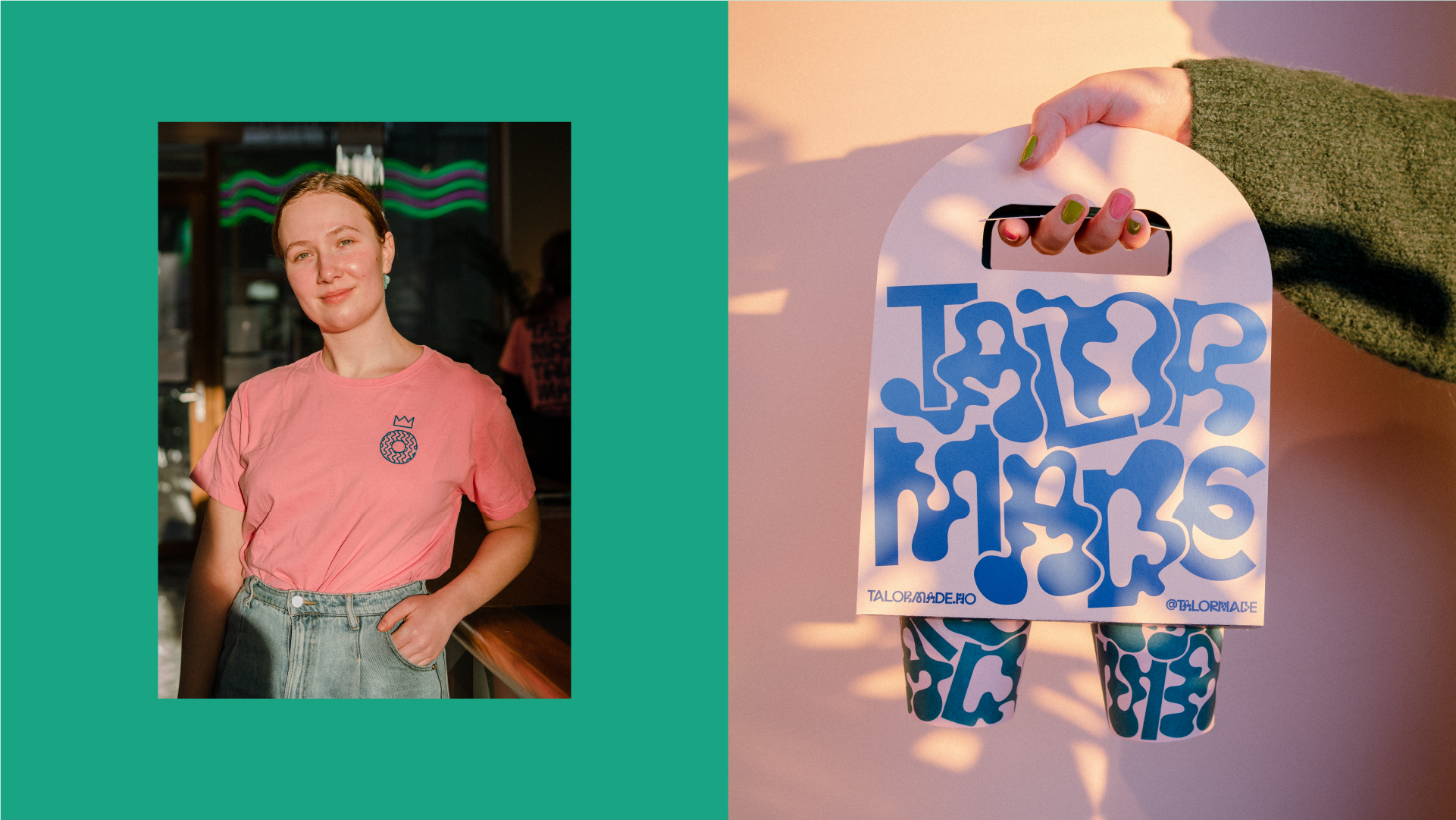
Talormade, Identity
2020
Designed by Evan McGuinness at Bielke+Yang
Art Direction: Christian Bielke
Categories: Identity
Industry: Commercial
Tags: Typography / Food and drink / Signage / Branding / Identity / Food
Website: talormade.no
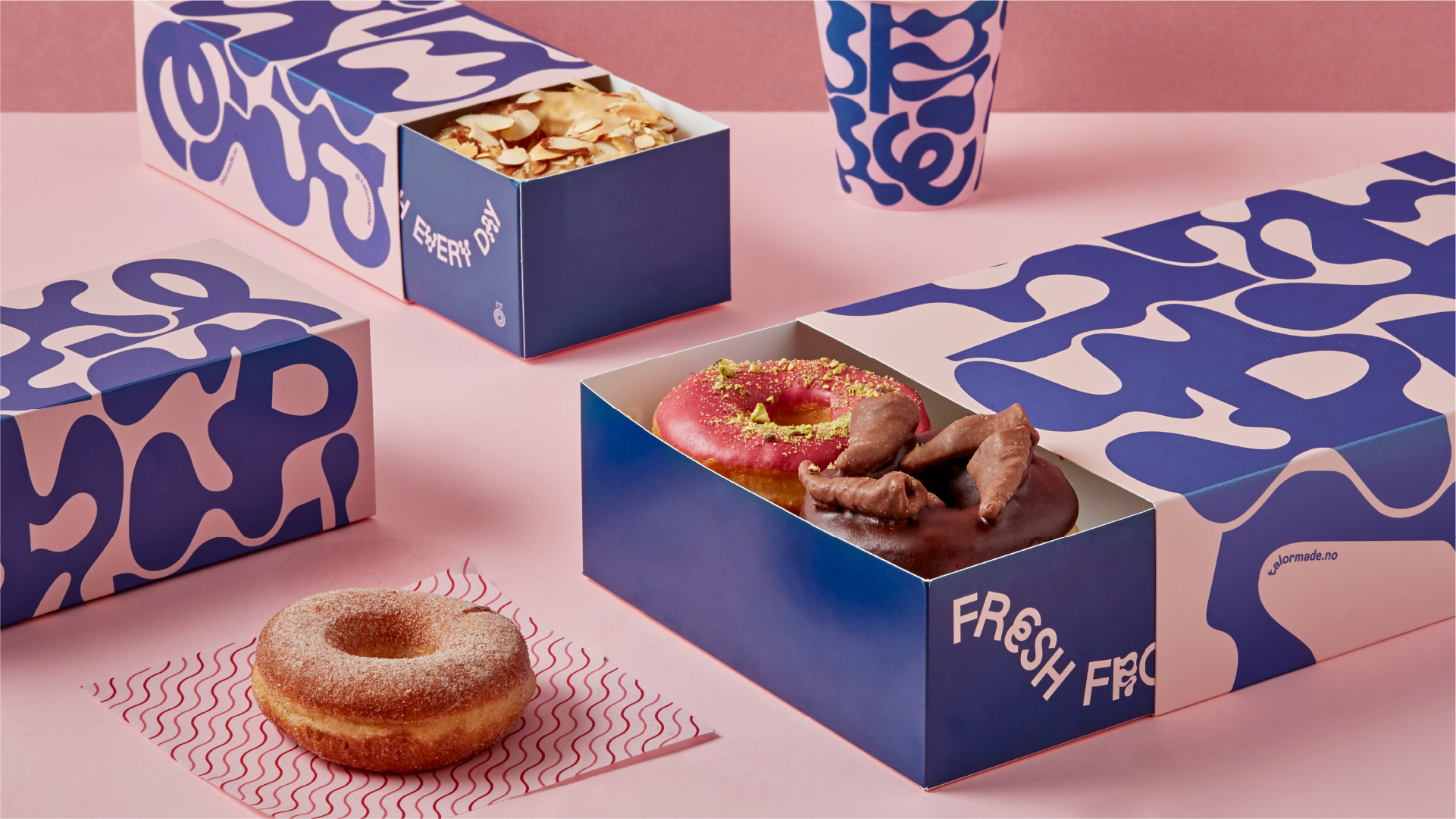
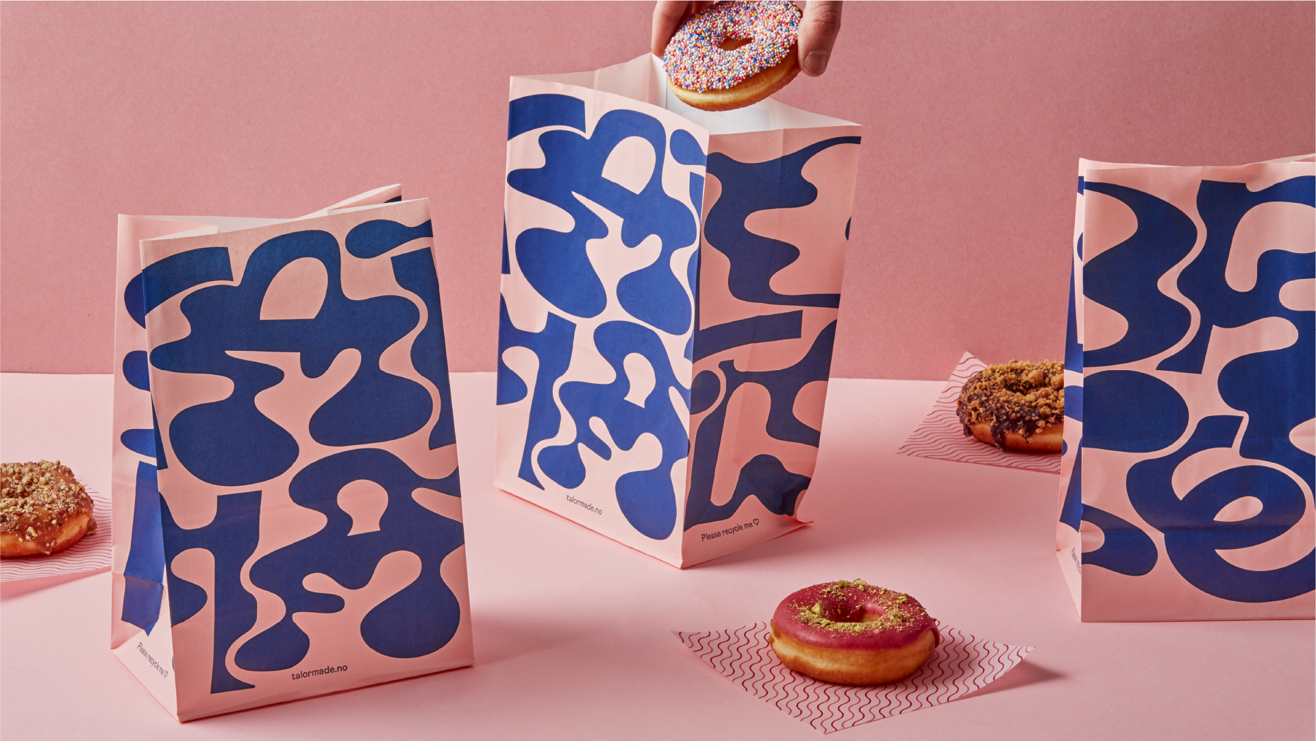
After having worked for 20 years in the coffee industry, Talor thought to herself: Wouldn't it be nice to have super high-quality coffee but without all the attitude? Talormade is the story of Talor doing her own thing, resulting in fans all over the globe. Today, she makes coffee, doughnuts and is opening stores across Oslo as well as shipping to customers worldwide.
By combining hard work, creativity, and a competent team, Talor has created something completely new. Thereby, she has challenged the norms and conventions within her segment.
We wanted to create an identity that reflected Talor’s unique personality and project. Since Talor has paved the way for women in a segment dominated by men, we looked to historic women's rights material for inspiration. Talor refuses to be told what she can do and not do, we wanted Talormade’s new identity to reflect this, to stand out, just as much as she does herself.
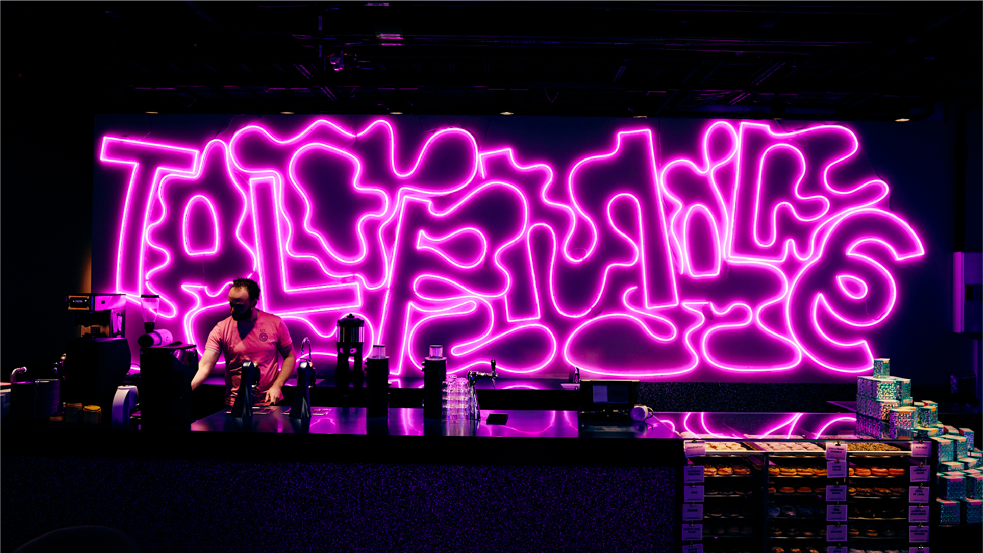
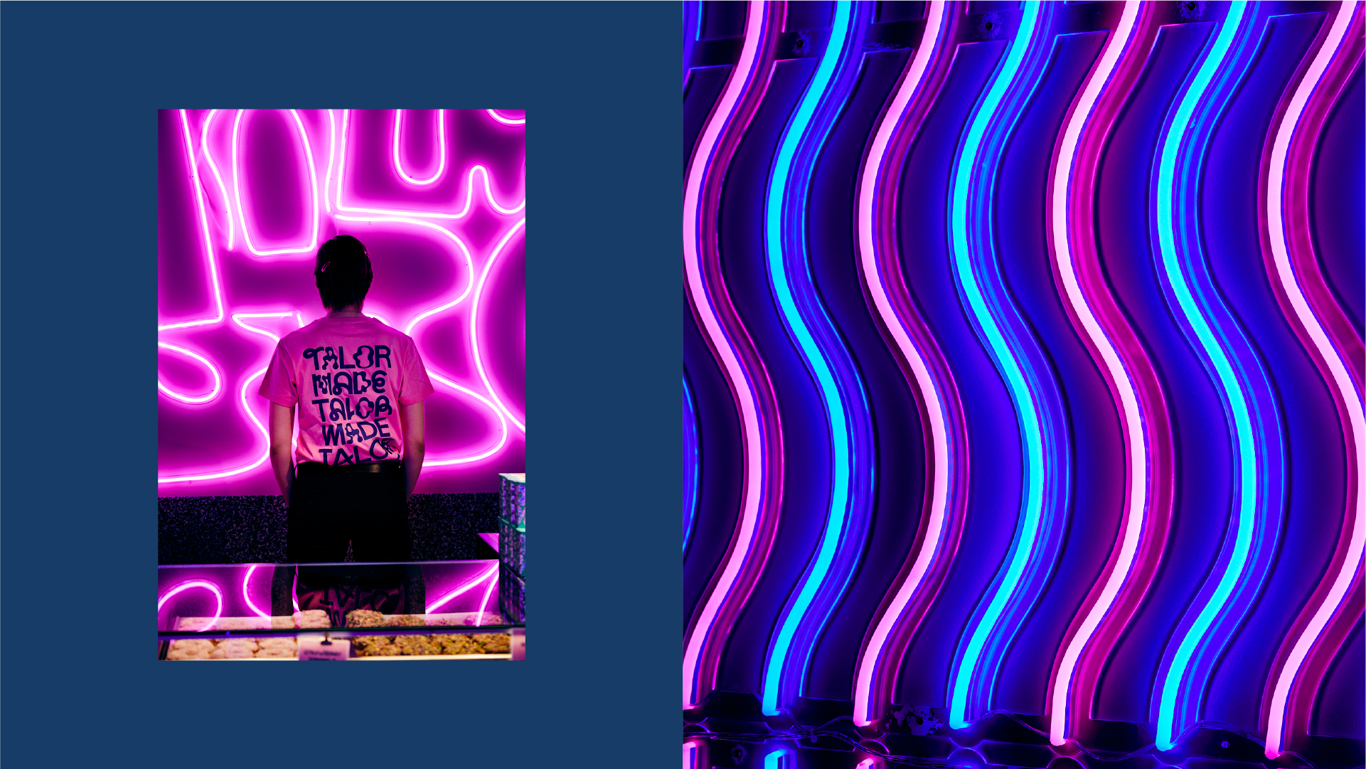
Through close collaboration with Talor, we have brought this personality through at every opportunity. Whether that is a 10M wide neon sign, special foils on the packaging, or a glitter wall, it's all about creating safe inclusive spaces where people can enjoy delicious doughnuts and coffee but most of all, have fun!