Tara Gartlan Chocolate Brand Identity & Packaging Design
Designed by Clare Lynch (Creative) at Clare Lynch Creative
Printing: JJ O'Toole
Categories: Print / Identity / Packaging
Industry: Commercial
Tags: Typography / Food and drink / Visual art / Art direction
Website: taragartlan.com
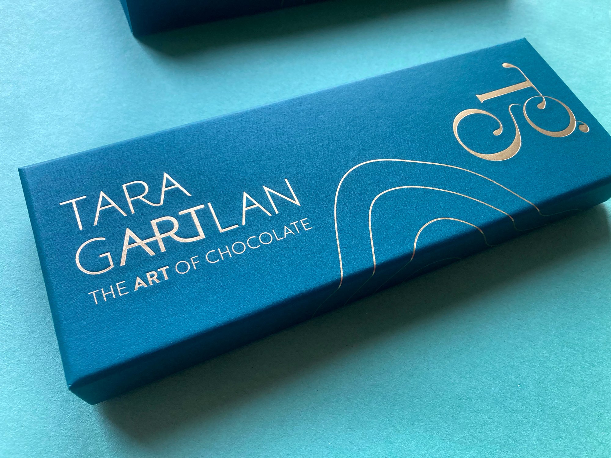
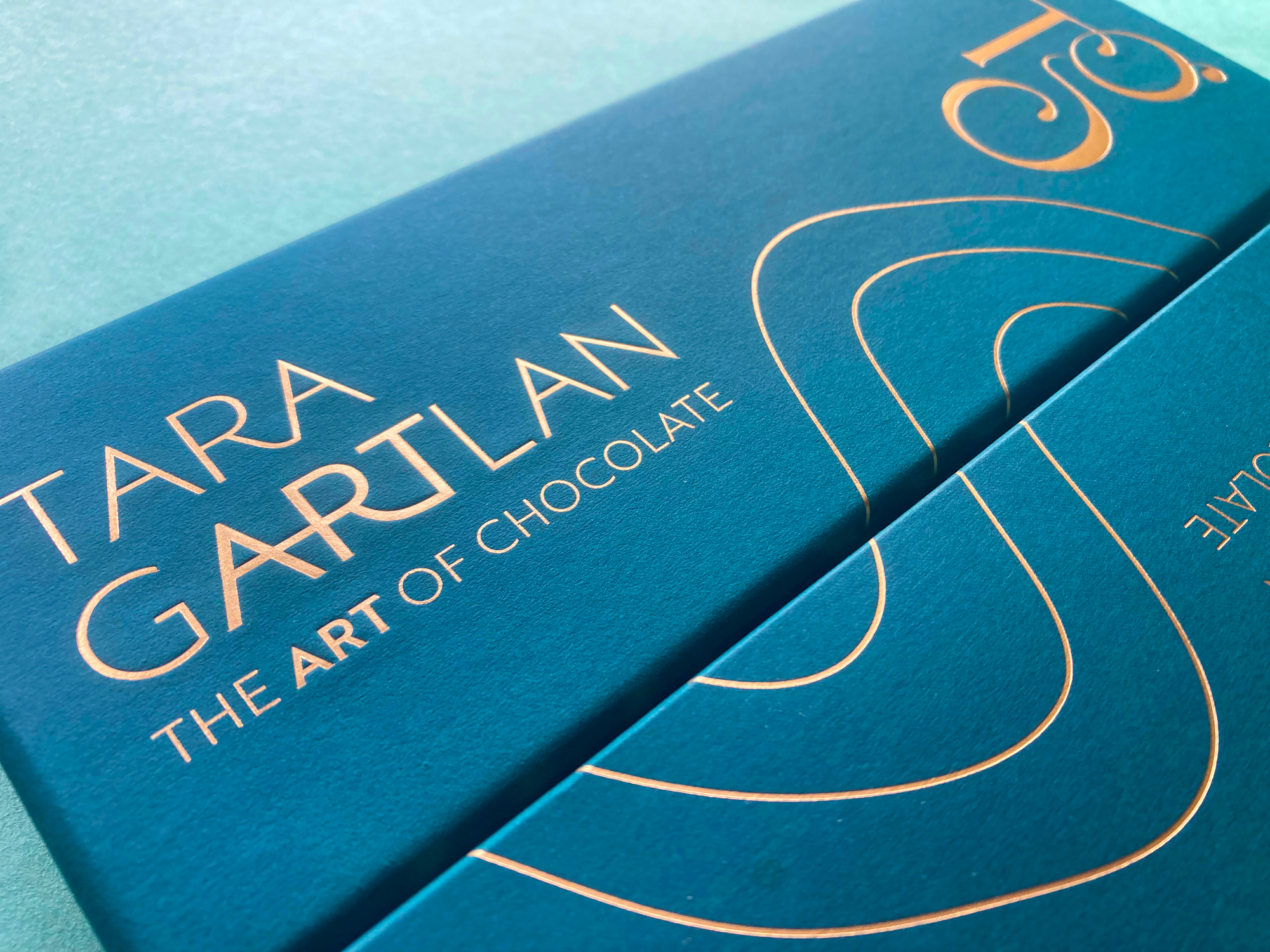
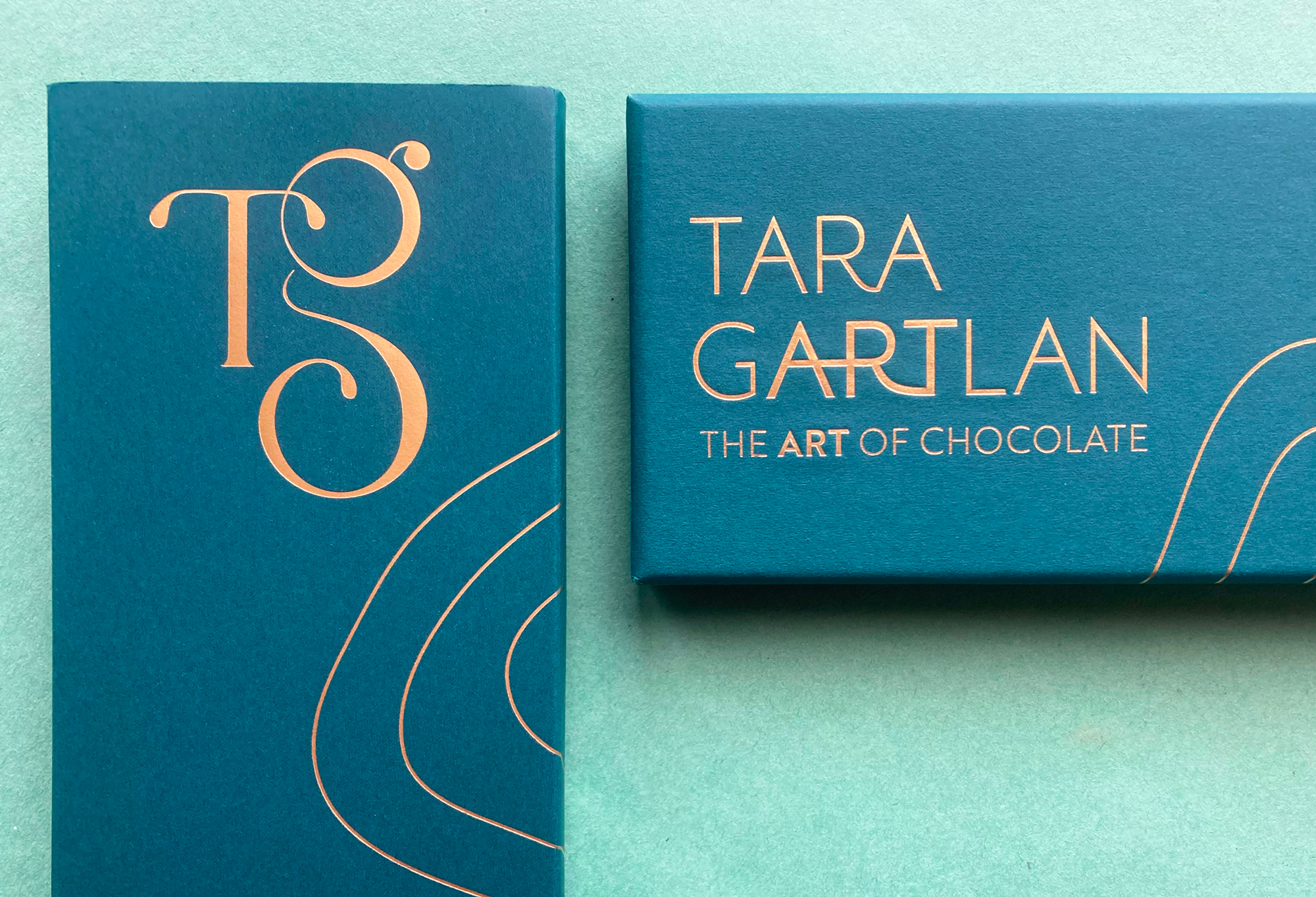
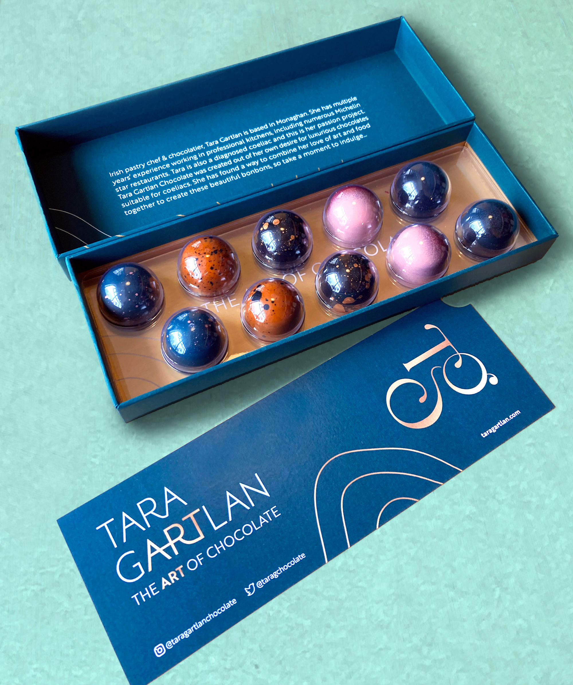
Introducing the Brand Packaging Design for Tara Gartlan Chocolate – luxury handmade Irish chocolate bonbons, created by Michelin star pastry chef Tara Gartlan, who is based in Co. Monaghan.
Each chocolate collection is like a work of art – every chocolate is meticulously handmade with beautiful designs, which lead to us creating the tagline ‘The Art of Chocolate’, highlighting the word ‘Art’ tucked within Tara Gartlan’s name. Cocoa butter is used artfully for decoration and all recipes are expertly crafted by Tara Gartlan. They look almost too good to eat! But once you do, you’ll be reaching for another one.
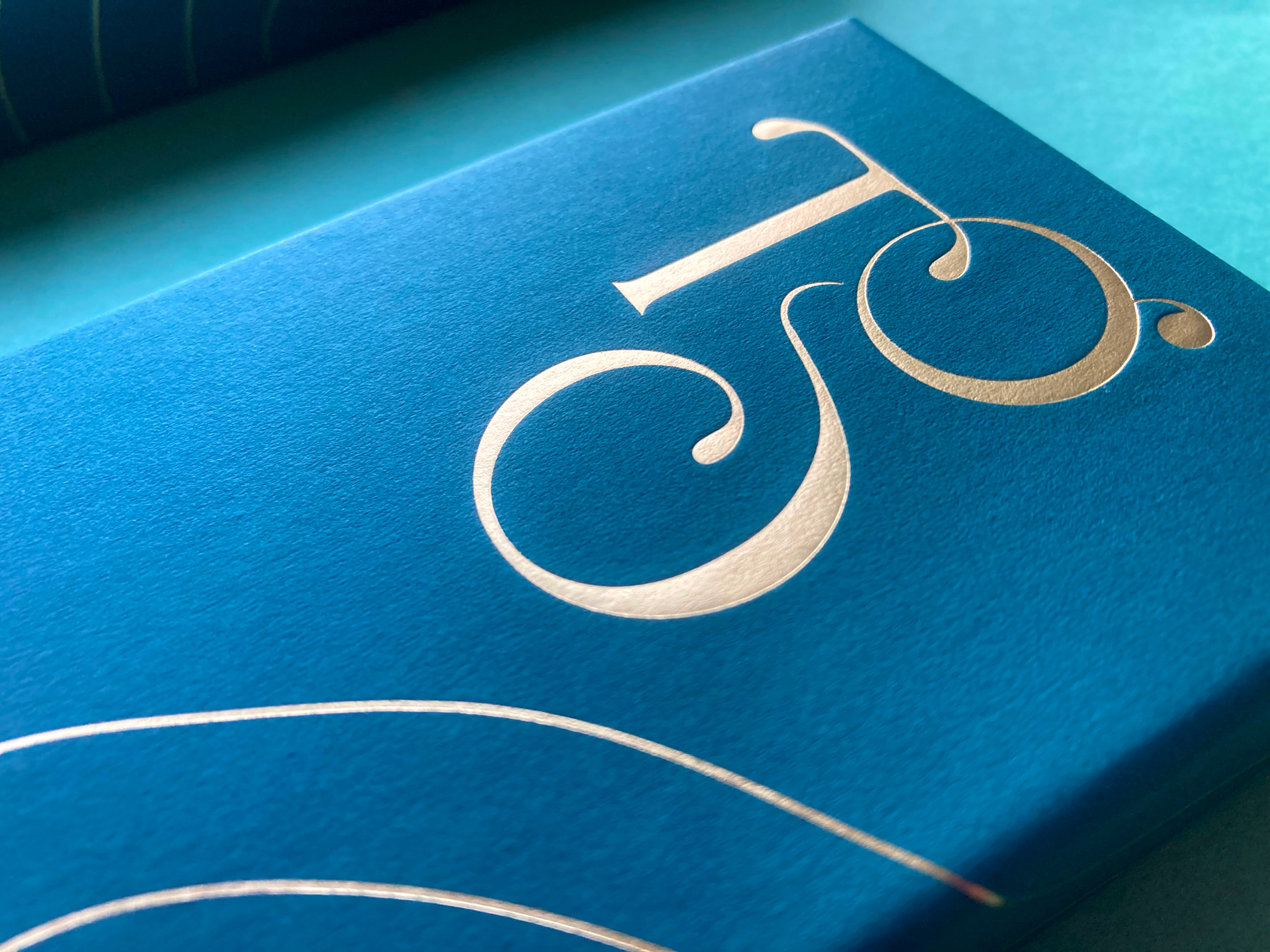
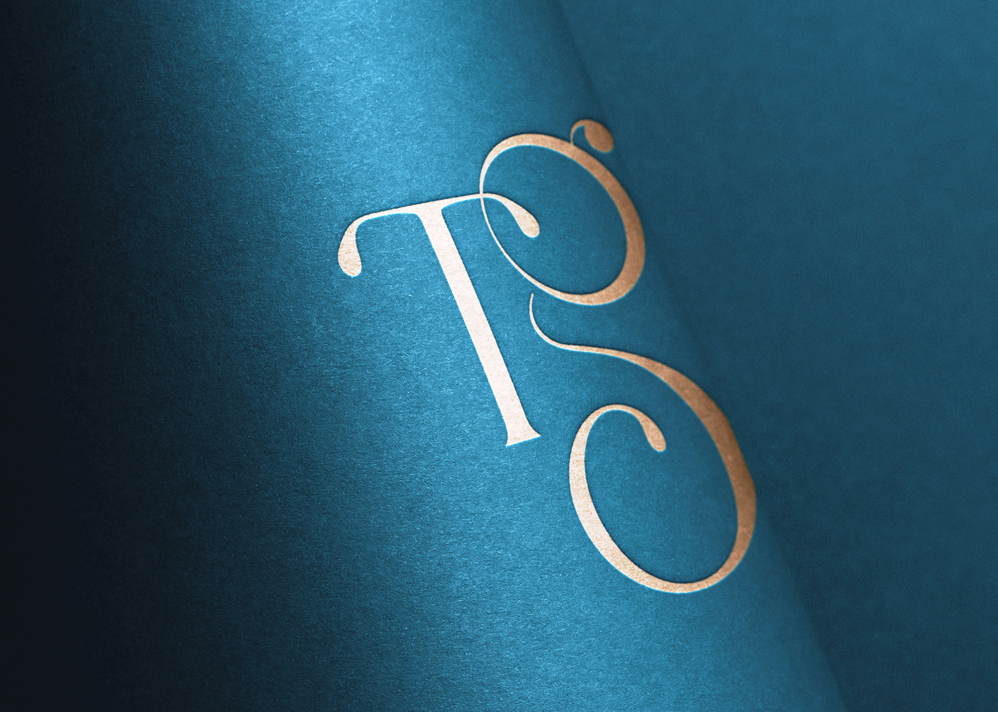
The initials ‘TG’ from Tara Gartlan’s name were used to create a strong graphic symbol with it, taking cues from the flowing nature of chocolate and incorporating droplets, like with chocolate dripping. There is a subtle ‘c’ within the base of the ‘G’ for the word ‘chocolate’ and also for ‘coeliac’, as these chocolates are coeliac-friendly. The beautiful boxes exude quality, the gold-detailed curvy lines take cues from the free-flowing way that chocolate is poured and the natural flowing lines in nature, as many of the ingredients are grown locally, guaranteeing the most fragrant flavours.
Brand Guidelines and assets were created including a colour palette to communicate the essence of Tara Gartlan Chocolate – the brand identity is sophisticated, elegant, premium, Irish and a true reflection of the high quality and standard of their chocolates and service.
JJ O’Toole Ltd did a beautiful job on printing the packaging at a very premium standard and assured us that the packaging is fully recyclable.