The Adrian Brinkerhoff Poetry Foundation, Typeface
Designed by Bobby Tannam and Evan McGuinness at Bielke+Yang
Art Direction: Martin Yang
Categories: Website / Identity / Typeface
Industry: Cultural
Two years ago, The Adrian Brinkerhoff Poetry Foundation reached out to us after seeing the work we had done with Maaemo on their website and identity. The Foundations founders Peter and Cathy Halstead, asked if we could help them to develop a new visual language and website for the Foundation. Of course, we had to do a custom typeface as a part of this.
Today several organizations focus on poetry and literature, but not many have succeeded in engaging their audience with good content and visual aesthetics that appeal to the younger generations. The Foundation wants to celebrate and introduce poets from the 1800s and the 1900s, and at the same time give room for young unestablished poets from all over the world. During the time of the pandemic, The Foundation also arranges digital events to keep the engagement and contact with their audience going.
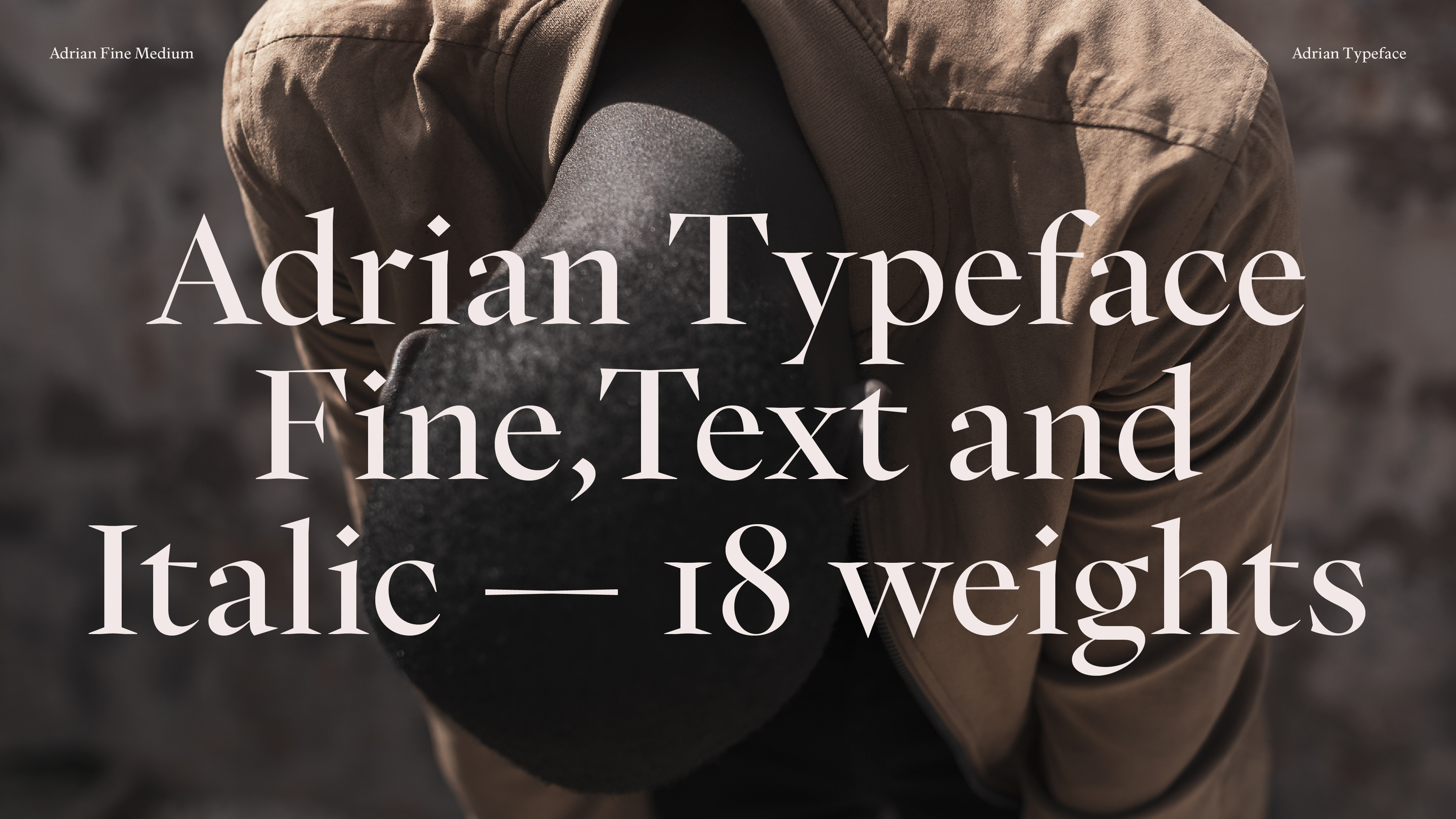
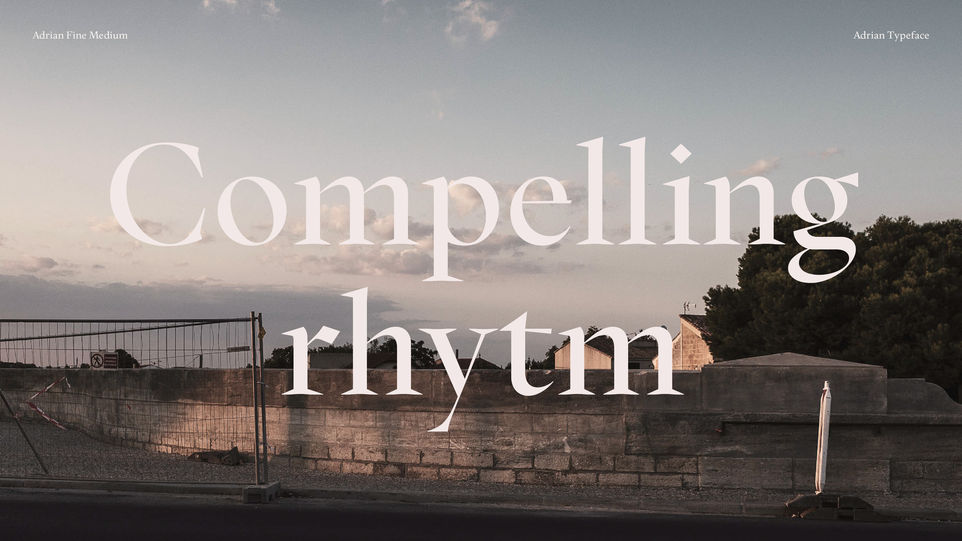
We wanted to develop a typeface that cherishes tradition and pulls inspiration and characteristics from some of the most well-known typefaces throughout history. At the same time, we wanted the typeface to look forward, and work perfectly in digital settings. The typeface Adrian is grounded in the concept of time because The Foundation itself works with the poetry and literature of the past, present, and the future.
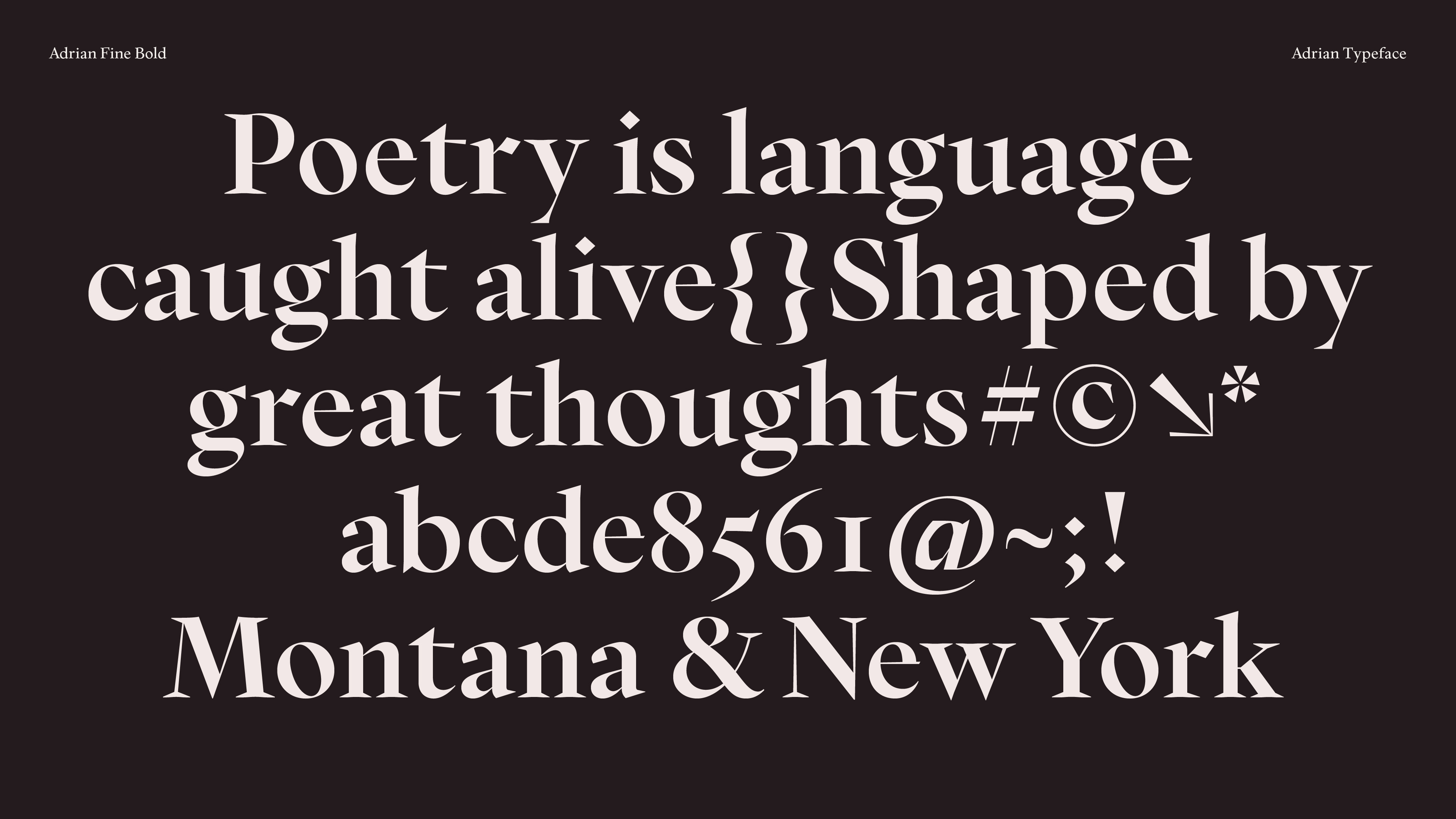
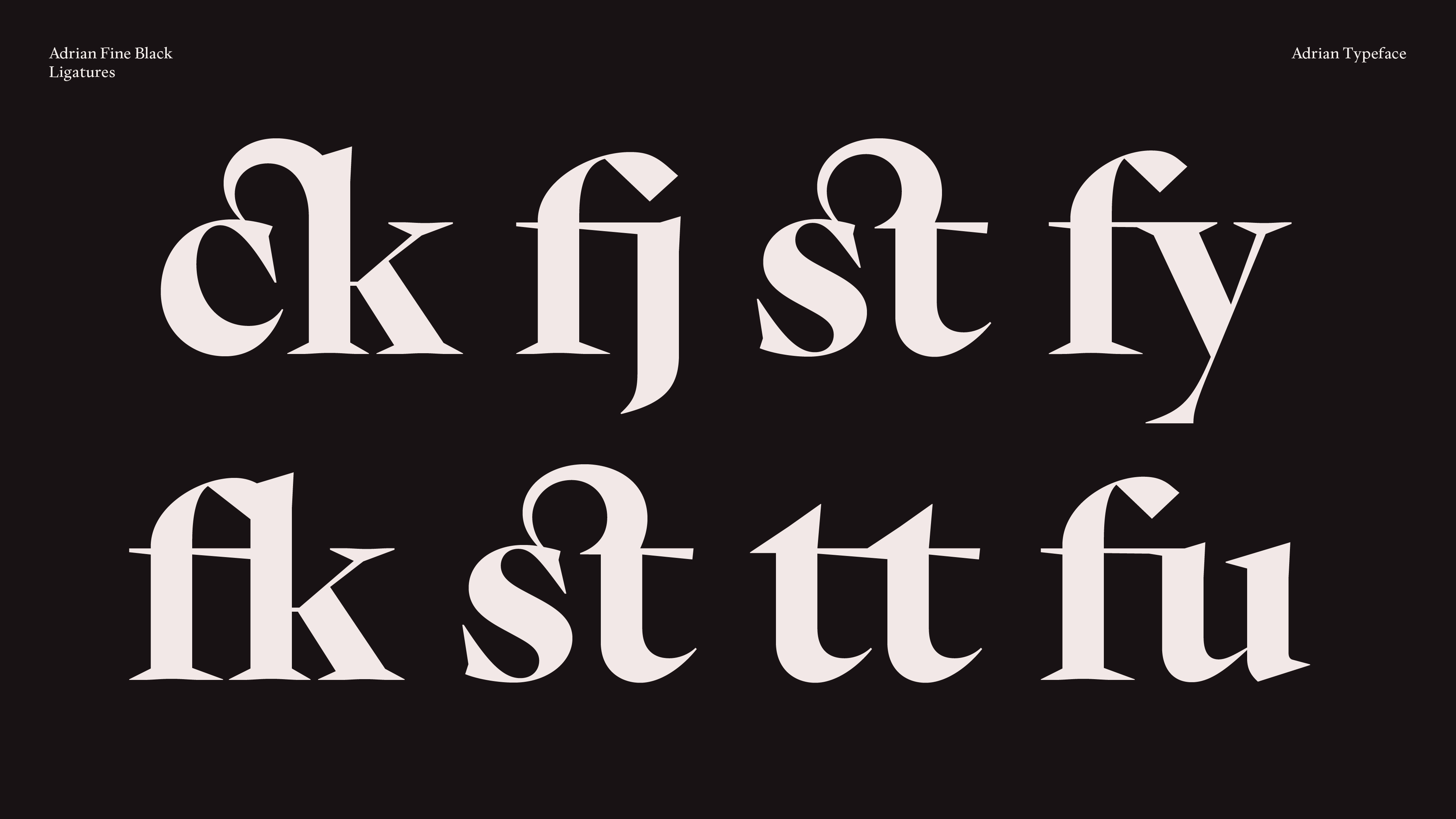
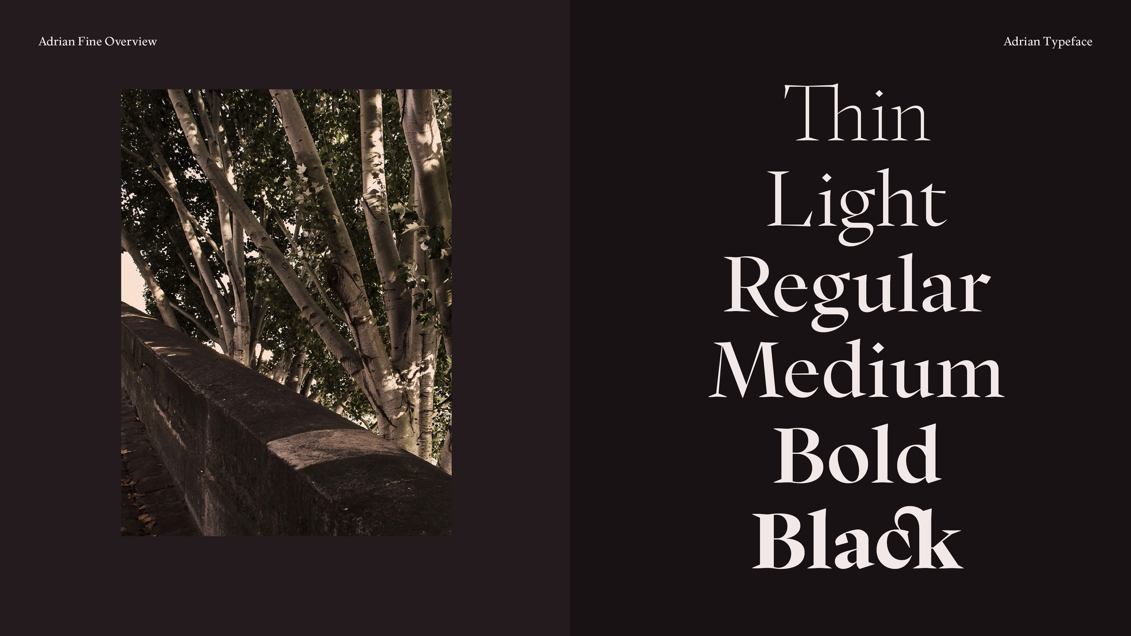
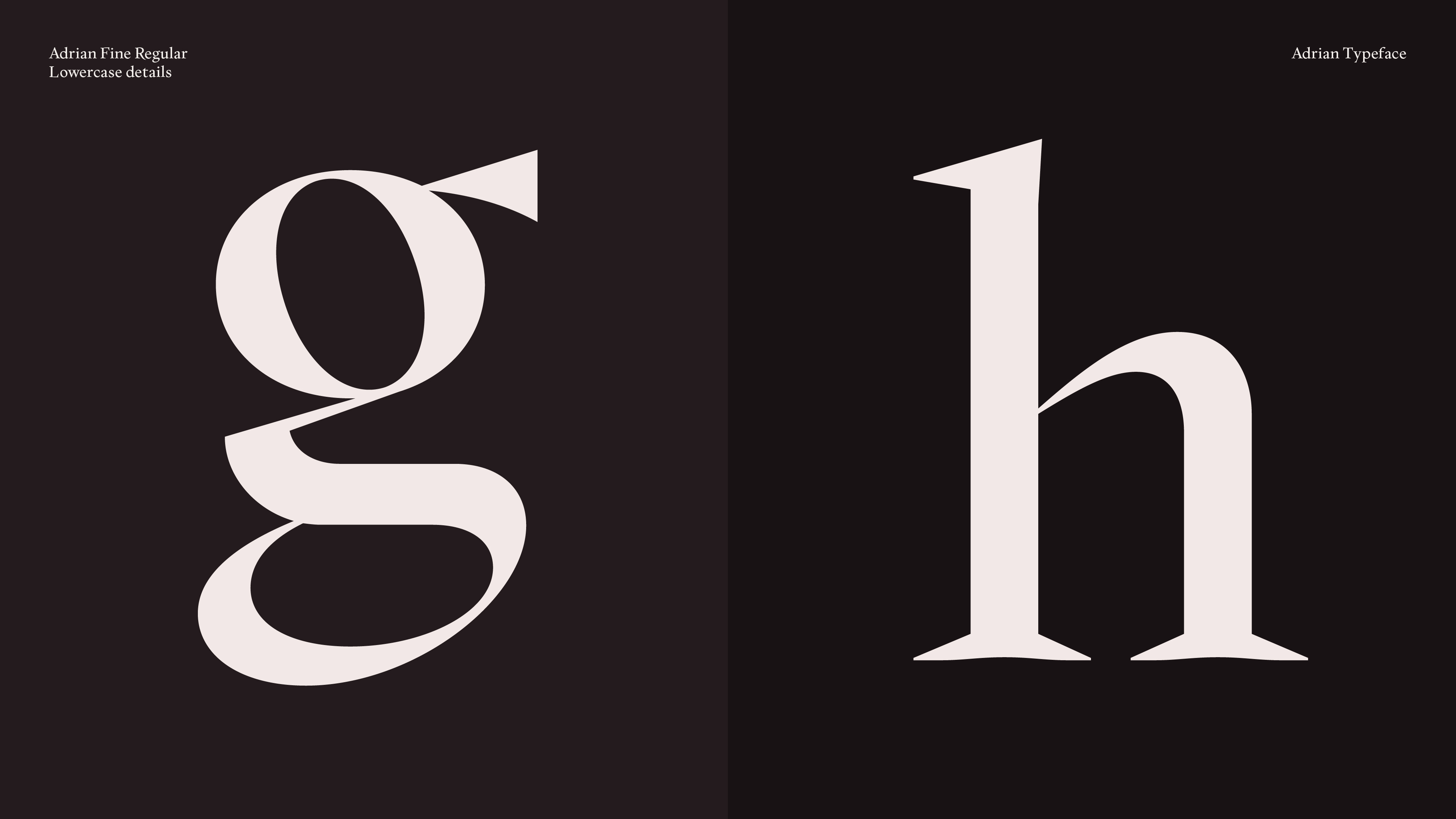
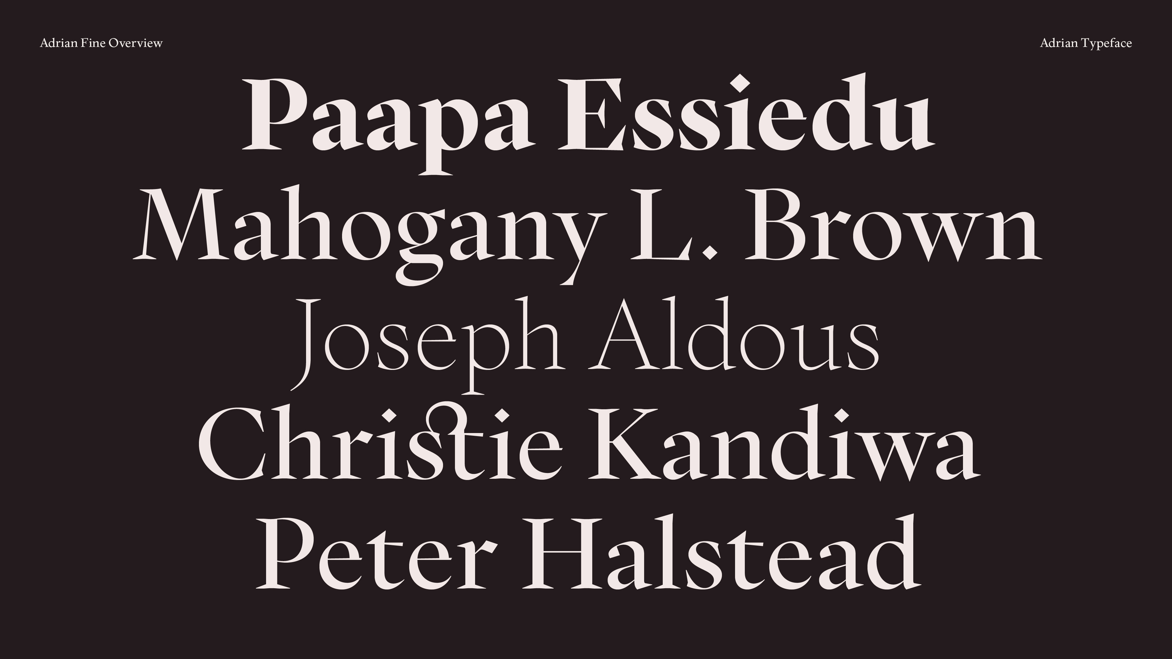
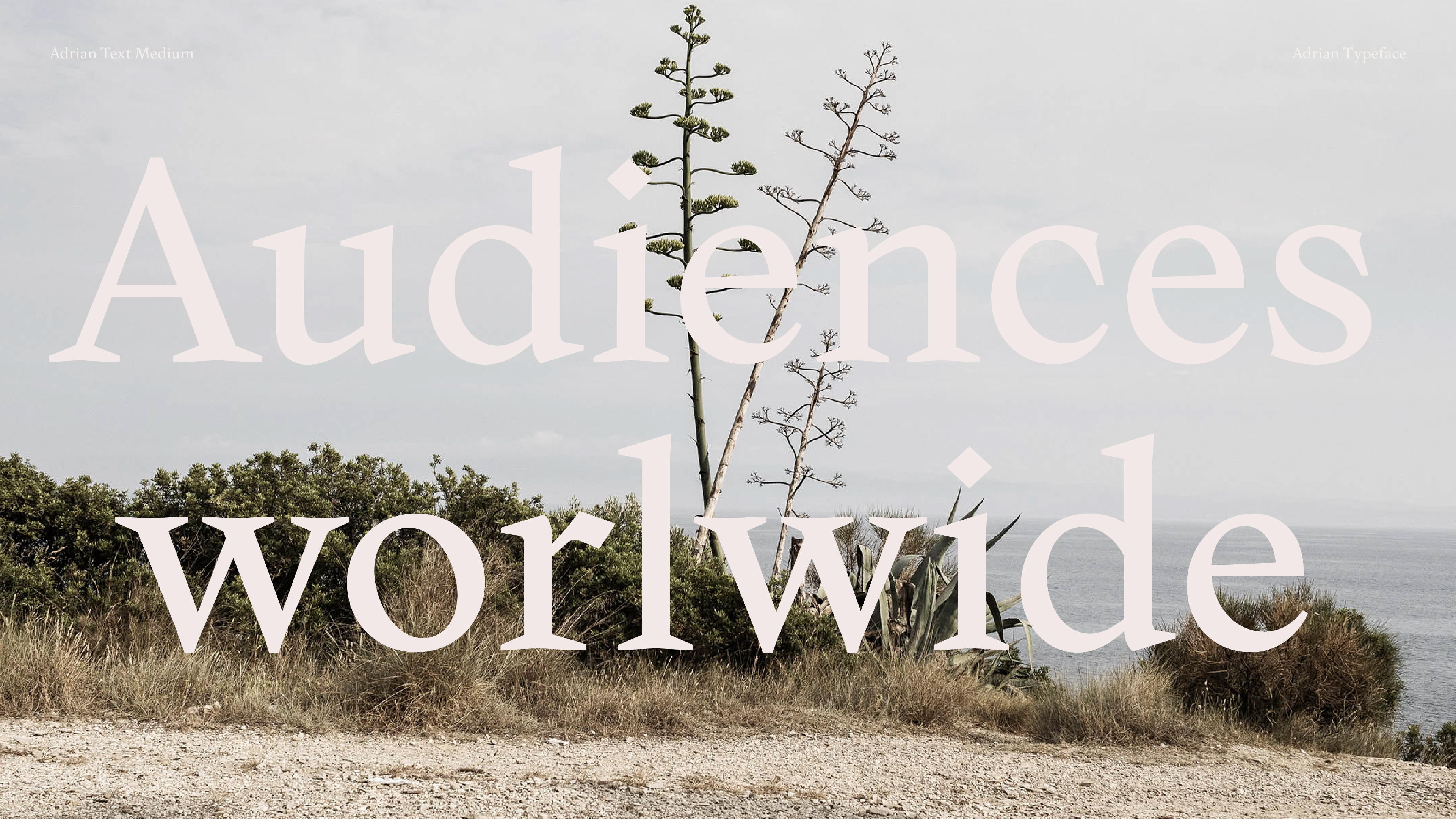
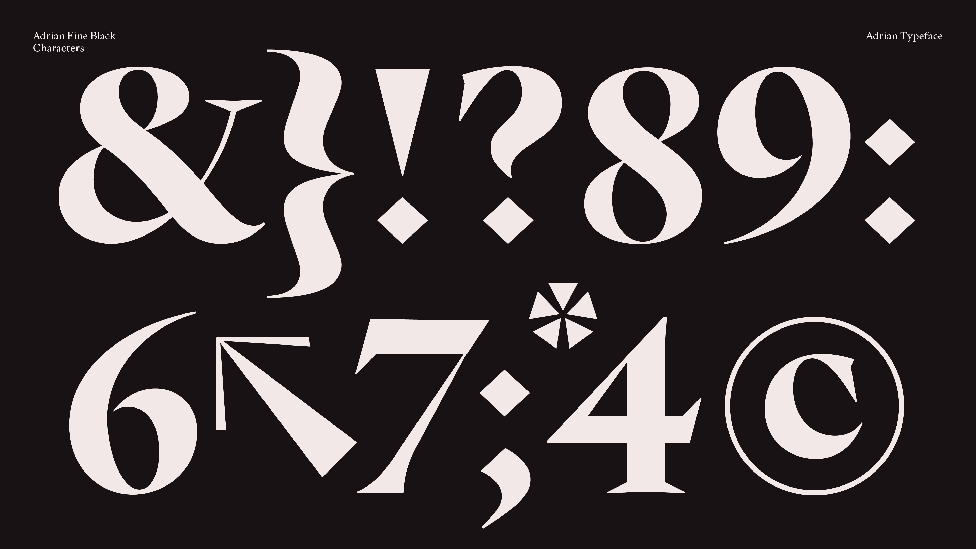
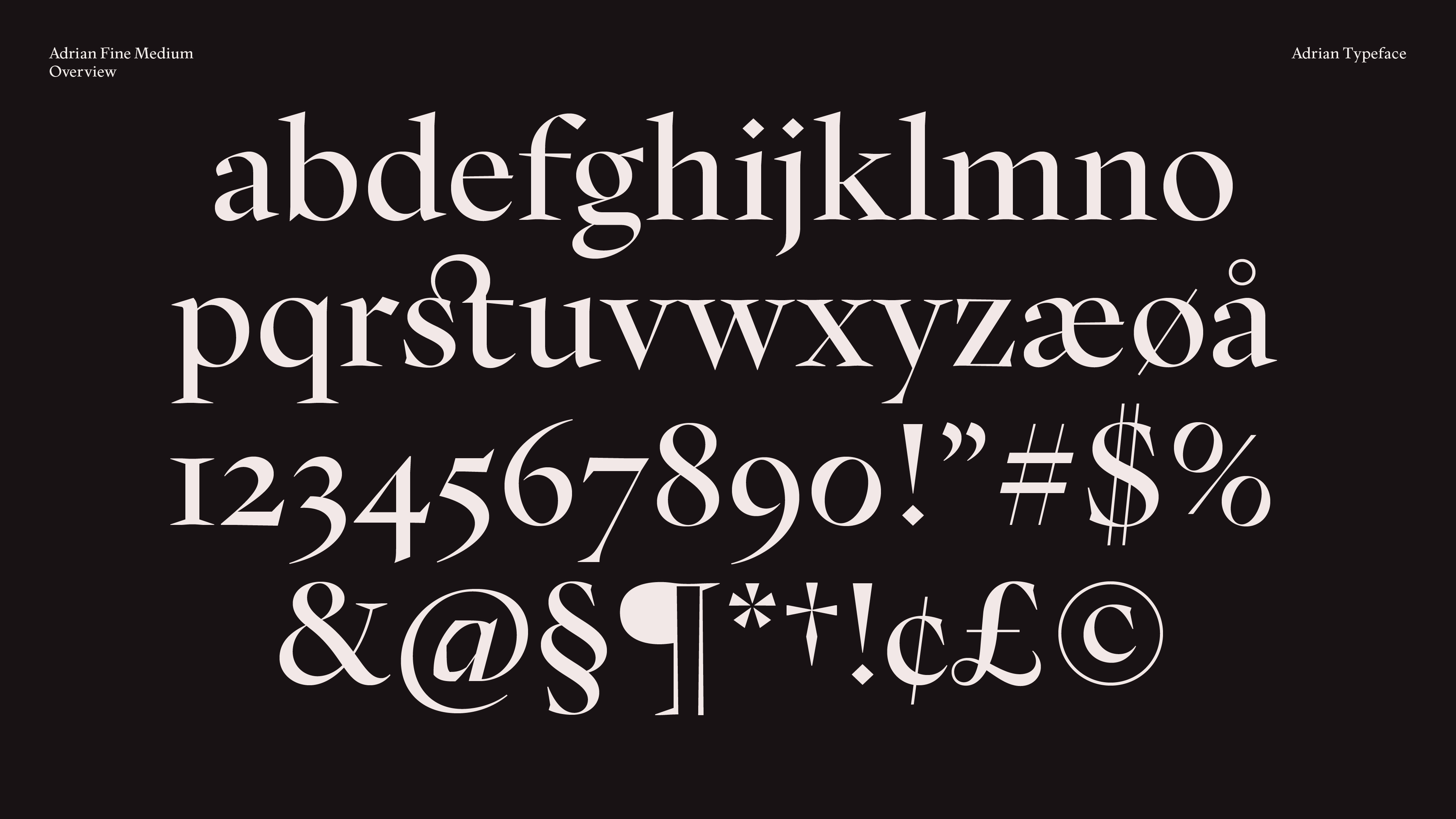
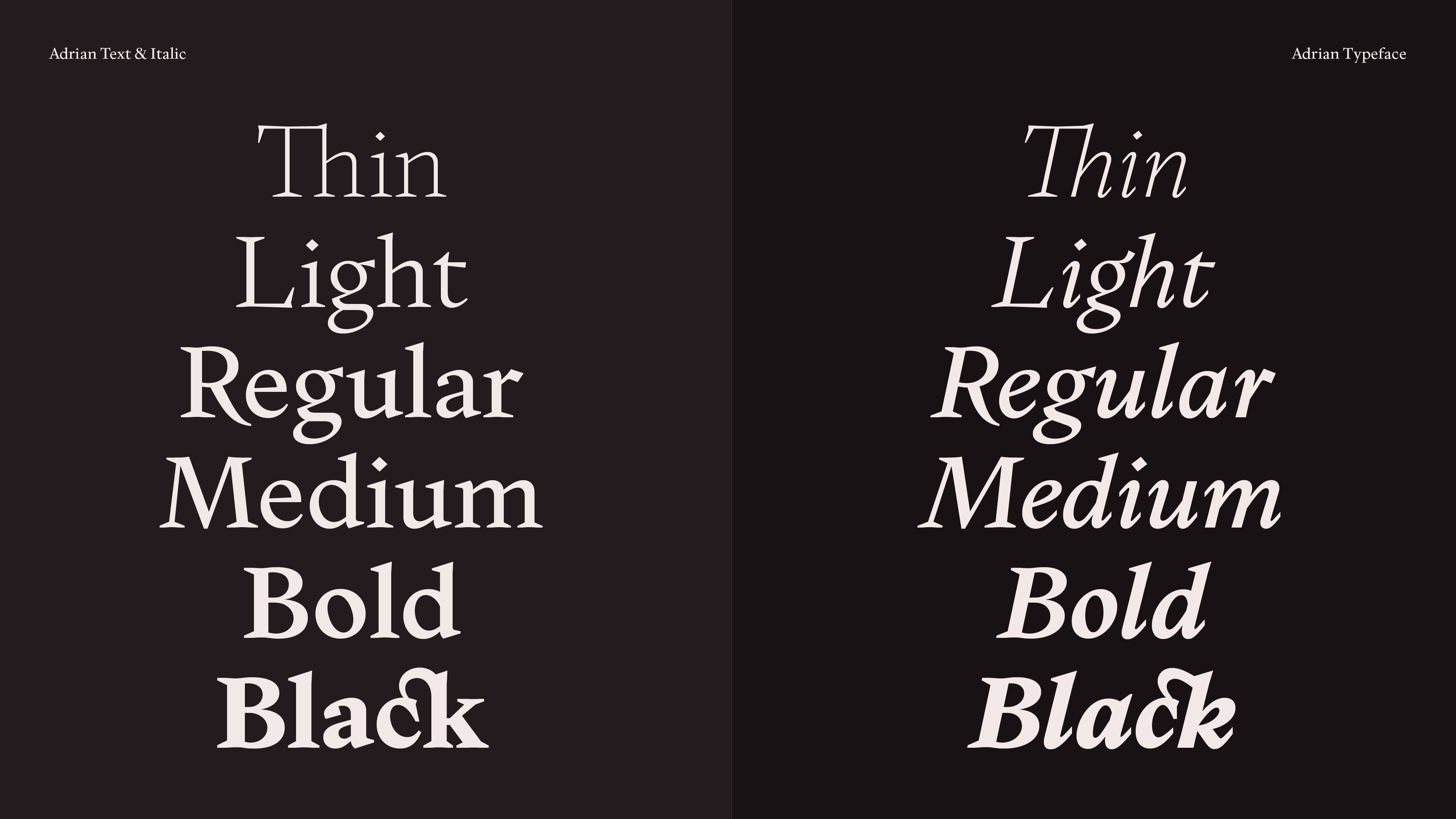
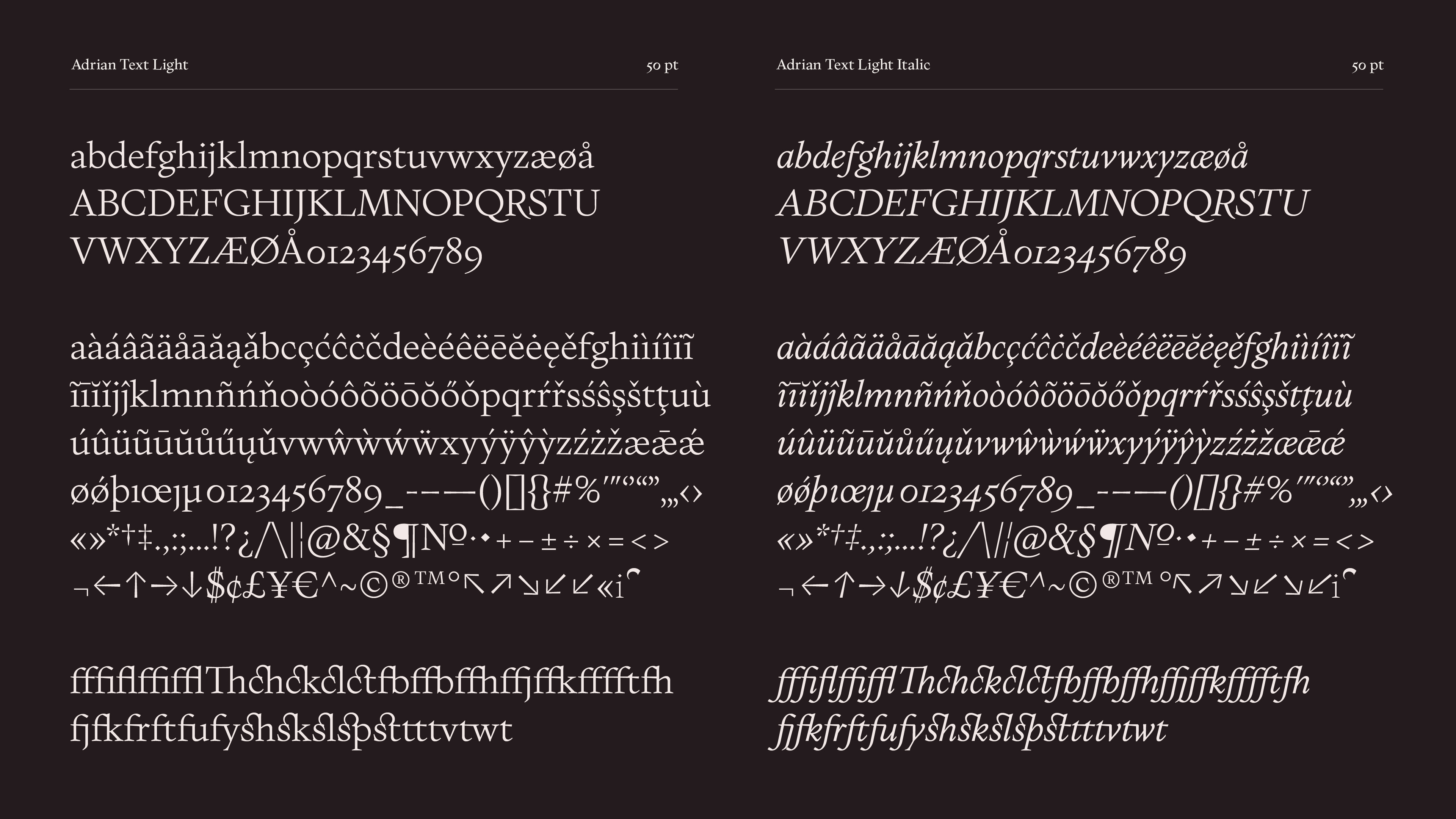
The typeface consists of a display version and a text version with italics. All together, Adrian consists of eighteen weights. The text weights are optimized for small sizes and are flexible to use, whether it is for showcasing poems on the website or for use in long articles. The display weight has details with a lot of personalities, that will become clearer when used bigger.