The Classics Series – Set 2 (2013)
Designed by David Wall and Conor Nolan at WorkGroup
Publisher: Roads Publishing
Categories: Printed Publication
Industry: Commercial
Tags: Illustration
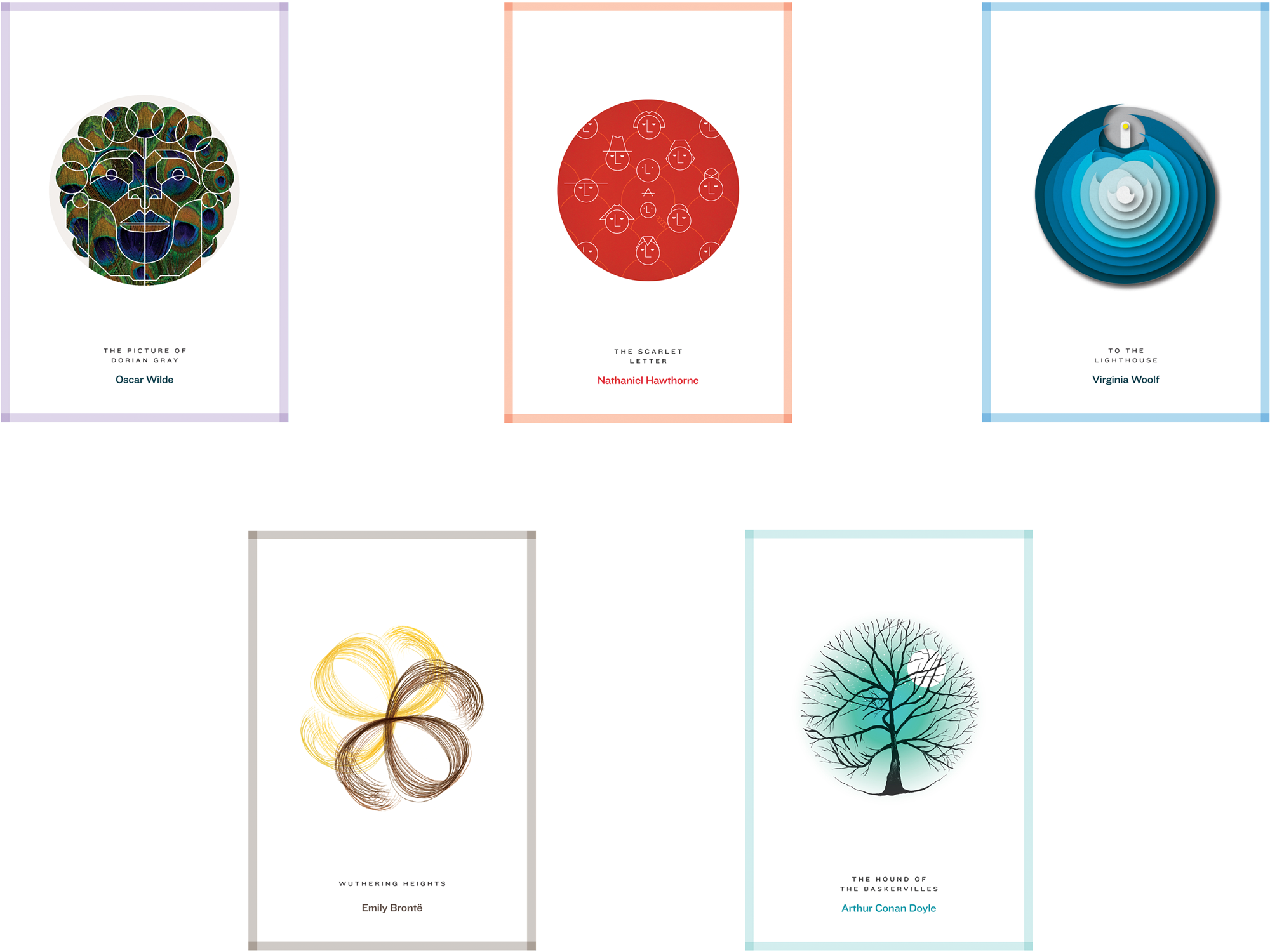
This project for Roads Publishing had two parts; the first was to devise a system flexible enough to work with all genres in a variety of media, with the freedom to use illustration, typographic layouts or photography as appropriate to the content and context.
The second and ongoing part comprises the individual cover image. Each captures the essence of the book, rather than reproducing specific scenes or dramatic moments. As classics, the books and associated imagery already exist in the public consciousness. It was important to step beyond this and to reflect a deeper understanding – one that is as connected to the contemporary era as it is to the author’s. Rather than acting solely as windows onto the authors’ world, these books (and their covers) should be mirrors to our own.
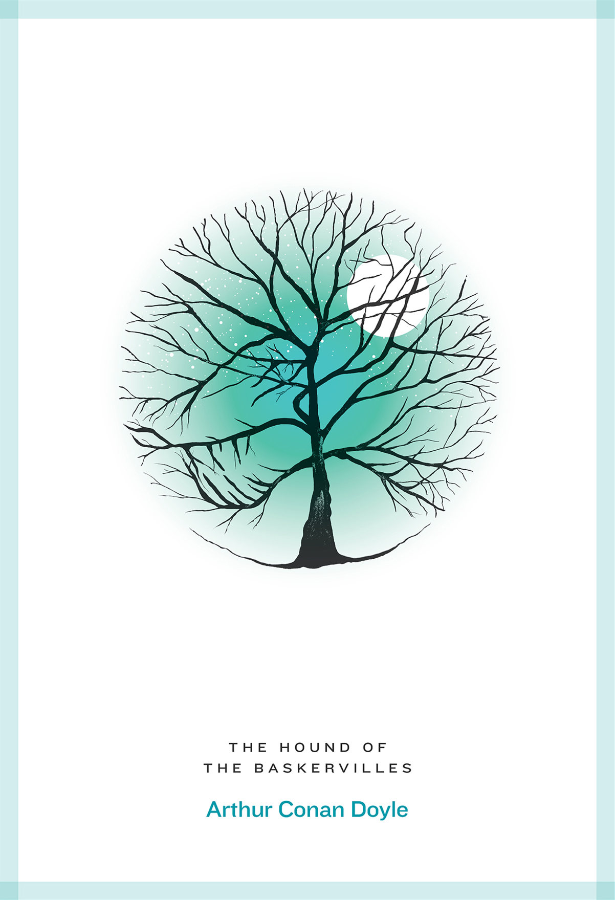
For ‘Hound of the Baskervilles’ illusion and deception are at work, compounding the contrasting themes of truth and fantasy. The novel’s setting, a darkly ominous moor, hides the menacing profile of its supernatural canine monster.
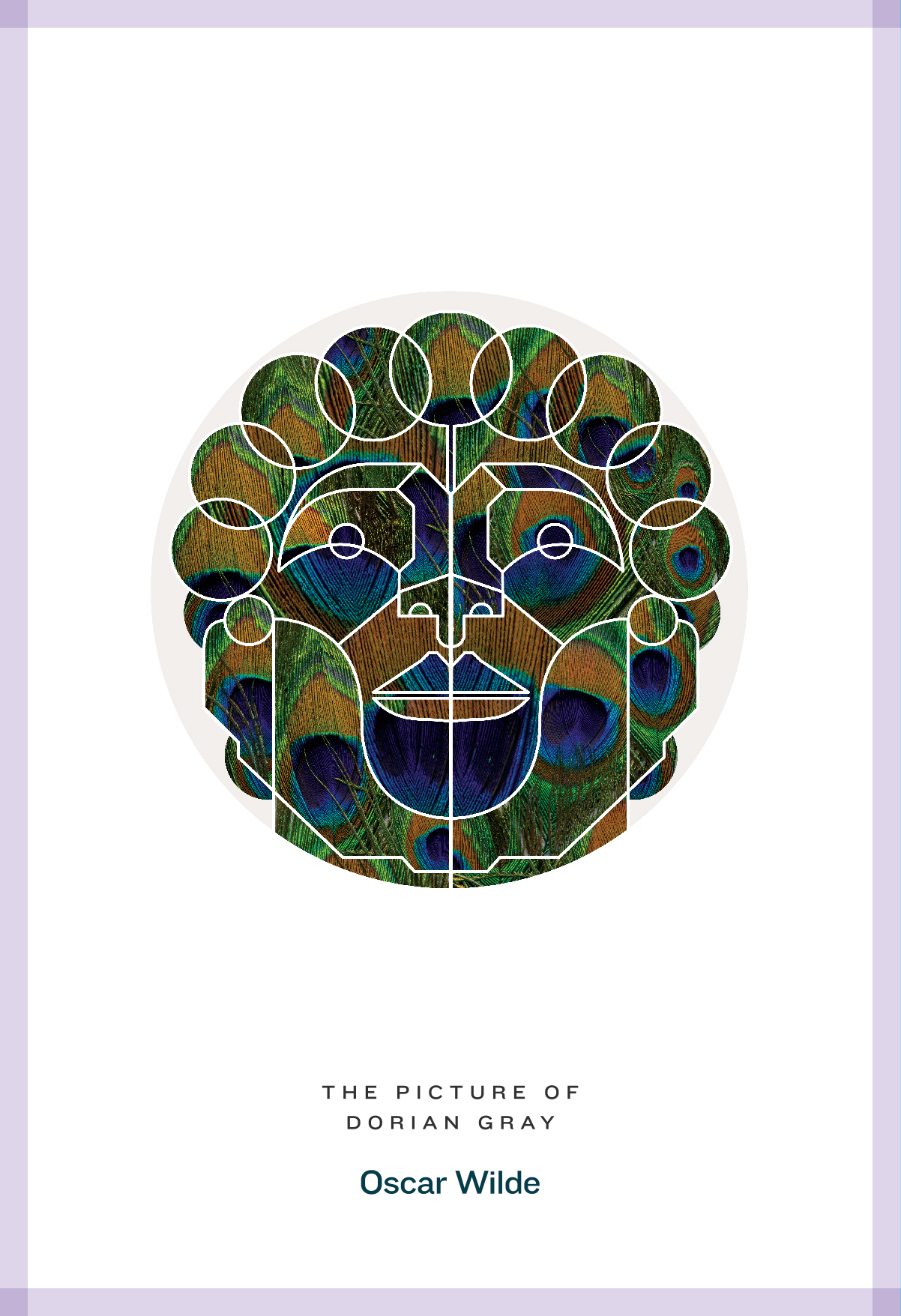
As though he were the result of a formula for male perfection and beauty, this geometric and symmetrically-proportioned portrait of the Dorian Grey is illuminated by the feathers of a peacock, a symbol of immortality and vanity.
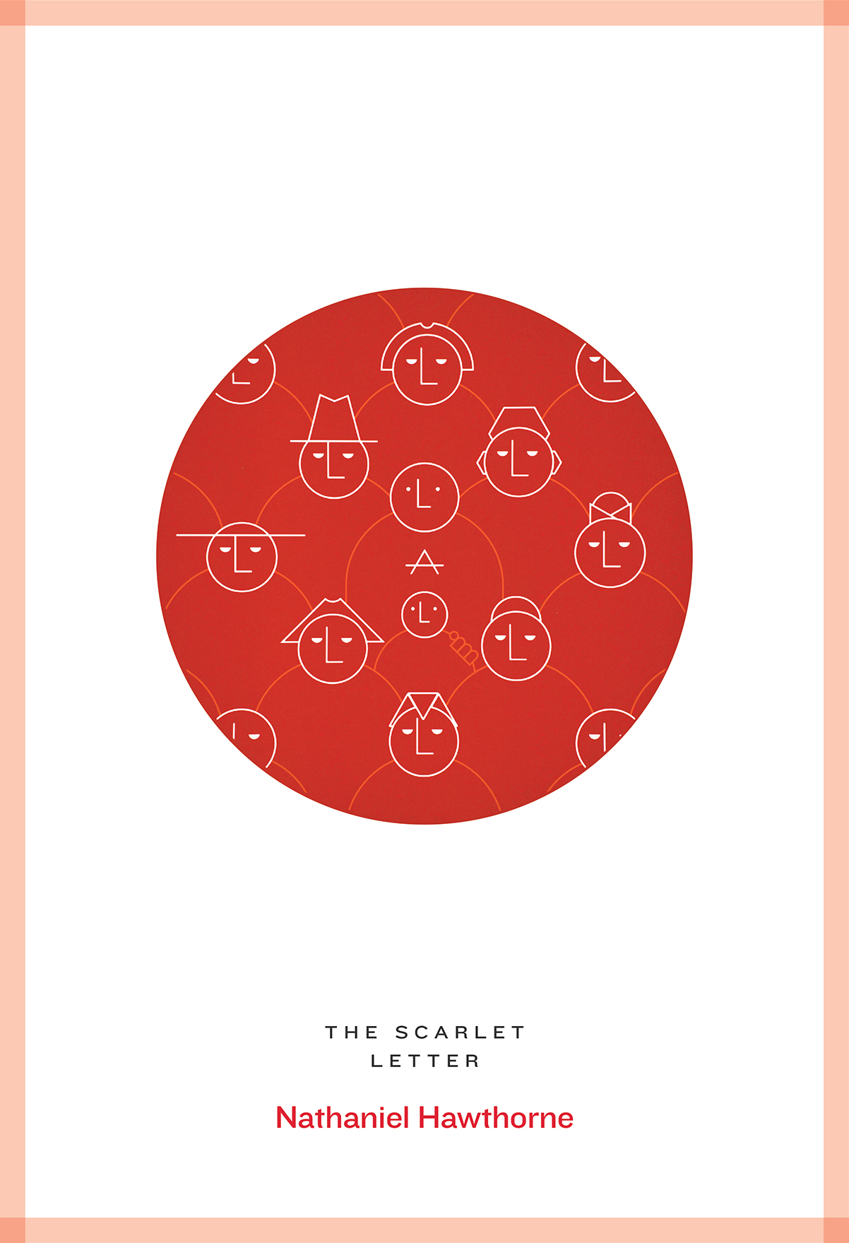
The uniform figures on the cover of ‘The Scarlet Letter’ exemplify the strict puritanical homogeny of the society depicted in Hawthorne’s novel. Under the scrutinizing gaze of the crowd around her, our anti-heroine and her child, stand out as marked individuals.
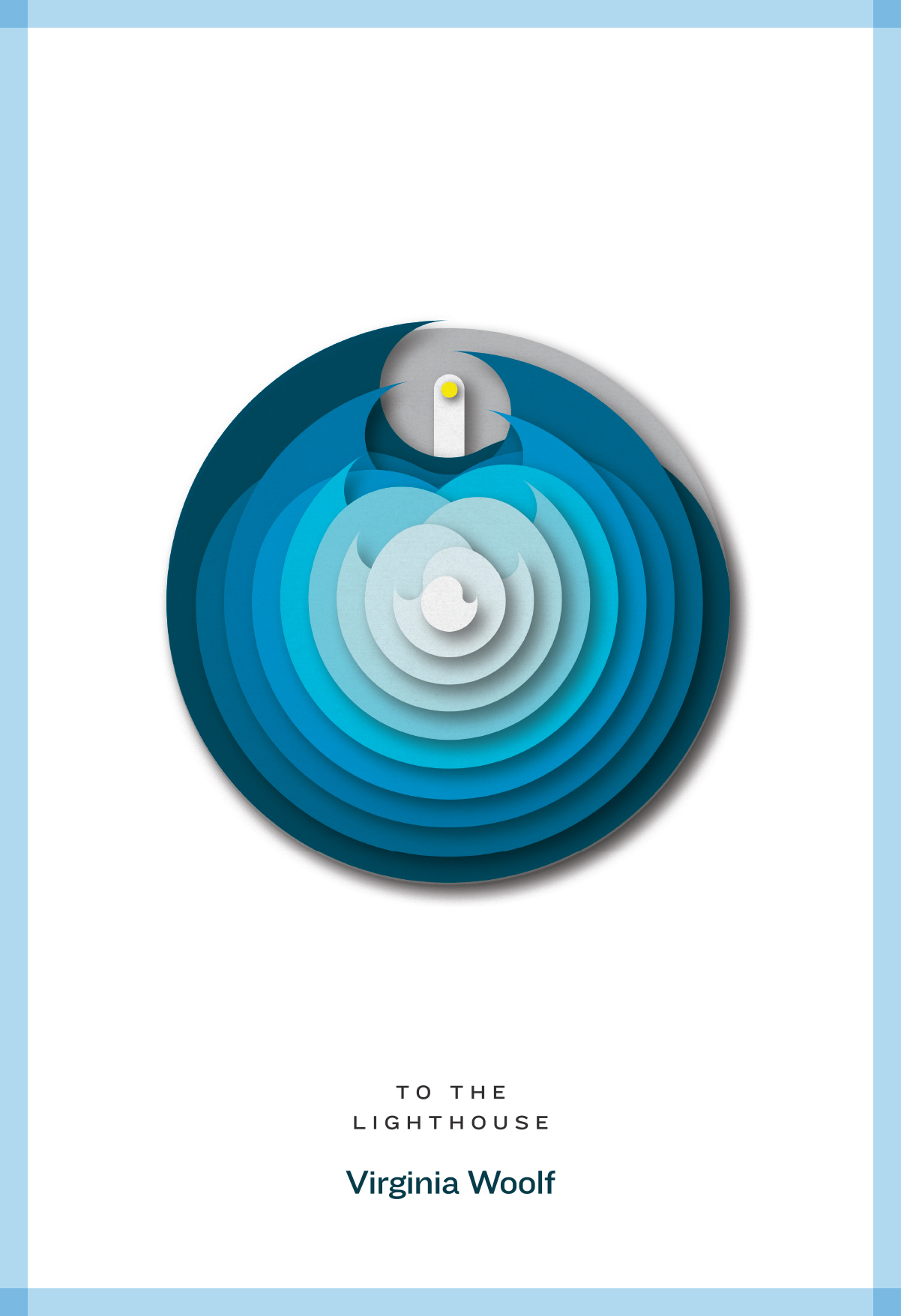
For ‘To the Lighthouse’, layers of cut paper, rotating on a central axis, make up a mesmerizing clockwork sea that separates the Ramsey family from the inaccessible beacon of light on the opposite side of the bay.
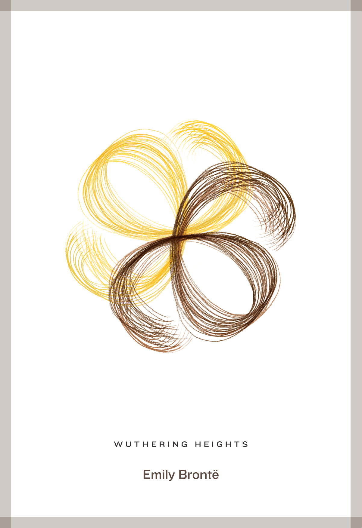
Two softly-illustrated, looping locks of hair capture a single moment in the relationship of the romantic heroes in ‘Wuthering Heights’, representing a love that is doomed to remain stagnant and lifeless. The mirroring shapes of the locks play on Brontë’s use of repetition, weaving its way throughout the storyline as though traveling along a Möbius strip.