The Forestry Company identity
Designed by John Raftery at John Raftery
Printer: City Print
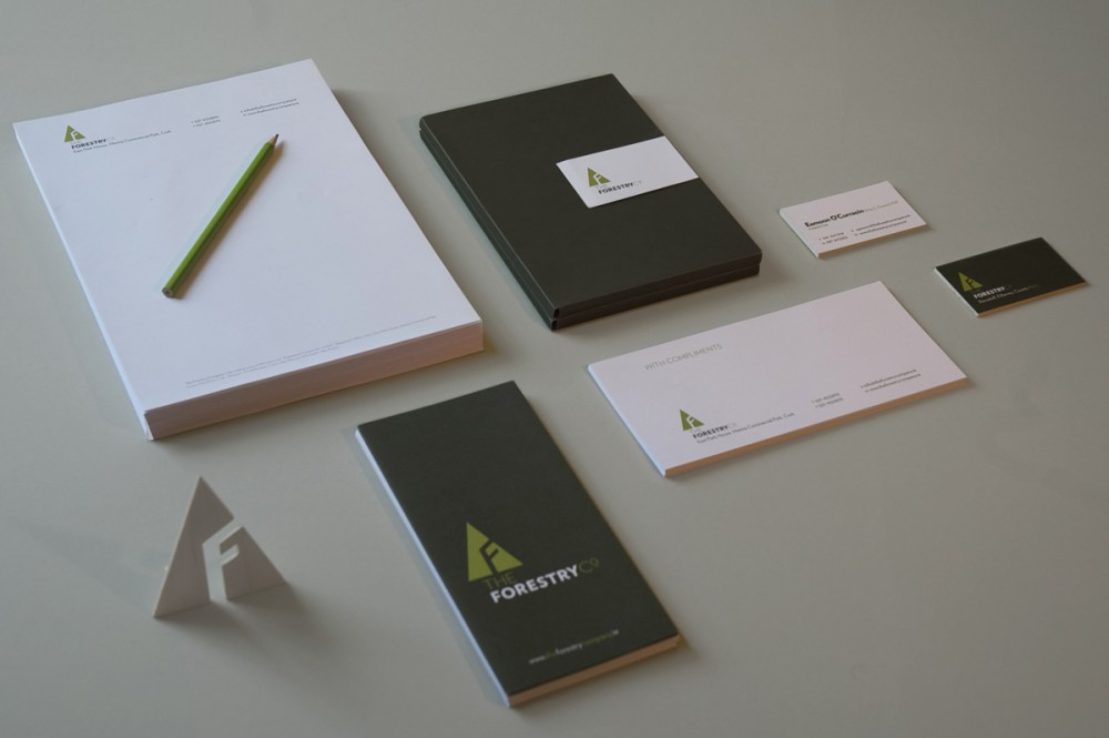
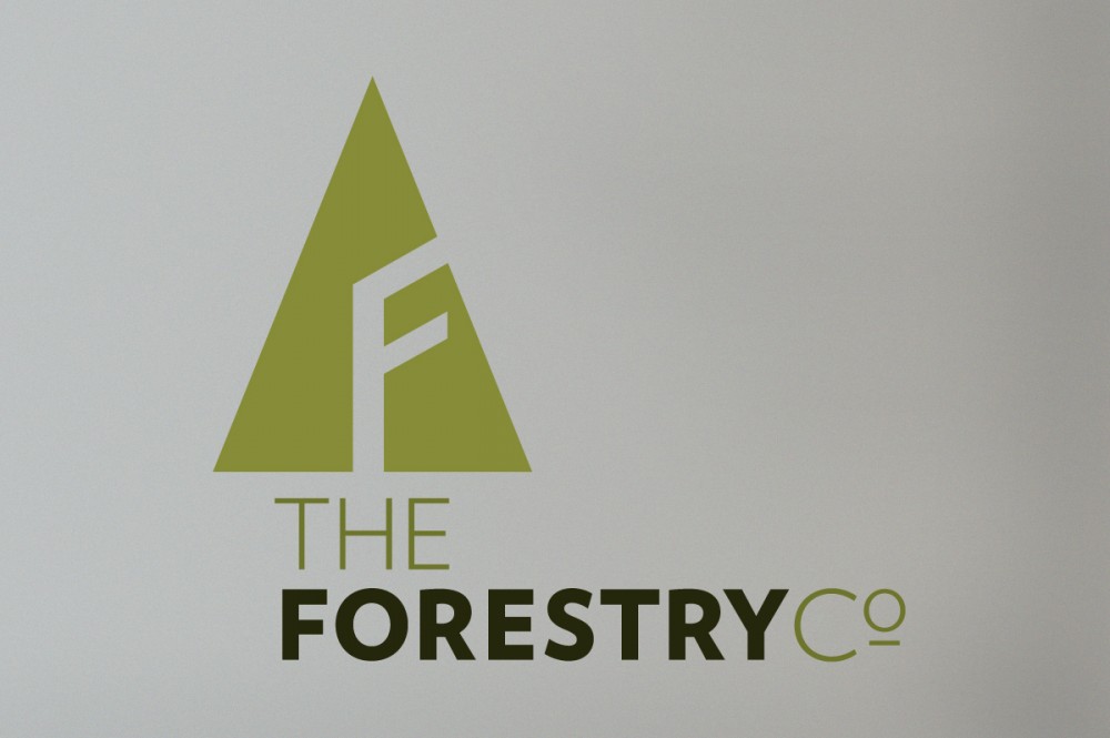
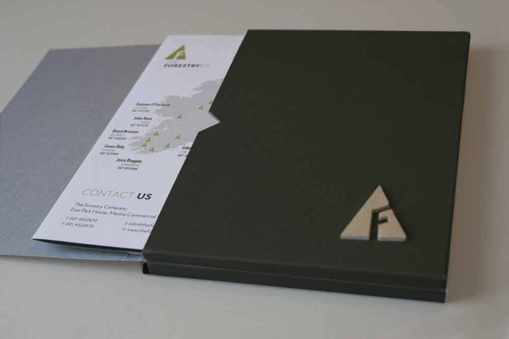
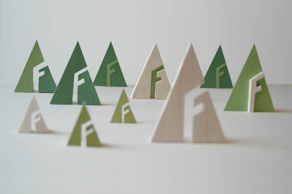
The Forestry Company specialise in all aspects of forestry management. The letter F references the form of a branch in a tree making a unique and intuitive symbol. The identity gives The Forestry Company clear standout from competitors. The Forestry Companies green credentials connects with market concerns through the use of uncoated stock throughout application and is also reflected in the colour choices.