the stationery store
2020
Designed by Marianna Mooney (Freelance)
Categories: Identity
Industry: Commercial
Tags: Retail / Stationery
Website: n/a
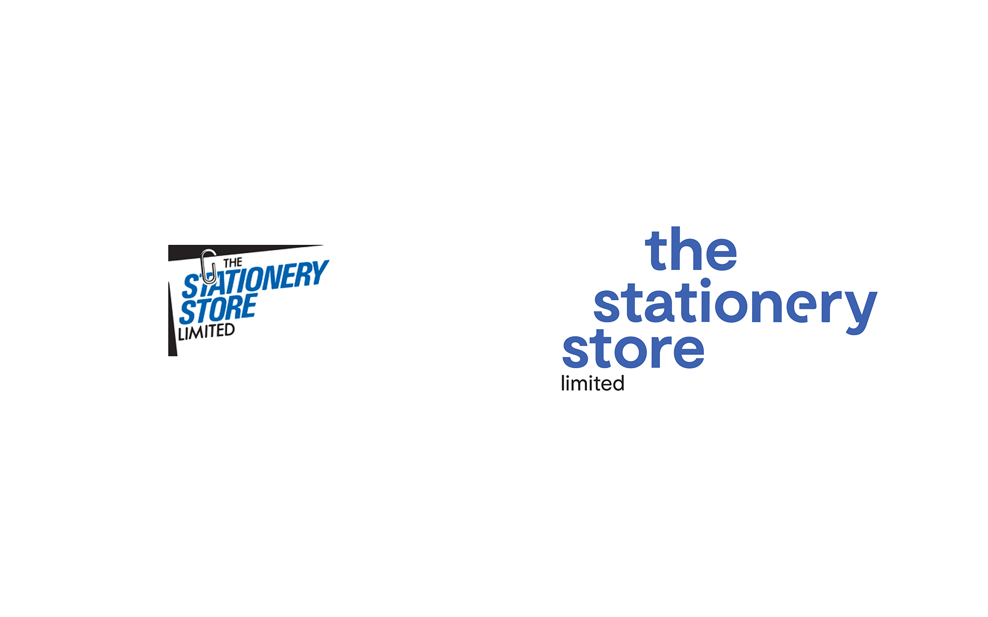
A family-run business, The Stationery Store has adapted and grown with the times, but their visual identity and brand remained the same from when they opened in 1984.
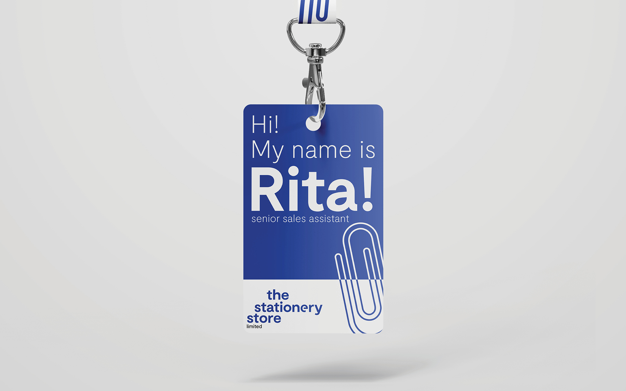
They were proud of their achievements and wanted their identity to reflect who they really were: friendly, considerate and knowledgeable. They wanted something that could be uniquely theirs.
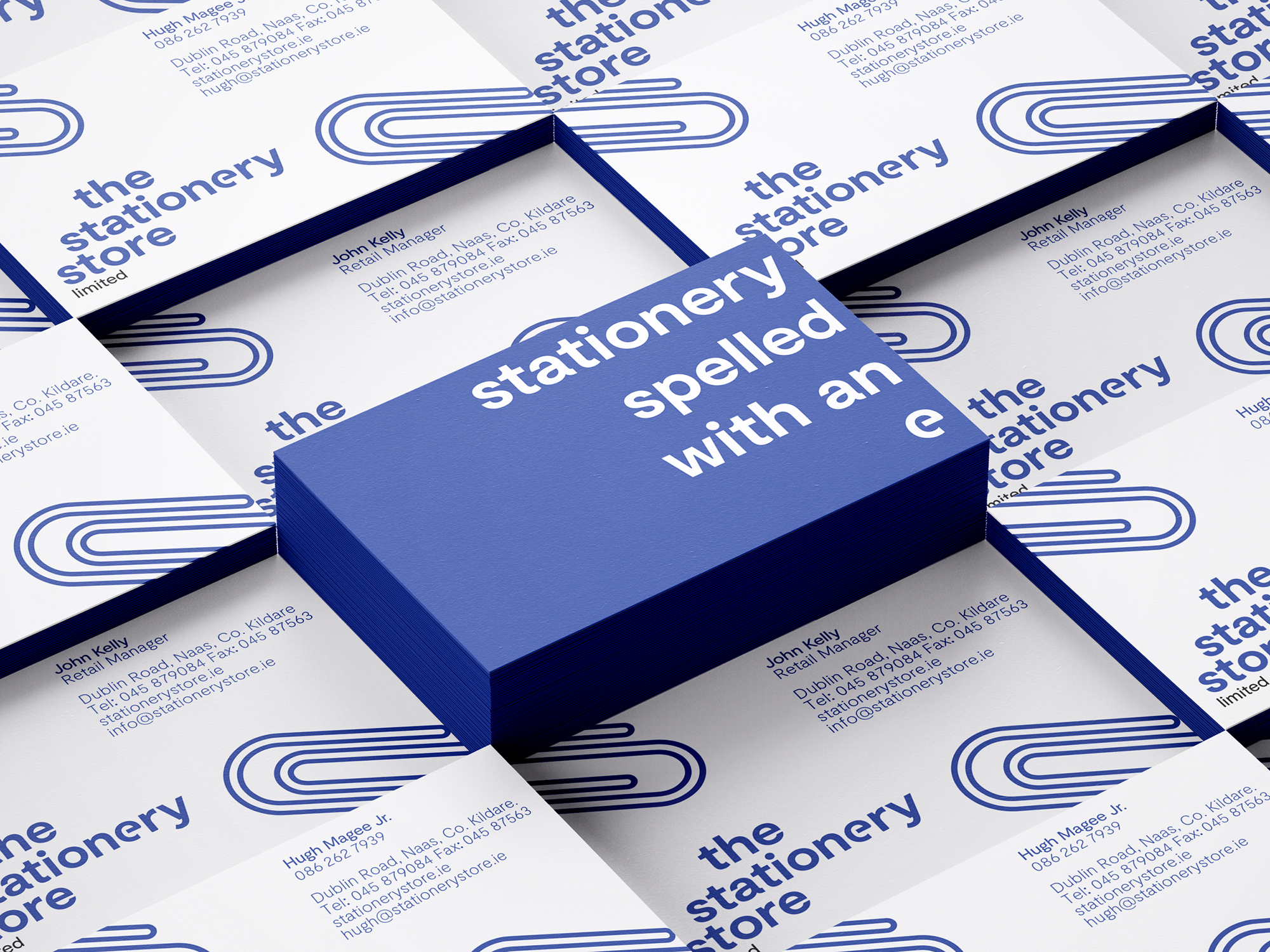
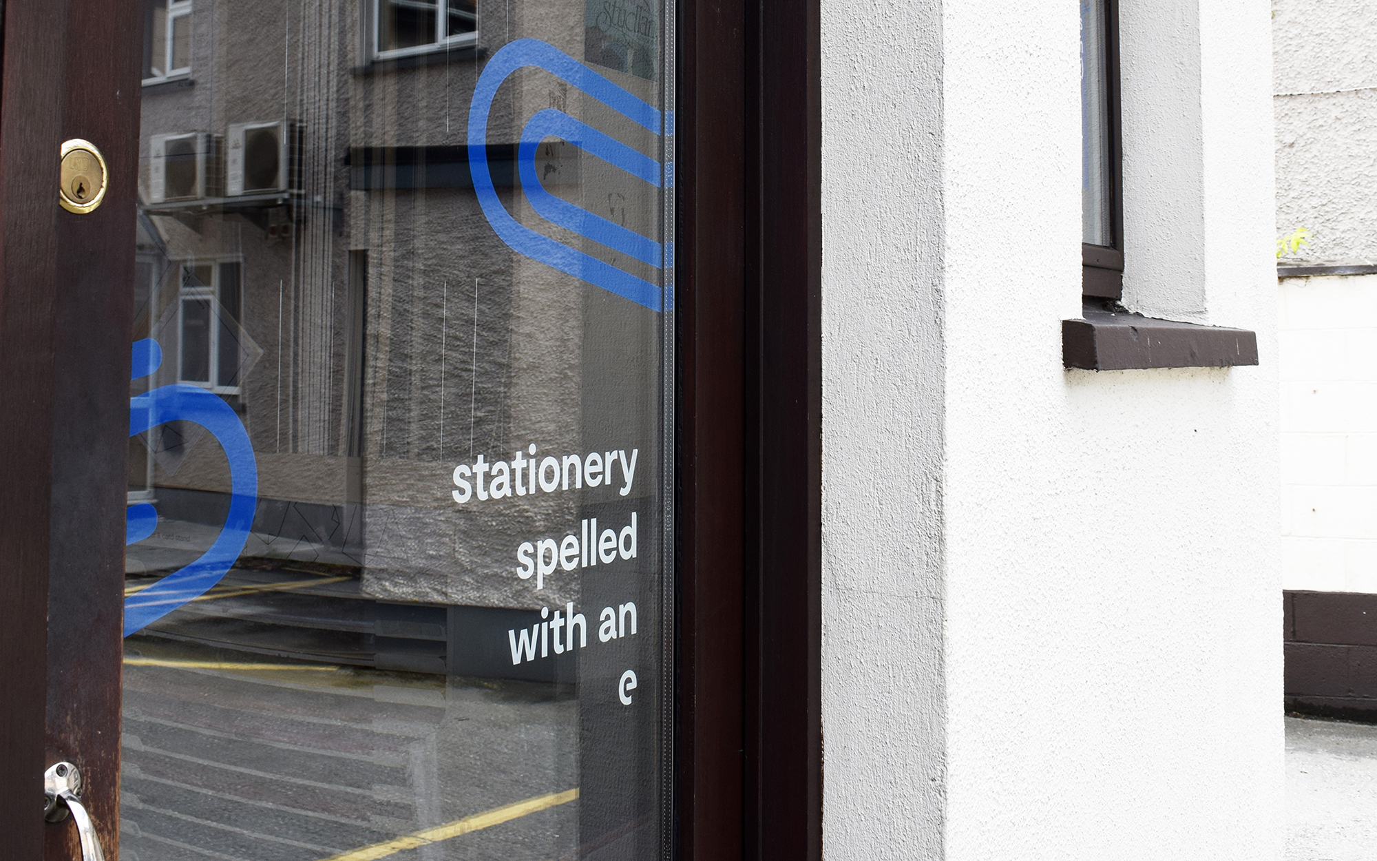
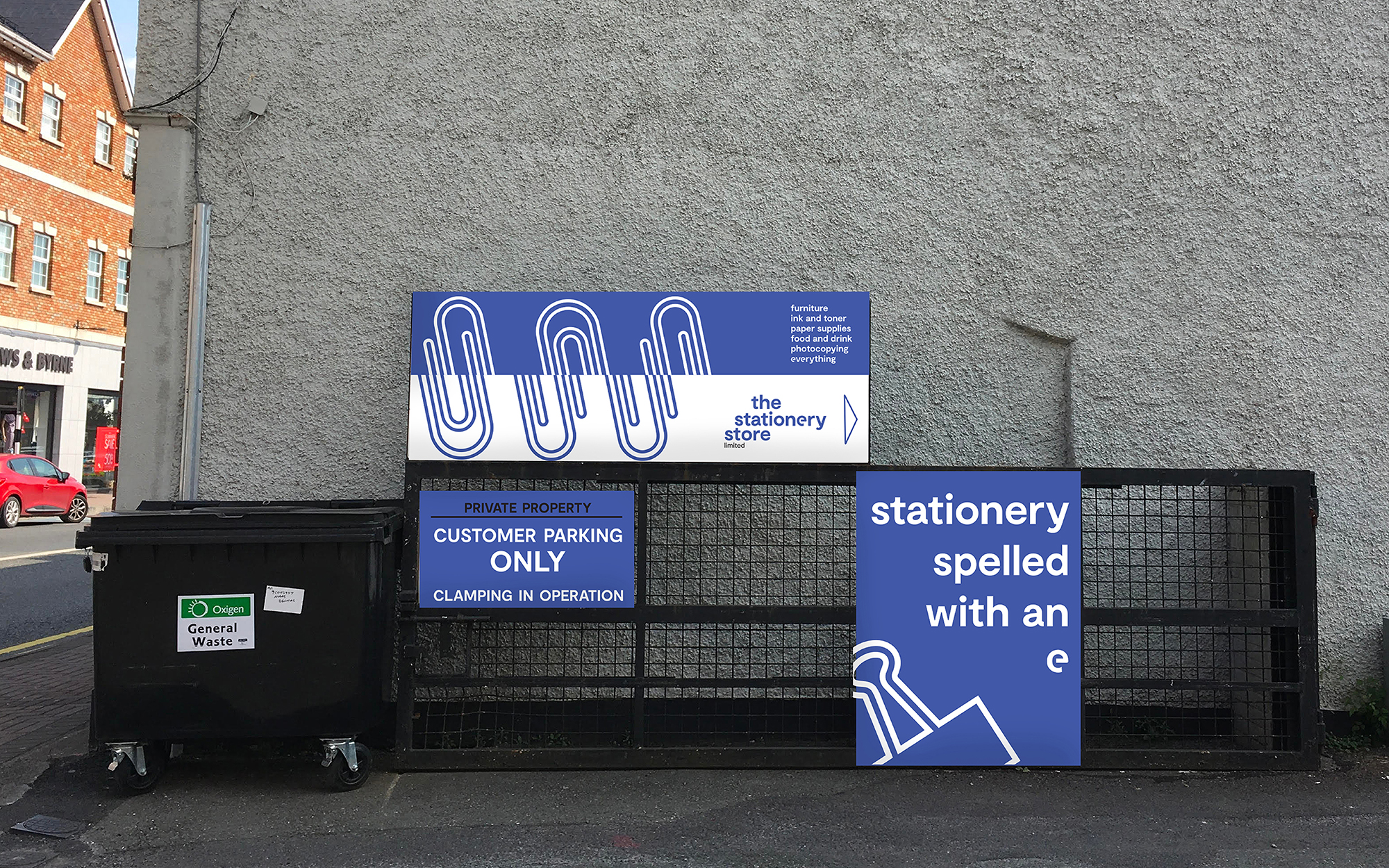
Doing in-person research with staff, one issue that came up was how people spell the word stationery. Stationary (with an a) is often used by visitors, and actually denotes the meaning of 'standing still.' Stationery with an e is meant for writing and office supplies. This might be a fun fact, but also: a problem when it comes to new customers contacting the shop, especially through email. If you spell it the wrong way, they might never hear from you.
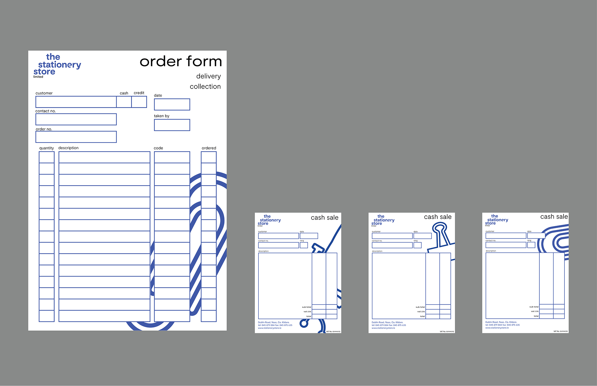
Embracing this as the tag line; an e has been specially adapted in the logomark to reflect the old branding. It's been 'cut' like a paperclip: another nod to the legacy logo they've worn proudly for the last thirty-six years. The logomark has now taken lowercase form; to represent the friendliness and openness the shop offers to their customers. The visual language has blossomed from this and the identity has been warmly welcomed by staff and locals.