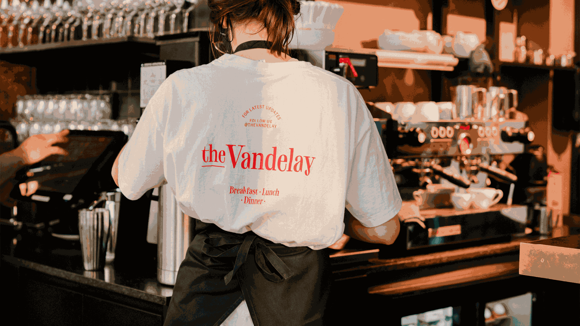
The Vandelay
2020
Designed by Evan McGuinness at Bielke+Yang
Graphic Design: Martin Yang
Graphic Design: Christian Bielke
Illustration: Ryo Kaneyasu
Animation: Steven Redwood
Development: Trond Mjøen
Music (casefilm): Christian Sol
Photography: Alexandra Gjerlagusen, Thomas Ekström, David Torch, Ronja Slar, Anders Husa
Categories: Identity
Industry: Commercial
Tags: Illustration / Typography / Food and drink / Restaurant / Identity
Website: thevandelay.no/
In 2020 the chef behind the three-star Michelin restaurant Maaemo, Esben Holmboe Bang, was to open his second restaurant in Oslo. Esben wanted it to be a neighbourhood restaurant for everyone. The Vandelay is located in Oslo's newest neighbourhood, a refurbished harbour now called; Oslobukta. At The Vandelay, you can enjoy an early breakfast with your friends, a Sunday brunch with your family or dine out on a Saturday night with a loved one.
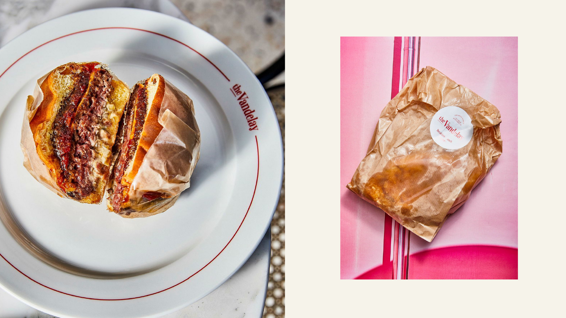
The menu at The Vandelay consists of uncomplicated dishes based on really good ingredients at an affordable price. Ranging from oysters to tartar and what was to become the most popular cheeseburger in Norway, Esben wanted to create a relaxed and inclusive atmosphere for everyone who visited. Since the opening of the restaurant in September, at the height of the pandemic, it seemed like this was exactly what the people of Oslo needed: a place where you could dream of better and brighter times. The Vandelay has soon established itself as one of the most popular spots in the city.
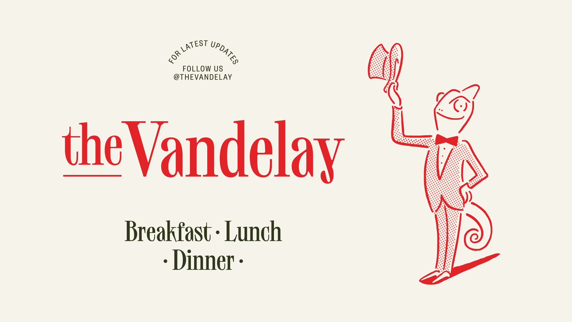
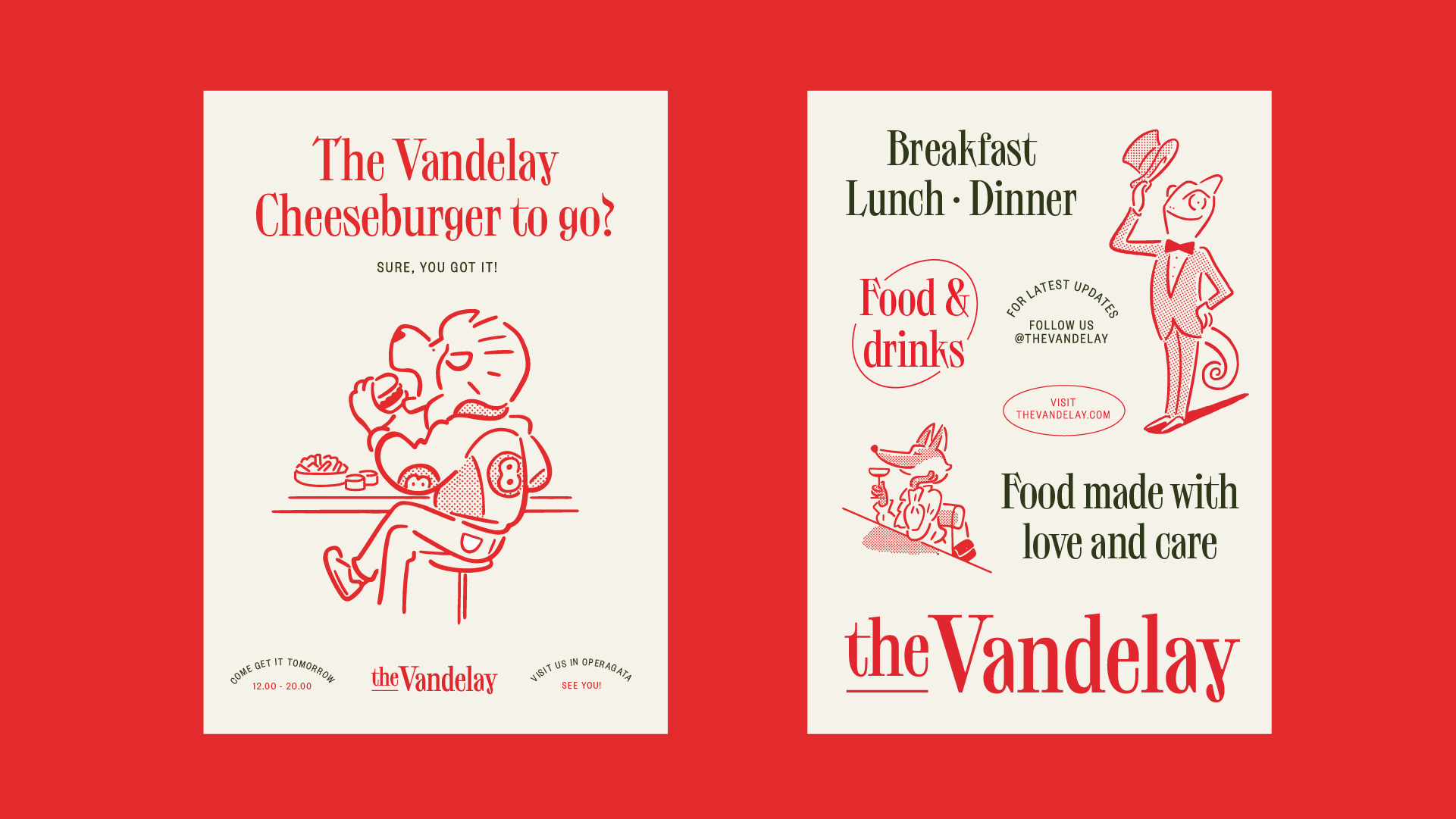
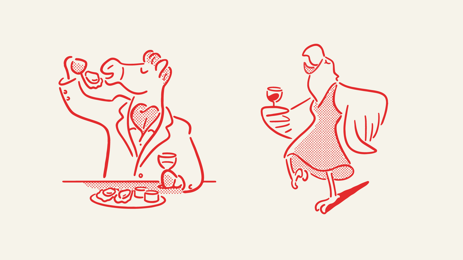
The name itself, The Vandelay, is inspired by the sitcom classic Seinfeld. In the TV show, the character George uses the name Art Vandelay to impress others in various social settings. Sometimes he pretends to be a writer, other times he's an architect. Using the name Art Vandelay, he can easily adapt to the situation – like a chameleon. The chameleon is therefore one of several characters you will meet as you enter the Vandelay universe.
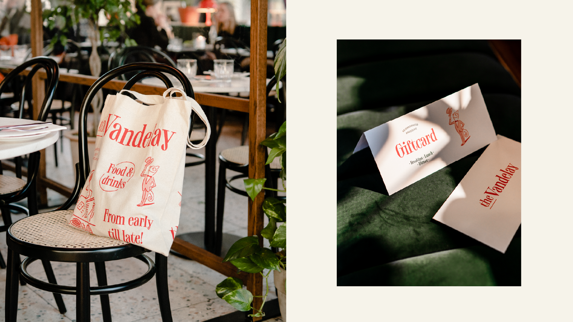
The identity points to details from a range of Seinfeld episodes. Including puffy shirts, an absurd dance, and a sombrero made for urban environments. The typography, the illustrations, and the colour palette all have references to the world of bistro esthetics, but with an added charm to make the whole expression more playful and less complicated. The profile is implemented on everything from dinner plates to uniforms, gift certificates, and tote bags. Animations work to add additional playfulness on digital surfaces, especially in social media – where thousands of food fans have lined up, ordered food, and engaged themselves in this new Oslo dining phenomenon throughout the pandemic.