The Walls Project Brand (2023)
Designed by Noelle Cooper, Colin Farmer, Chris Fullam, Colin Bergin and Alanna Drury at Unthink
Categories: Promotional / Identity / Moving Image / Experience / Social Media / Screen
Industry: Cultural
Tags: Poster / Typography / Digital / Campaign
Starting with an in-depth brand analysis workshop, we collaborated with the team behind The Walls Project to re-imagine their identity. We began the process with a redefined brand positioning and tone of voice. Community, the celebration of art and connection were the key pillars uncovered in the workshop forming the foundations for a new adaptable and aspirational visual language.
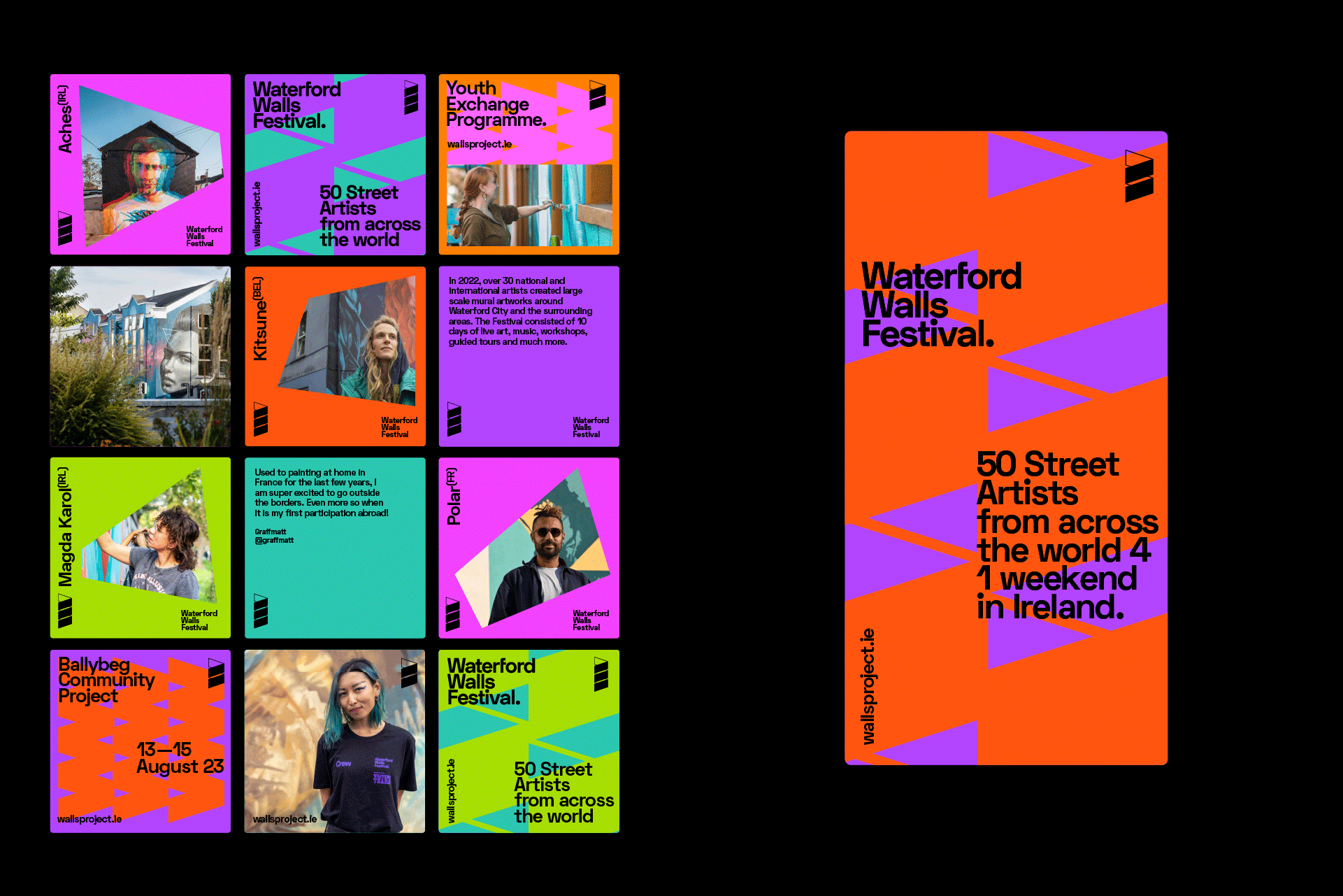
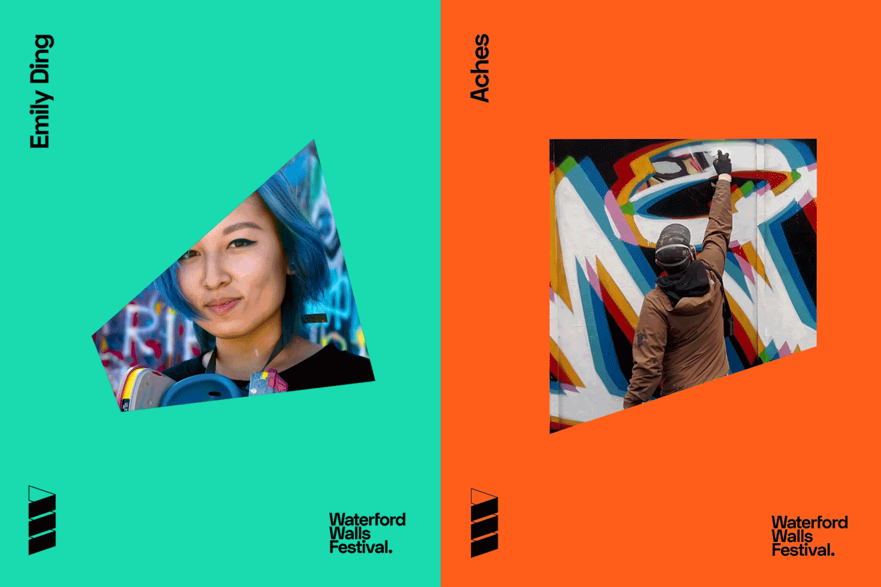
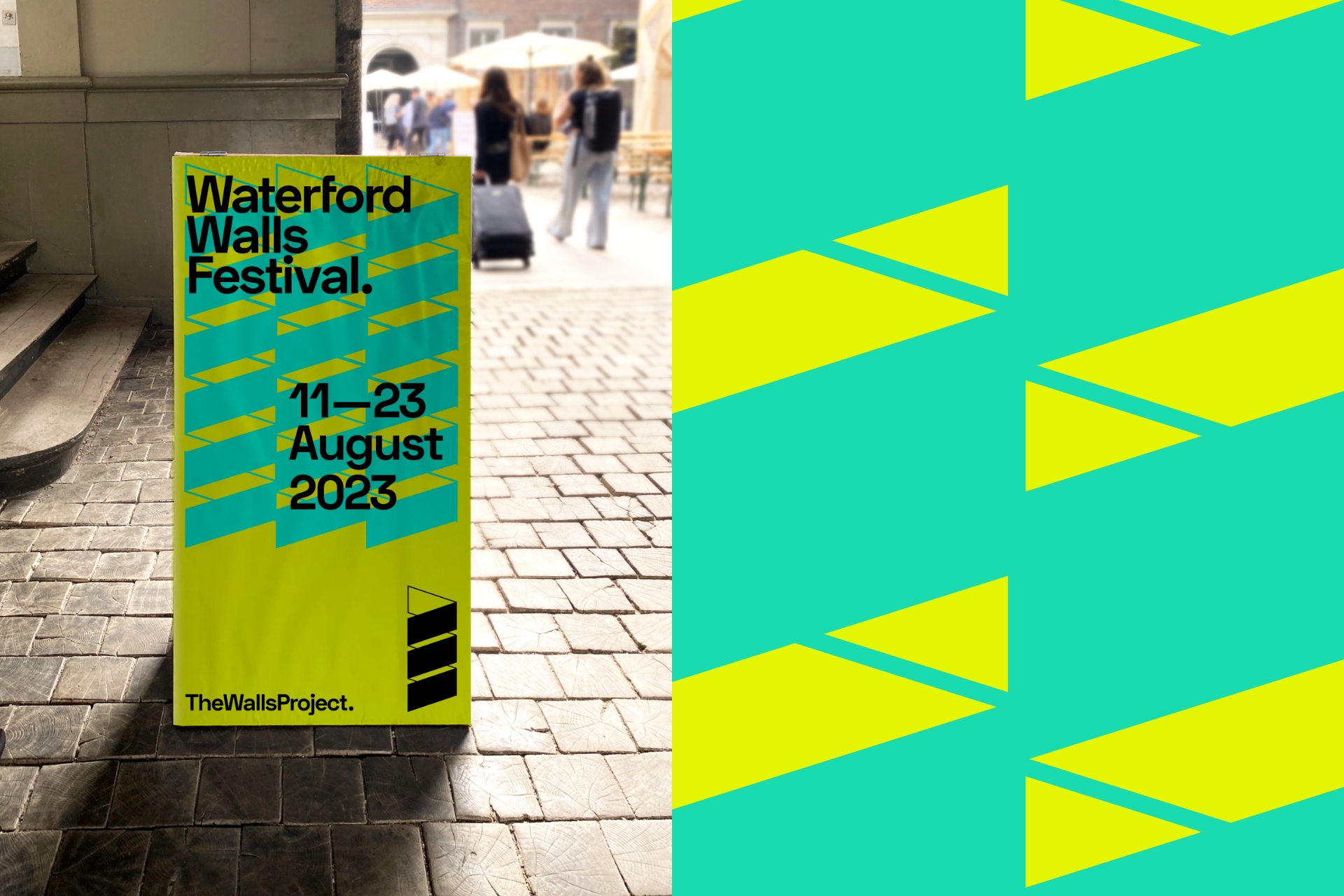
As part of the re-imagined brand for The Walls Project, the world-renowned Waterford Walls Festival also received a new identity that fits within The Walls Project family and better reflects the spirit of the annual festival.
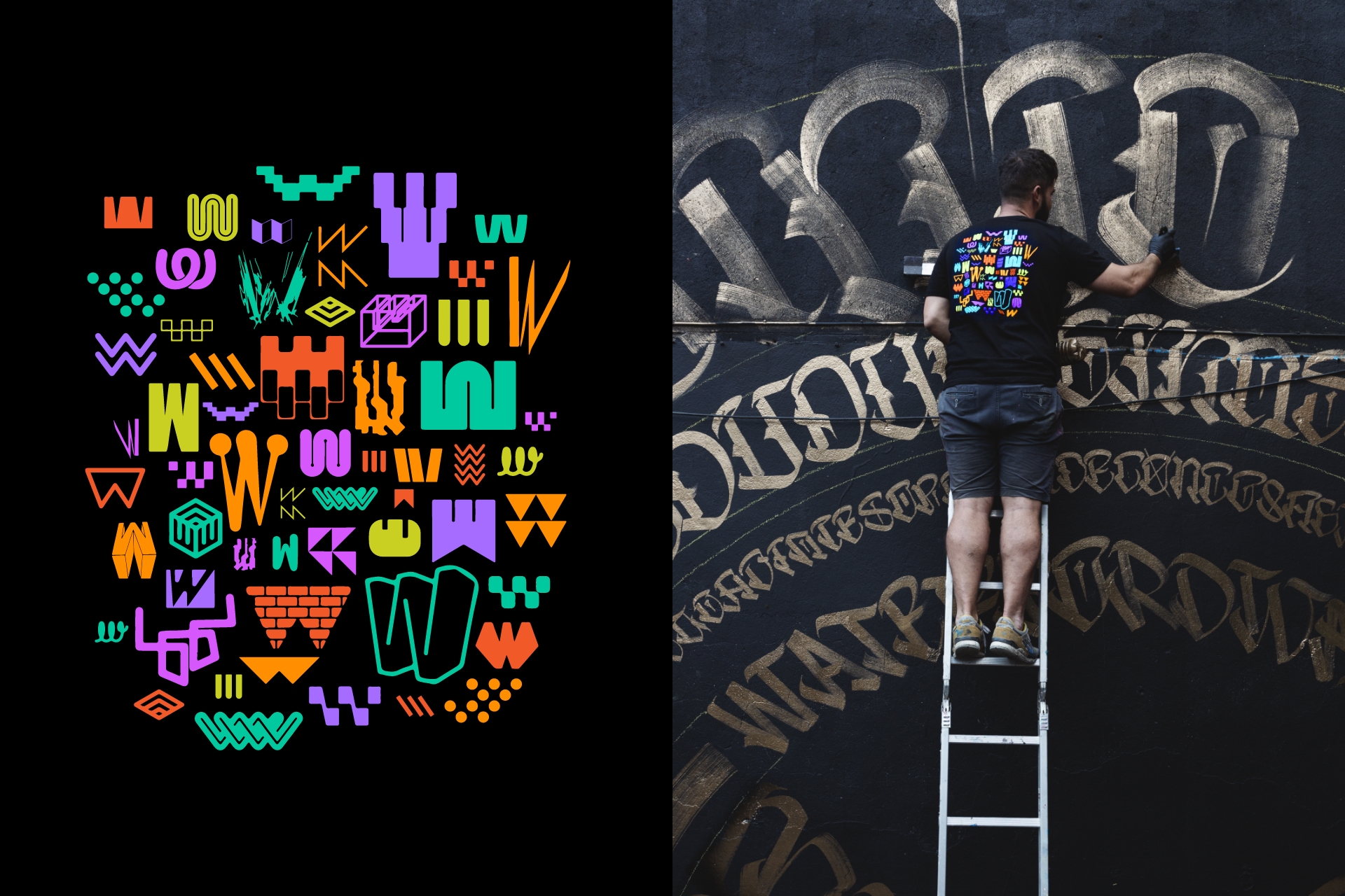
The new brands embody a restrained typographic expression of the organisation, reflecting their confident position as leaders in their field. Both logo symbols incorporate their initials ‘W’ while also inferring the corner at which two walls join adding depth and symbolism to their identity. They seek to support and compliment their extensive and exhilarating visual content provided by artists worldwide.
Alongside the extensive brand guidelines and tone of voice analysis, a range of print and digital outputs were created for the team to easily implement and adapt to their needs.
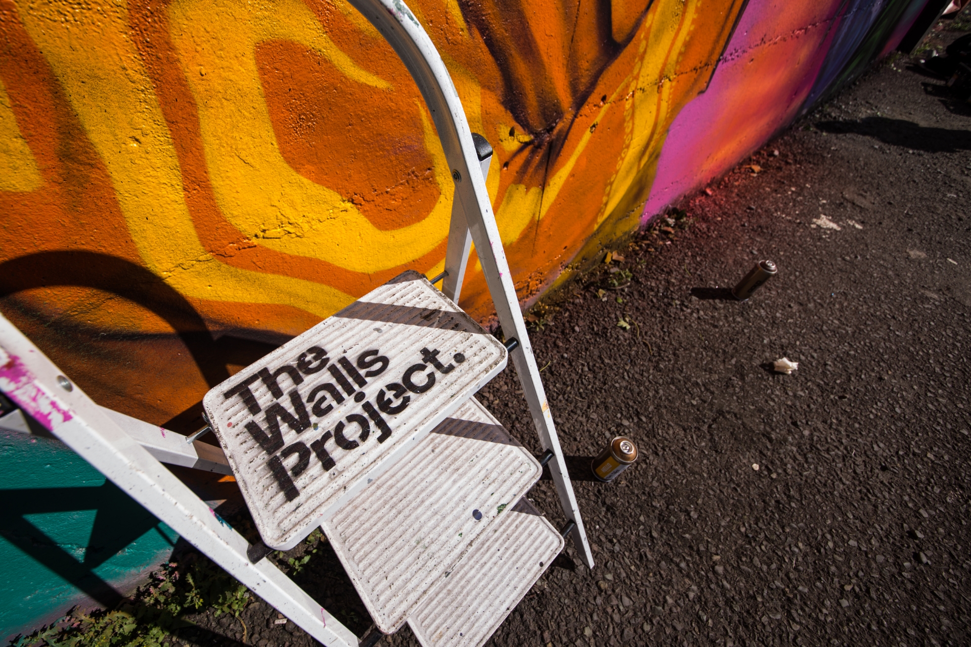
As an added bonus during our collaboration, the Walls team extended a special invitation to us, as artists, to design their annual festival t-shirt. For the concept, we chose to celebrate the unwanted W's that emerged during our early exploration for the rebrand, rather than dismissing them as redundant. This design would become an integral part of the weekend's attire and merchandise offerings.