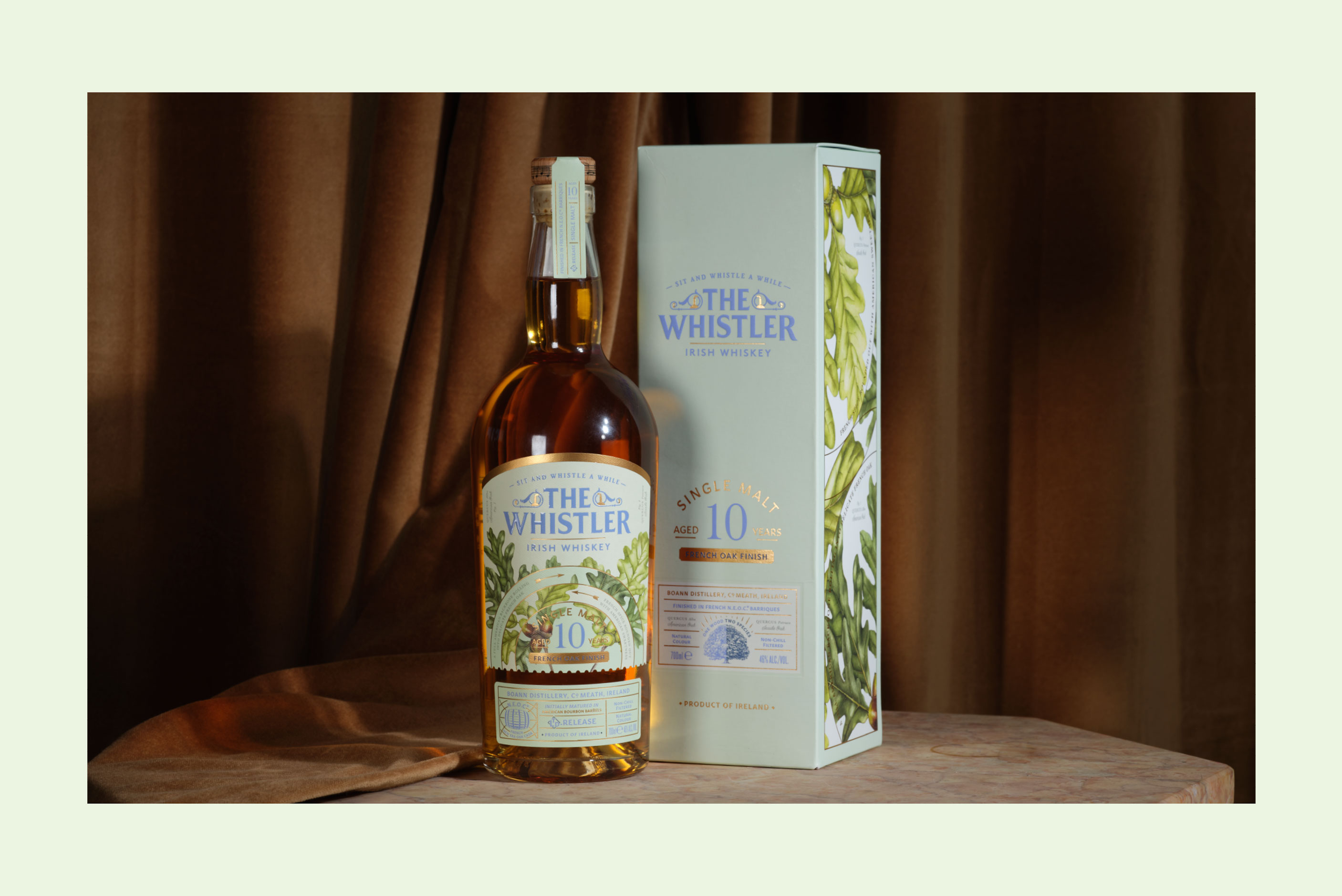
The Whistler 'French Oak' N.E.O.C 10 Y.O. Single Malt
2022
Designed by David Walsh at Greenhouse
Botanical Illustrations: Lynn Stringer
Illustrations: David Walsh
Categories: Packaging
Industry: Commercial
Tags: Illustration / Typography / Food and drink
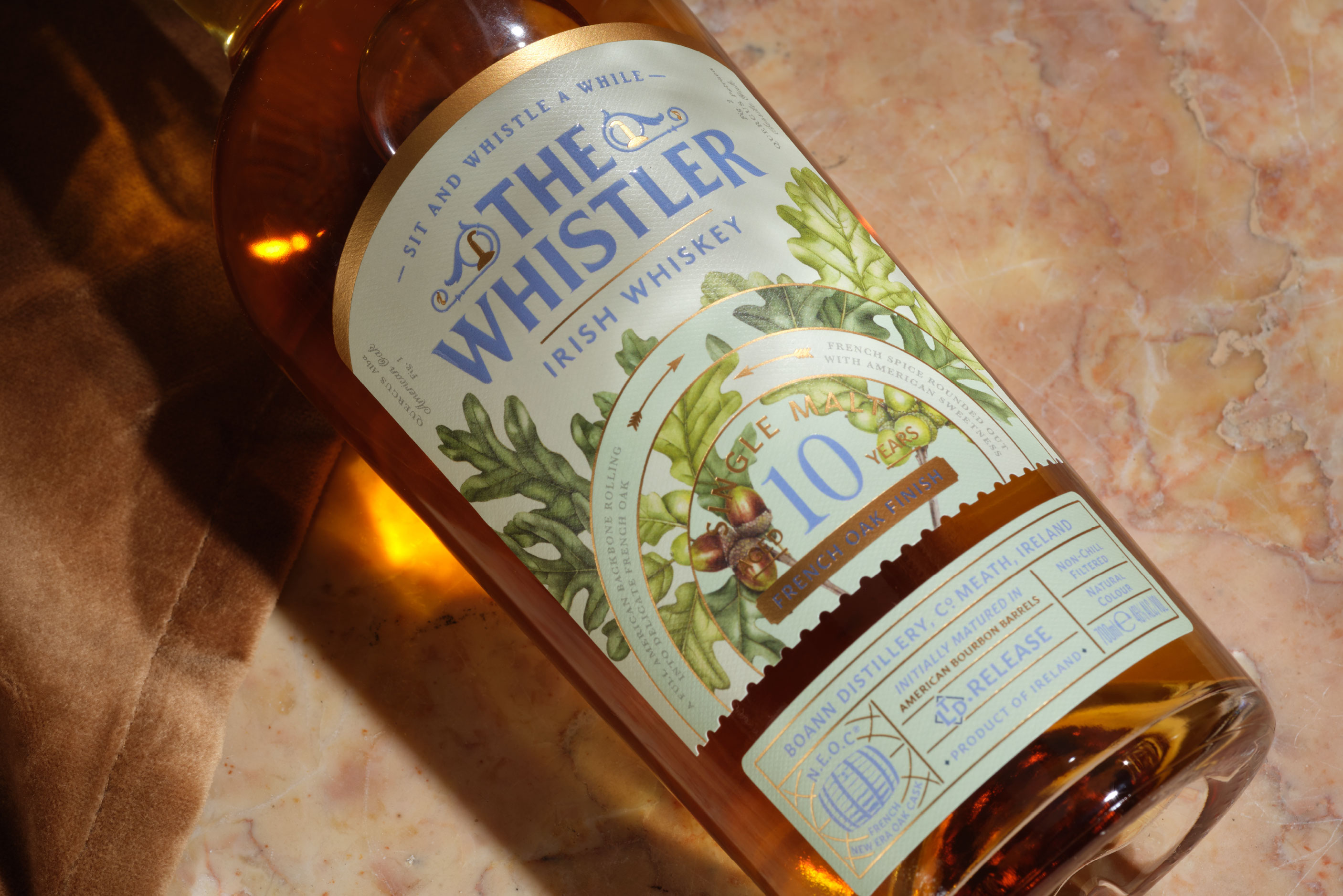
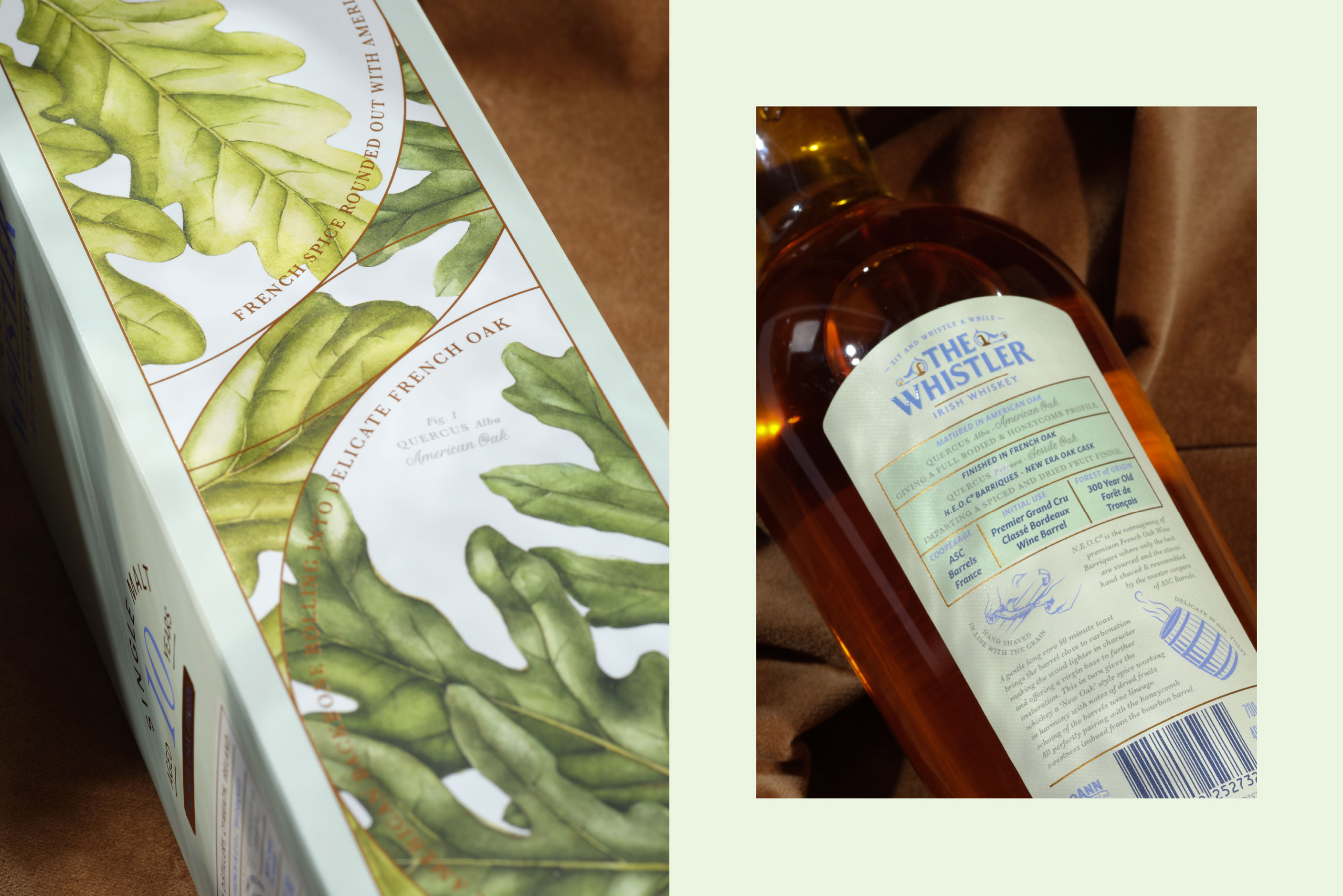
The Whistler is a brand with a vast catalogue of whiskeys. The brand is a creative exploration into whiskey finishing and as such the labels have a legacy of capturing this. With strong visual references to the origins of the finishing casks, they proudly portray the story each finish brings to Single Malt or a Blended Irish Whiskey.
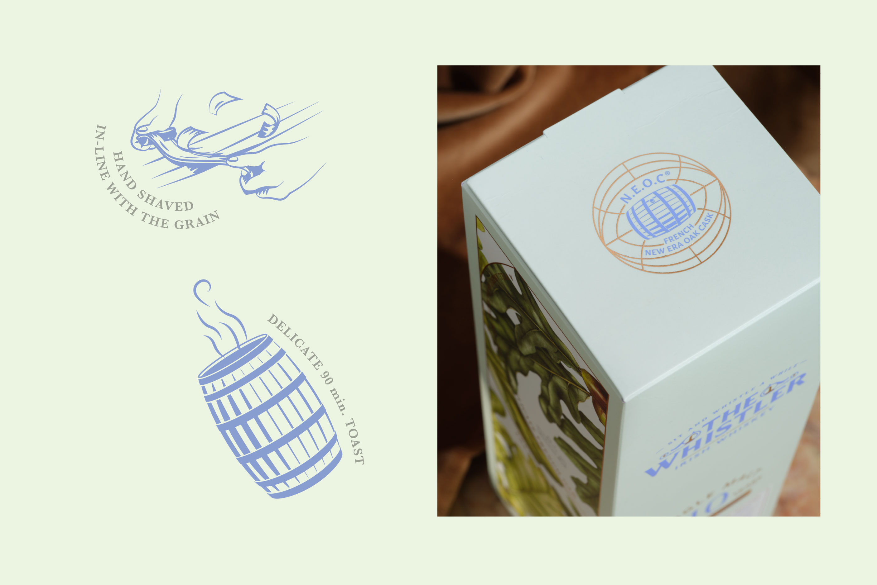
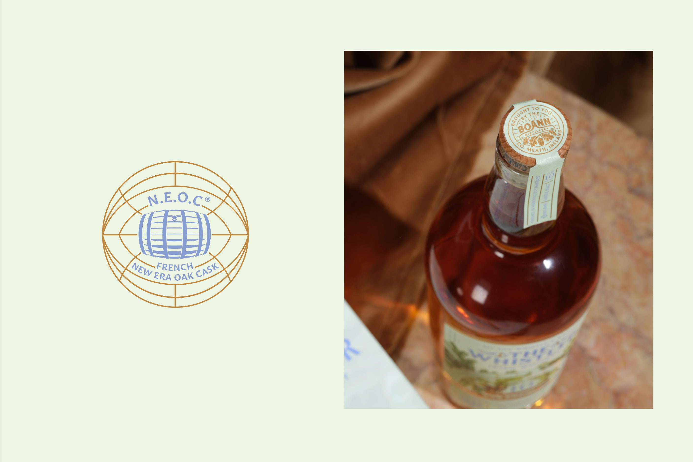
N.E.O.C (New Era Oak Cask) being such a recent development in the world of barrel refurbishment, it’s process gives lighter and spicier ‘new-oak’ flavours to the whiskeys that are finished in these casks. This was the cusp of the idea to visually tell the story of this new whiskey finish.
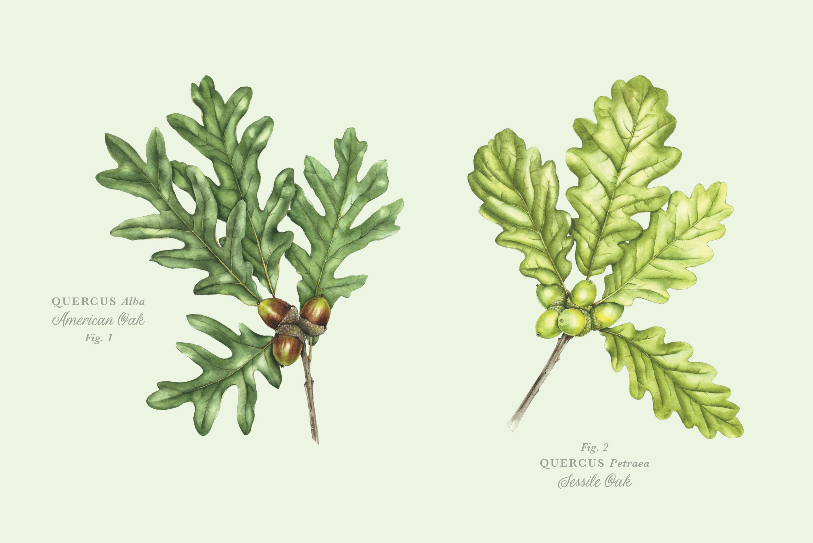
Light colours and botanical illustrations would work as the framework of the label where we developed a rotating structure outlining how the Bourbon barrel ageing and N.E.O.C finishing work together. The two different species of oak - American oak and European oak - became a hero feature and visual icons for each of the casks. Working with the botanical illustrator Lynn Stringer, we championed these beautiful illustrations by giving them their botanic Latin names and ownership of the main label.
This N.E.O.C process being a very recent development in the whiskey world, we set about explaining this new process on the back label to better inform the consumer and to reinforce how special this new release is. A series of illustrations created in-house tell this story in a more visual way to aid people in understanding.