tHERE
2025
Designed by Ellen Martin-Friel
Author: Pauline O'Connell
Boxmaker: Elize de Beer
Categories: Printed Publication / Print / Editorial / Publication
Industry: Self-initiated
Tags: Typography / Visual art / Publishing / Craft / Letterpress
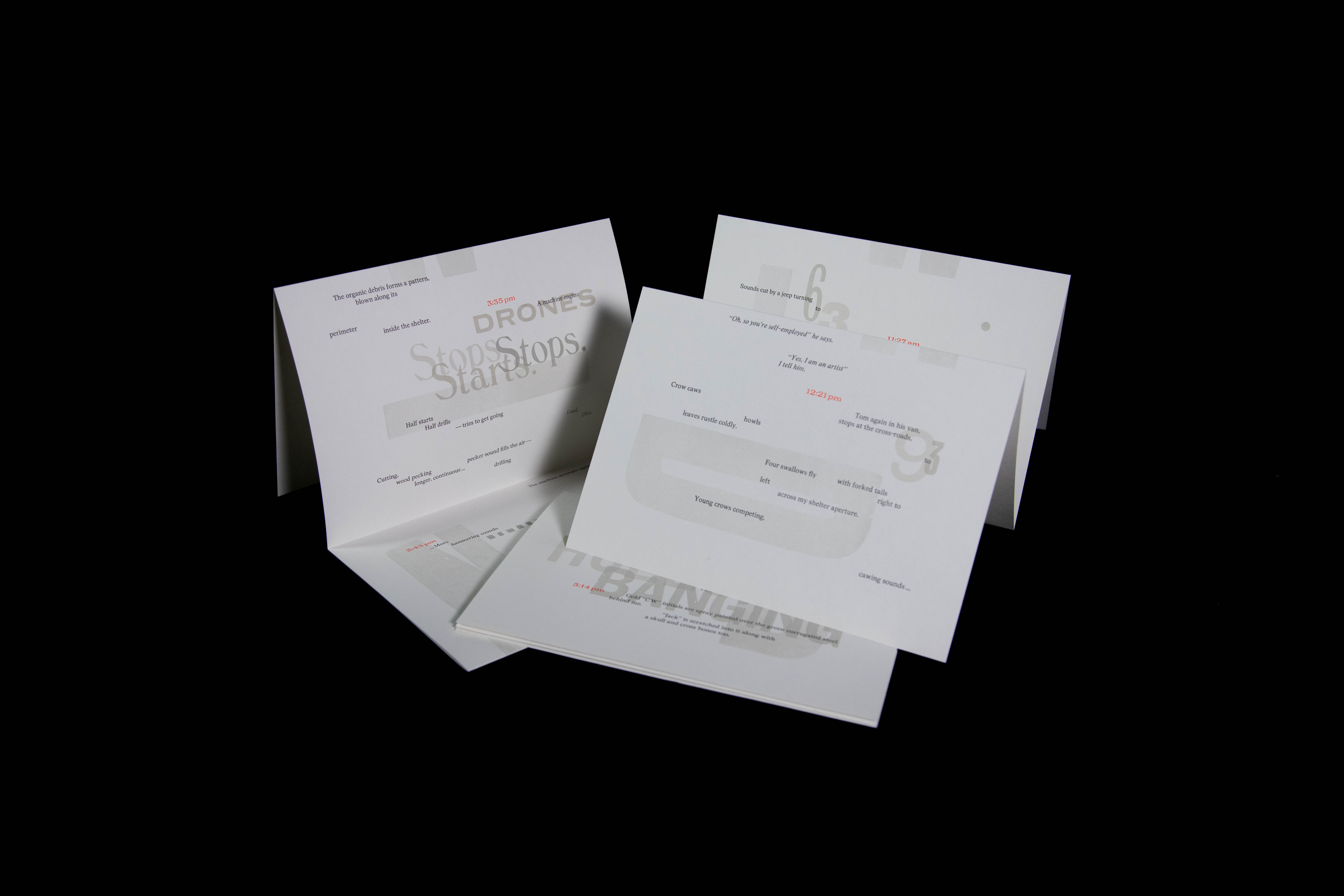
tHERE is an artist book produced through letterpress inspired by George Perec’s performative writing methodology in his 1974 work ‘An Attempt at Exhausting a Place in Paris’, whereby he observed and documented seemingly insignificant happenings around him over the course of multiple days. tHERE reimagines this immersive exercise, with artist Pauline O’Connell observing a rural crossroads in Kilkenny from a steel bus shelter over the course of three days.
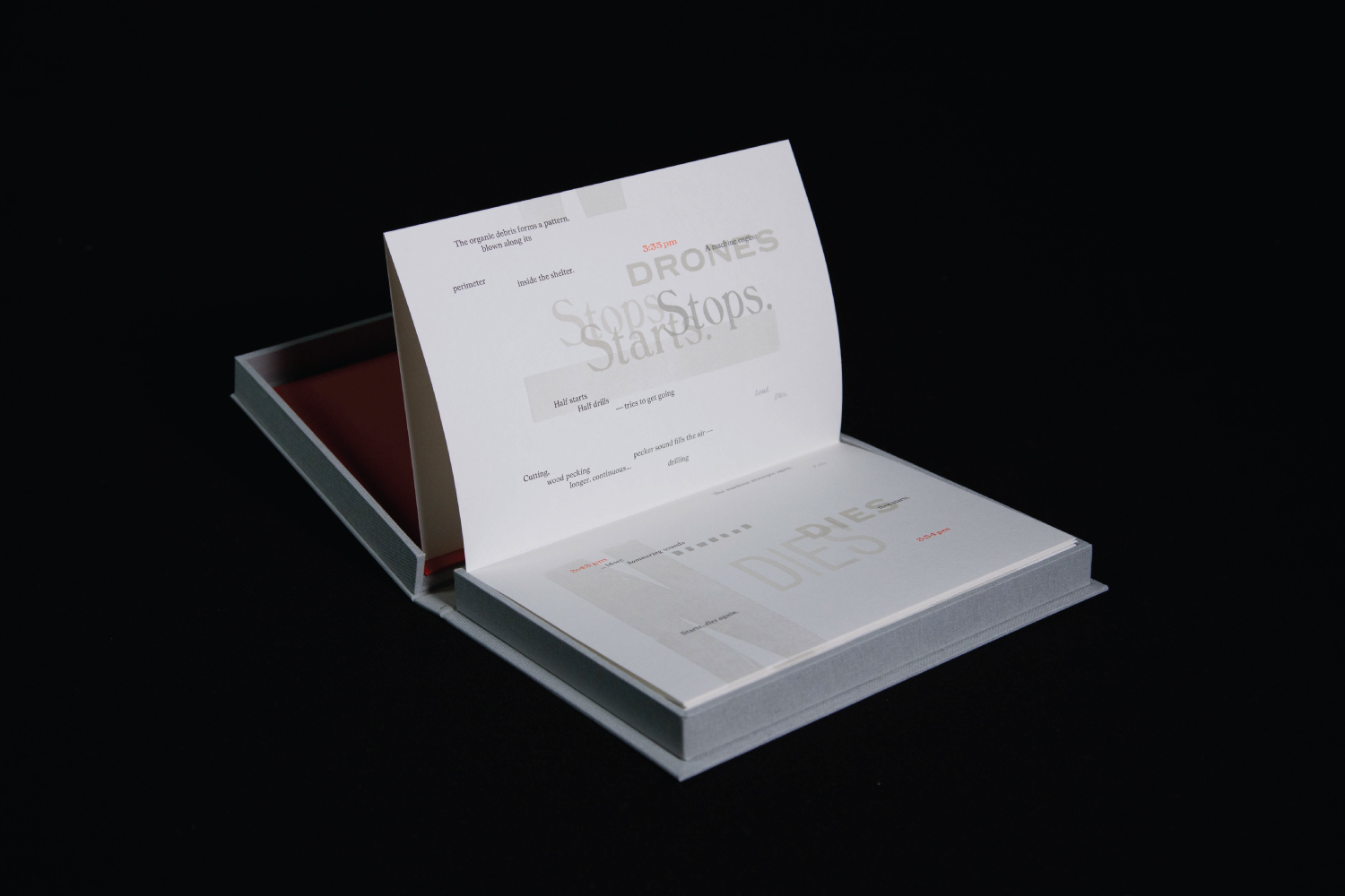
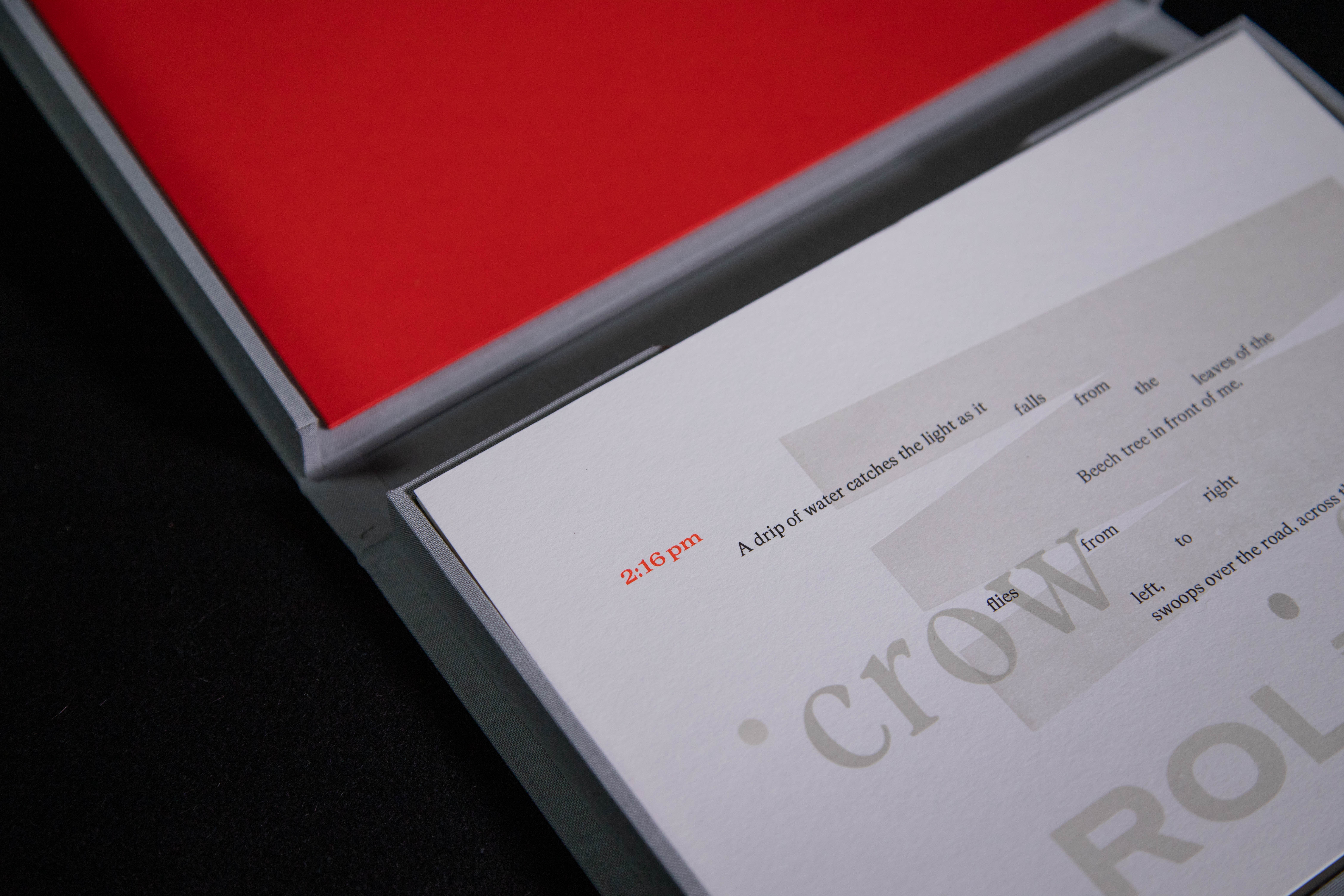
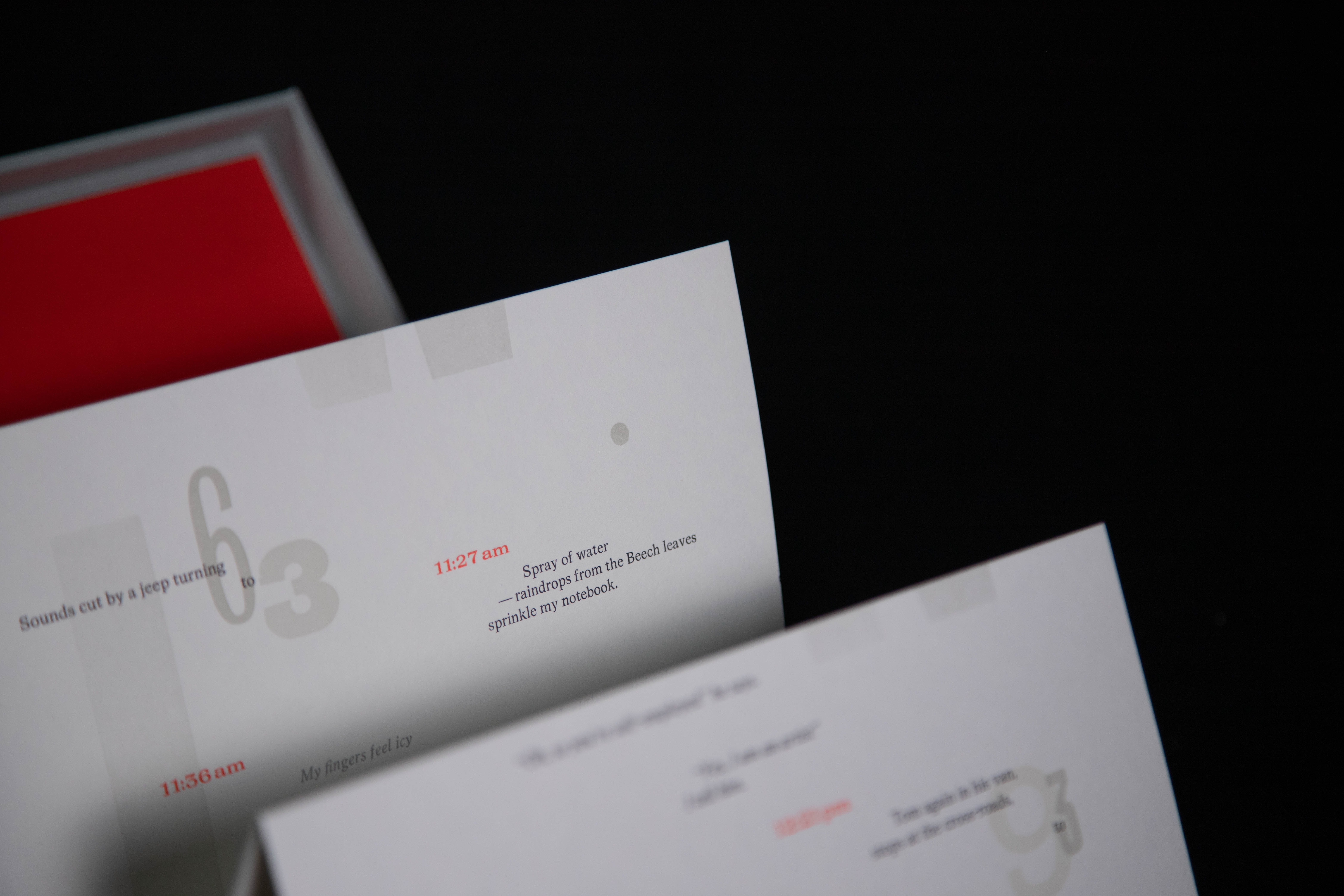
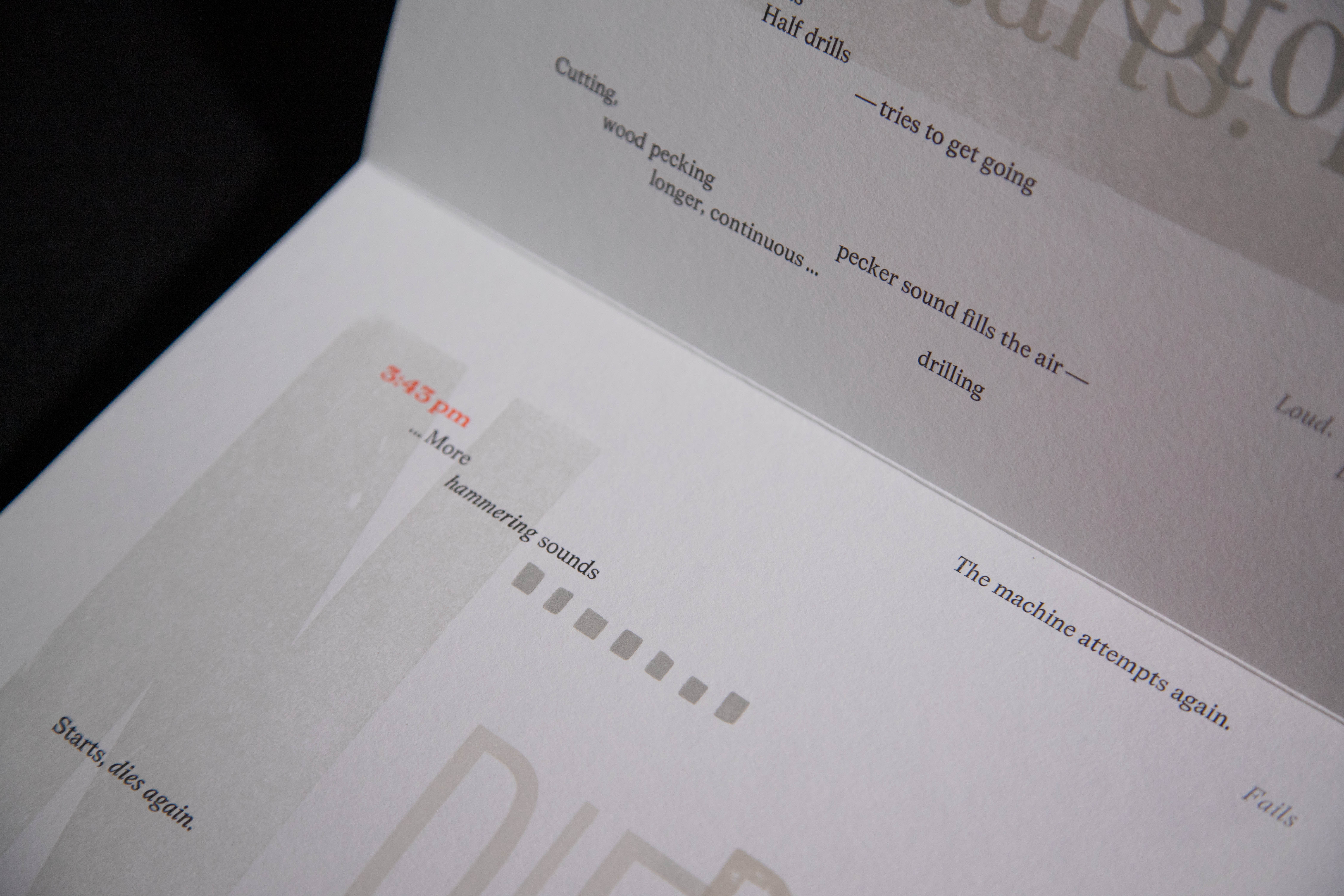
Using typographic devices and playing with opacity and scale, this designed representation creates a dynamic interplay between narrative threads while evoking sensory stimuli described in the writing. The text flows directionally – dropping, rising and shifting in perspective – and is punctuated by timestamps marking the chronological nature of the piece. Presented as accordion-folded loose leaves, the book forms a triptych representing the three days of performative writing, with the folded panels taking on a sculptural quality reminiscent of the corrugated metal shelter. Through the act of unfolding, the reader can reorientate themselves, in time and place, to the crossroads where O’Connell observed the minutiae of everyday rural life.
Magister (Aldo Novarese, 1966) is used in 12pt metal type to underscore a narrative thread, utilising large indents and meandering text to illustrate the fluid nature of observation and thoughts. An interior dialogue element pertaining to the author's physical sensations are highlighted in silver Magister italic. A range of larger wooden display typefaces of various line heights convey the acoustic elements within the text, with grey tones overprinted in places marking moments of intensity and loudness denoting construction sounds, car engines, and the cawing of birds. Full stops printed from wooden type punctuate physical sensations such as raindrops, and metal 'rule' (leading built up to type-high) is printed to illustrate the corrugated metal of the bus shelter. Neon red timestamps set in Magister Bold Extended mark the chronological nature of the piece and indicate the author sometimes becoming lost in thought before pulling her attention back to the present. Due to the upland area where the writing took place, the wind was omnipresent in the text. This recurrent word 'wind' is redacted from the text and instead printed as a base layer in 40-line type (480pt) in an almost transparent silver. This feature appears on each panel / day in different orientations and forms the foundation for the rest of the design.
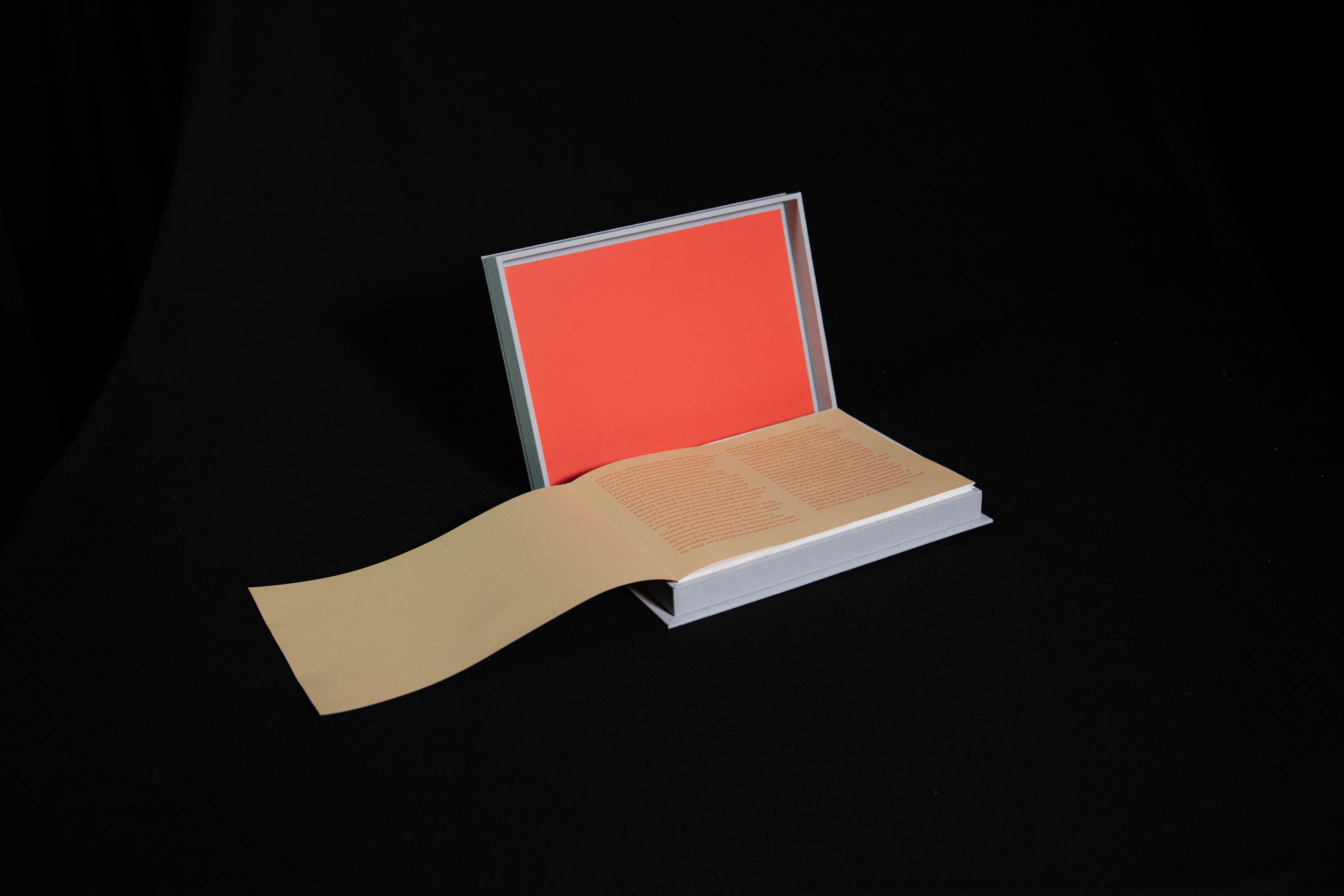
Designed, typeset by hand and printed by Ellen Martin-Friel. Paper is 180 gsm Fedrigoni Materica. The book is accompanied by an additional notes / colophon page. Printed in an edition of 75 numbered copies signed by both collaborators and housed in a cloth-covered solander box lined with Fedrigoni Sirio, crafted by Elize de Beer at her studio in Cork City.