Three — Brand Evolution
2012
Designed by Barry Smith, Patrick Horan and Shane Casey at Boys and Girls
Creative Director: Kris Clarkin
Head of Digital: Shane Casey
Digital Producer: Tom O'Reilly
Web Developer: Brendan MacDonagh
Account Director: Andrea Dalton Doran
Categories: Identity / Moving Image
Industry: Commercial
Tags: Typography / Advertising
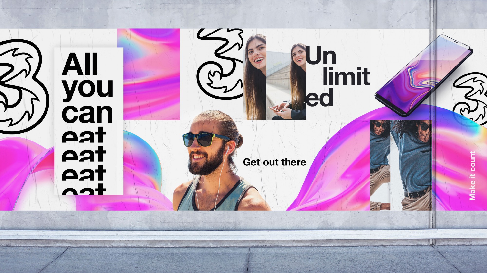
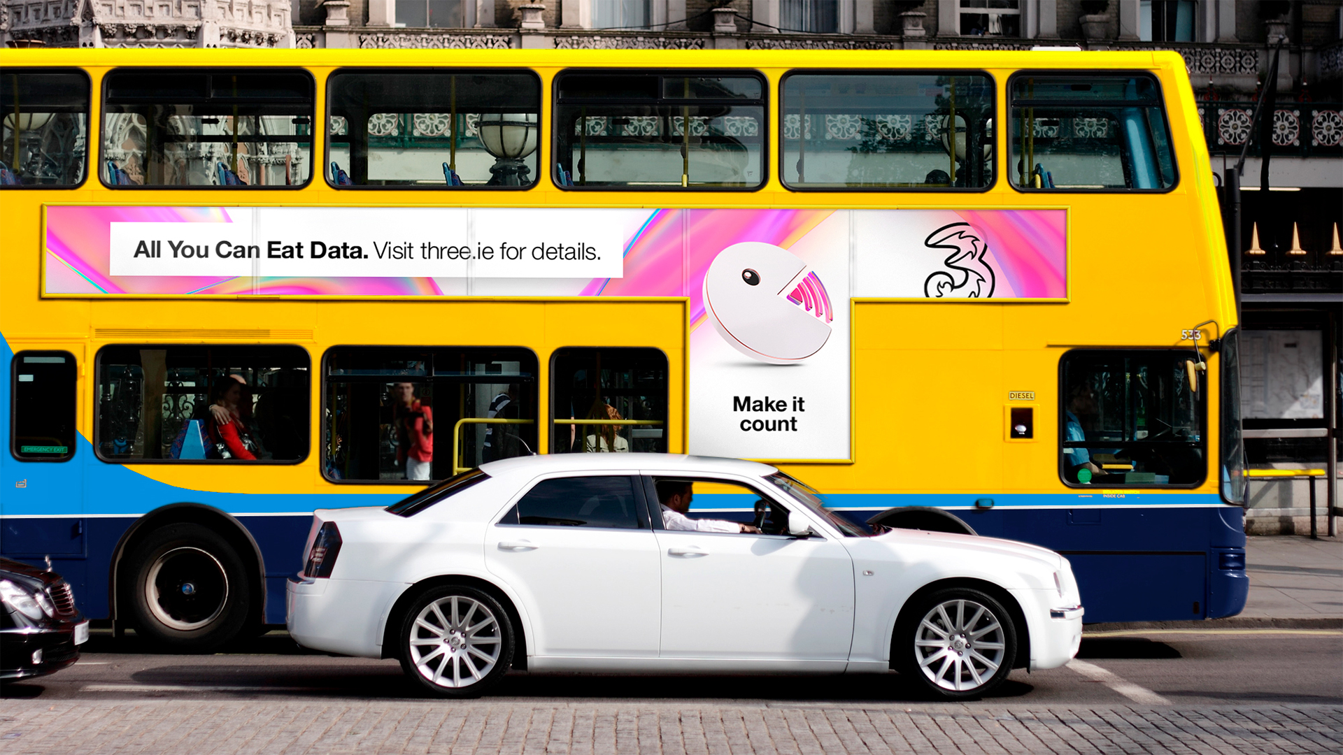
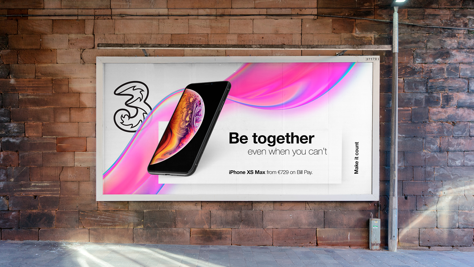
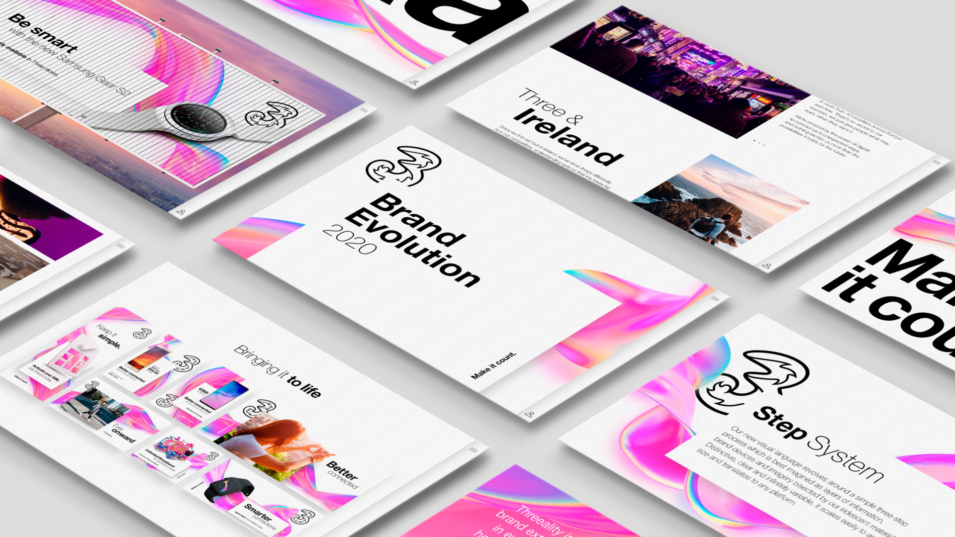
With a rapidly-evolving global landscape of channels for brands to communicate through, the challenge was to develop a unique and contemporary design system to help unify Three’s messaging. From social posts in Ireland to print ads in Hong Kong, everything needed to look like it belonged together. It also had to be flexible enough to adapt to the content, while still being unmistakably Three.
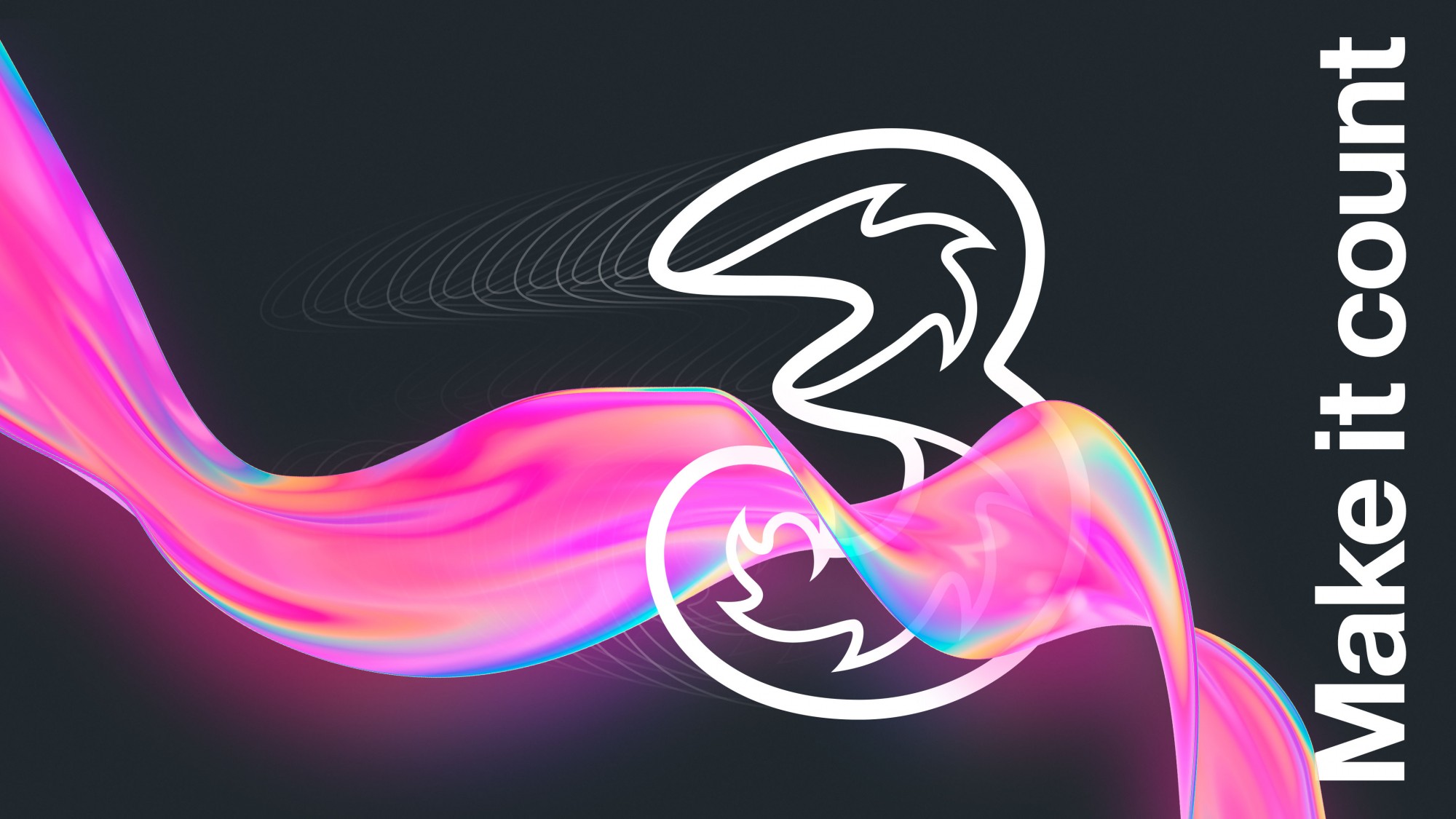
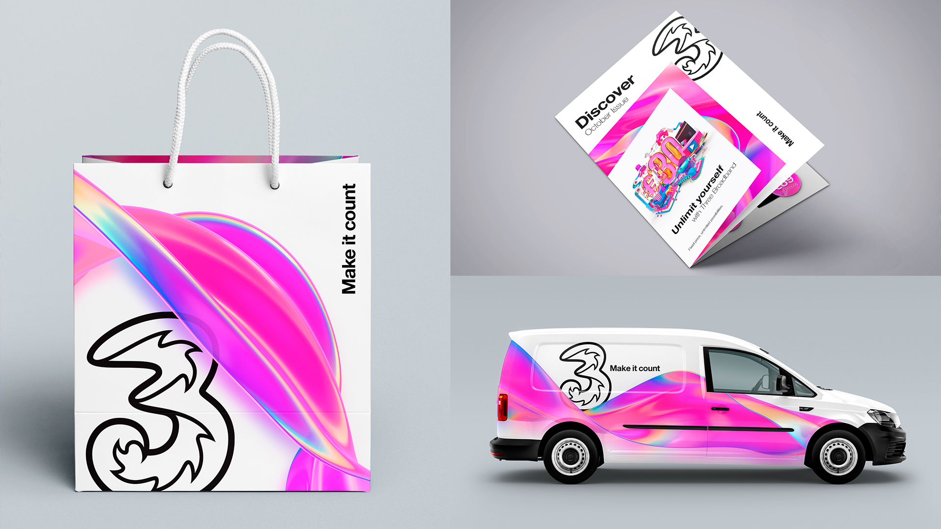
We wanted to capture the space where our real lives and our digital ones meet, to show the connections that Three make possible. It’s not quite real, not quite fantasy, but a blurring of the two we’ve called ‘Threeality’.
‘Threeality’ influences every visual element of the brand expression. You can see and feel it in everything from how images are created to how colour is used and even how brand experiences are shaped. We paired this with ‘Living Colour’ which adds emotion and vibrancy to the communications by creating a shimmering, iridescent ribbon that’s always in motion.
Our new visual language revolves around a simple three-step system, best imagined as layers of information, brand devices and imagery interacting with our iridescent material.
We also built a custom brand portal where the brand guidelines could work their magic. It’s a vital resource enabling markets across the globe to really get to grips with the system and even download all of the brand assets too.