Tilting the Lens Website
2025
Designed by Declan Behan and Diarmuid Slattery at New Graphic
Developer: Daniel Costello
Project Manager: Karen Connolly Heery
Content Creation: Michelle Walsh
Categories: Website
Industry: Commercial
Tags: Digital
Website: tiltingthelens.com/
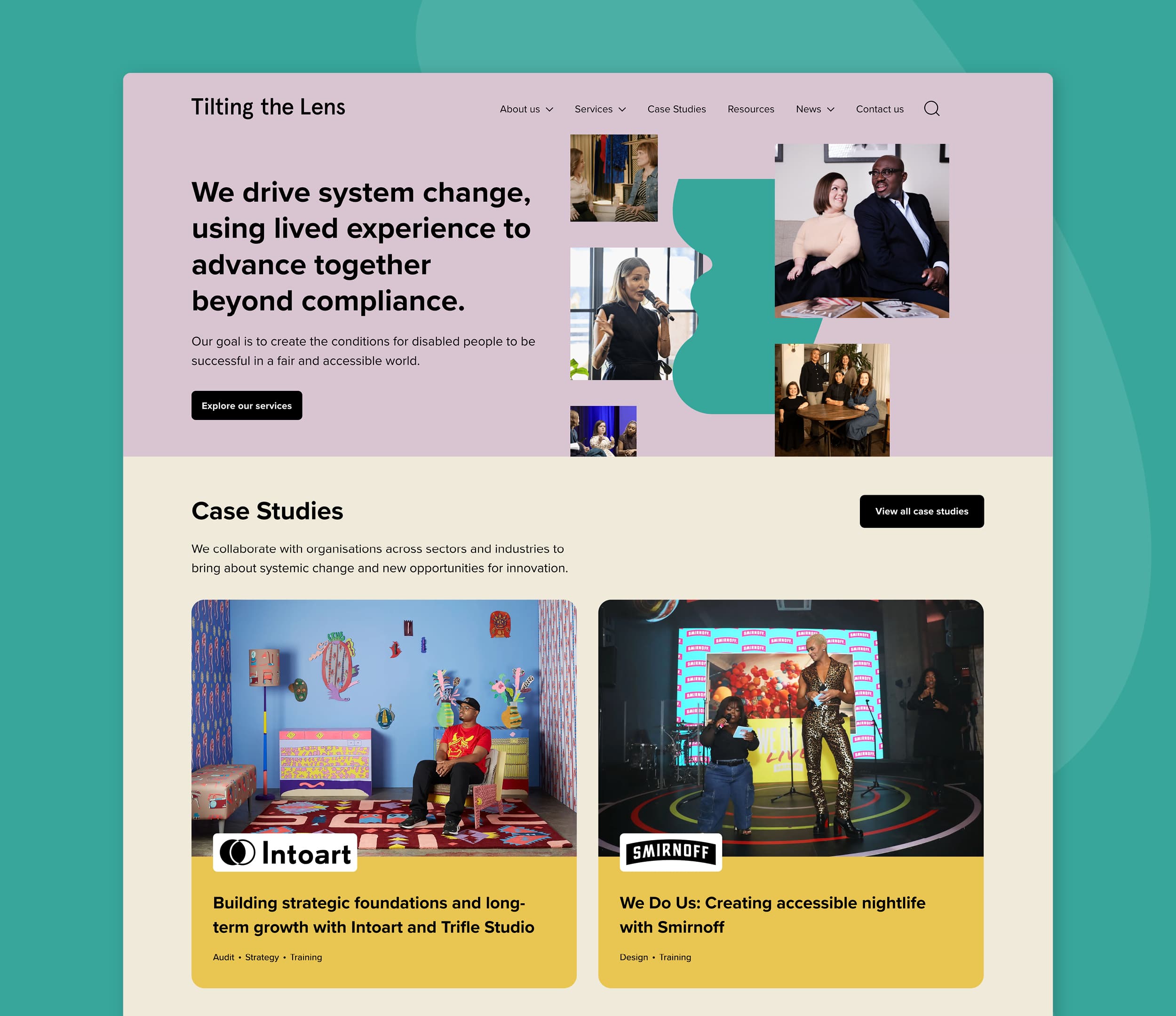
Global strategic accessibility consultancy Tilting the Lens required a new website that embodied their mission to use lived experience to create system change beyond just compliance. Their goal is to create the conditions for Disabled people to be successful in a fair and accessible world.
The challenge was to design a website that functioned as a communication tool, a functional hub, and a living example of best practice in accessibility. At every stage, we worked together to push far beyond compliance, and created a site that is intuitive, responsive, and equitable for all users. The entire project was an iterative learning journey in access. Our design intent was to centre lived experience in every decision – from navigation and content structure to aesthetics and technology – ensuring that the site not only showcased Tilting the Lens’ work but also modelled and led with human-centred co-design.
The new Tilting the Lens website is a living example of co-design and human-led design. We created and evolved new examples of best practice, showing what can be achieved when accessibility drives creativity. The ambition was not simply to comply with access standards, but push beyond them. The site reflects one of Tilting the Lens’ core beliefs: that accessibility is not a checkbox but both a framework and an evolving practice.
What sets this project apart is the design process. Accessibility was not retrofitted, but embedded from the outset through collaboration with Disabled people.
User testing took place at multiple stages during the process. From the initial research and discovery, to team workshops, through to design and development with Disabled people from Tilting the Lens’ research database. Their feedback shaped the direction and decision-making process in the design and development of the website.
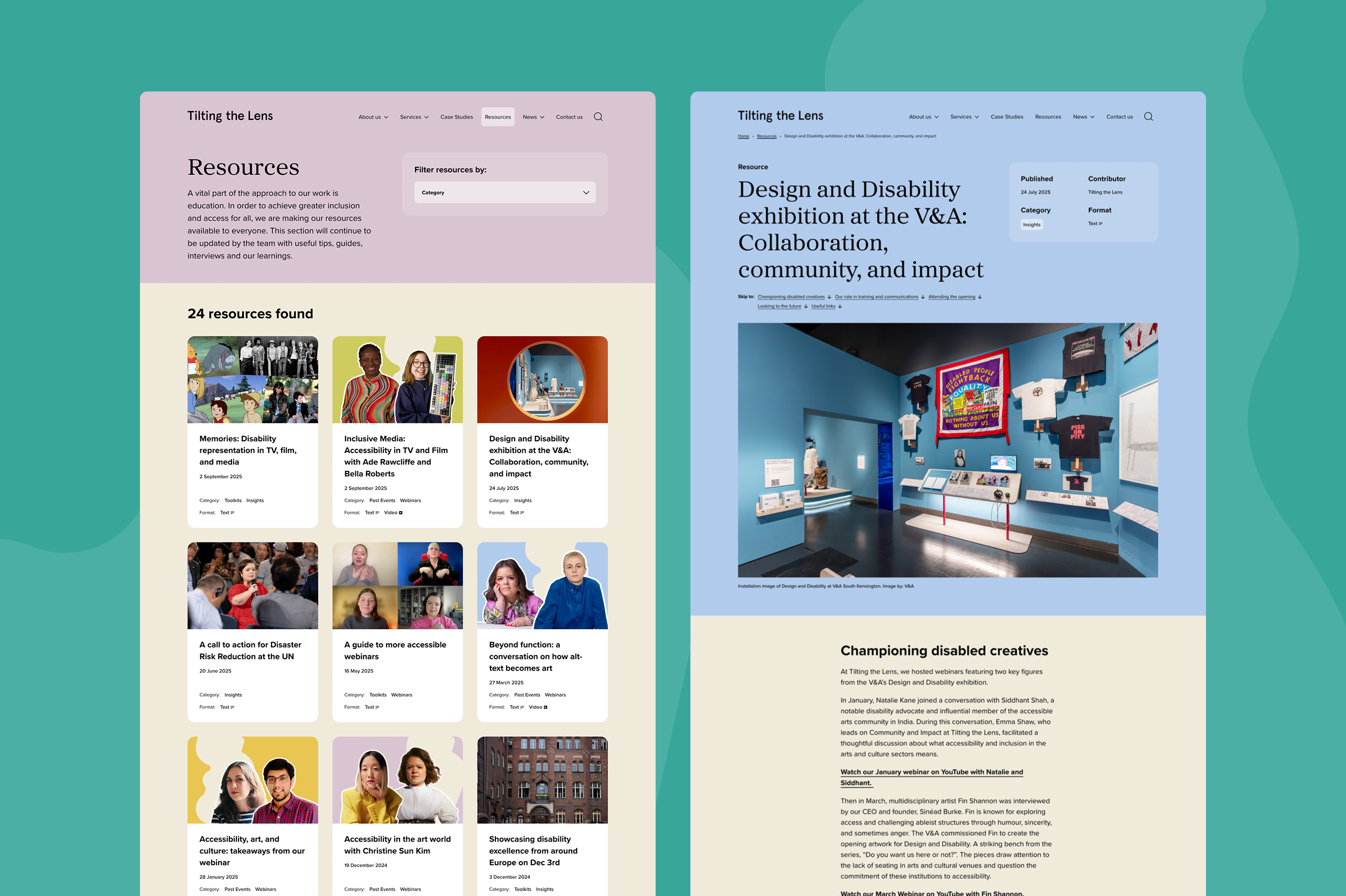
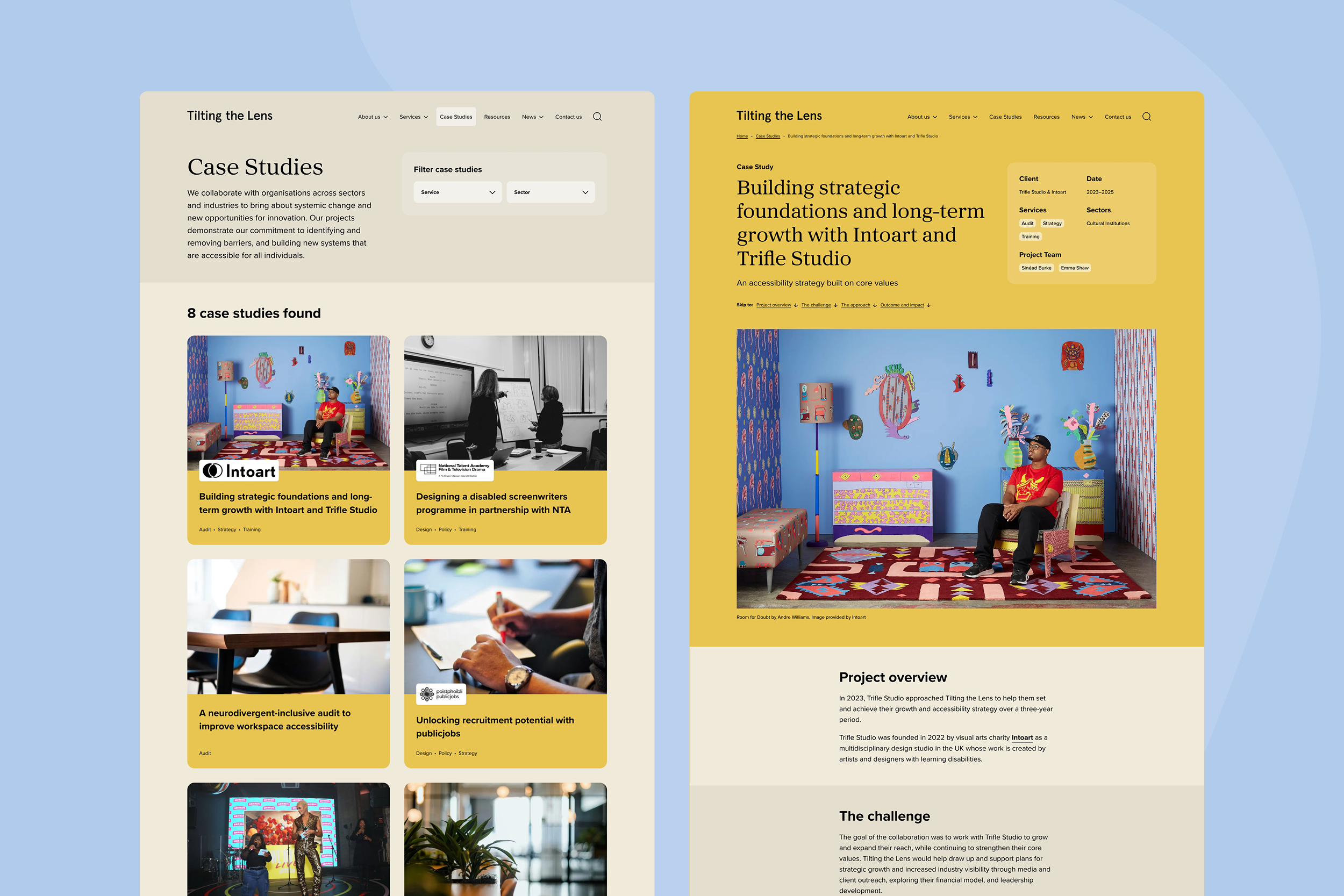
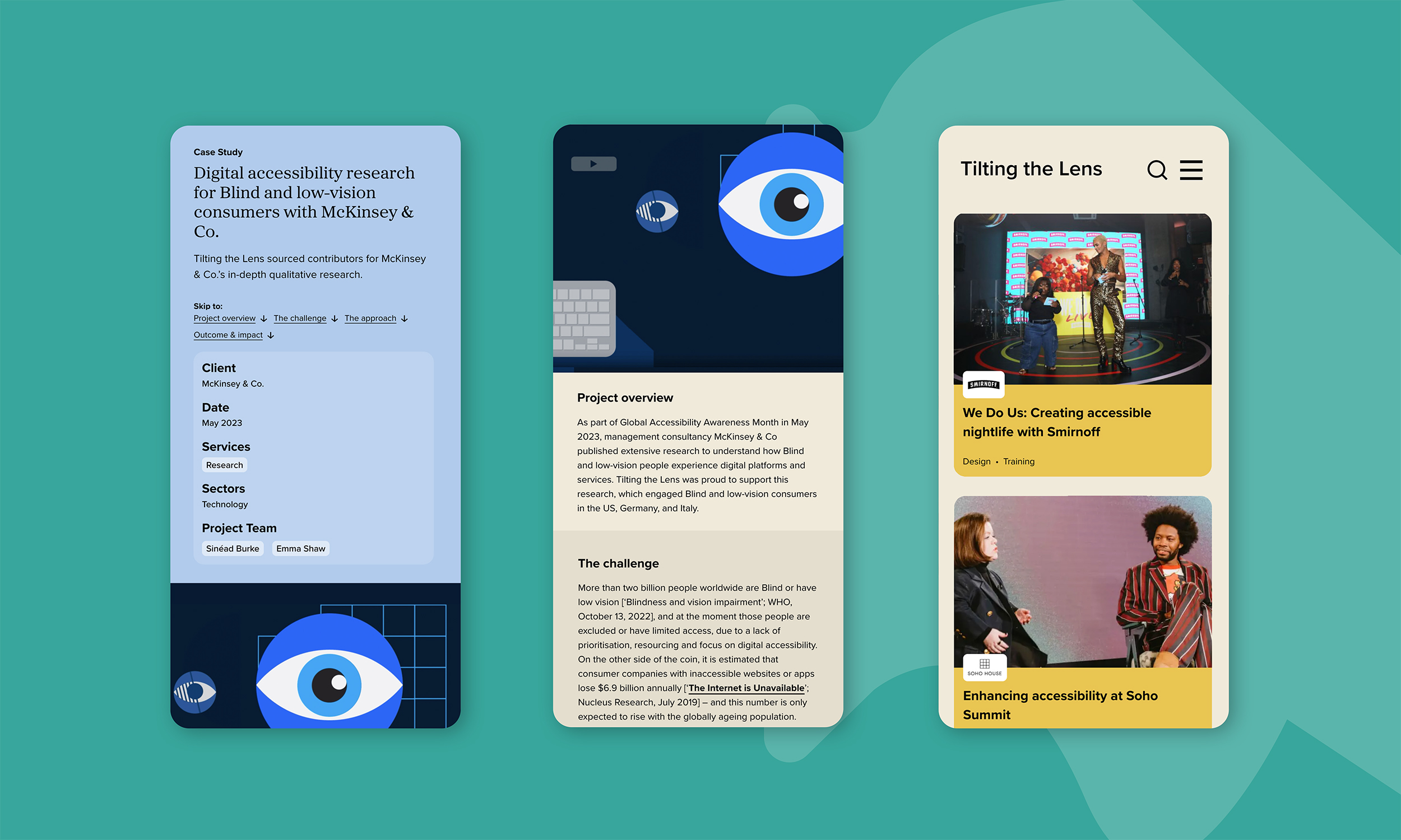
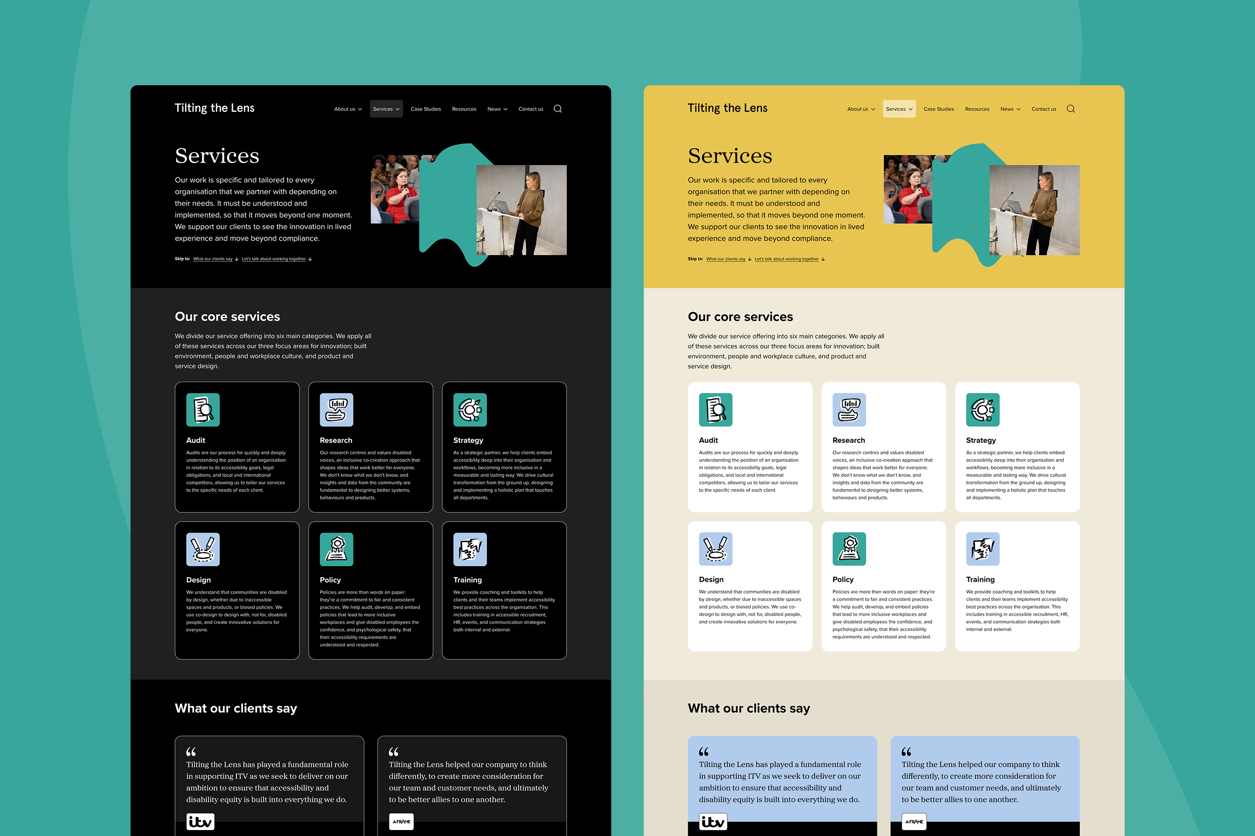
We used a combination of user testing methods to consider individual elements like page names, button styles and filters. Some useful feedback from users was around their browsing preferences and experiences, i.e websites in dark mode, integrated tech, and common issues they face. We responded with various solutions, like creating a dark mode version that the site automatically switches for the user’s preferences.
A combination of automated tools, manual checks, and real-world engagement with Disabled testers shaped decisions on content, navigation, typography, colour contrast, and interactive elements, ensuring the finished product met user needs rather than simply technical standards.
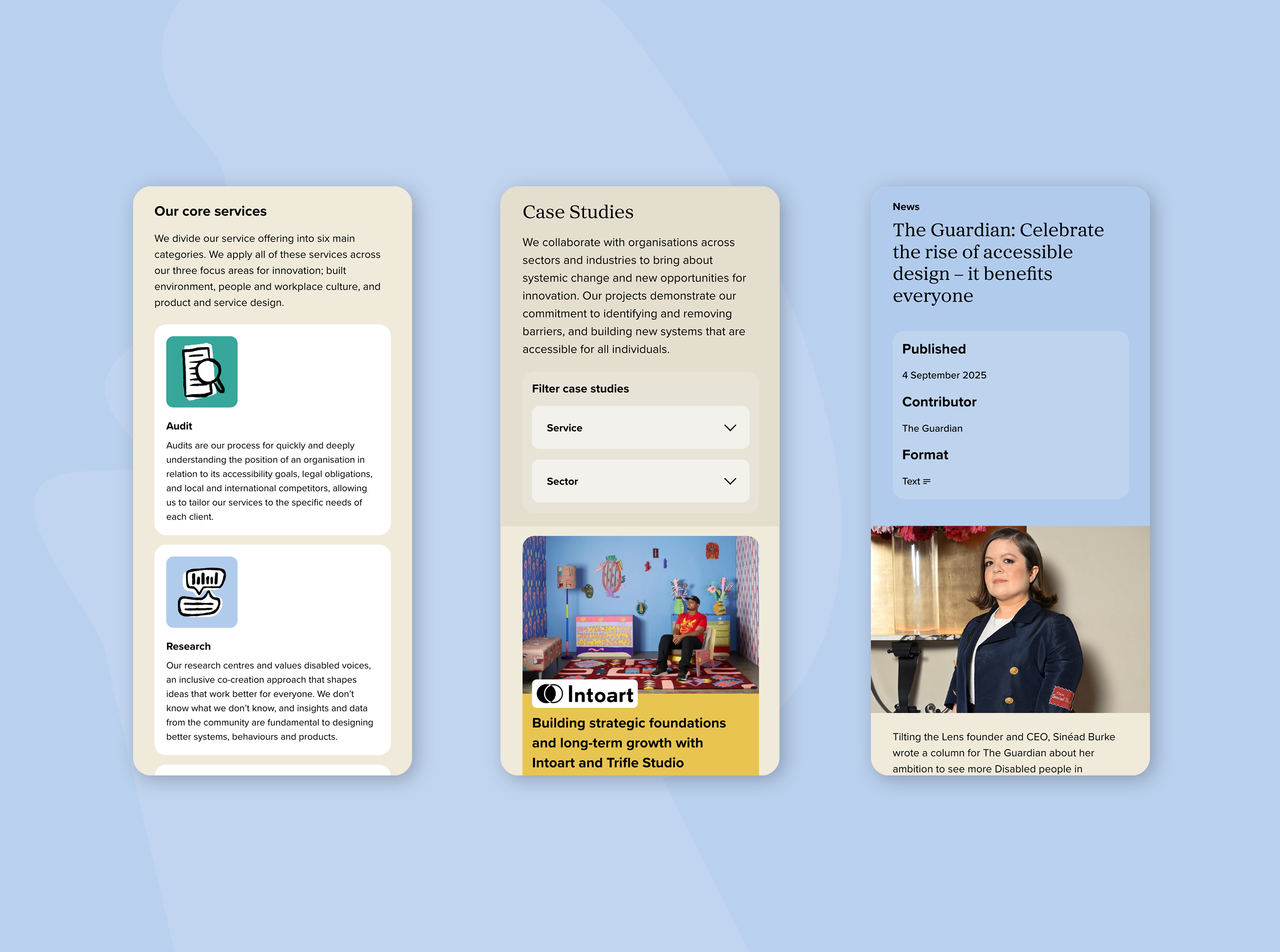
The project challenged the assumption that accessible design must sacrifice aesthetics. Visual clarity, brand expression and design quality were treated as essential, not optional. The result is a visually confident, inclusive platform that reflects Tilting the Lens’ brand and values. Designed to evolve alongside accessibility standards and user feedback, the website demonstrates what is possible when accessibility leads design.