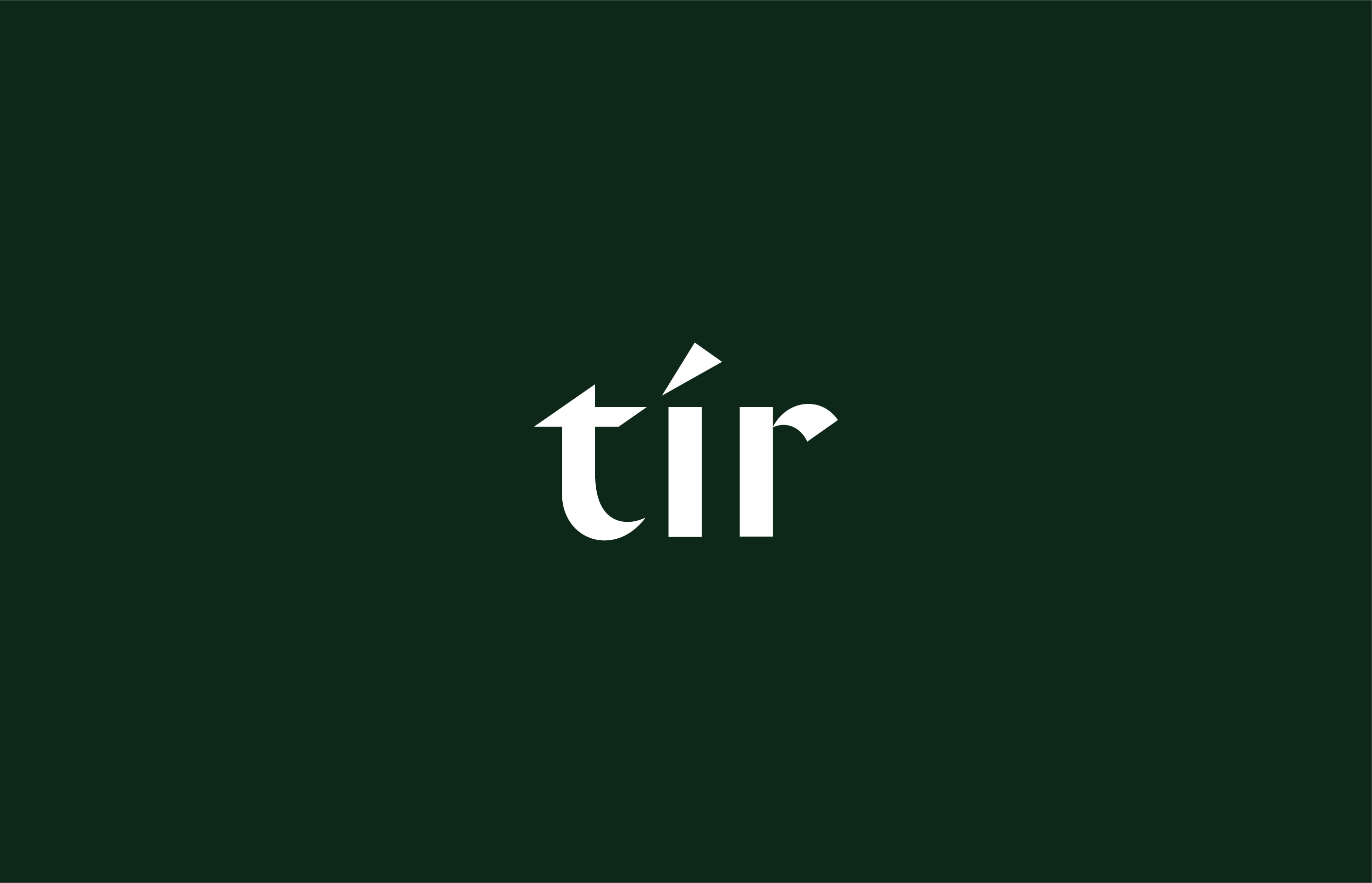
Tír
2021
Designed by Keith McGuinness at Red&Grey
Design: Leah Bredendieck
Design: Shane Carty
Categories: Identity
Industry: Commercial
Tags: Typography / Art direction / Branding / Identity
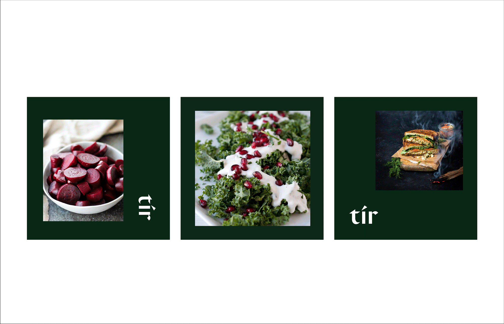
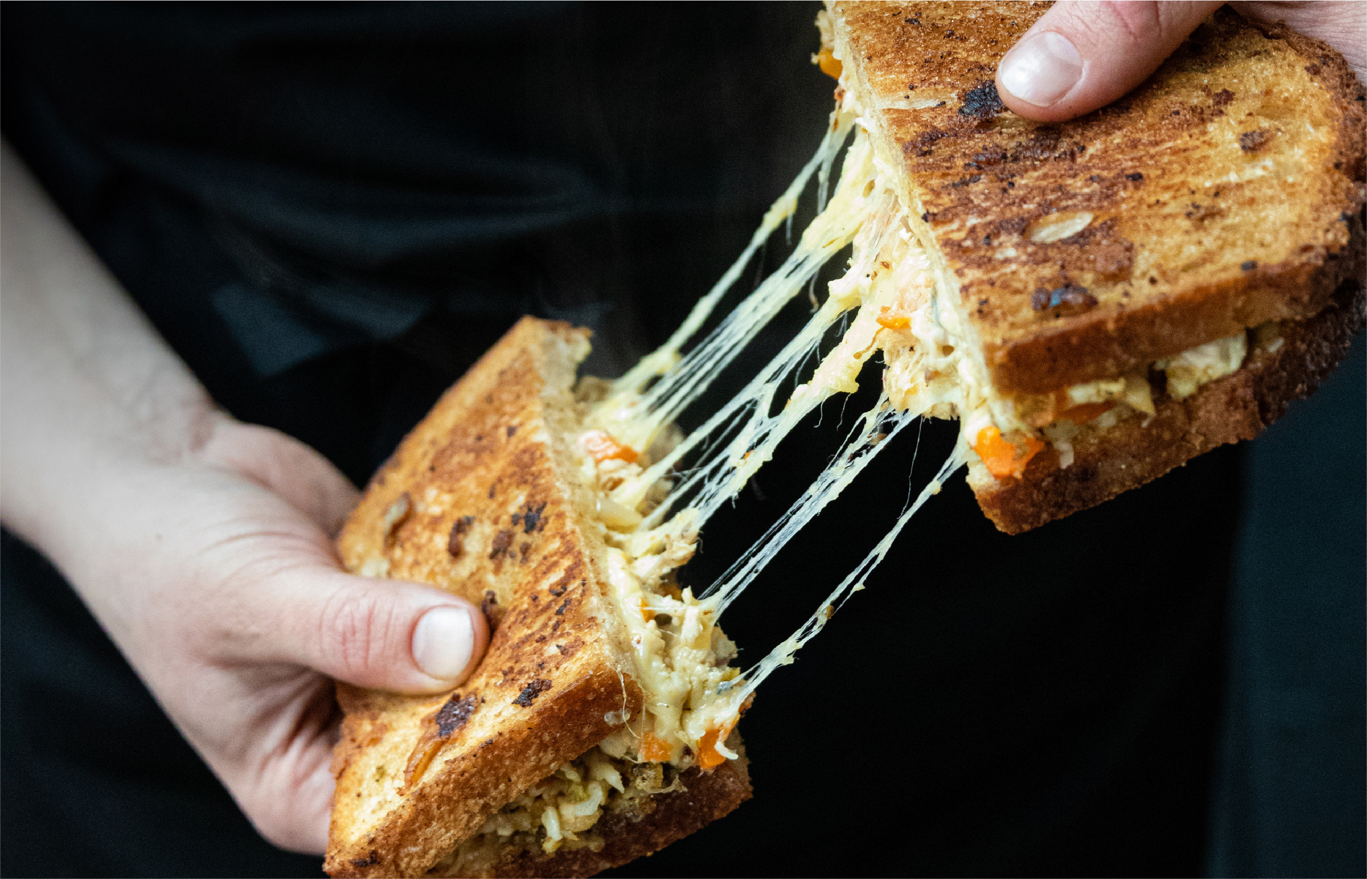
Tír makes seasonal Irish sandwiches. Their deli celebrates authentic Irish food by adding a modern twist. Each ingredient is locally sourced and sustainable. They are dedicated to the craft of making delicious sandwiches.
First, we worked together on the brand name. Tír is the Irish word for country or land. Then we created their branding, giving it a contemporary Celtic feel that is clean and professional.
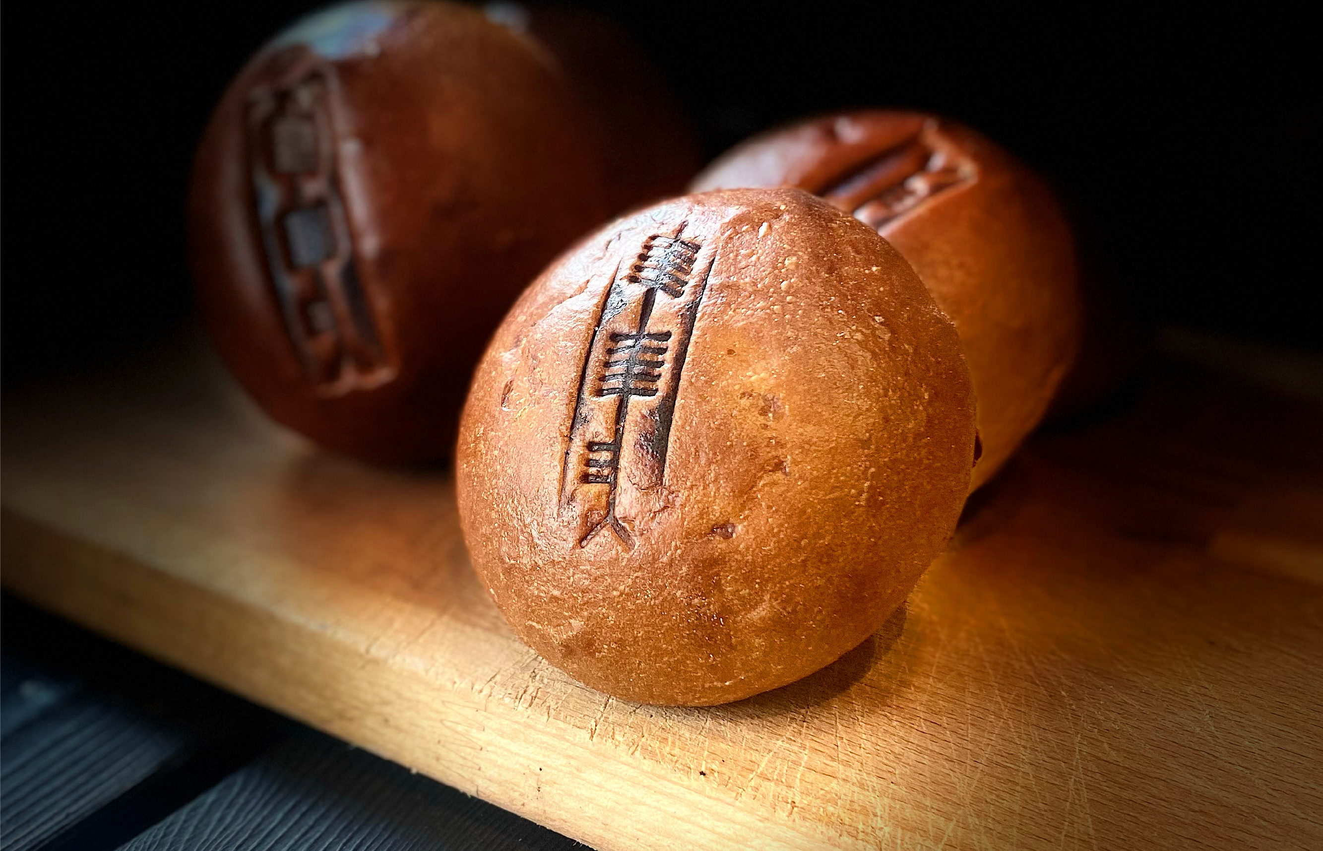
We also created a mark that is used to brand their sandwich buns. Ogham inspired the symbol, a medieval alphabet used to write the early Irish language.