Toys”R”US Brand Refresh
2012
Designed by Brendan Murphy at Lippincott
Art Director: Michael Guerin
Art Director: Bethany Lesko
Designer: Angela Ko
Designer: Coco Han
Creative Writer: Lizzie Harris
Creative Writer: Aerie Em
3-D Illustrations and Animations: Nico Castro
3-D illustrations and animations: Tamas Arpadi
Illustrations: Olimpia Zagnoli
Categories: Identity
Industry: Commercial
Reimagining play for a new generation
In the six months between bankruptcy filing and liquidation, Toys“R”Us came to us to help build a brand platform that would carry them beyond their next chapter. What followed was a
comprehensive overhaul for the Toys“R”Us and Babies“R”Us brands to reclaim their iconic and preferred market position.
This undertaking presented a series of challenges. Both brands needed to appeal to a new generation of parents — according to PEW research, more than one million Millennials are becoming parents each year. But, while they grew up with Toys”R”Us as kids, today’s world is a different place for these new parents who have access to an overwhelming amount of shopping options, recommendations, rankings and reviews at their fingertips. We also needed to develop a brand offering that would compete against both ends of the market, from massive online retailers who compete on price and convenience, to local boutiques that offer the personalized experience and trustworthiness many new parents seek. Further, the transformation faced another big obstacle. How do you design two distinct visual systems that would give each brand its independence across the digital ecosystem but also integrate together seamlessly, as part of the retailer’s co-located store strategy?
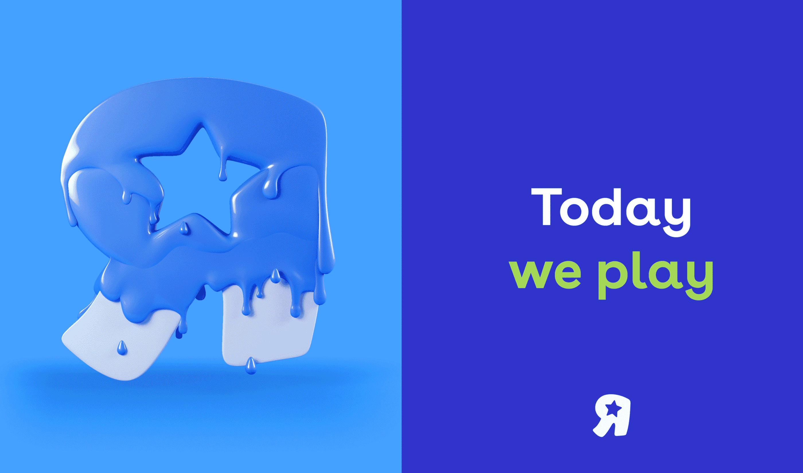
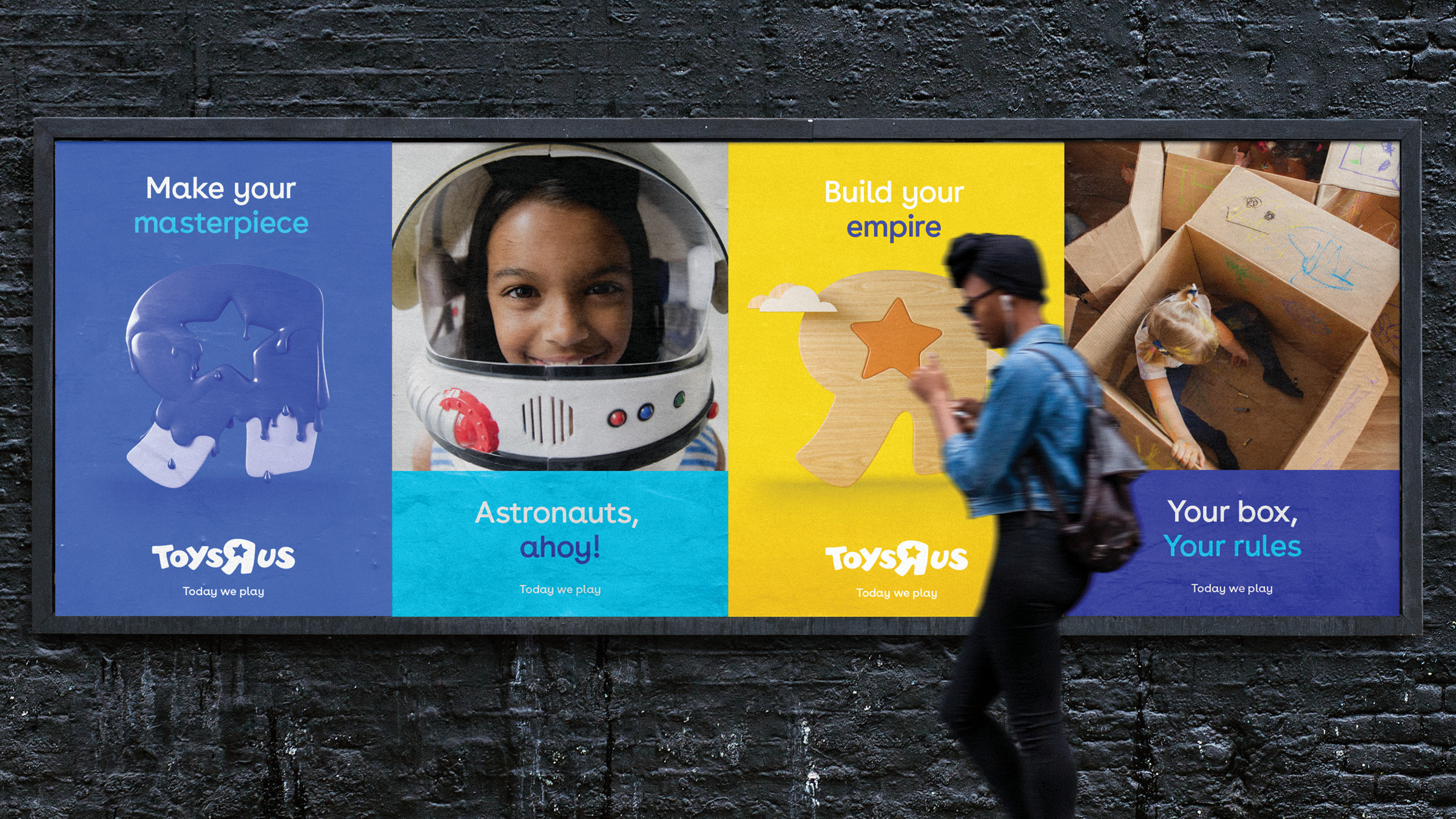
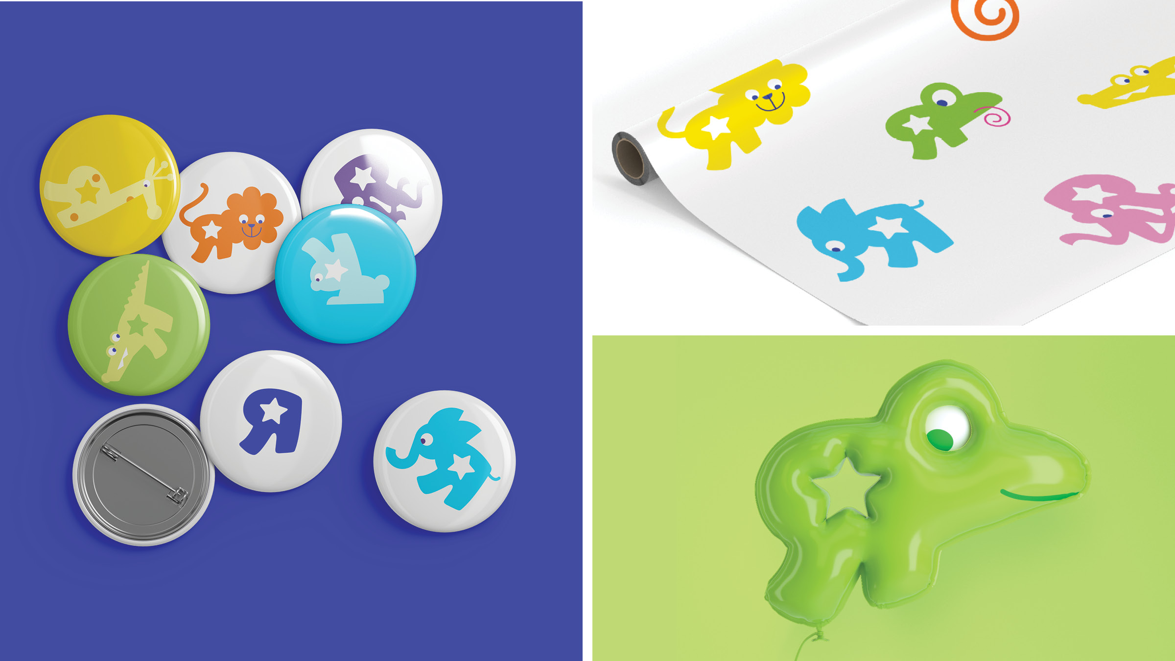
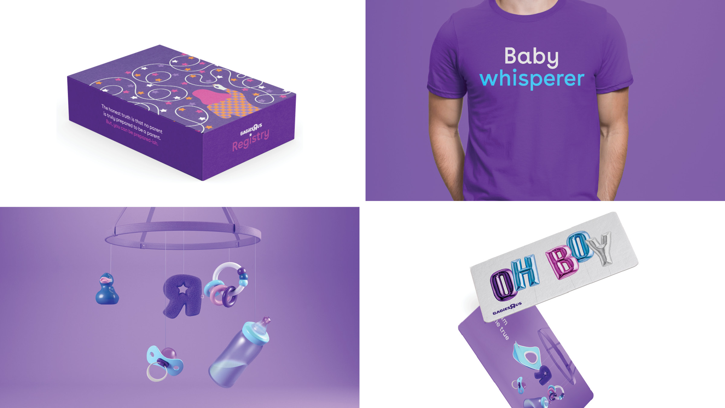
The resulting work was an innovative and original, yet nostalgic, interpretation of both brands that considered every single touchpoint along the customer journey, aligning and reviving them at every step. We devised familial visual systems – like fraternal twins, each brand’s system would stand out by virtue of its distinct brand voice and its own primary colors. Subtly, the familial unity is achieved by a secondary color palette which not only unifies the look and feel of both brands, but also helps the entire business get back to the core of who they are — the toyland for play. New research uncovered a nostalgic affinity amongst today’s new parents – they love the brand’s iconic backwards R. For these new parents, most of whom grew up with Toys“R”Us as kids, the childlike “R” personified the whole idea of play.
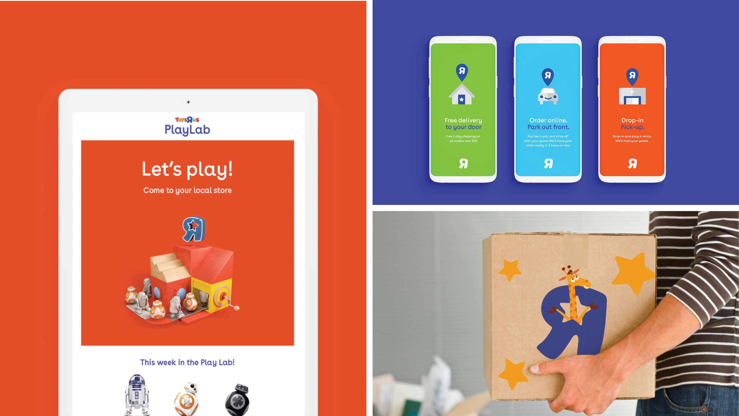
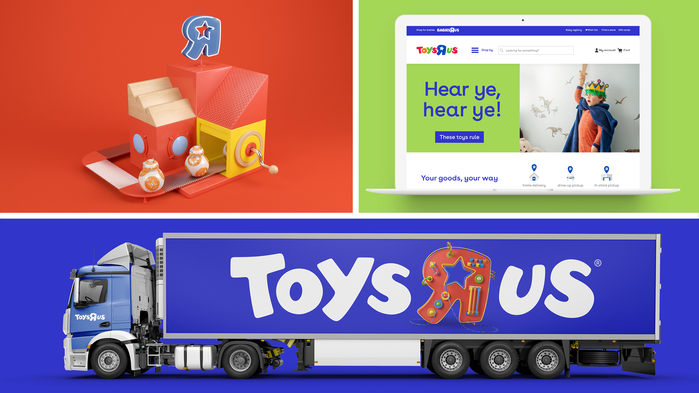
Armed with this insight, we reclaimed this key element of brand equity for the two visual systems, giving each brand’s R a distinct aesthetic treatment unique to its essence. The visual systems retain the logo while using color, typography, photography, icons, and illustrations to tell stories about all of the ways the brand can unleash the power of play. We further developed proprietary icons to represent key services, categories and functions for a visual shorthand that clarifies, identifies, guides and teaches with a signature sense of fun.
The new system was interpreted across the entire customer journey, from in-store graphics to website applications and digital communications to packaging and gift wrapping. While time ran out for the U.S. company before launch, we were given permission to share the work with the world, and are excited to share that it will be entering global markets this year.