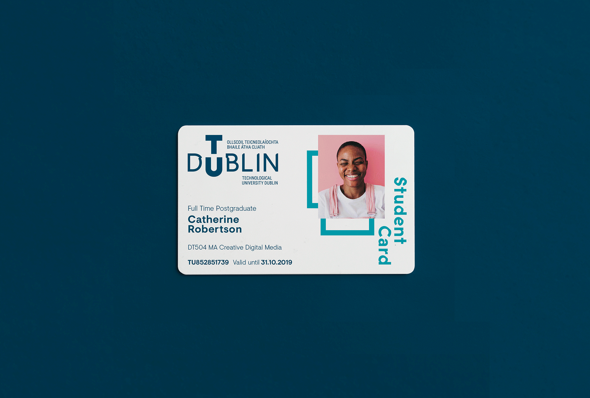
TU Dublin
2012
TU Dublin, an amalgamation of Dublin Institute of Technology, Institute of Technology, Blanchardstown, and Institute of Technology, Tallaght, is Ireland's first Technological University. An entirely new type of university, it provides a practice-based environment informed by the latest research and enabled by technological advances.
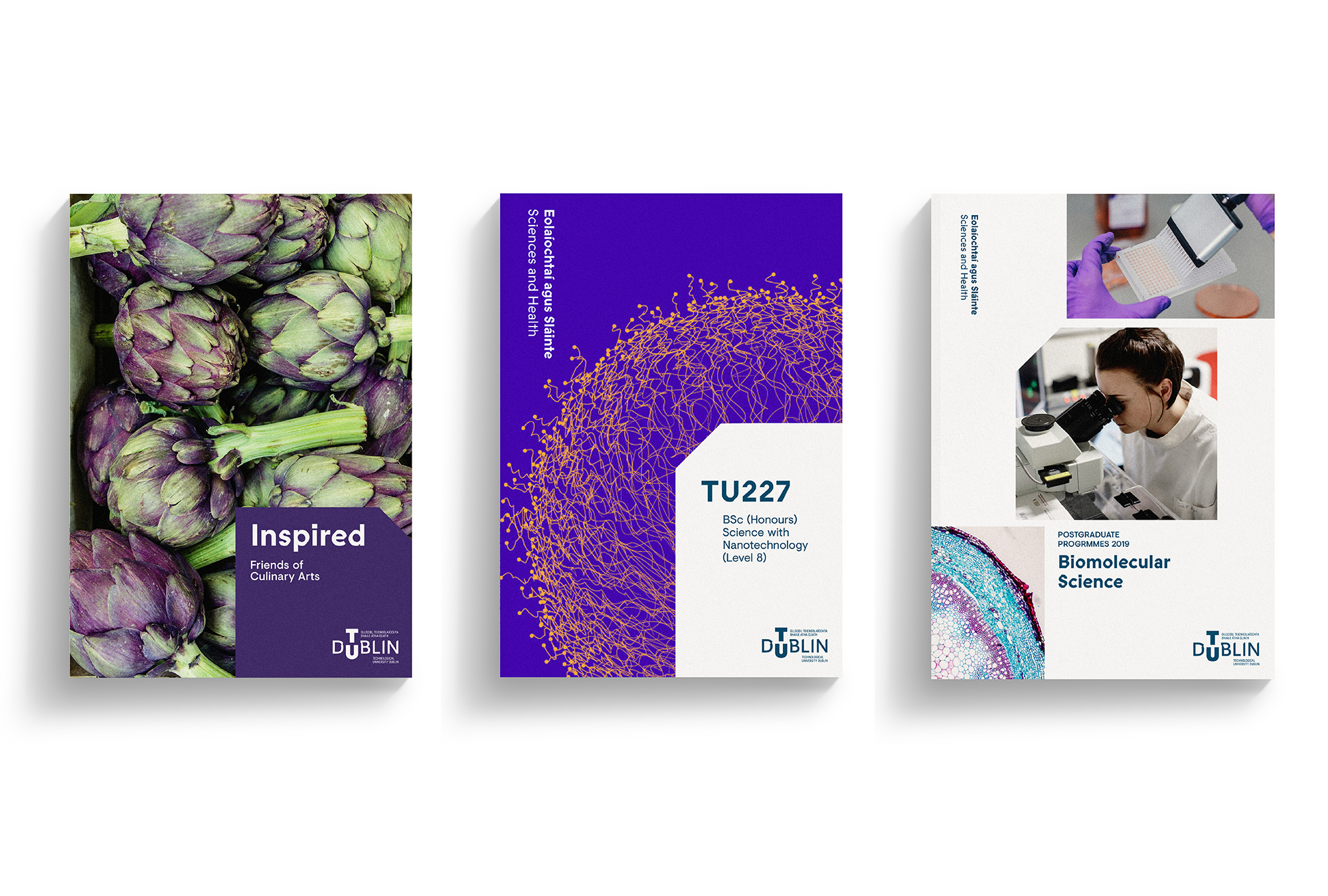
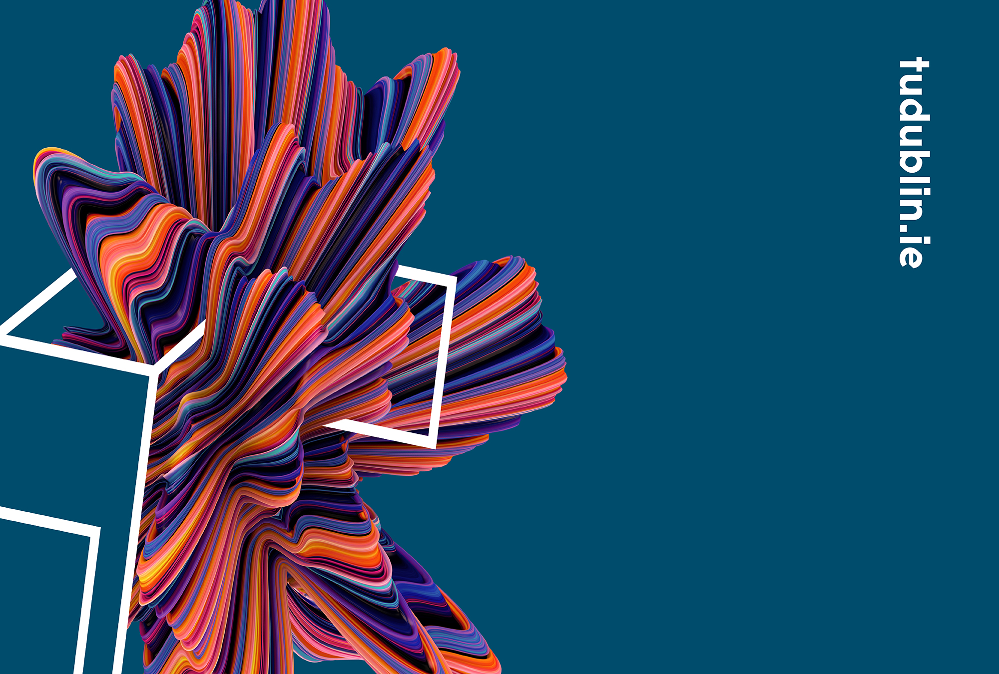
TU Dublin's visual identity communicates the spirit of change. It challenges convention and stands out in a crowd. While many Irish universities have a crest or a symbol, we felt that, because TU Dublin is a different kind of university, it was important that we approached its identity differently. Our approach to the project hinged on a seamless brand development: the creative approach informed strategic thinking, and strategic input guided the design process. Meanwhile, rigorous testing throughout ensured our strategy was on-point and connected with a wide range of different stakeholders.
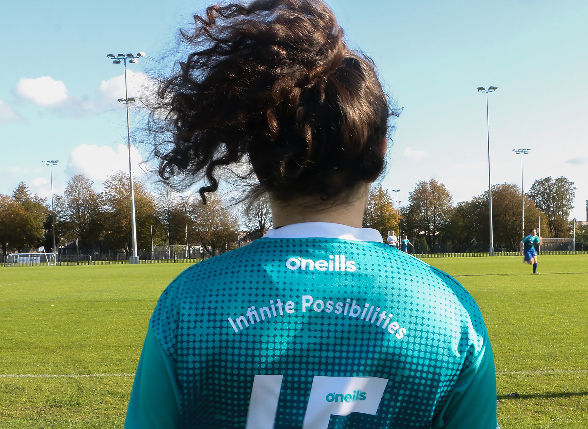
TU Dublin is bold, modern and dynamic and the logotype demonstrates the impact that it will have on the landscape of Dublin and higher education. It has the power to change, disrupt and transform. It is both contemporary and progressive while conveying a bold and confident tone. The logotype treatment also allows us to focus solely on the name and to embed it in people's minds. By bringing the TU Dublin brand personality into the name, we help to fast-track recognition for this new brand. The possibilities are infinite.