Tula - Branding & Environmental
Designed by Emma Connolly at Slater Design
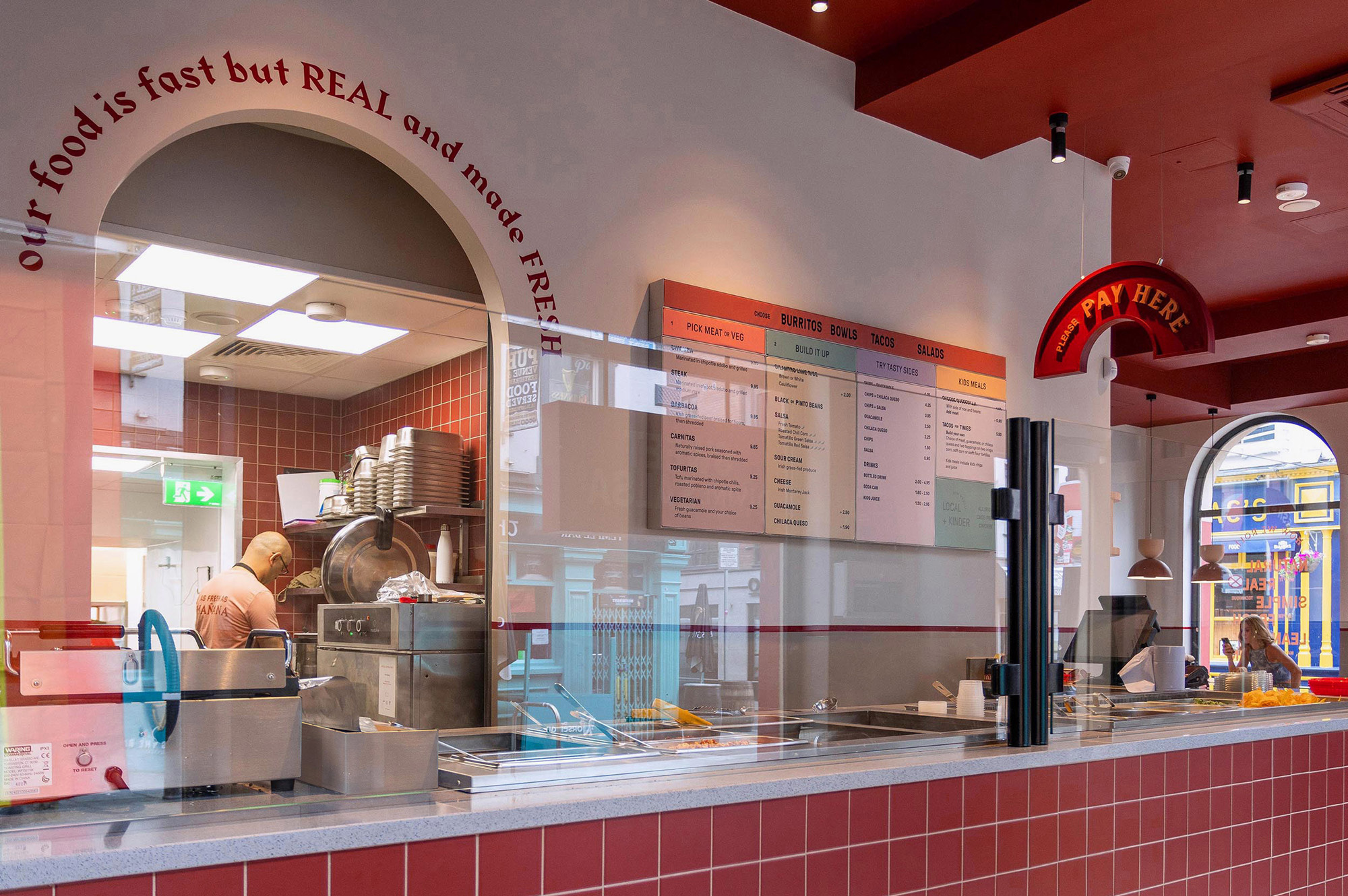
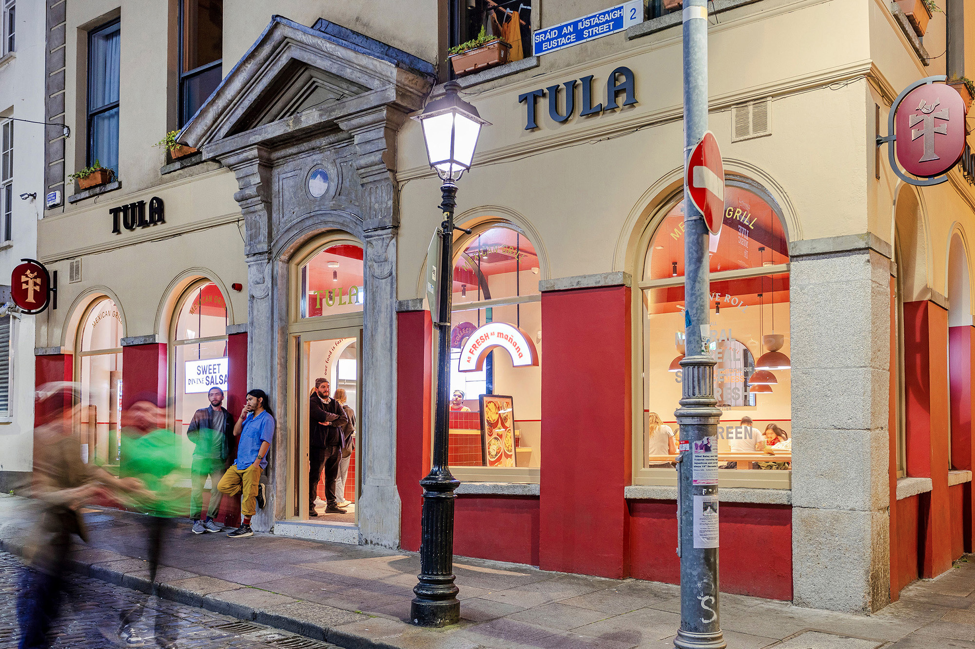
Interior Design: 21 Spaces
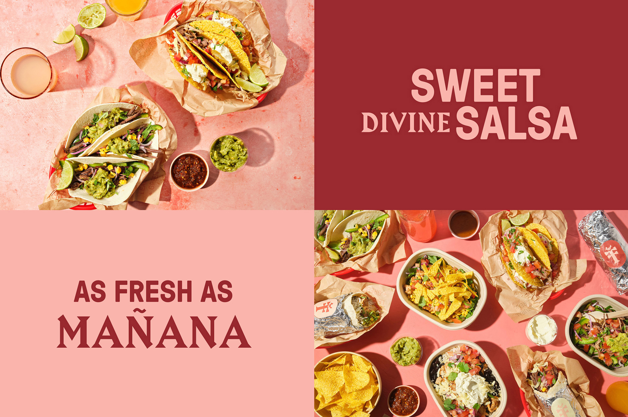
Food Photography: Jo Murphy
Signage: Academy Signs
Categories: Environmental / Identity / Signage
Industry: Commercial
Tags: Food and drink / Retail / Restaurant
Tula began with a passion for Mexican-style burritos and bowls. On-the-go food made with local fare - quality, humane produce that partners local where possible; essentially seeking to nurture a better world through our bellies.
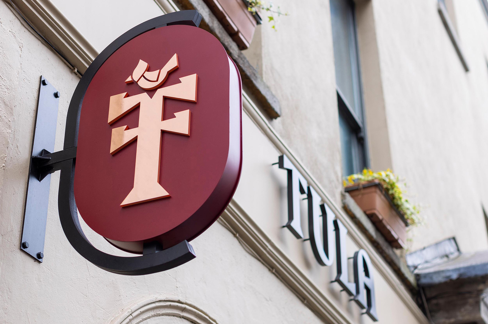
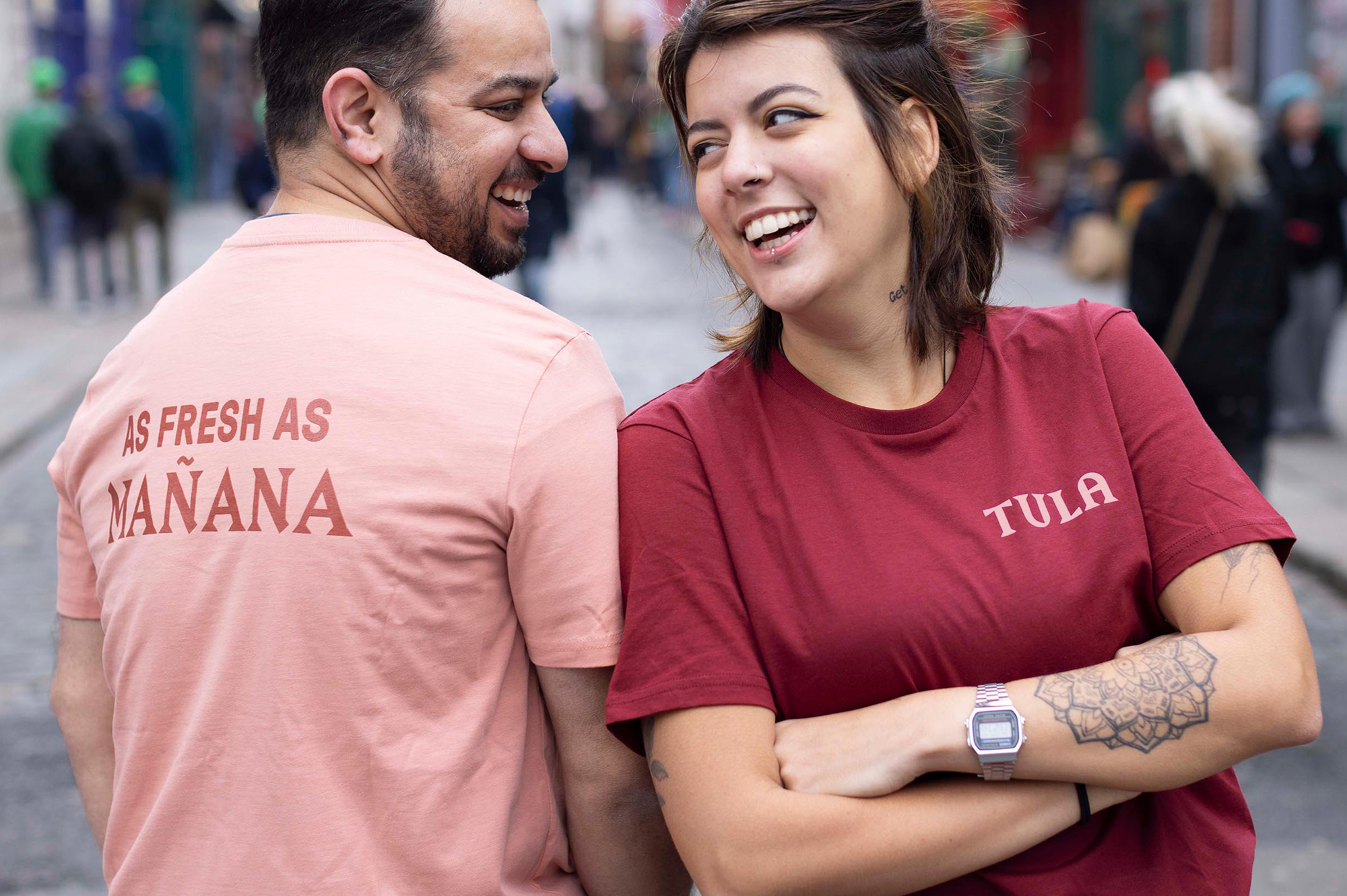
Tula needed an identity that captured their essence and celebrated their food while complementing their interiors; an identity that would work across a chain. The Mexican tree of life influenced the development of the 'T' emblem, creating an abbreviated version of the Tula brand as a distinct asset and signpost. The tree of life is a symbol that reaches deep into Mexican culture, as far back as the Aztecs, where its roots stem from ideas of life cycles, fresh beginnings, and replenishment.
Drawing on the casual nature of the food, a black letter font was inspired as a nod to Hispanic street culture and vendors and was chosen for its interesting combination of arches and angles. A soft fuse of earthy pink and red tones marry with the interior style and create a warm, unified space. ‘Real’ food photography shows the food as it is meant to be sampled and enjoyed - rich, layered, messy, colourful spreads.