Turning research into medicines
2023
Designed by Colin Byrne at TOTEM
Name & Strategy: Garrett Reil
Identity: Tomás Ashe
Website: Mike Buchan
Categories: Website / Identity / Other
Industry: Commercial
Tags: Science
Website: aton-group.com
For Hybrigenics Pharma, a Euronext-quoted biotech business, promising drug trials had ended in disappointment, leaving morale and shareholder sentiment at a low ebb.
A new CEO reviewed its unique resources, technologies and learnings. Where some might see failure, she saw an exciting new opportunity. The group would pivot to become a support platform, helping life sciences companies change how effective treatments are developed.
To begin the transformation, it was essential to reset, rally the troops, and clearly communicate the new vision. We explored the group’s origins and ambitions, including stakeholder interviews and a workshop. It was critical to understand the companies and technologies it owned, as well as the marketplace and benchmark companies.
These insights brought clarity and a led us to a powerful brand purpose, ‘To advance therapies for the good of patients, medicine and society.’ The future direction for the brand became clear. This was a major change to the mission and purpose of the business.
To signal the bold change of direction and break with the legacy business, we needed a new name and clear narrative. Following the name creation process, Hybrigenics Pharma became Aton (the sun, ancient Egypt). A metaphor for the group’s central role as guiding light and sustaining influence at the heart of an ecosystem – the group’s collaborating life science companies, each with diverse skills and technologies.
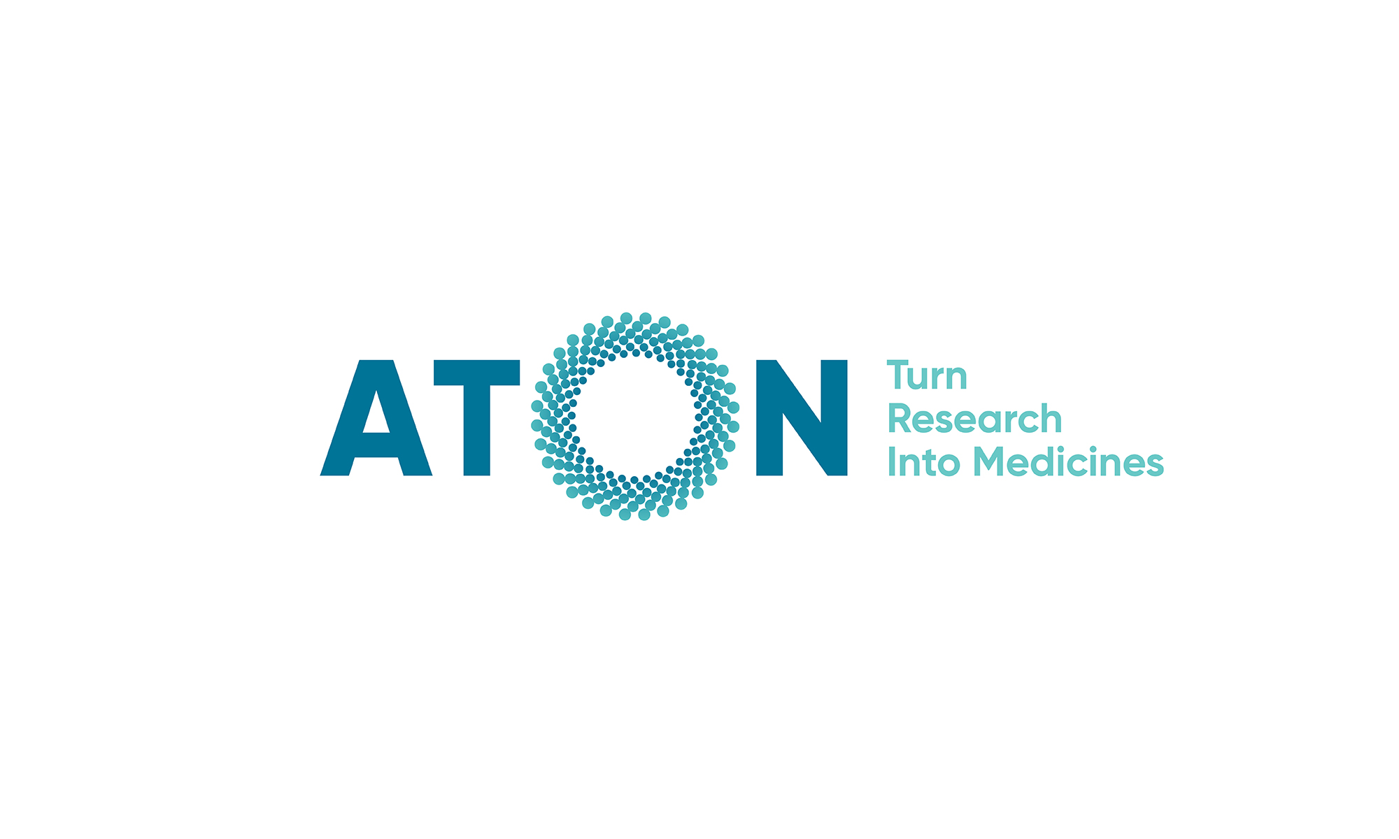
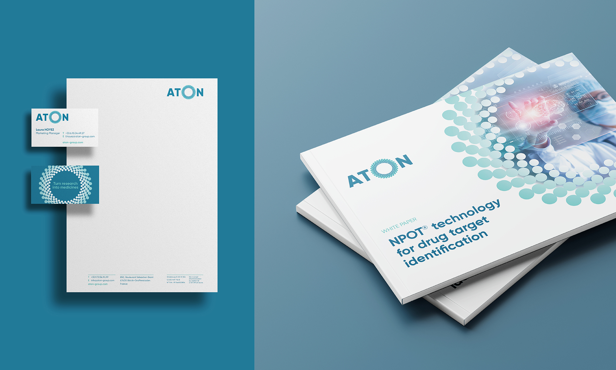
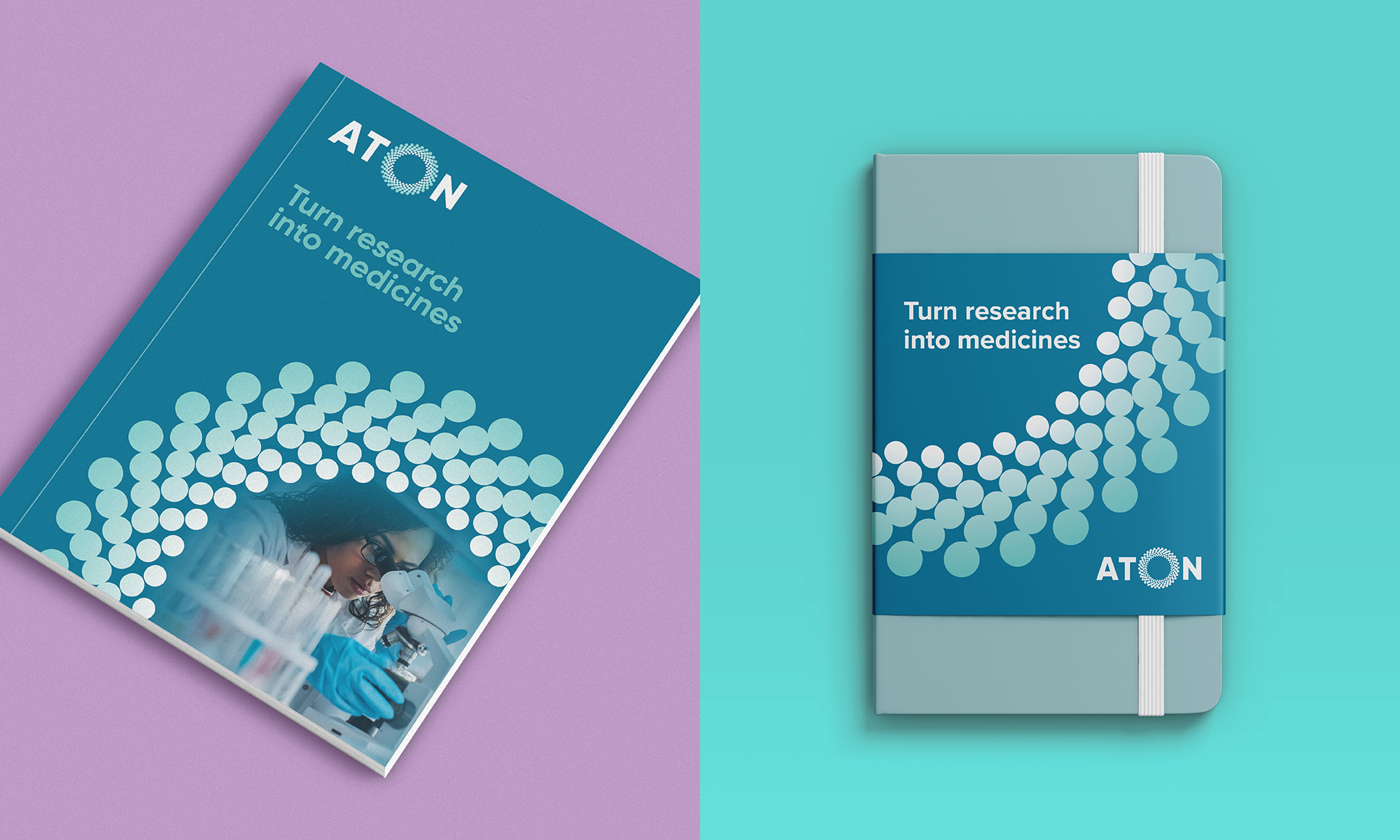
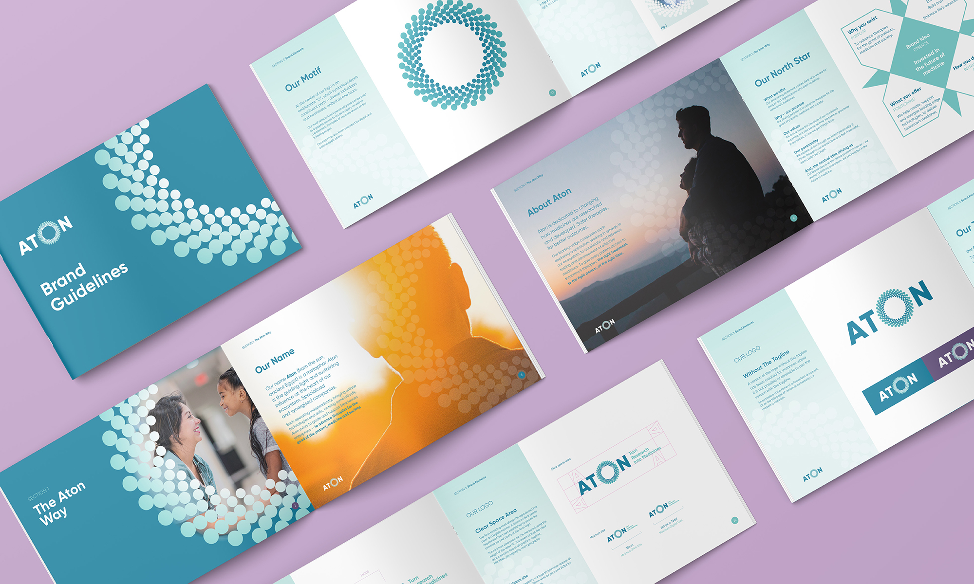
With the Aton name trademarked, we created a visual identity to bring the strategy to life. A confident word mark, with its emblematic ‘o’, symbolises the constituent parts — diverse individuals and businesses, unified as one team. To this, we added a new tagline, ‘Turn research into medicines’. A direct promise, and a clear articulation of the group’s purpose.
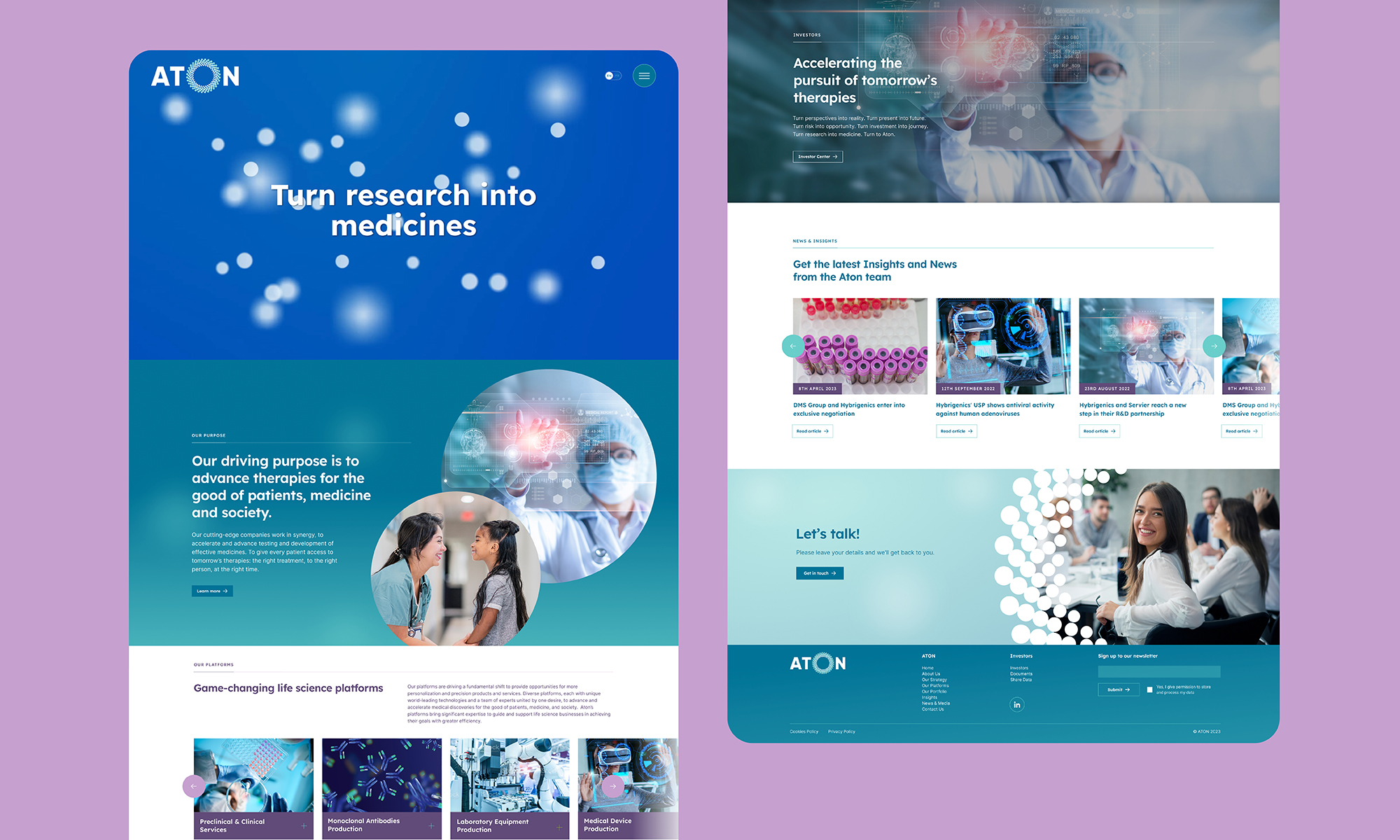
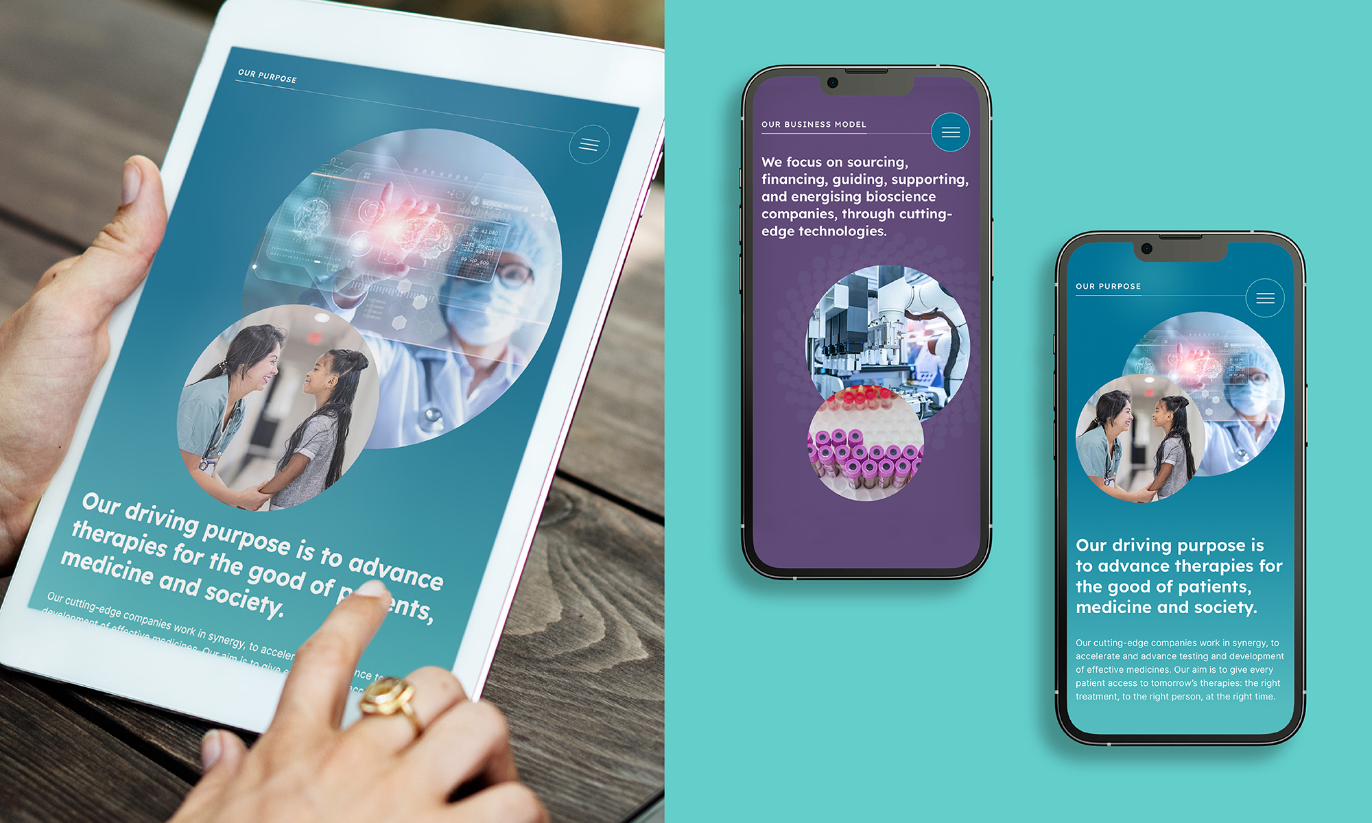
The new visual identity works in harmony with the narrative and ‘tone of voice’ for the new brand. This gives Aton the toolkit needed to be distinctive and clearly express themselves to different audiences. We created video explainers highlighting the positive change and new direction to stakeholders. And also delivered a new website (in English and French) to engage and excite shareholders, potential partners, employees and invested companies alike.
