TYPE
2022
Designed by Danielle OConnell and Emma Woods at Good as Gold
Categories: Website / Identity / Screen
Industry: Cultural
Tags: Architecture / Digital / Interactive
Website: type.ie/
With a mission to share knowledge, increase accessibility, and support a culture of critique within the Irish built environment, TYPE's need for a new identity and online platform immediately interested us.
Michael Hayes saw a need for an online collection of writings, academic and otherwise, to be curated, hosted and managed by himself and his team, supported by membership subscriptions.
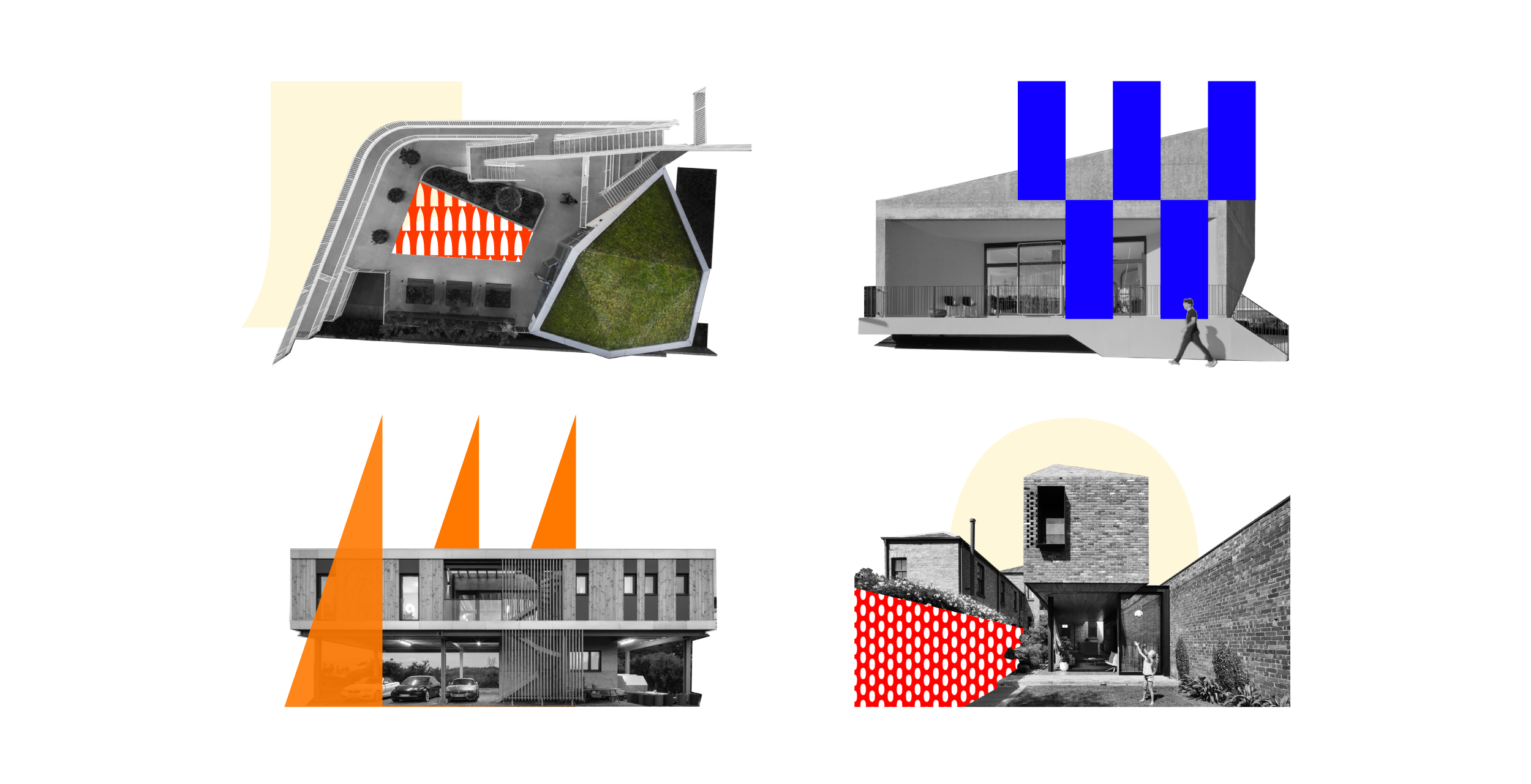
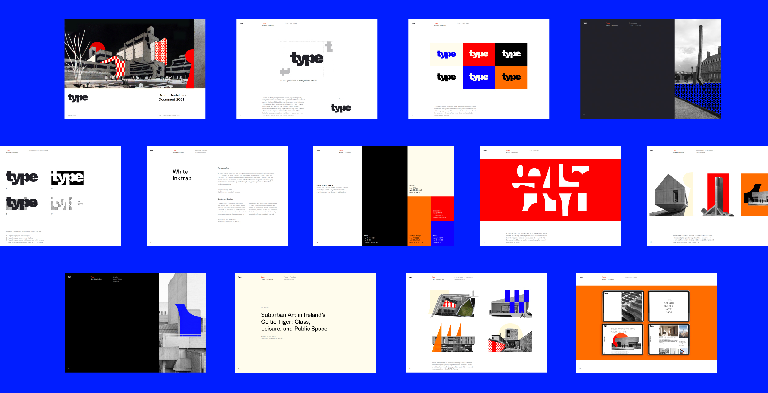
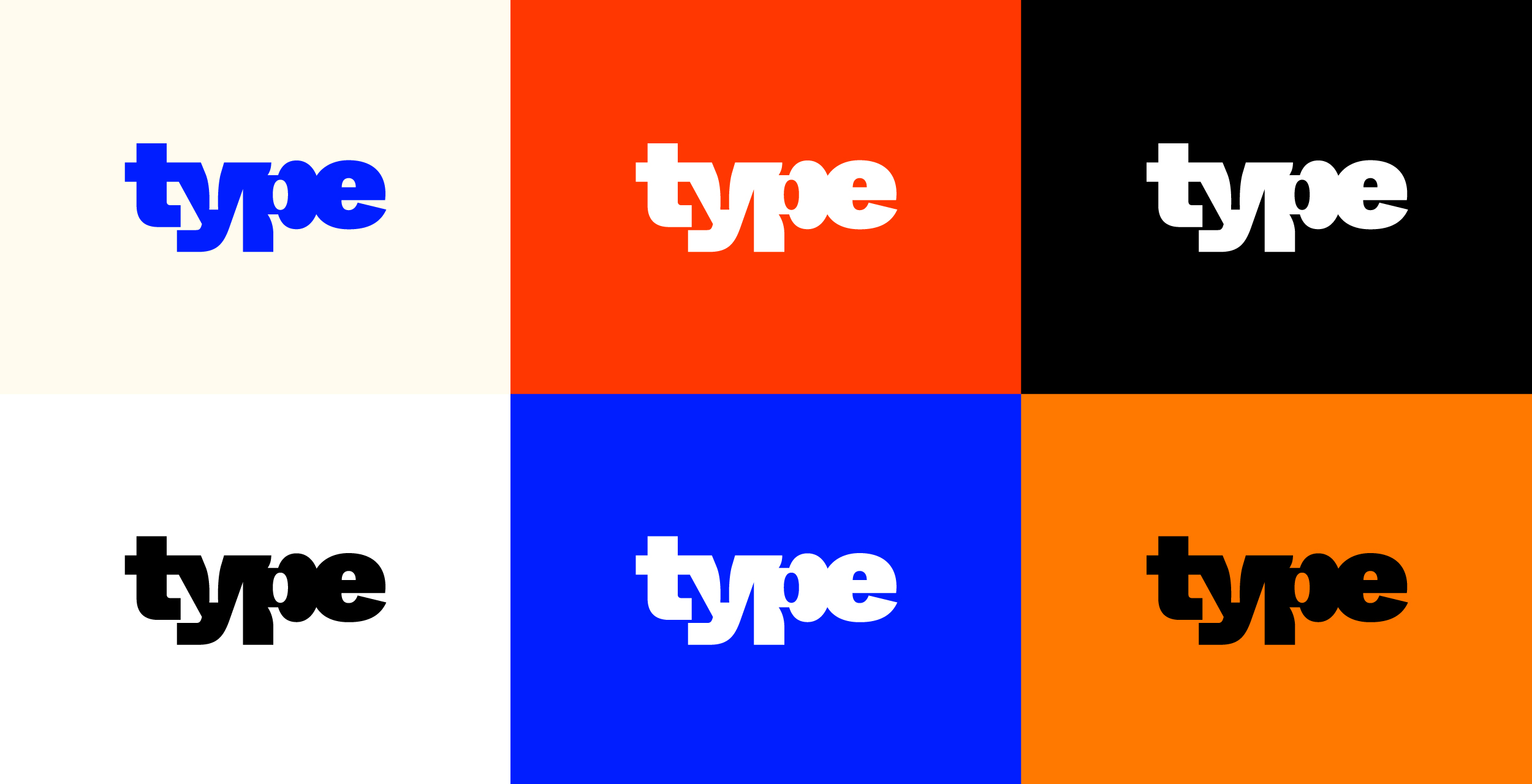
Our brief was to create a bold, contemporary identity that would focus heavily on space and our interaction with it in Ireland. The rich visual references and the wealth and depth of the subject matter allowed us to enjoy our research and exploration, informing our experiments with typography, form, and brand language.
Taking inspiration from the built environment we opted for an experimental typeface, obstructing it slightly to create a solid shape, reminiscent of plans in an architectural drawing. From this, we dissected its forms and negative spaces to build minimal but varied brand patterns which were then coupled with iconic imagery of Irish architecture to create a unique aesthetic for TYPE.
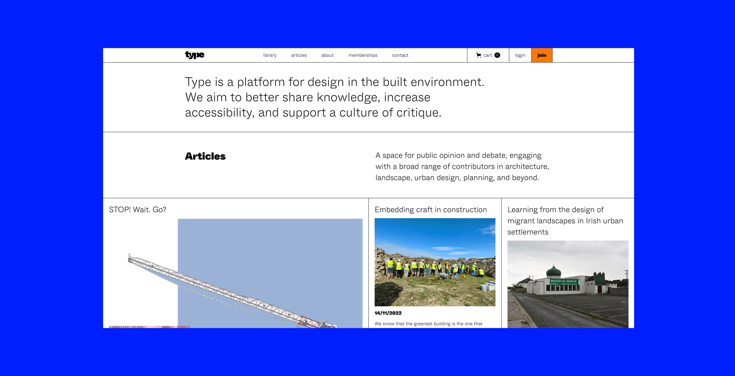
The need for online access to this type of content is becoming more apparent, accelerated by the pandemic when physical access was either completely unavailable or significantly diminished. Looking at a subscription or e-commerce model for the website was our starting point for the website part of this project.
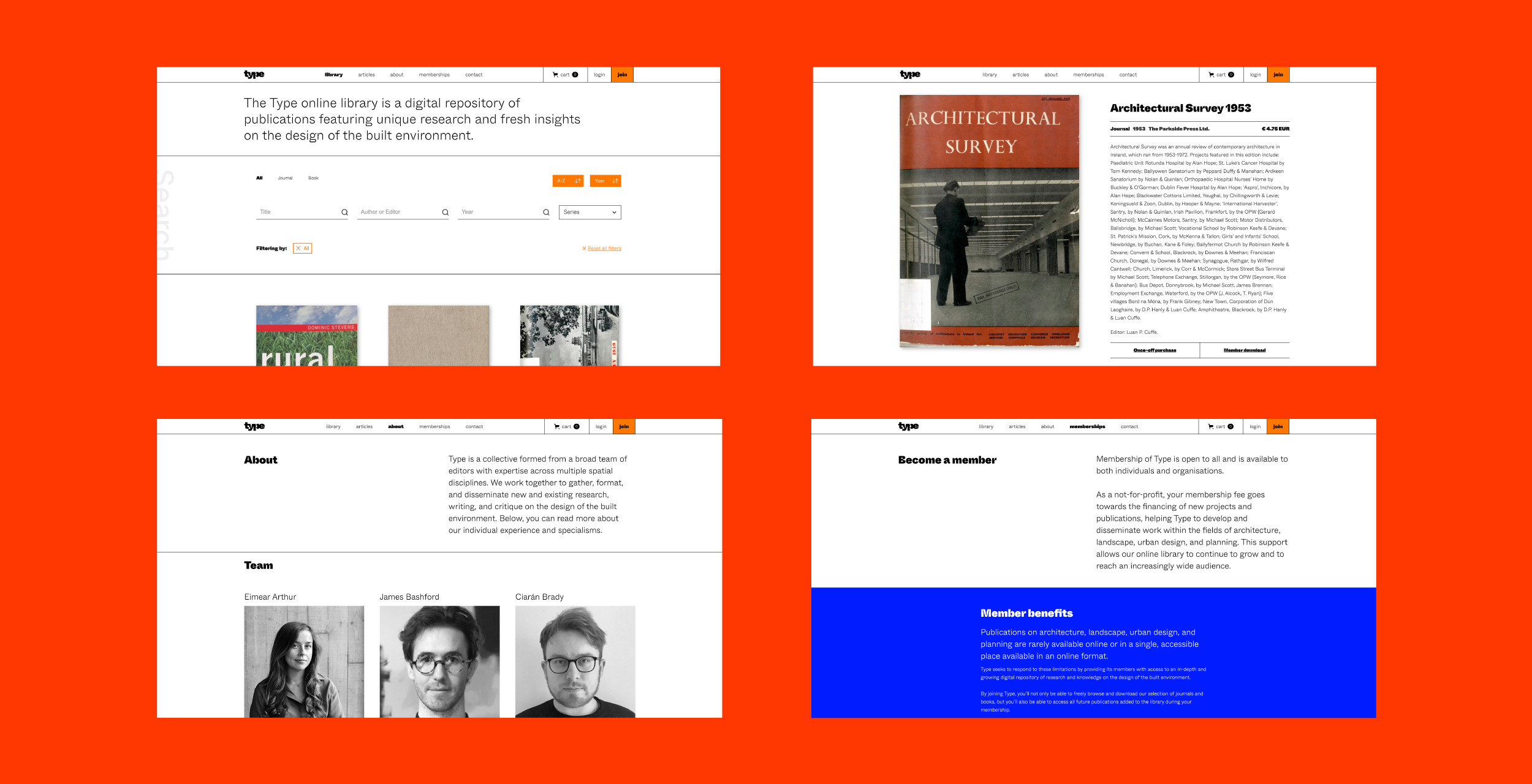
Our brief was to design and build a customer-facing website that would appeal to quite a specific audience. The UX strategy was devised around promoting once-off purchases of digital products (publications) and the purchase of Memberships. We wanted the website to have an archival feel as well as employ best practices around e-commerce UX design - the promotion of clear, simple and fast sales. The site also needed to showcase articles written by the team and capture a database via newsletter sign-up.
After mapping out the content and website structure, we worked out the information and inventory architecture alongside researching the best systems to use for the build. The client needed to be able to edit the site content, manage inventory, orders and memberships. We needed all of these features to be possible without compromising on our design goals.
In terms of UI, we wanted to keep it minimal and product and text-focused. There are touches of the brand visuals in place, but nothing that distracts from the overall UX goals.
As the site builds traction and grows, we hope to work with TYPE to meet demand, looking at adding features, editing existing features or looking towards a custom backend and more advanced search function in the future.