Uniquely
2023
Designed by David Dowling, Stephen Byrne, Liam Willis and Martin Fanning
Strategy: Celine Dee
Tone of Voice: Leigh Morrow
Copy: Aoibhe Casey
Categories: Website / Environmental / Identity / Signage
Industry: Corporate
Website: uniquely.ie/
The quick context
In today’s pacey, tech-shapeshifting reality, a human-first approach sets the extraordinary apart from the ordinary. As a stalwart in the sales industry for 18 years, SalesSense, with its relentless commitment to redefining the norms of traditional sales and services, has consistently elevated customer experiences through innovative and uncommon strategies. Over years of growth, however, the company realised its existing identity did not capture the full spectrum of services it offered. Moreover, it did not capture the dynamic essence of its culture, people or products which span from sales-related services to a holistic, 360-degree approach to the customer experience.
The strategy-shaping insight
At the core of SalesSense’s success was its unique approach; putting people at the centre of each and every interaction. Every action they took centred around creating seamless experiences for partners, employees and customers with zero exceptions. This intuitive insight, know-how and dedication is what sets them apart.
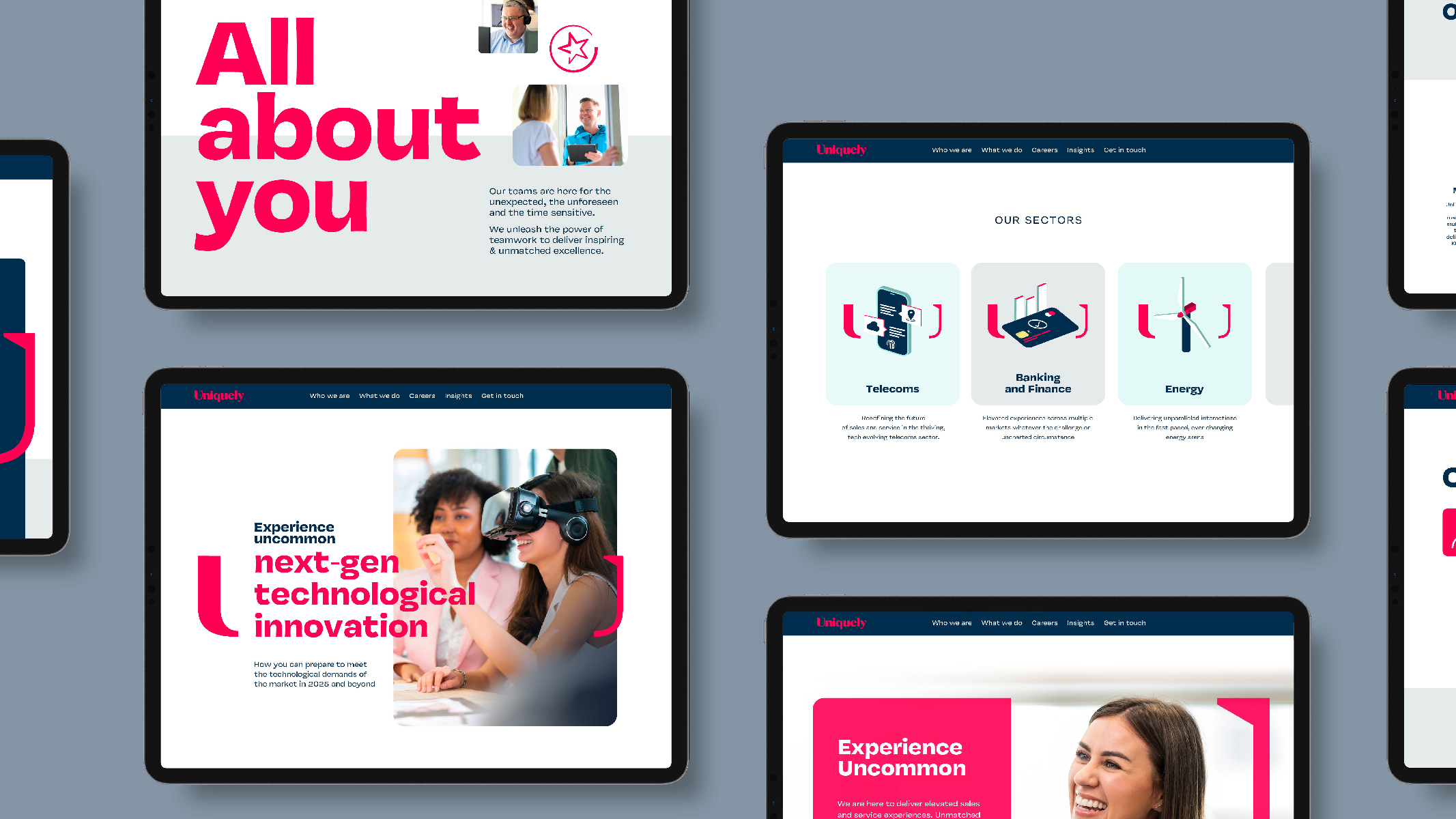
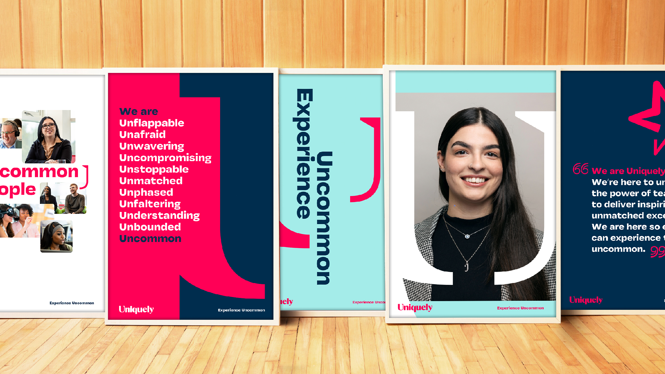
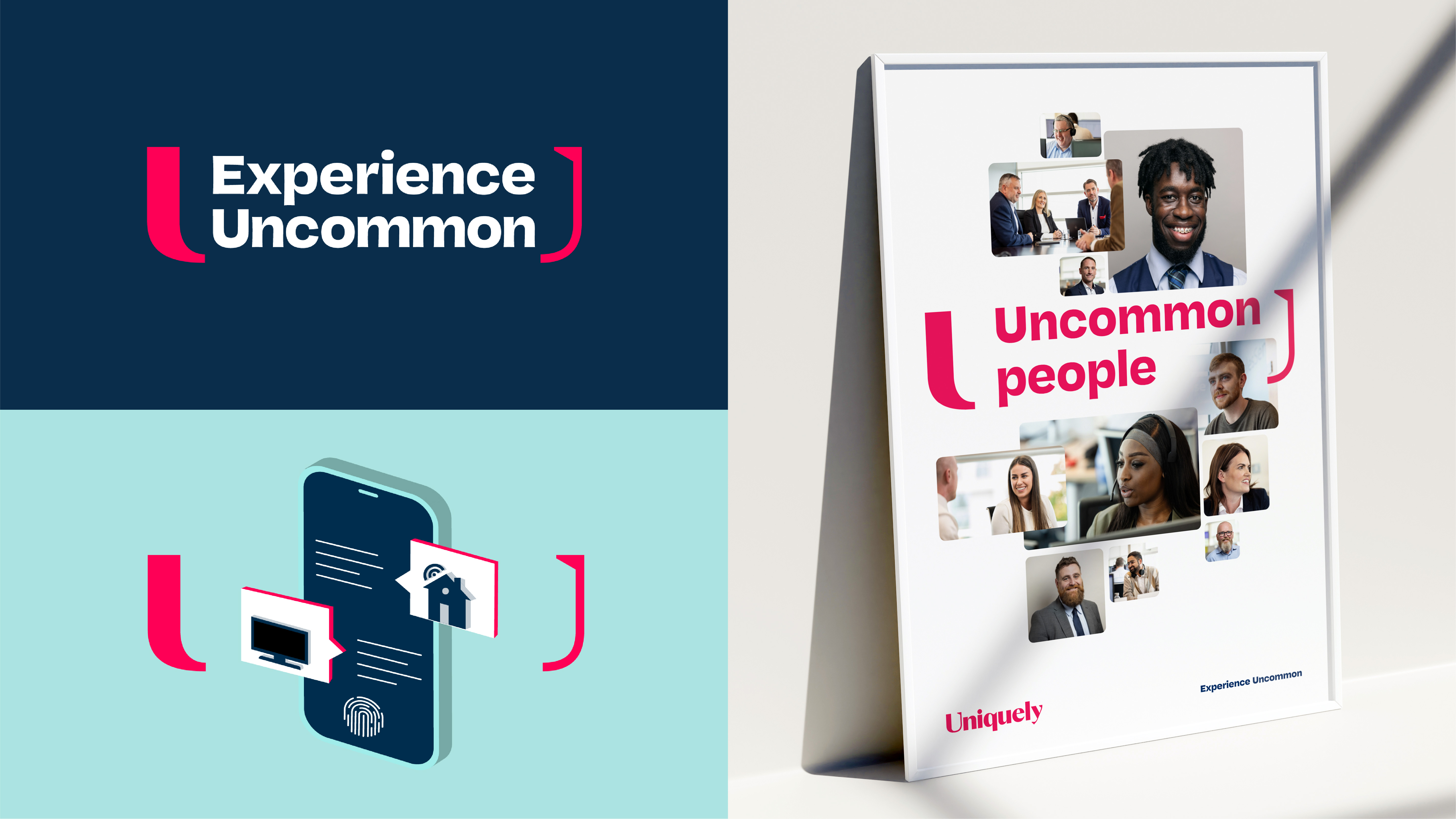
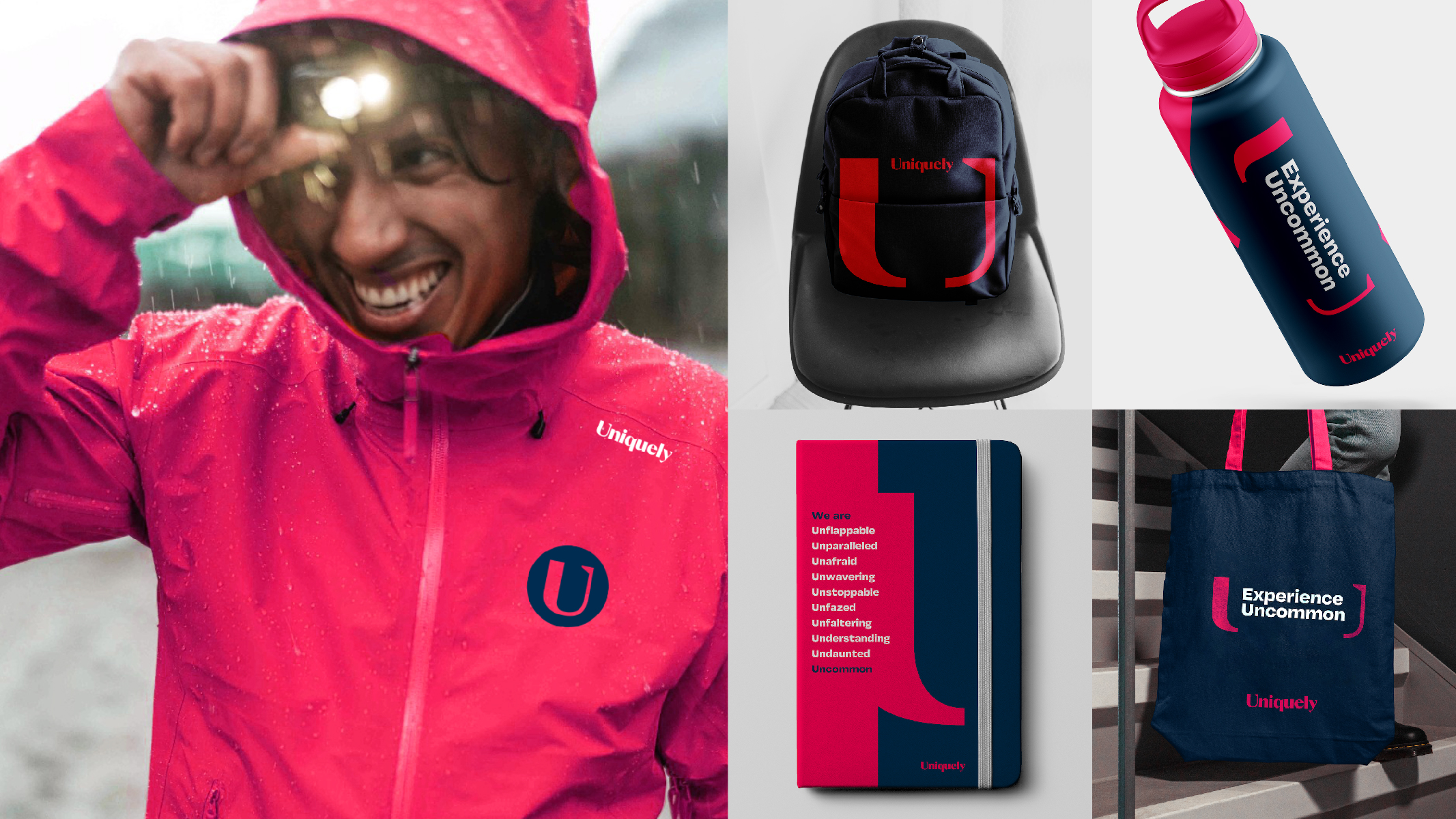
Recognising this elemental strength, we knew their brand had to elevate experiences, hero its people and be unapologetically uncommon. A proposition, Experience Uncommon, and a new name, Uniquely, were developed to bring life to this insight and develop a strategically grounded outlook and identity.
The challenge
The challenge was monumental – transform an established brand without compromising long-standing client relationships and navigate potential resistance from internal stakeholders.
The result
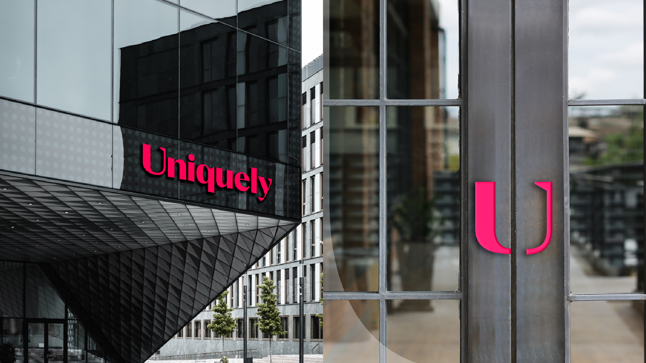
The transformation was not simply cosmetic. It was a strategic move forward for the brand to align its image with future aspirations. Our goal was to create a distinctive visual and verbal brand identity that stood out from the crowd. From the band-inspired typography and “U” framing device to the photography of their own people and energising brand proposition – individuality, energy and spirit now radiated through the brand at every level. The new identity and tone have also helped the brand move away from the generic business-speak often found in the industry, putting its people-focused philosophy into action.