van Dijk Architects – Brand Identity
2020
Designed by Killian Walsh and Jake Heavey at Grandson
Categories: Identity
Industry: Commercial
Tags: Architecture / Illustration / Rebrand / Branding / Logomark / Brand identity / Logotype
International architecture practice, van Dijk Architects have been operating for over 20 years. We were tasked with modernising their brand identity, while staying true to their original hand-drawn illustration element of their original branding.
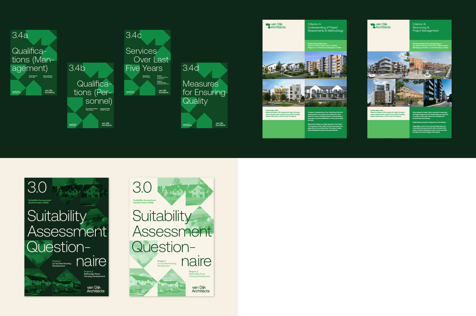
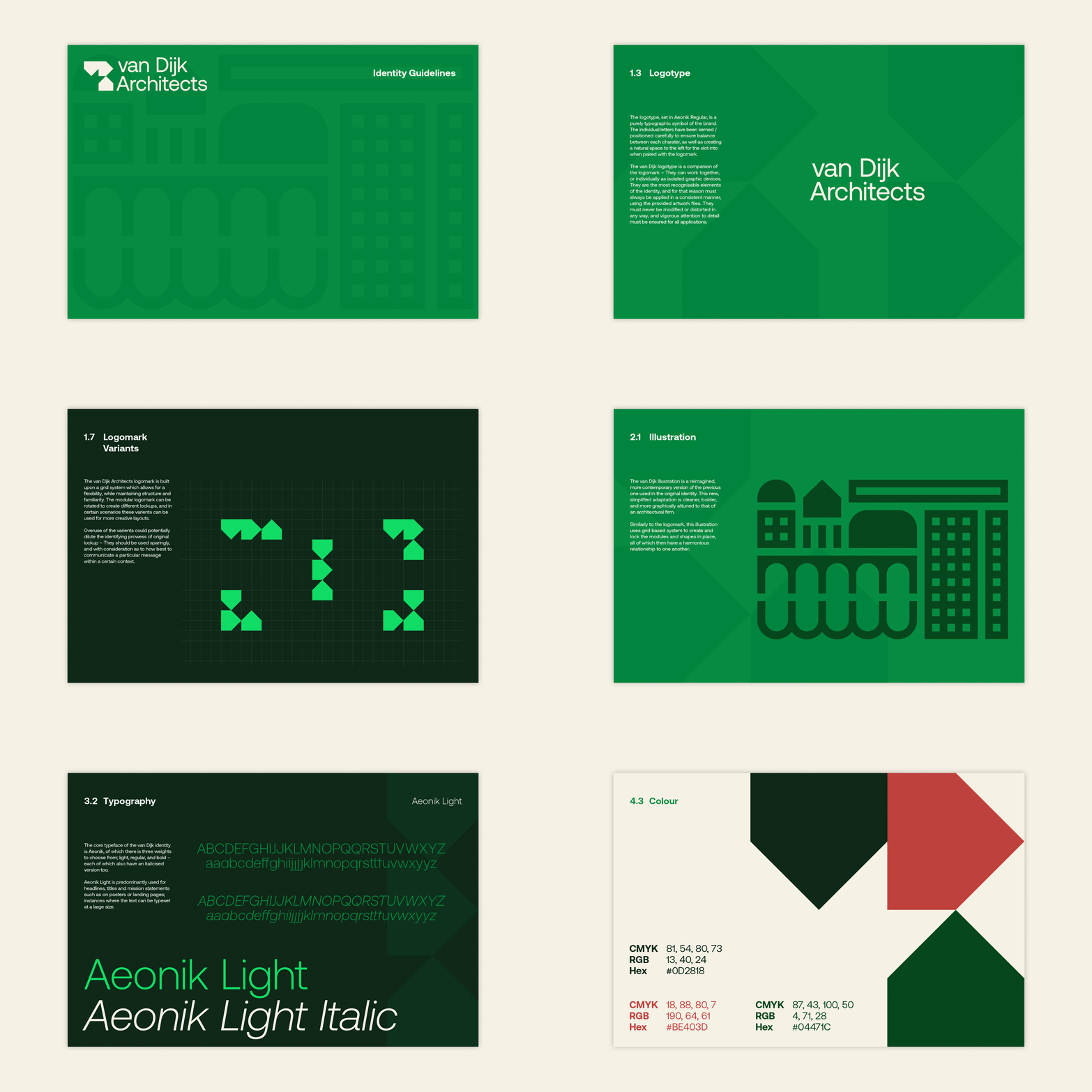
Based off the previous illustrative brand identity, we modernised and re-imagined the VDA brand, creating a modular and contemporary logomark and bespoke illustration, reflecting the various architectural sectors they work within, using form and shape in a modular and adaptable way.
The VDA logomark is also representative of architectural forms and building blocks, which can be adapted, stacked, switched and built upon.
Using a reductive colour palette, featuring G.F Smith Lockwood Green paper stock, and Aeonik typface by Co Type Foundry.


