VISUAL (2015)
Designed by David Smith, Clare Lynch (Design) and Oran Day at Atelier David Smith
Print Media Services: MM Artbook Print & Repro
Client and CEO, VISUAL: Ann Mulrooney
Categories: Identity / Promotional
Industry: Cultural
Historically this signature venue was branded as both a centre for the arts and a theatre. The dual purpose of the venue contribute to a dilution or occasional micsoncepton of the space which without doubt is one of the finest contemporary arts spaces in Europe. The incoming CEO sought to reaffirm the venues Visual Arts credentials and position this dynamic multi-disciplinary arts venue amongst the best nationally and internationally. With limited funding and resources a phased roll out was desirable starting with a refresh/revised logo and new typographic standards for 2015 with environmental and digital applications to follow in 2016. Key to the success of the brief was retaining an association with the local community and a connection with the space and facility itself.
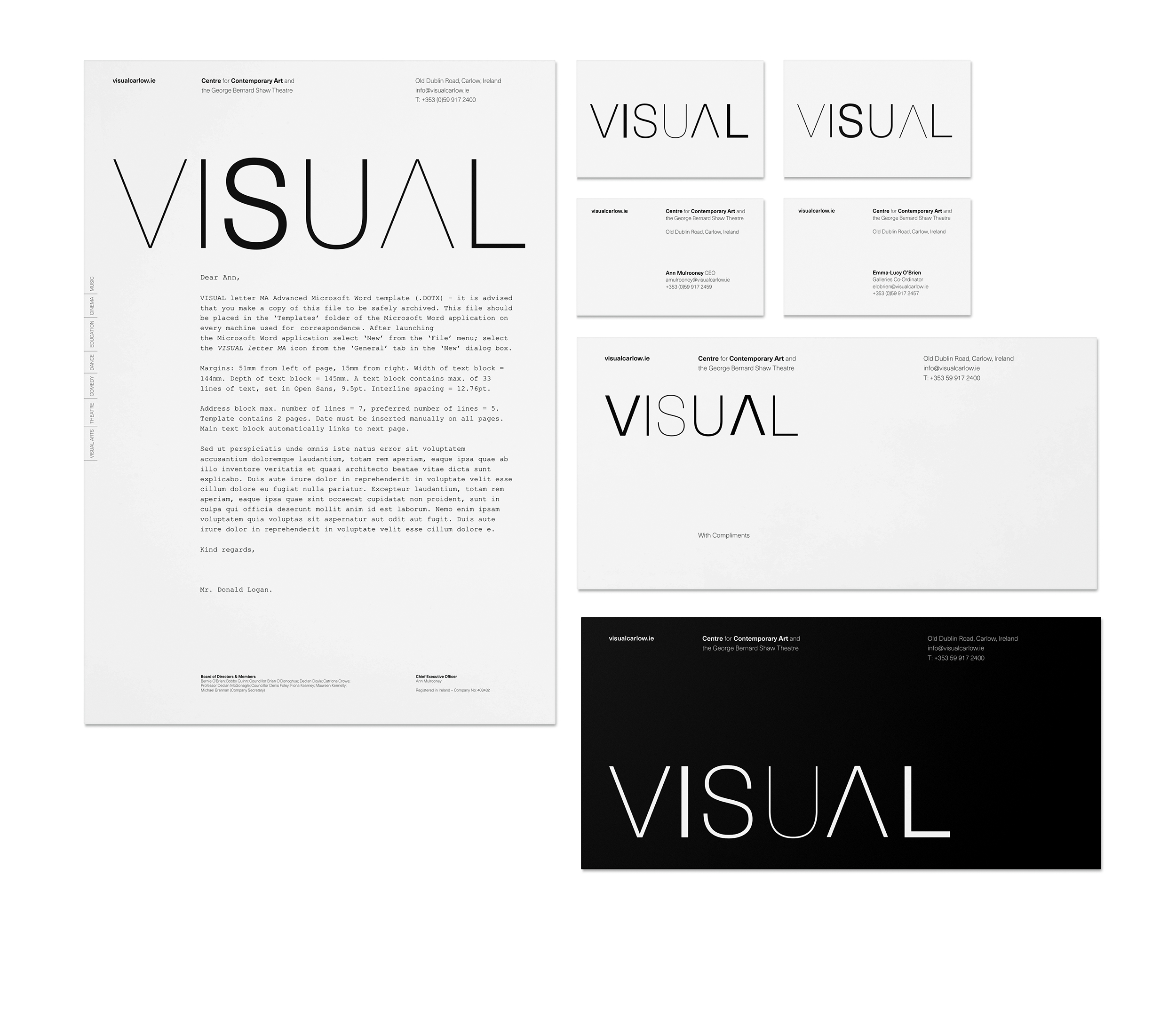
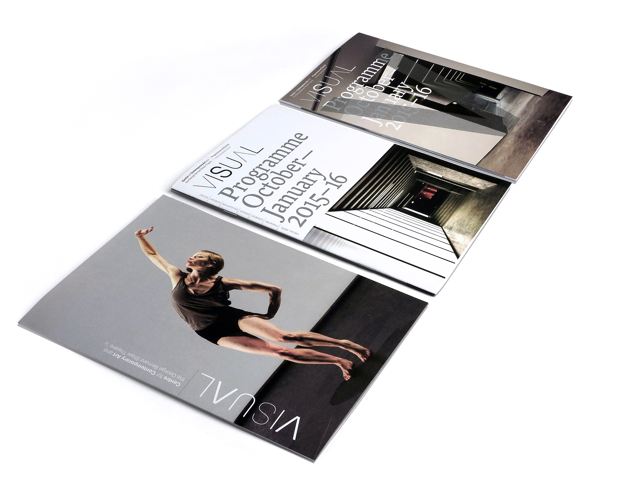
The legacy mark for the venue was wholly derived from the form of the building, singular and monolithic it became increasingly limited in it's flexibility. Despite its obvious "sense of place" it had diminishing currency or resonance with contemporary audiences familiar with international gallery programmes and identities. Seeking to retain an association with Carlow we surveyed the changing landscape over a period of months and also mapped changes of light in the vertiginous spaces of the Gallery. This flux of the light, be it over a day or a year; the changing seasonal shadows; different flecks of light on walls/surfaces all became the basis for typographic exploration.
Using the full scale of variants of a contemporary grotesk allowed us to create multiple master marks. Typically presented at scale – mirroring the buildings presence – the logotype elegantly and simply communicates the concept whilst presenting the venue in a more contemporary way.