Waterford - Pilgrimage 1st Cuvée: Bottle & Packaging Design
Designed by John Gavin, Colm O'Connor, Leon Murphy and Vanessa Gavin at TrueOutput:
Photography: Caolan Barron
Industry: Commercial
Tags: Food and drink
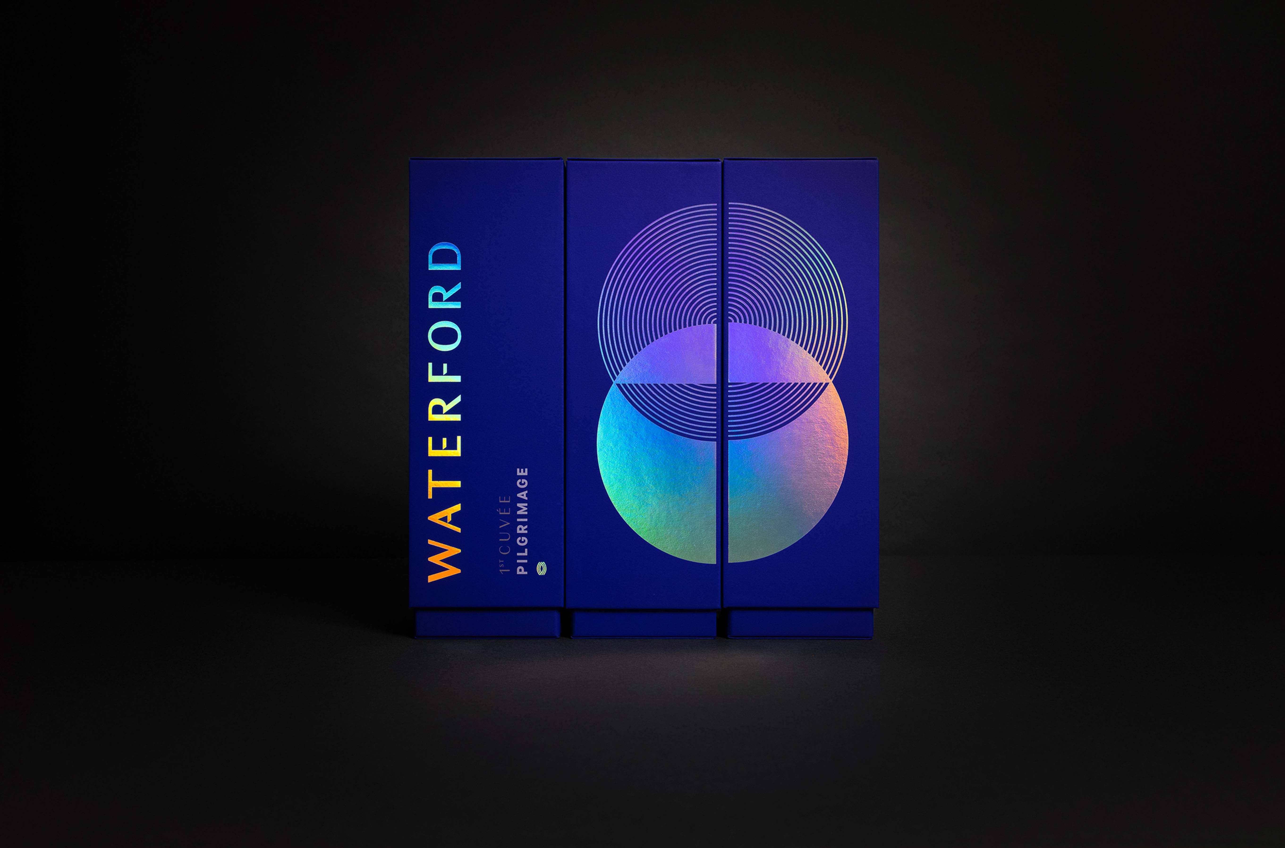
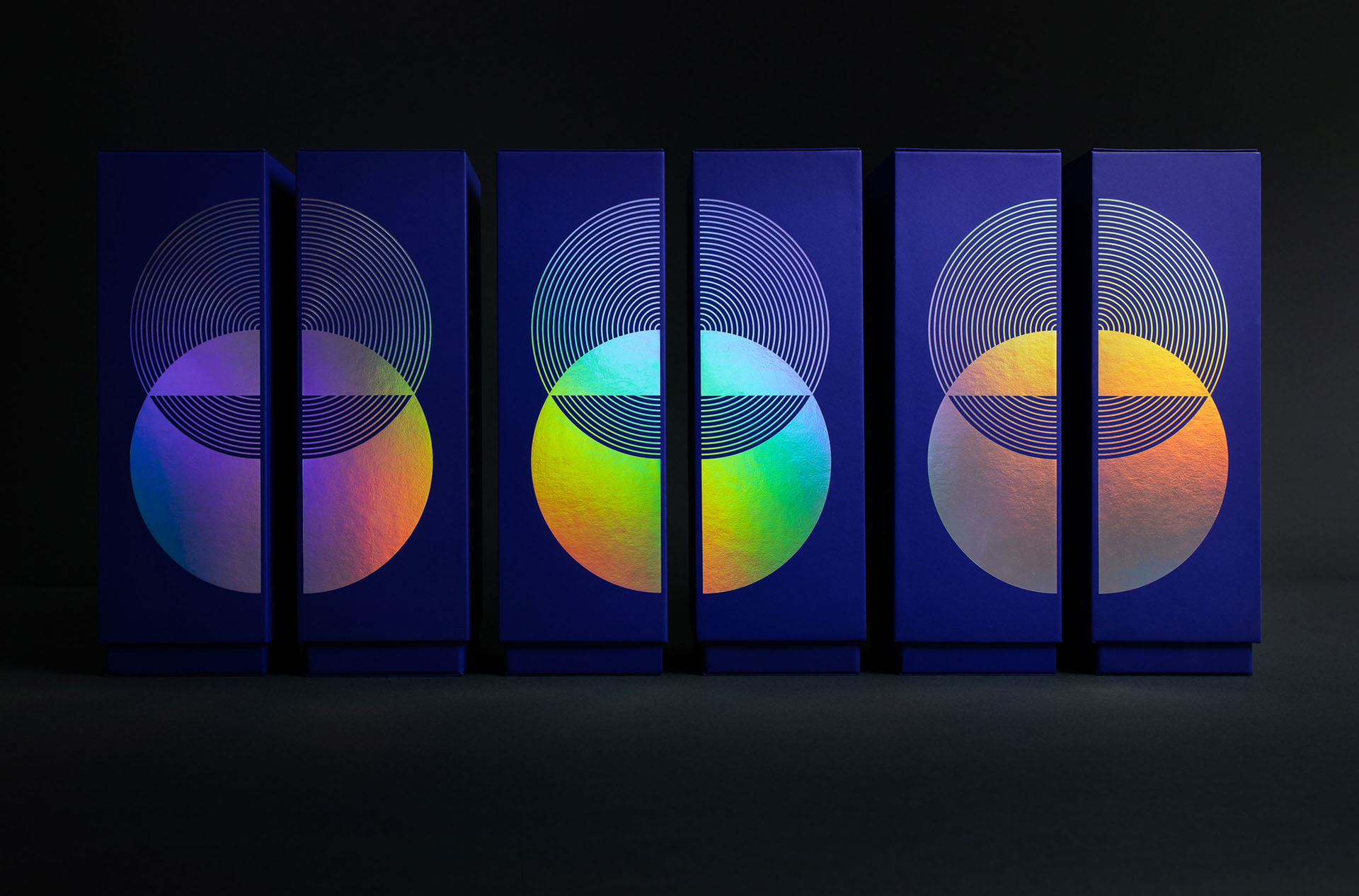
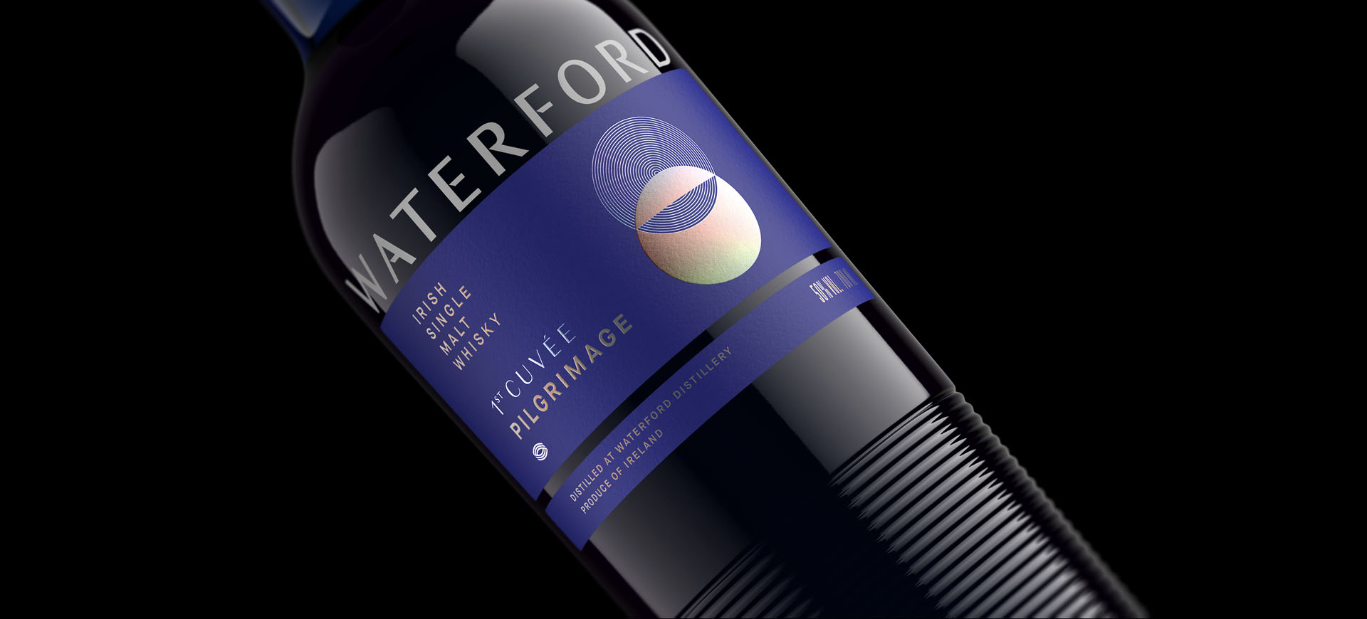
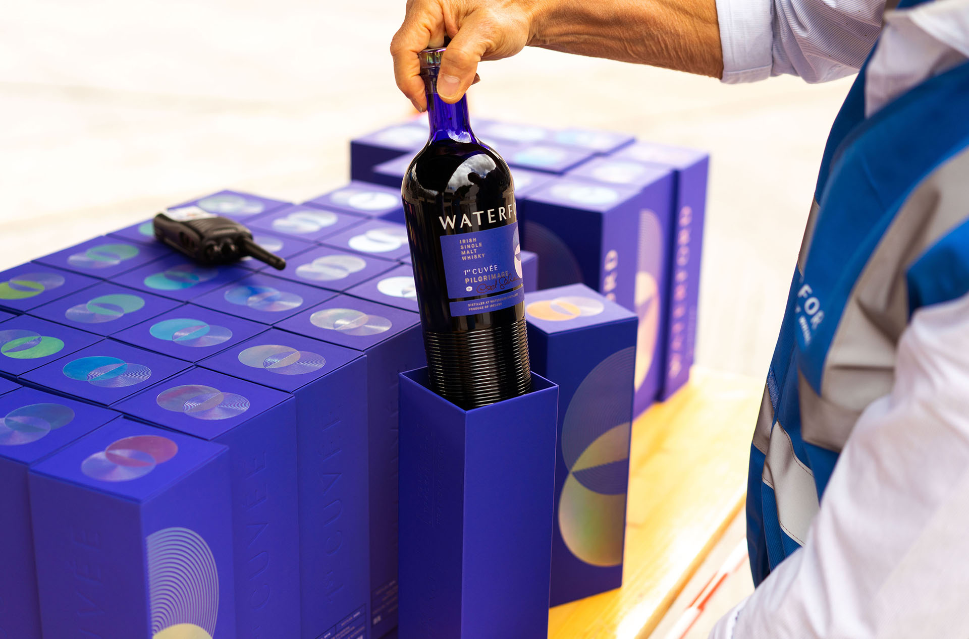
The first limited edition bottles of Waterford Whisky were launched in 2020. The packaging needed to mark this occasion and launch the new brand identity and bespoke bottle design to the world. The Pilgrimage took its name from the idea that people would need to make a pilgrimage to Waterford in order to obtain this inaugural release.
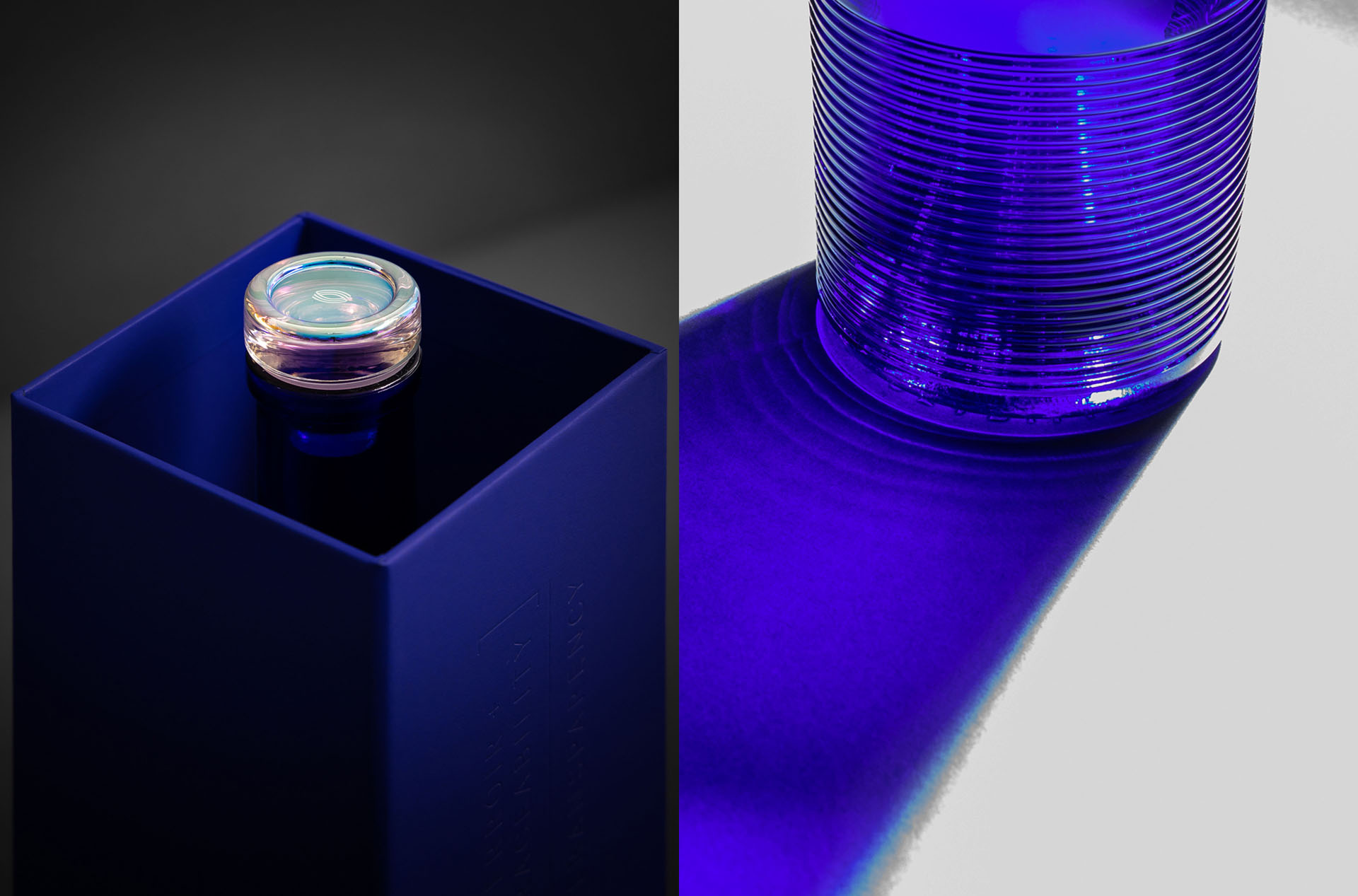
The bottle design challenge was to make something unique and practical - with the eye on creating an iconic classic. We were inspired by blue glass bottles once traded on the quays in Waterford and the contours on the bottom of the glass were inspired from the corrugated ridges on the distillery building itself. The deep connection this whisky has to nature and barley informed the symbols. Concentric circles represent the multiple barley farms intersecting with the solid circle; earth. Where they intersect creates the ‘hidden’ shape of a seed of barley. The glass stoppers were chosen as a more reliable and cleaner option to traditional corks. Foiling and embossing are used to add layers of depth and tactility. The majority of these bottles were bought for collections where the box and bottle are proudly displayed together. The final product avoided the use of plastic and specified FSC boards and papers throughout. We delivered the full brand Identity system, bottle design, and packaging design.