West Coast Cooler
Designed by Sinéad McAleer and Emma Connolly at Slater Design
Photography: White Cloud Photographic
Typography: Bobby Tannam
Categories: Identity / Packaging
Industry: Commercial
Tags: Illustration / Typography / Food and drink
Background:
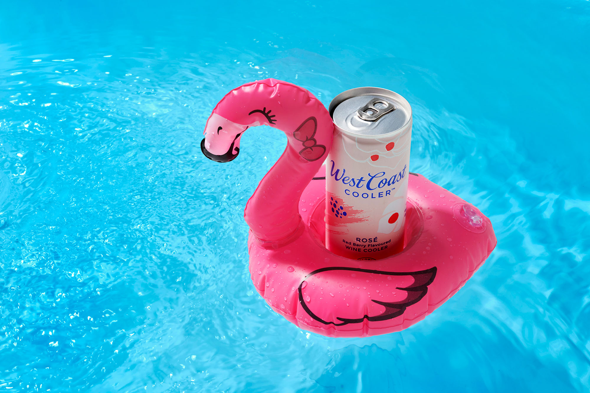
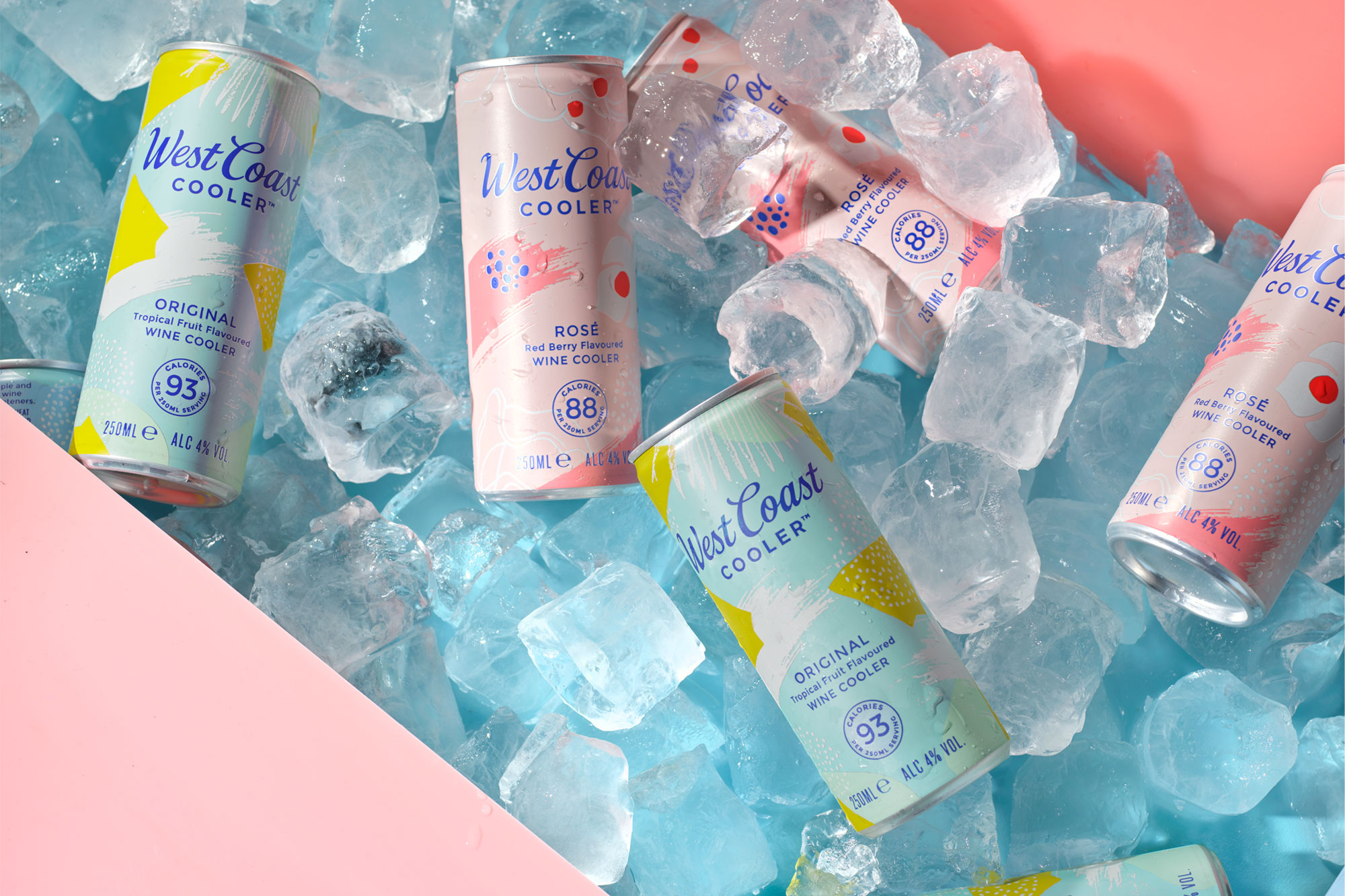
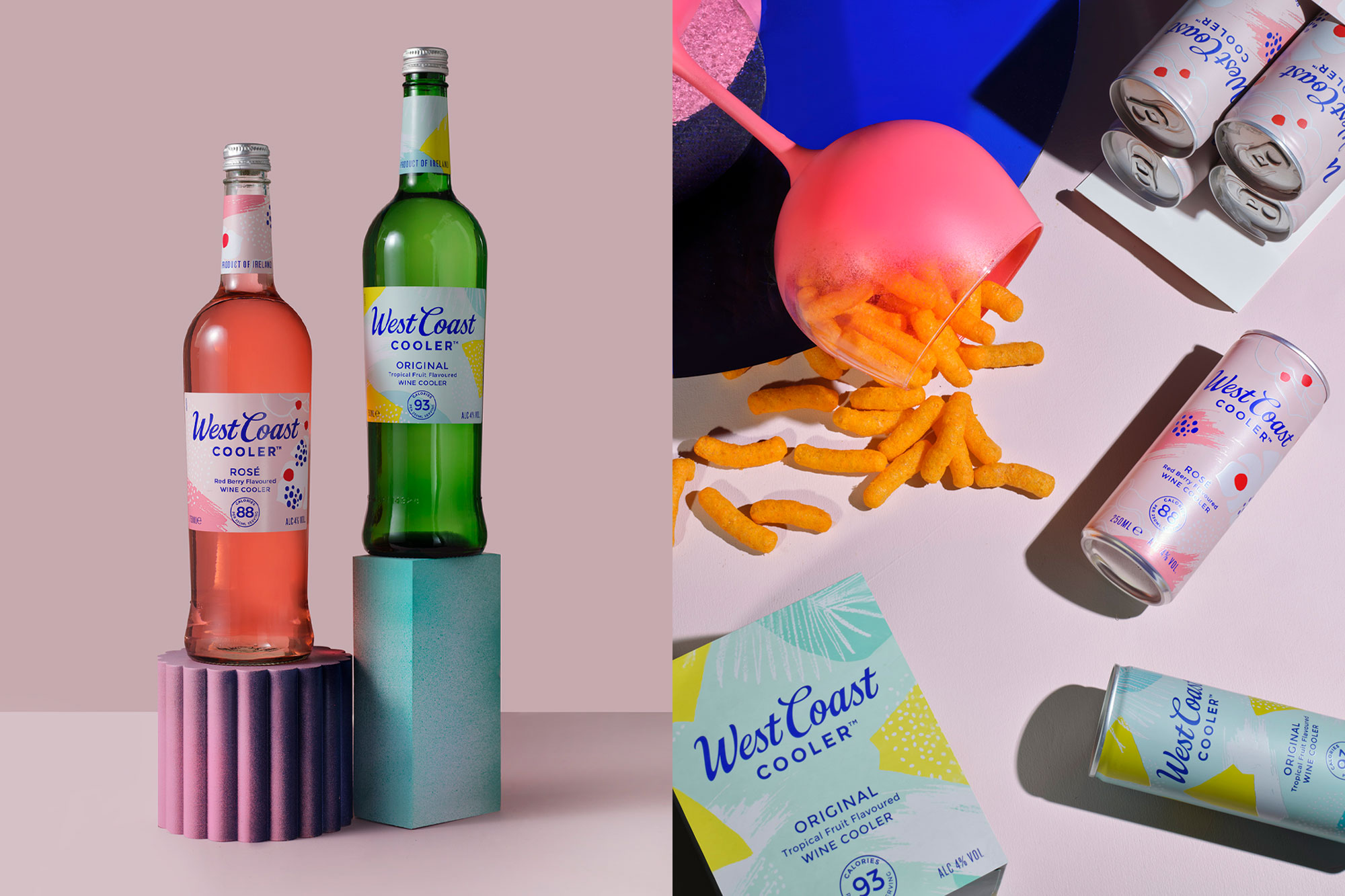
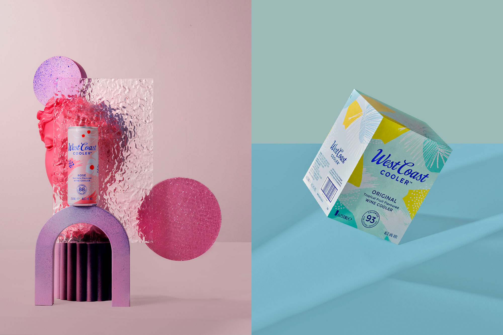
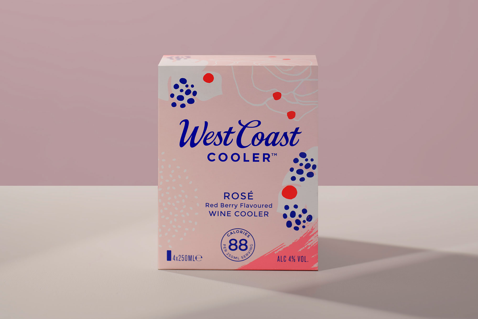
Irish Distillers approached us to refresh much loved Irish drinks brand and 80s classic, West Coast Cooler. With huge innovations in the ready-to-drink space, including the advent of the hard seltzer, West Coast Cooler needed a revamp to compete in this increasingly competitive space. The new look packaging had to grab the attention of new generation of shoppers, without alienating existing loyal customers. As part of the refresh a 250ml can format was introduced, a great opportunity to showcase the refreshed look.
Approach:
Our research took us back to the 1980s, when West Coast Cooler was born. A decade that didn’t take itself too seriously, there was a care-freeness to the 80s that we wanted to re-inject into the West Coast Cooler brand. Visual references from pop culture, music and fashion of the decade inspired the illustration style and colour palette - soft pastels with an injection of electric blue. We wanted the packs to feel light and refreshing - West Coast Cooler is low in calories and lower in alcohol than some competitors, big positives for today’s more health conscious drinker.
The West Coast Cooler word mark was at the centre of old brand, and held a huge amount of brand equity. There were some areas that it could be improved however. We identified these then engaged the expertise of script typography specialist Bobby Tannam to perfect the execution.