White Mausu
Designed by Rachel Copley McQuillan and Stina Sandström at Bureau Bonanza
Categories: Promotional / Print / Identity / Packaging / Signage / Social Media
Industry: Commercial
Tags: Typography / Digital / Food and drink / Art direction / Campaign / Social
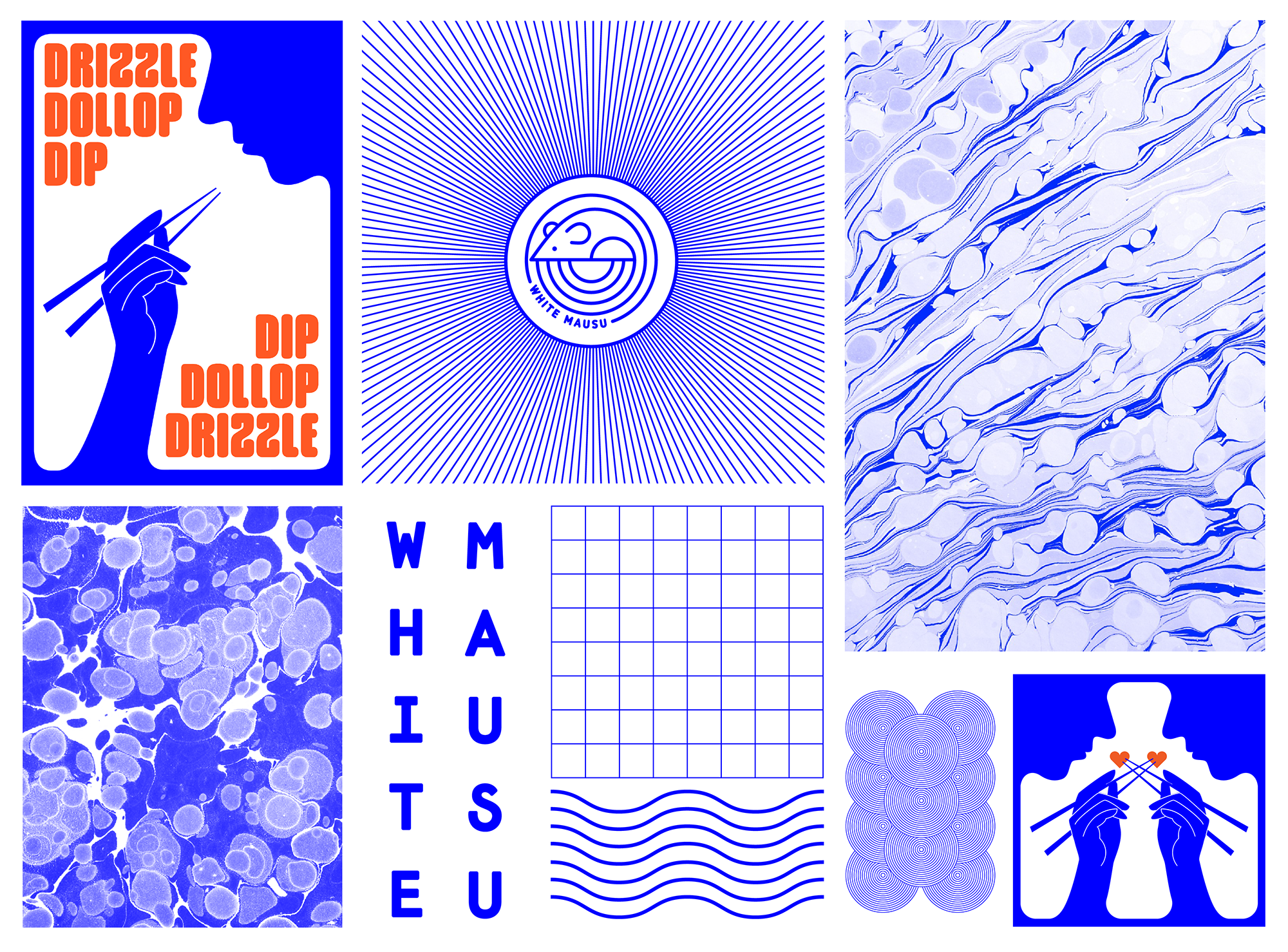
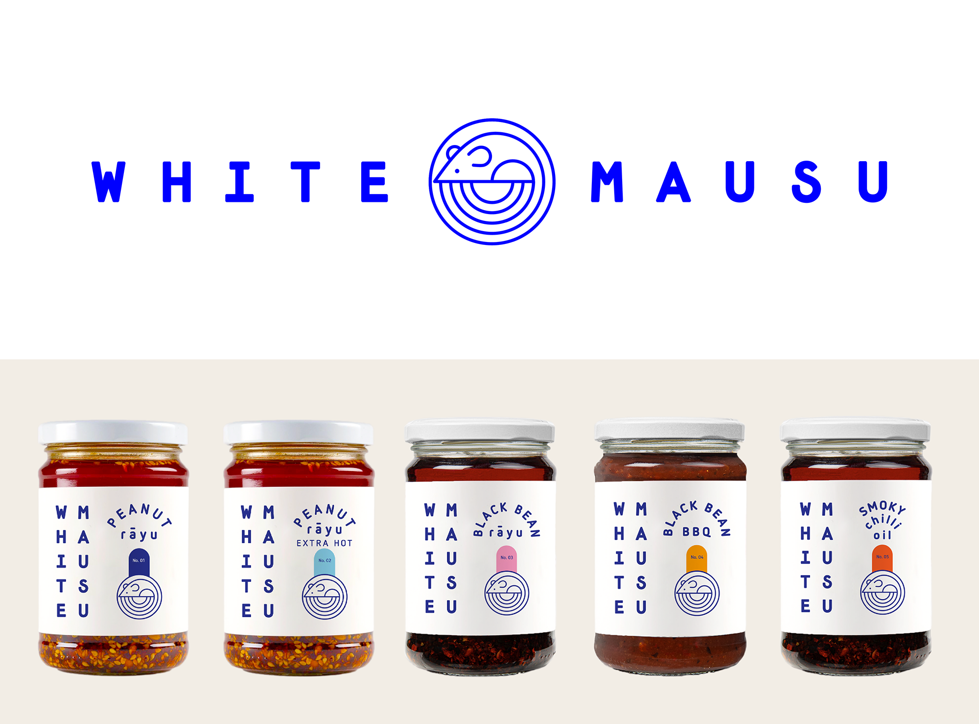
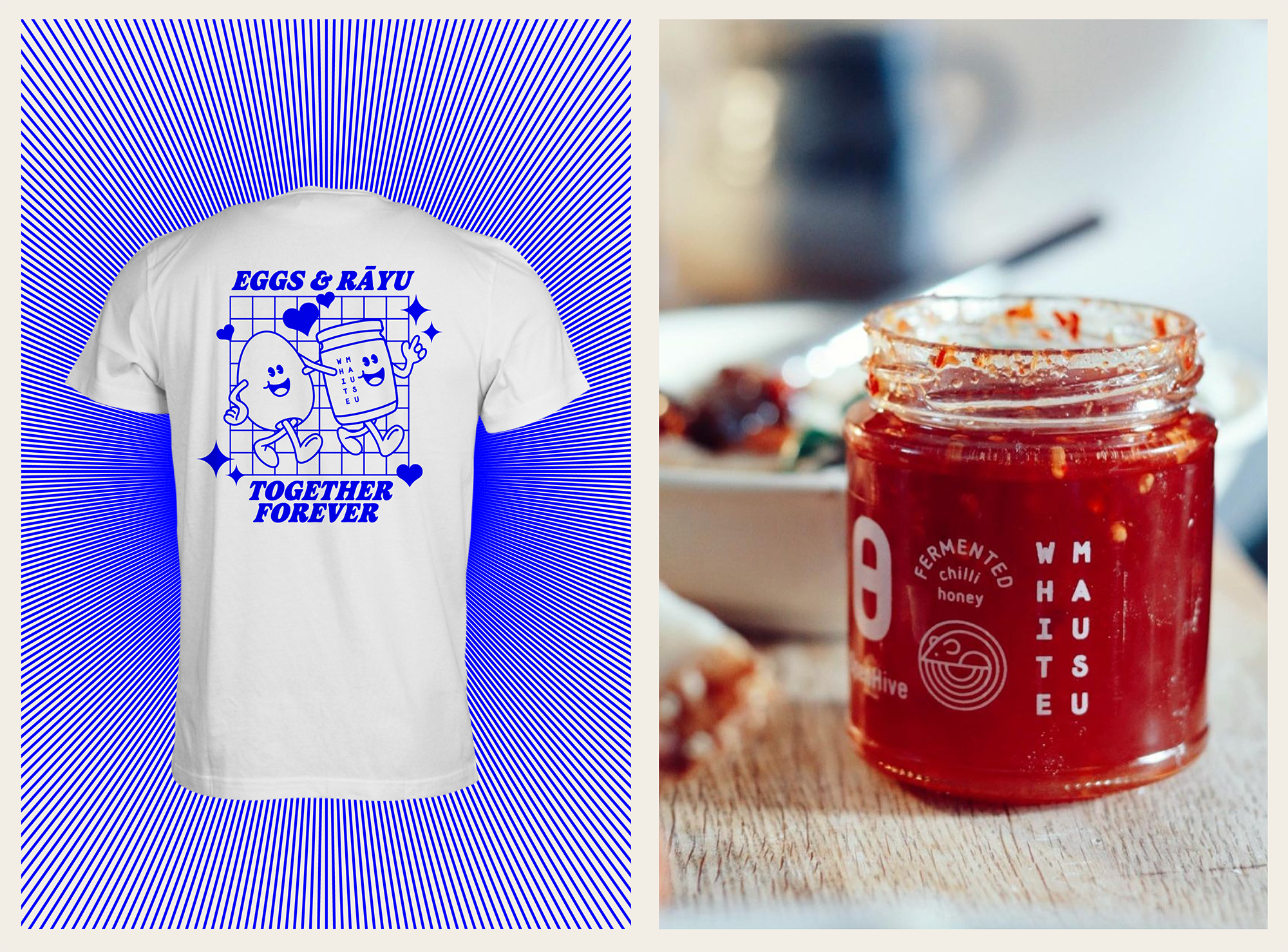
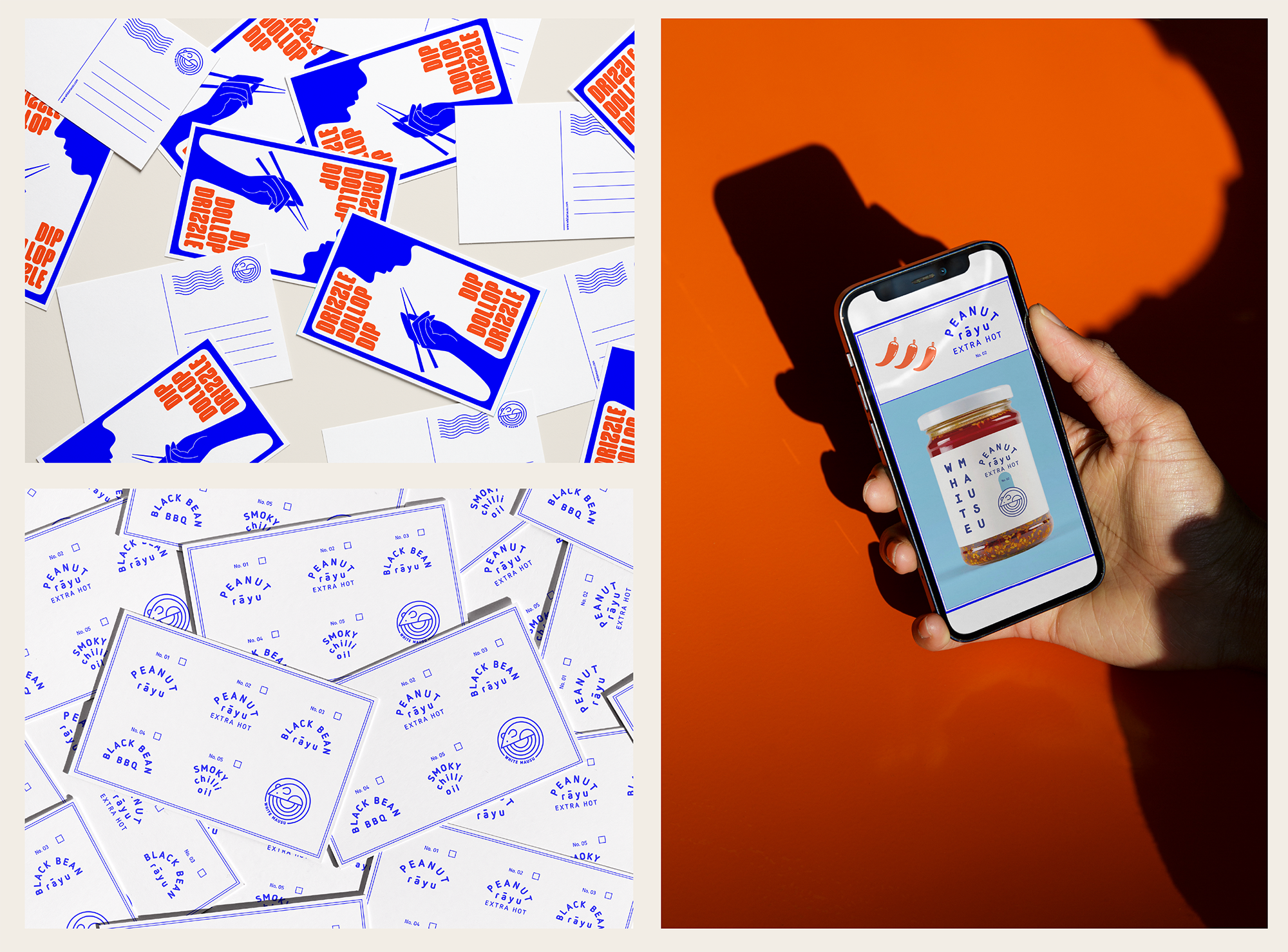
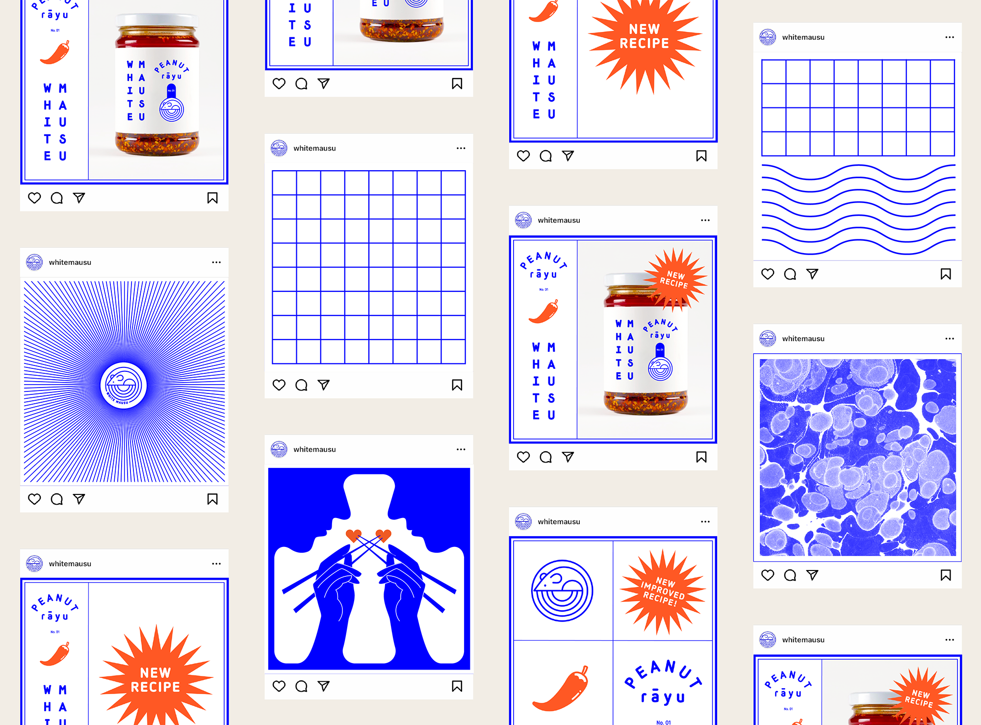
When White Mausu approached us seeking to update and revitalise their already impressive brand identity for the changing times, they had pinpointed certain aspects that were outdated, less effective, or unnecessary. Our challenge was to conscientiously propel it forward; aligning it with the evolution of the food company and their array of new flavours, ensuring its relevance for the future, all the while preserving the brand’s integrity and value. The objective was to develop their identity through a comprehensive set of new logos, labels, merchandise, social media assets and more to come that will harmonise their overall output.
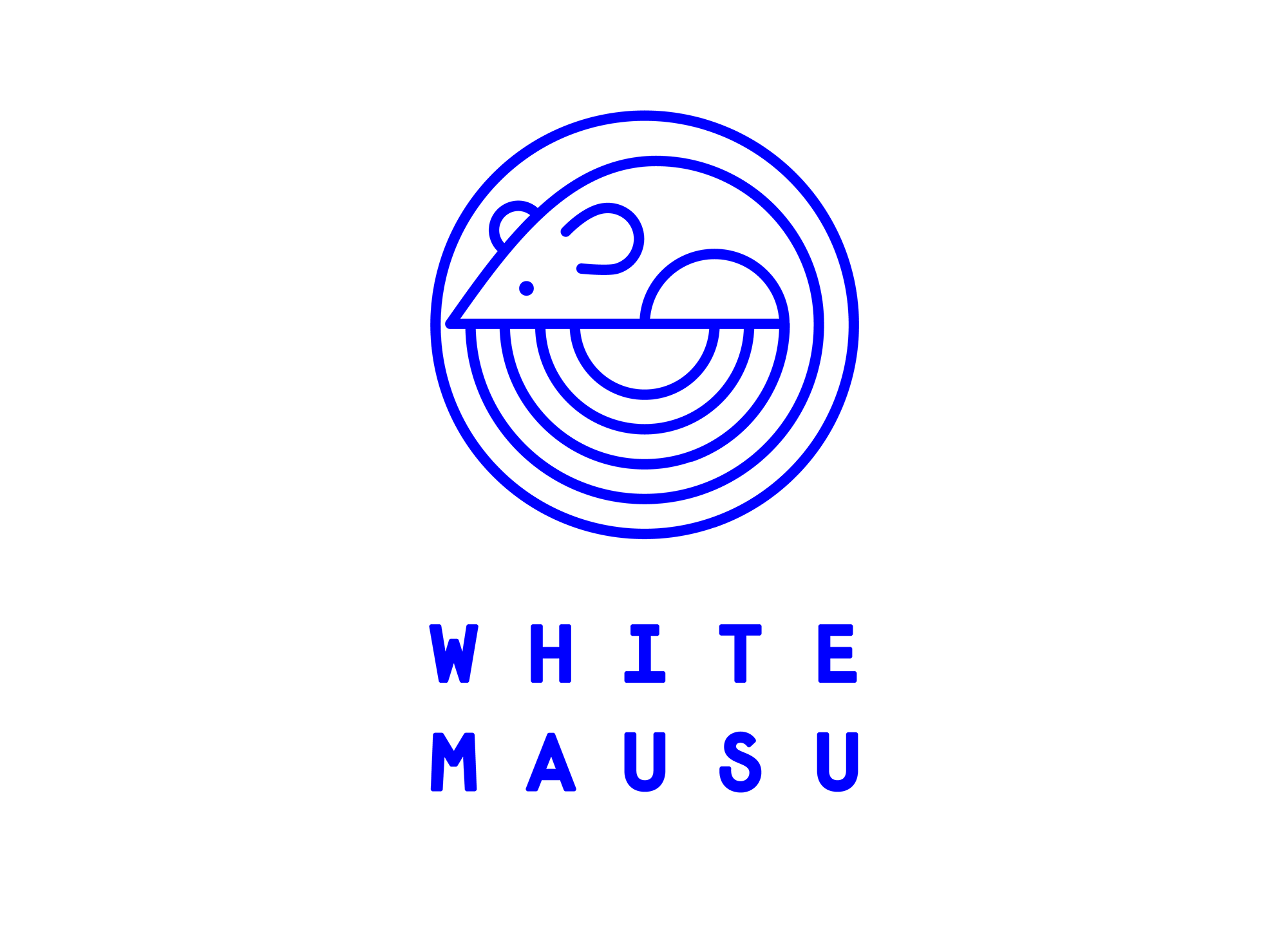
By examining the legacy brand, we identified which elements were successful and crucial to maintain in order to leverage their existing recognition. We retained, refreshed and enhanced the fundamental elements, such as the mouse roundel and the vertical logotype, while predominantly employing a blue and white colour palette for consistency. However, to reflect the distinct flavours of their products, we introduced new specific colour schemes for each. These tailored colour schemes were integrated across their product range packaging and online presence. While the blue and white is used across outer packaging, merch and signage.
As an ongoing and slow rebrand, elements are introduced over time in alignment with White Mausu’s commitment to sustainability. Furthermore all materials used in the branding process are eco-friendly and sourced from sustainable origins.