White Mausu Packaging
Designed by Trevor Finnegan and Shane Bonfield at Revert Design
Prop Design: Viv Quinn
Categories: Identity / Packaging
Industry: Commercial
Tags: Food and drink / Packaging
Website: whitemausu.com/
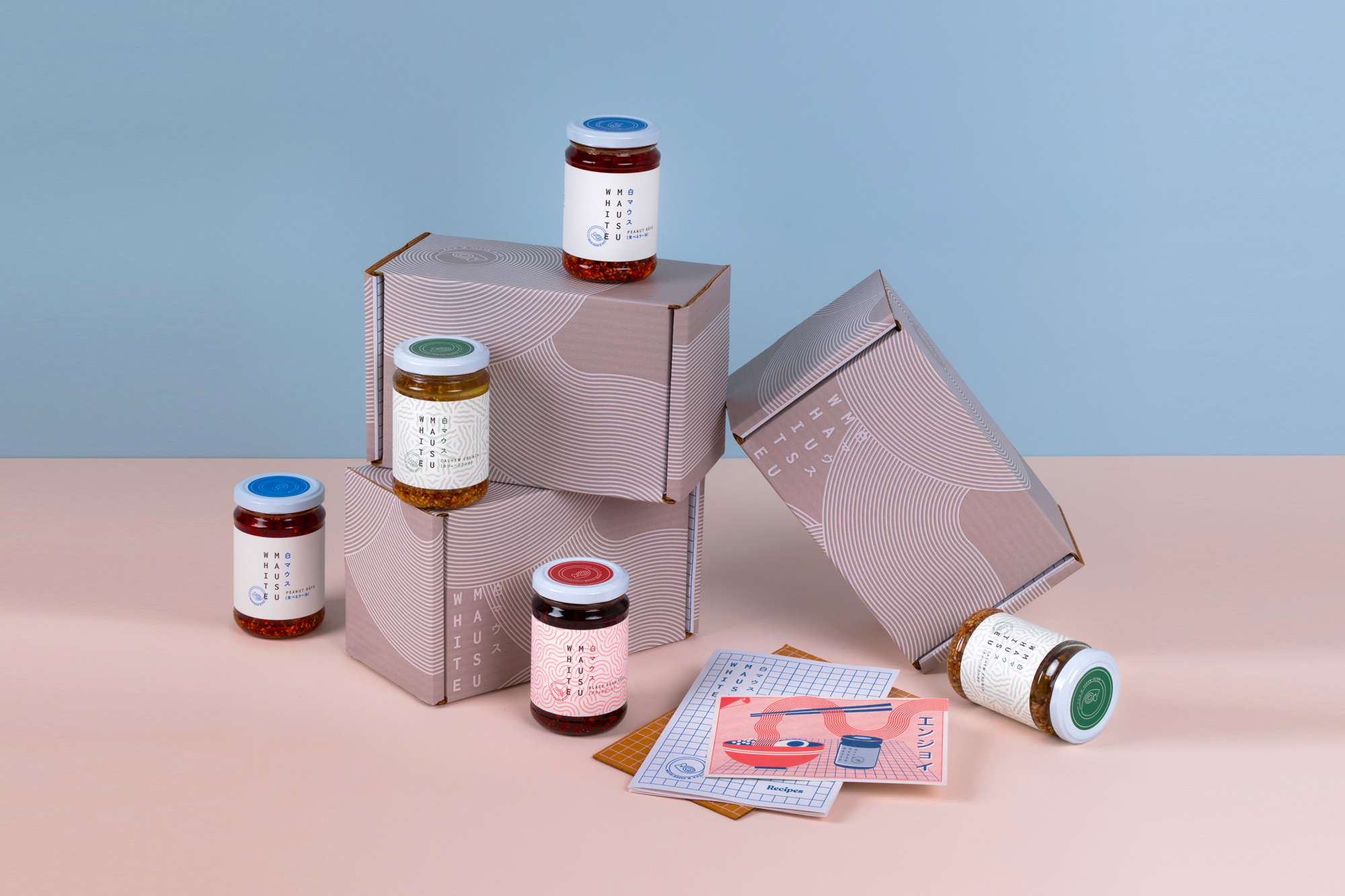
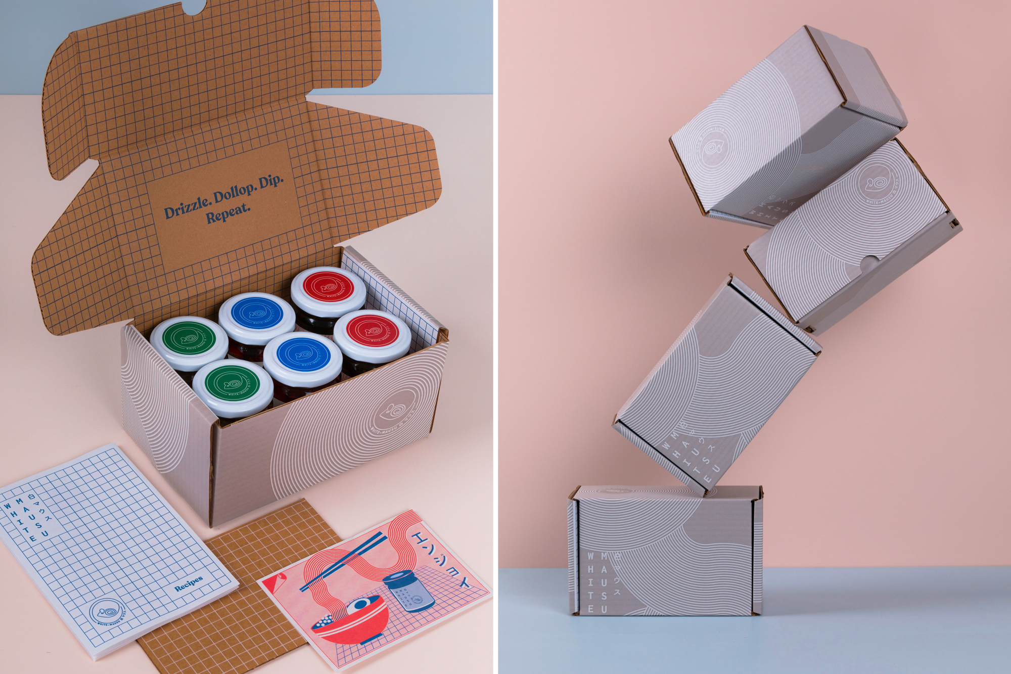
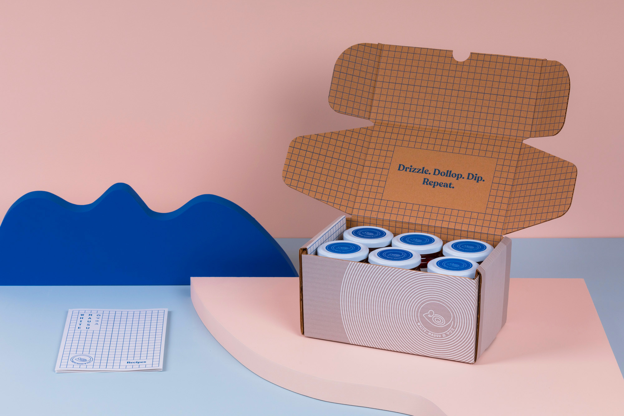
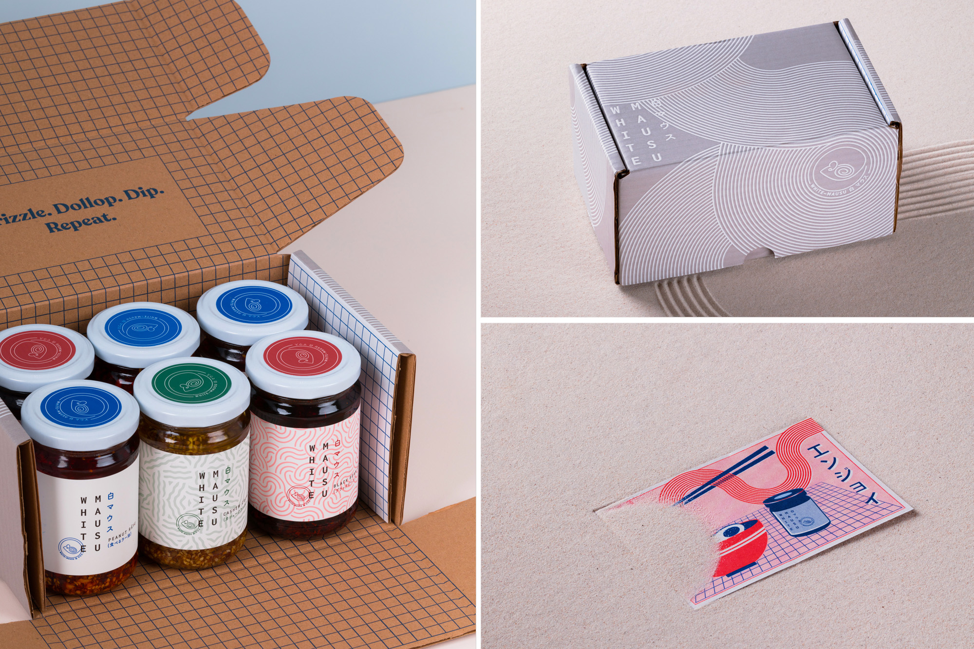
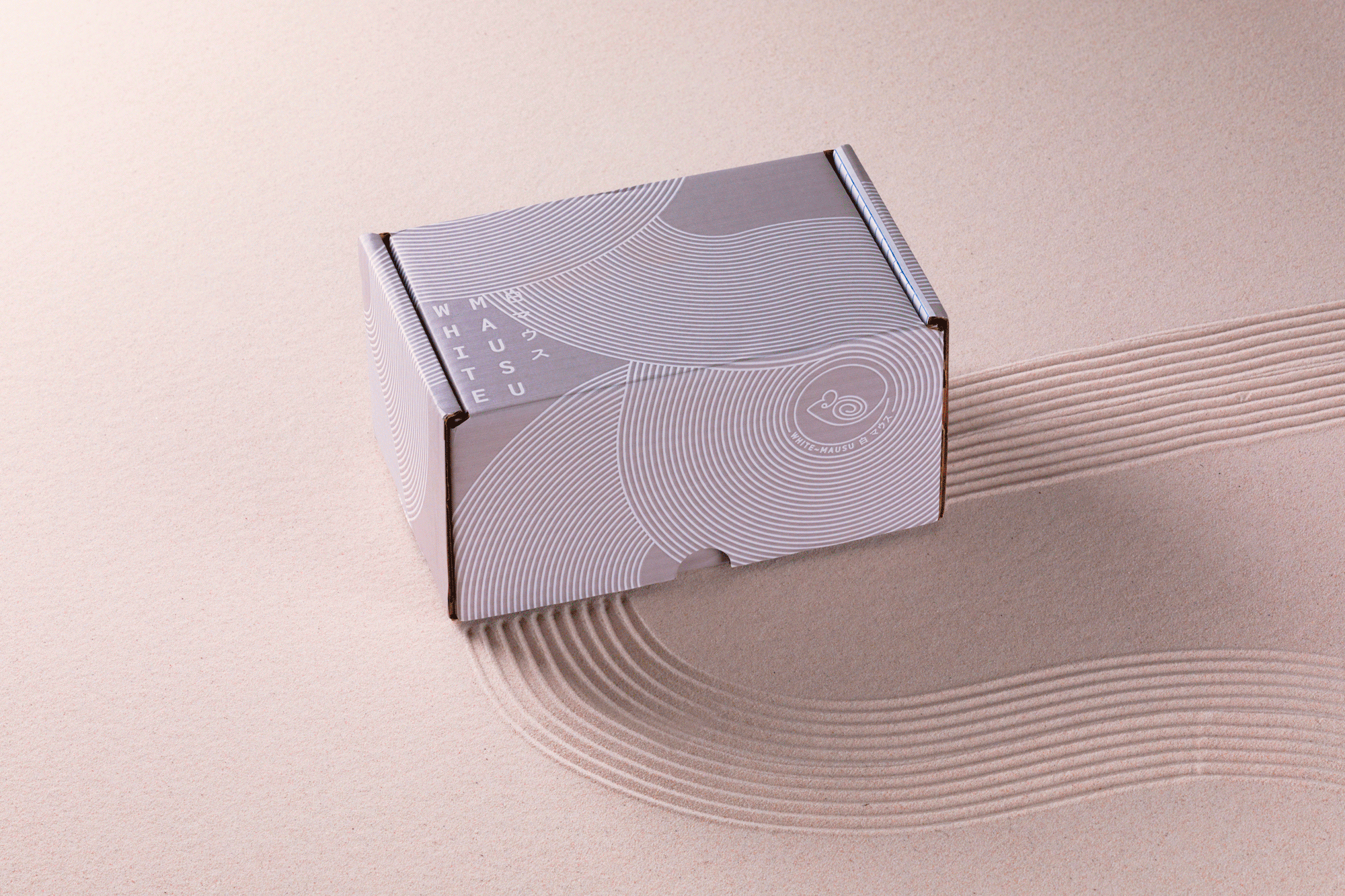
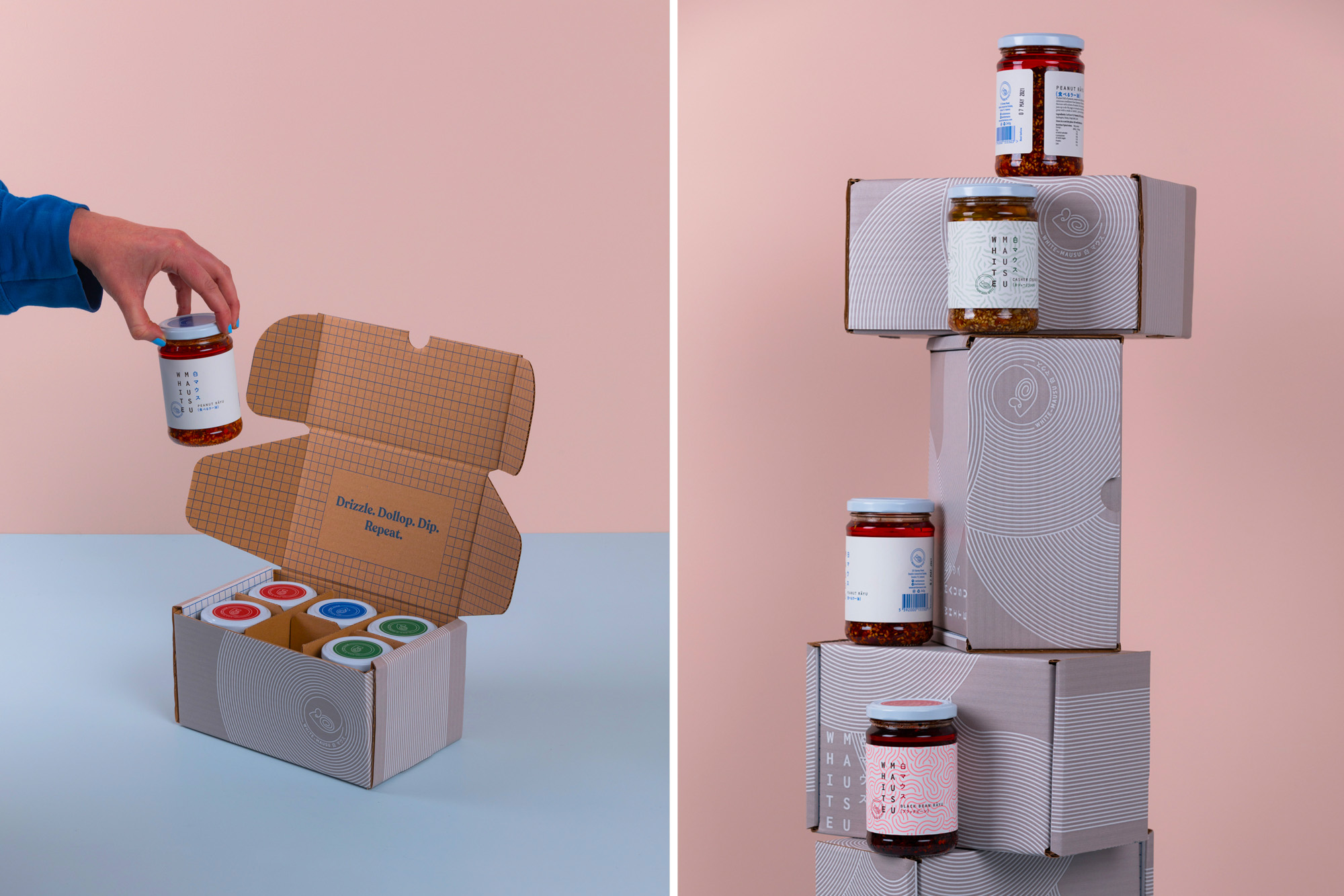
With e-commerce becoming more important than ever, we worked alongside the White Mausu team to produce the box packaging for the launch of their new website. The box design and illustrations pays respect to both their Irish and Asian influences. The spiral design is a nod to Celtic rock carvings similar to that in the original White Mausu 'mouse' logo. This pattern was then applied to the box using a very subtle warm grey flexi print to keep the branding in line with its minimalist roots. We also created a recipe booklet inside the box along with an illustrated postcard which takes inspiration from retro Japanese matchboxes from the 1920's onwards.