White Mausu - Set Design
Designed by Vivienne Quinn at Play Nice Studio
Design: Revert Design
Photography: Shantanu Starick
Categories: Object / Prop
Industry: Commercial
Tags: Art direction / Prop
Website: whitemausu.com/
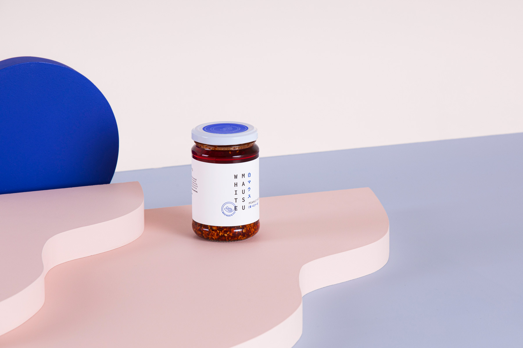
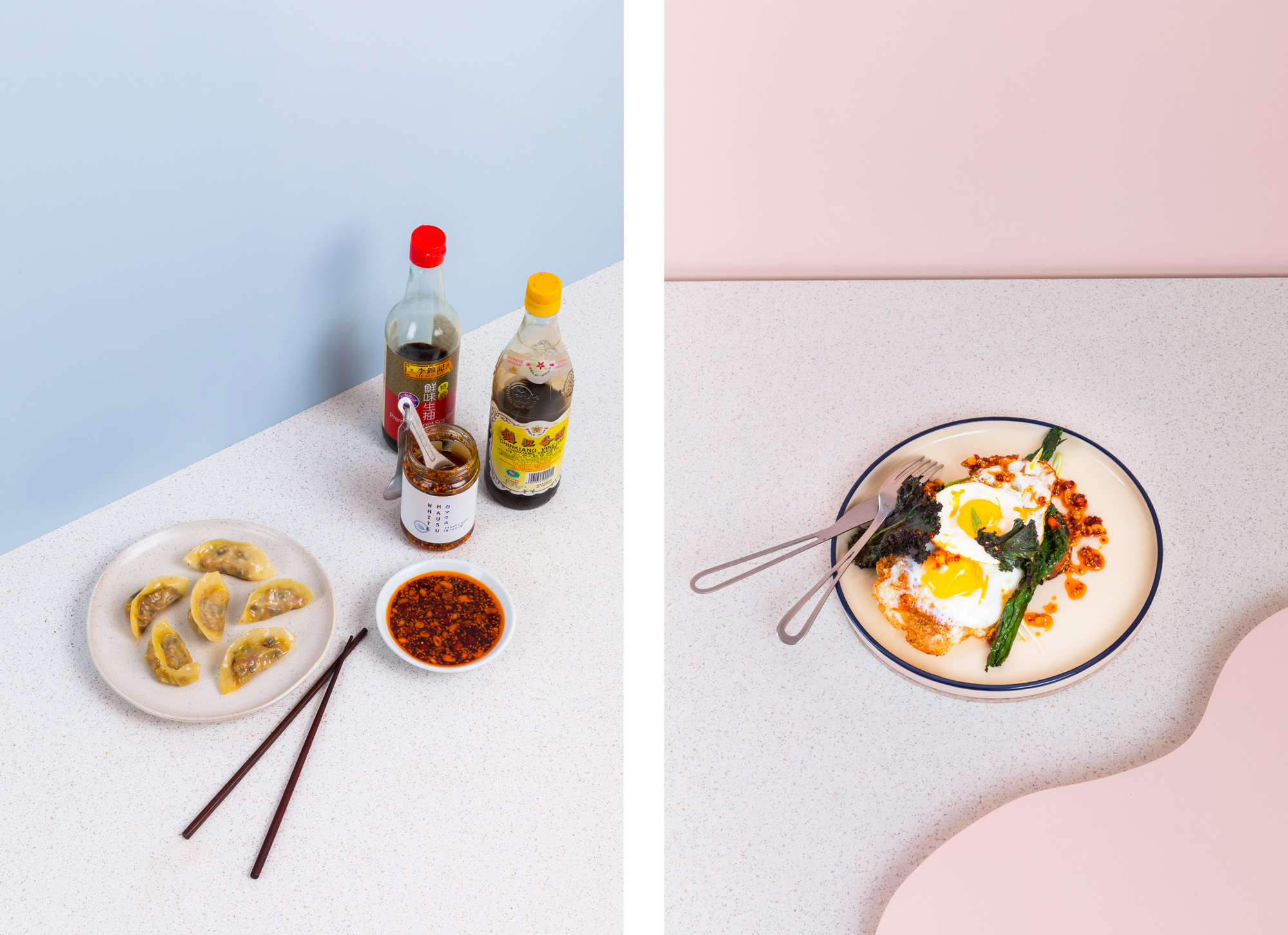
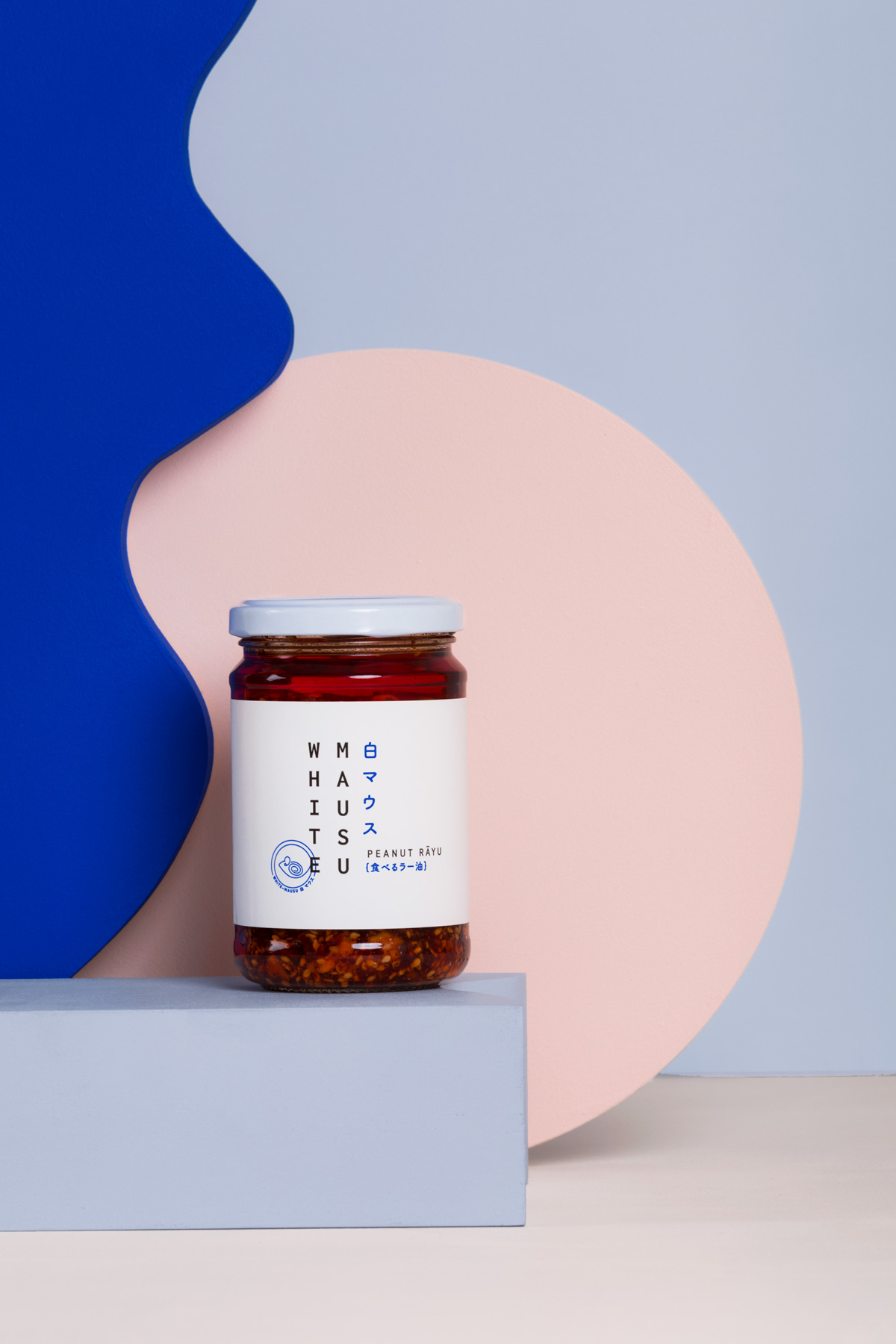
Working closely with the team at White Mausu and Revert Design we explored how to turn the White Mausu website into their shopfront, as was the focus for many businesses in 2020.
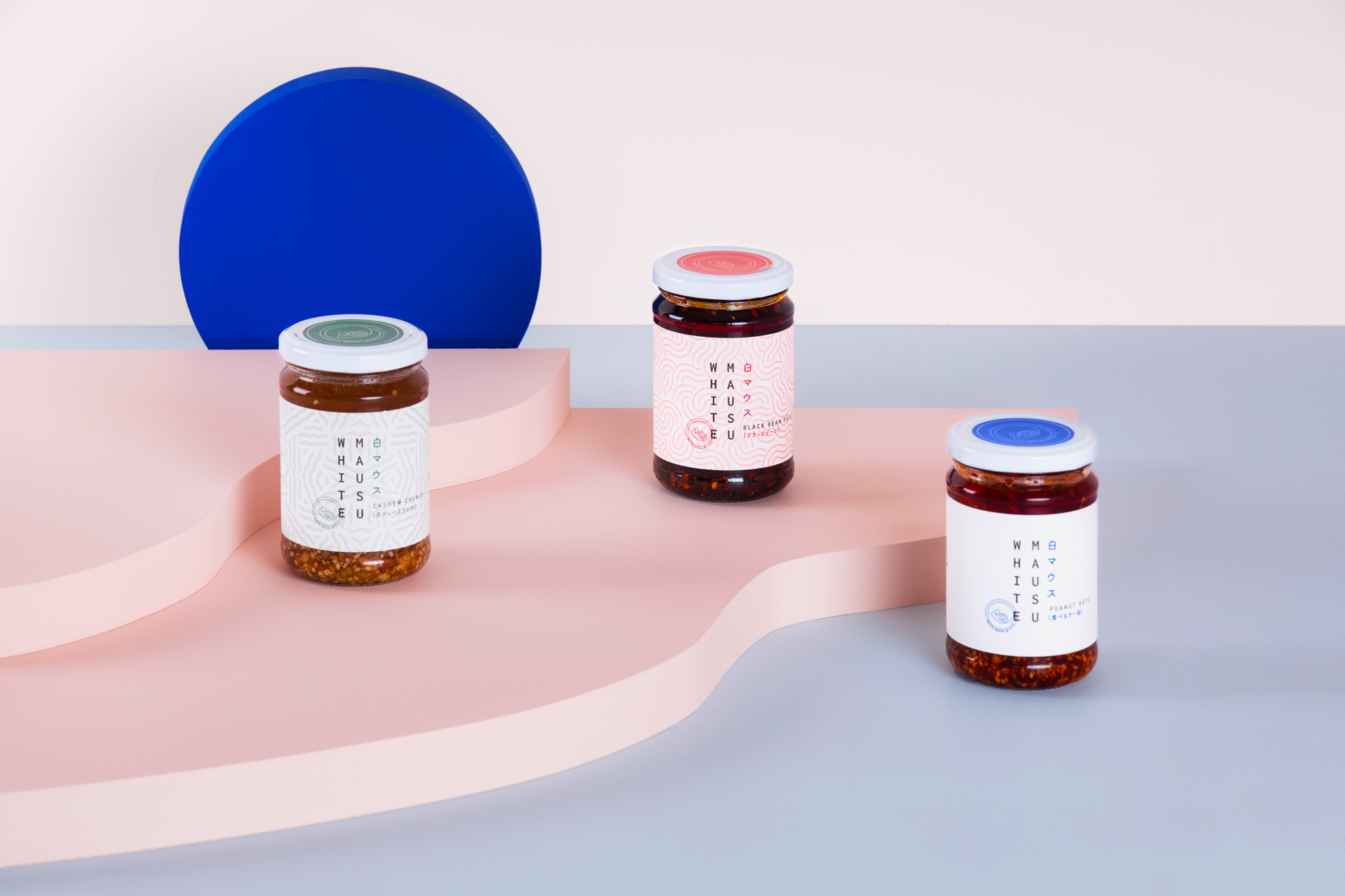
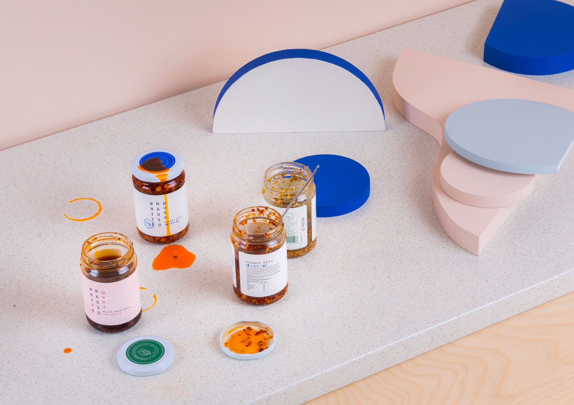
Wanting to reflect the design concepts and inspirations of the White Mausu brand we decided on wave-like fluid forms but wanted the props to feel very physical so opted for a thick block style finish. Wanting to keep the element of playfulness and movement the props were painted different colours on each side to keep them versatile and interchangeable, so one could be placed flat, to the side or standing up and act like a different form in its new state.
Drawing on the brands colour palette we kept the familiar strong blue associated with White Mausu but developed altered tones for the props that compliment the product but could also be photographed with food.