Zenia Insurance
2020
Designed by Louise Naughton at McCann Dublin and Louise Naughton
Copywriting: Amy Sergison
Motion: Aiden O'Brien
Project Management: Sofie Munch
Digital Direction: Eamonn Rohan
Categories: Identity
Industry: Corporate
Tags: Digital / Advertising / Logo / Print / Brand Identity / Motion graphics
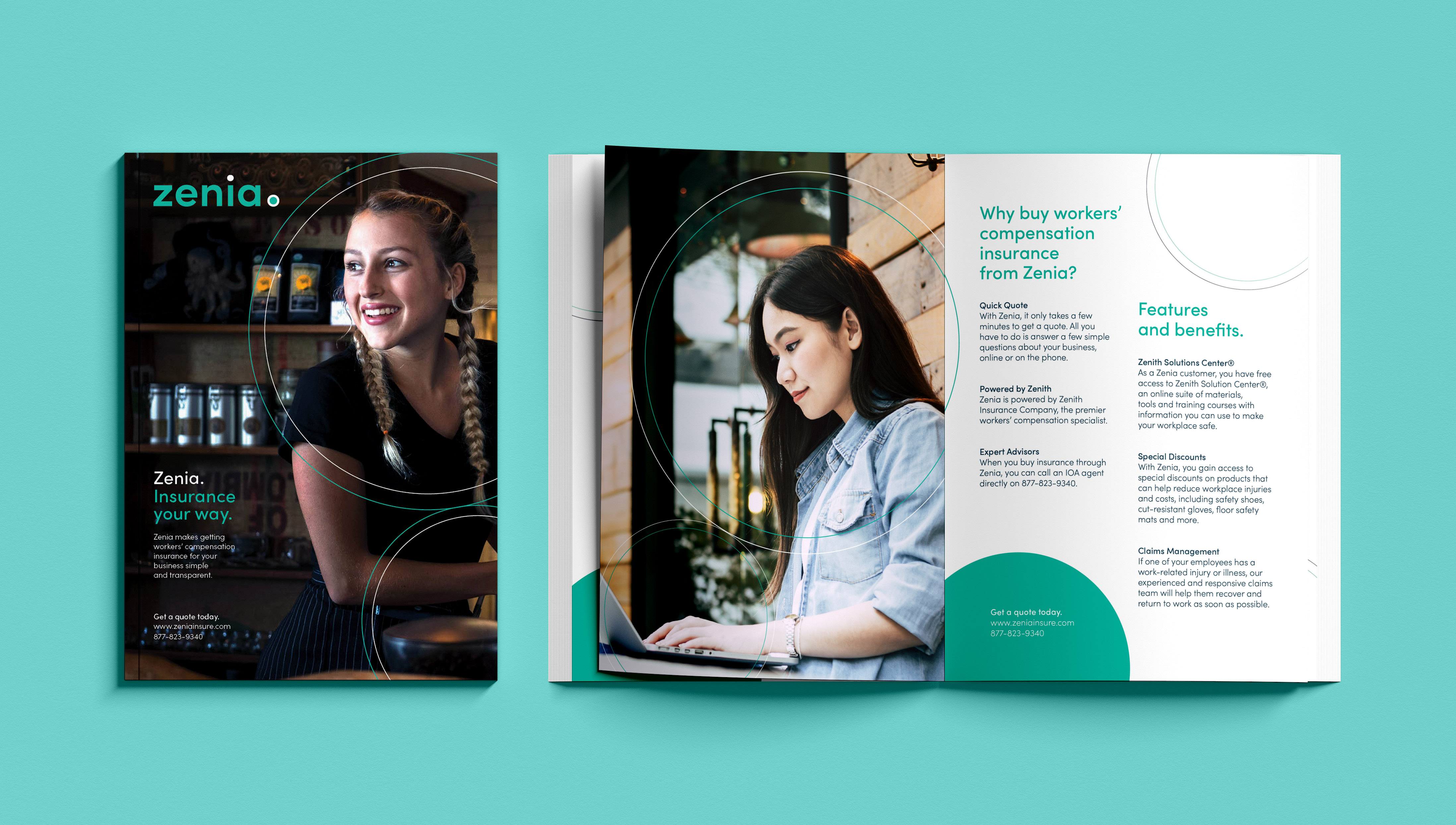
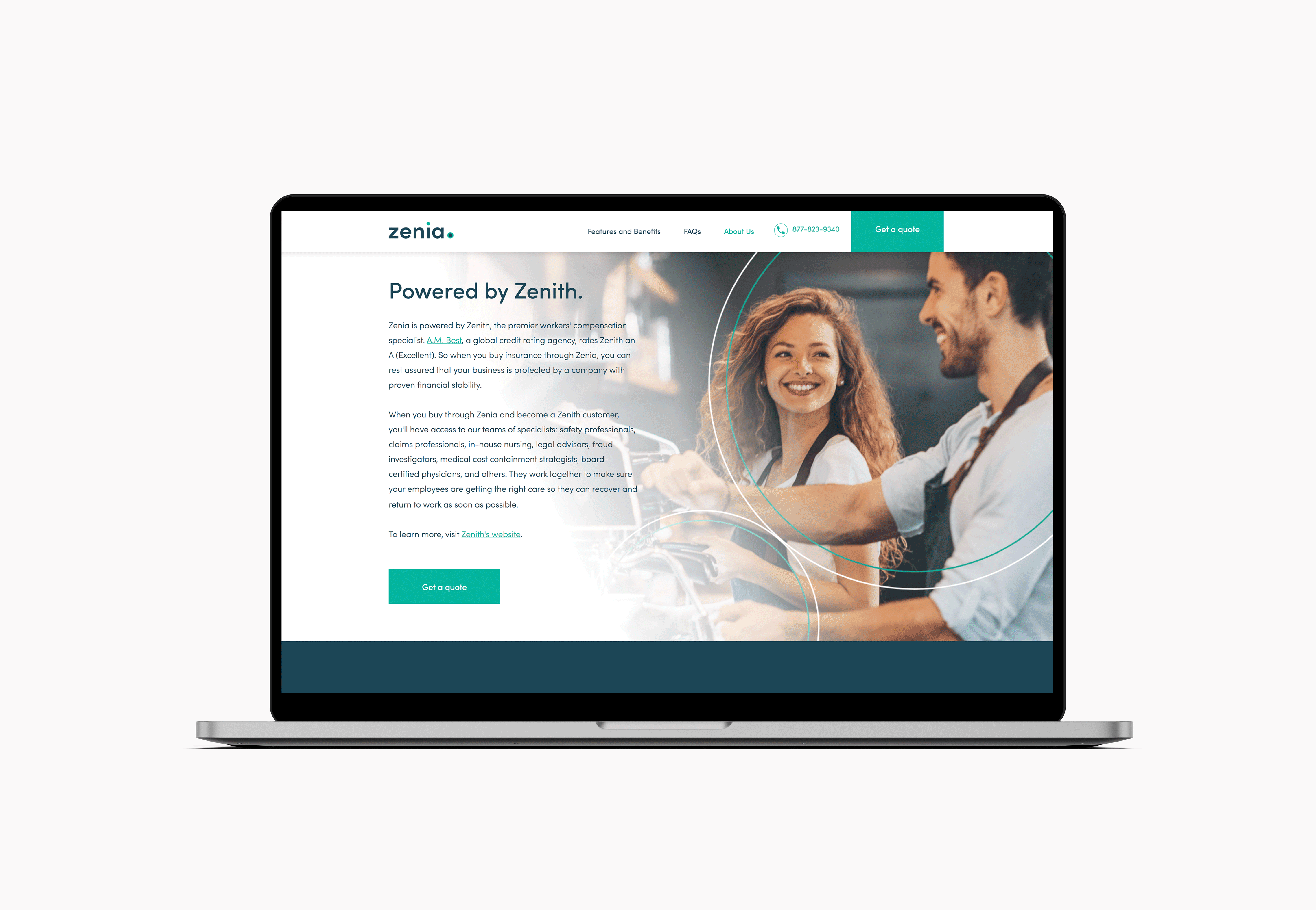
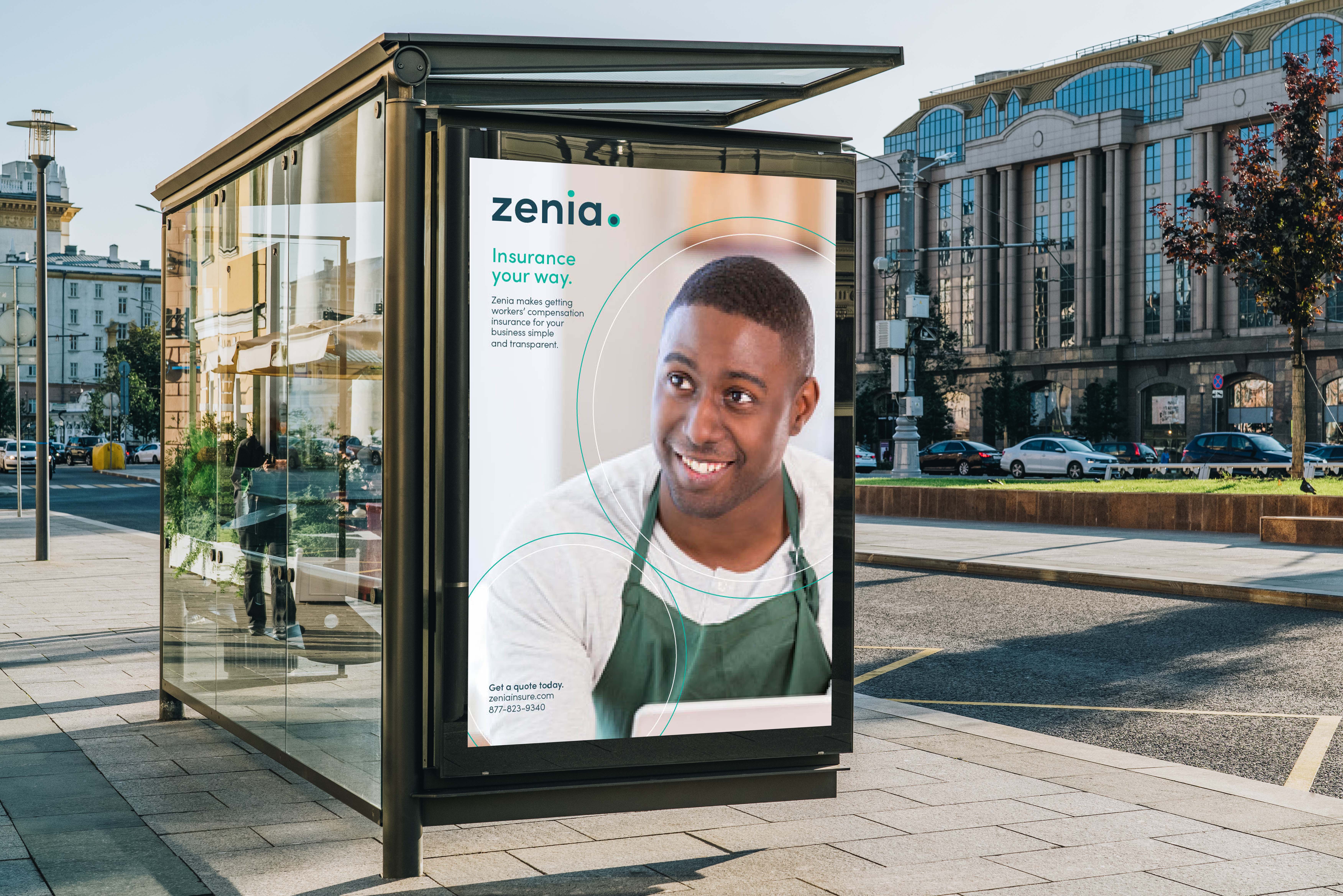
Zenia is a new online insurance company based in Florida, USA that is a specialist in providing workers compensation insurance. It helps small businesses to protect their employees with ease. The company needed a brand that communicated simplicity, transparency and ultimately, protection.
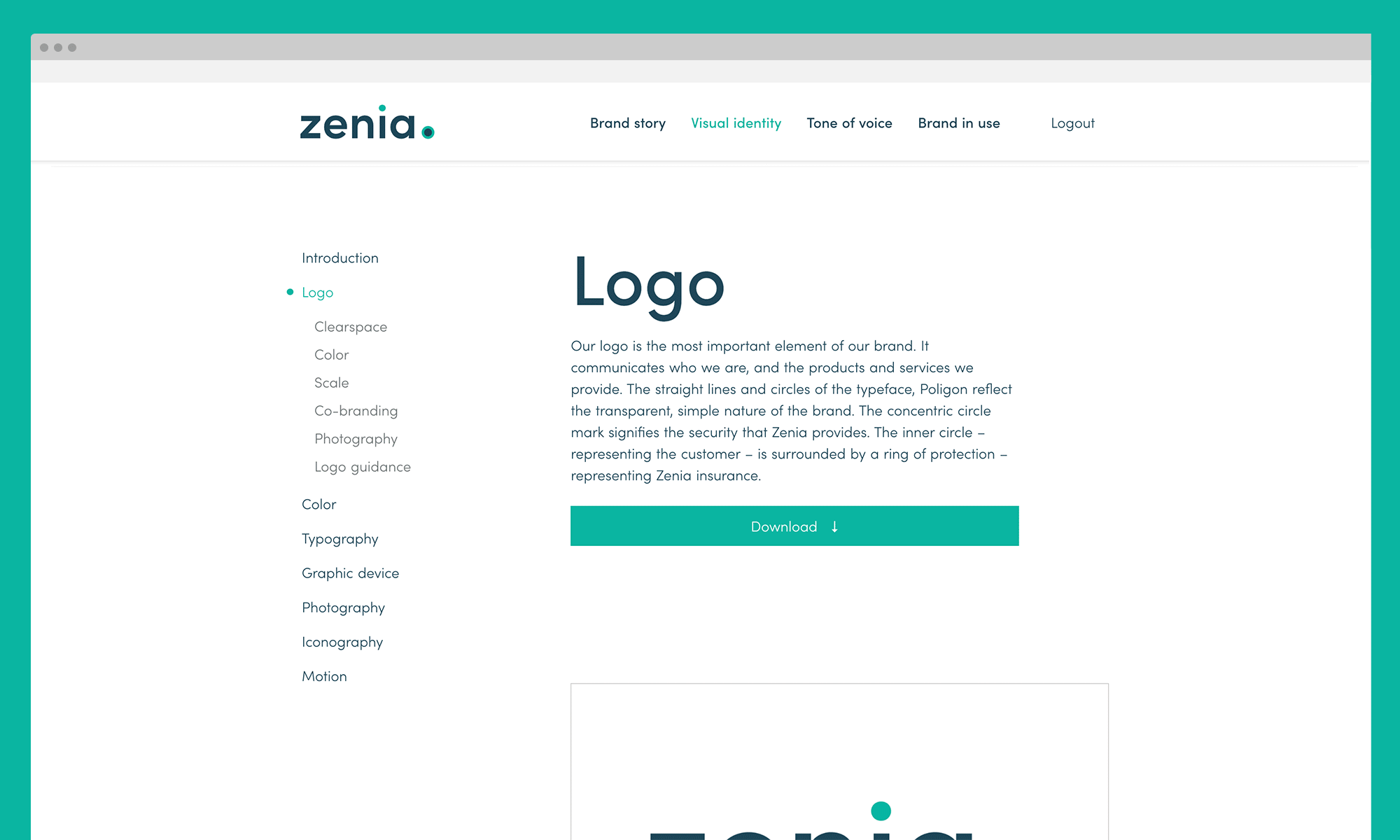
Customers are at the centre of the Zenia identity. The concentric circle of the logo mark signifies the security that Zenia provides. The inner circle – representing the customer – is surrounded by a ring of protection – representing Zenia insurance. The typeface choice reflects the transparent, simple nature of the brand.
Never static, always moving the circles continue throughout the brand language. The Zenia graphic device can be seen highlighting the people it protects, across all communications. The customer is placed in focus by the inner circle, with the supporting outer circle representing the protecting of their business.
The interactive brand identity guideline was designed as a standalone site for ease of use. Internal staff and creative partners / agencies, can navigate everything from the brand story, to a detailed visual identity guidelines with all brand language assets, moving and still, available for download on the site.
The project resulted in a visual identity, print communications, creative campaign, website, digital advertising and digital brand guidelines being created.