B&A Rebrand
Designed by Alan Murphy, Kim Robinson, Charly Tudor, Elena Stevant, David Stanley and Paula McEntee at Red Dog
Categories: Website / Identity
Industry: Corporate
Tags: Typography / Digital
Website: banda.ie/
Established in 1985, B&A is a large, well known, full-service Research and Insight Agency working in Ireland and internationally. Our task was to evolve the B&A brand to reflect its leading offering and personality as a passionate, innovative and strategic organisation – while appearing fresh and relevant.
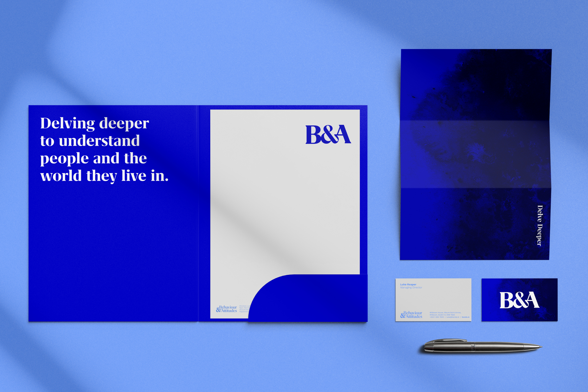
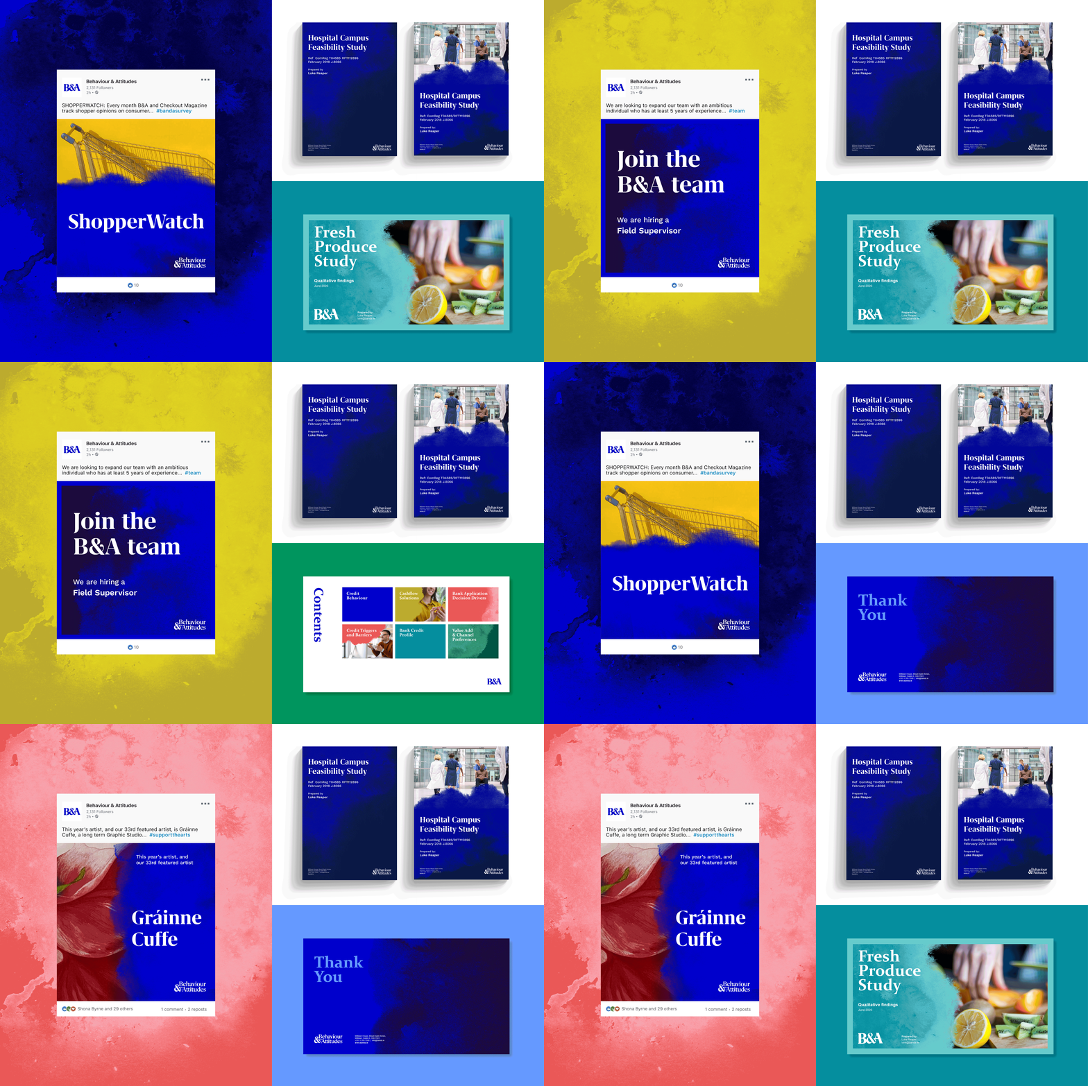
B&A produce a considerable volume of content. Our key consideration was that the brand must be practical and easy for the B&A team to translate across a wide range of collateral, decks and digital applications.
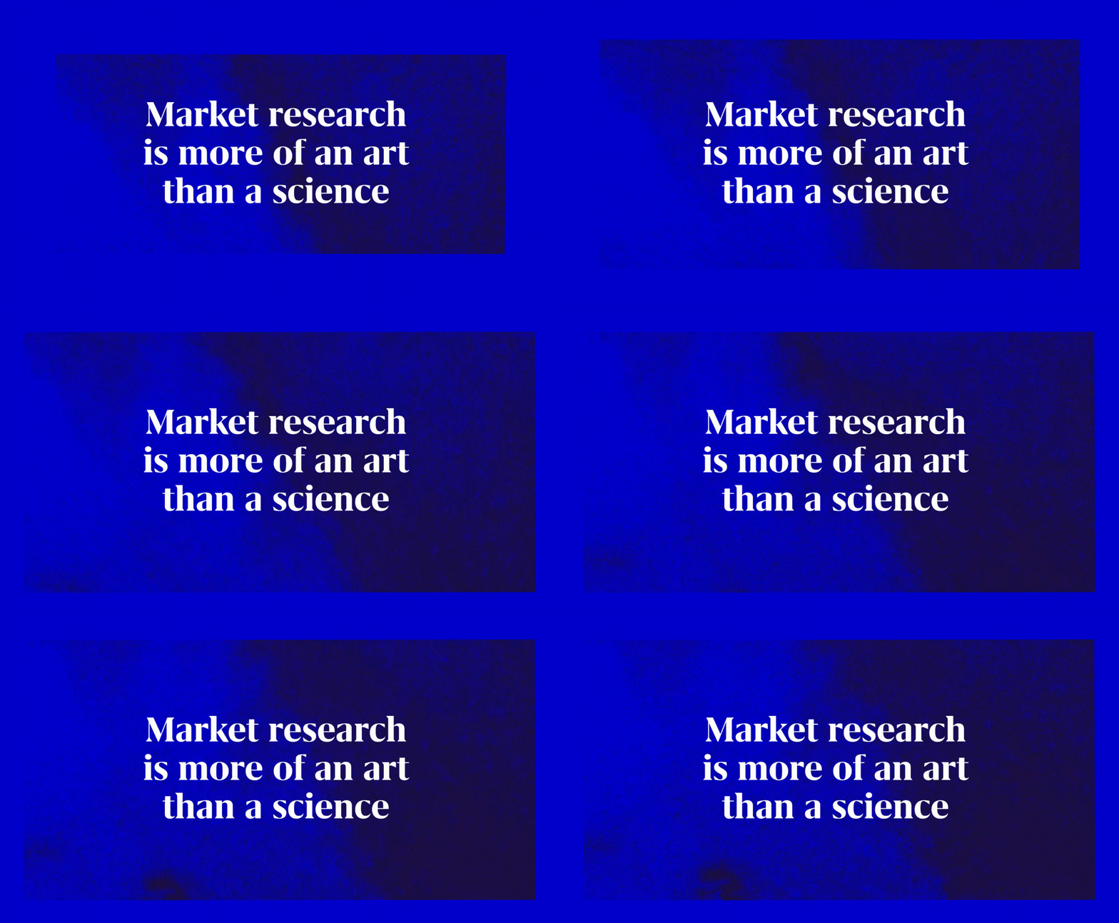
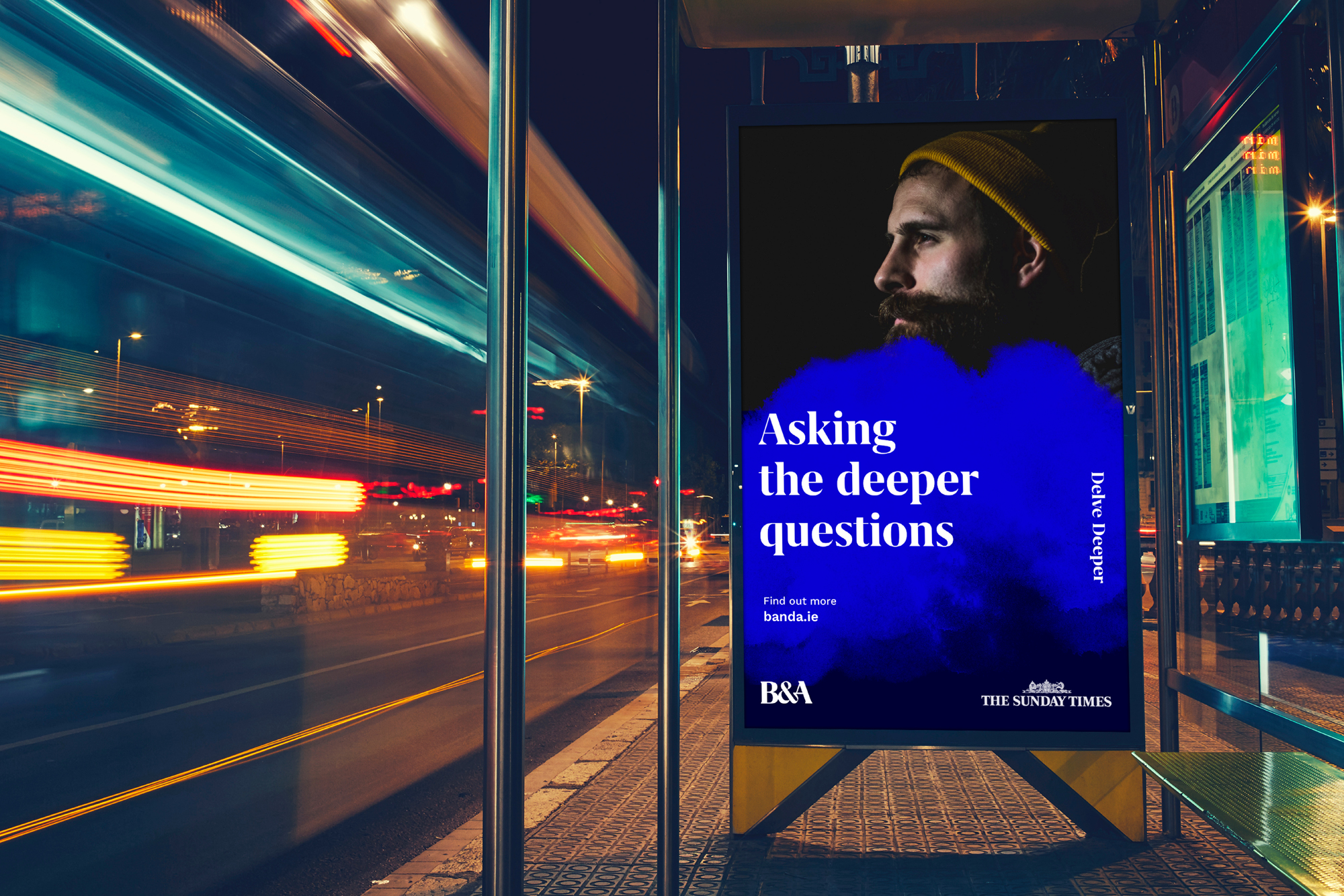
Since 1989, B&A has commissioned and showcased an original work from a different Irish artist every year. They are proud of their partnership with the Graphic Studio Dublin, which has produced a collection of over 100 original limited edition works. This core commitment to the Irish artistic community, informs the new visual language. It is represented throughout by a watercolour texture which can be mixed with colours from the primary and secondary palettes.
Blue is synonymous with B&A, and it has been maintained in the new brand’s primary palette alongside navy, and light blue, paired with a secondary palette of chartreuse, teal, coral and green to add freshness and vibrancy across screen and print.
Paired with the marque, the brand is contemporary, sophisticated and timeless, capturing the essence of B&A. The logo versions include a bespoke monogram and logotype. The monogram, which B&A will lead with in everyday communications, is a confident representation of their brand.
An additional part of our work on B&A’s rebrand project was to design and build a new website. The new site gathers all the different elements of the project – the identity, colour palette, typography and textures together in a way that speaks to B&A’s rich legacy and its commitment to excellence and innovation in research.
