Burren Smokehouse Rebrand
Designed by Scott Burnett and Archie Heaslip at Aad
Designer: Georgia Sinnot
Illustrator: Brian Gallagher
Categories: Identity / Packaging
Industry: Commercial
Tags: System / Illustration / Food and drink
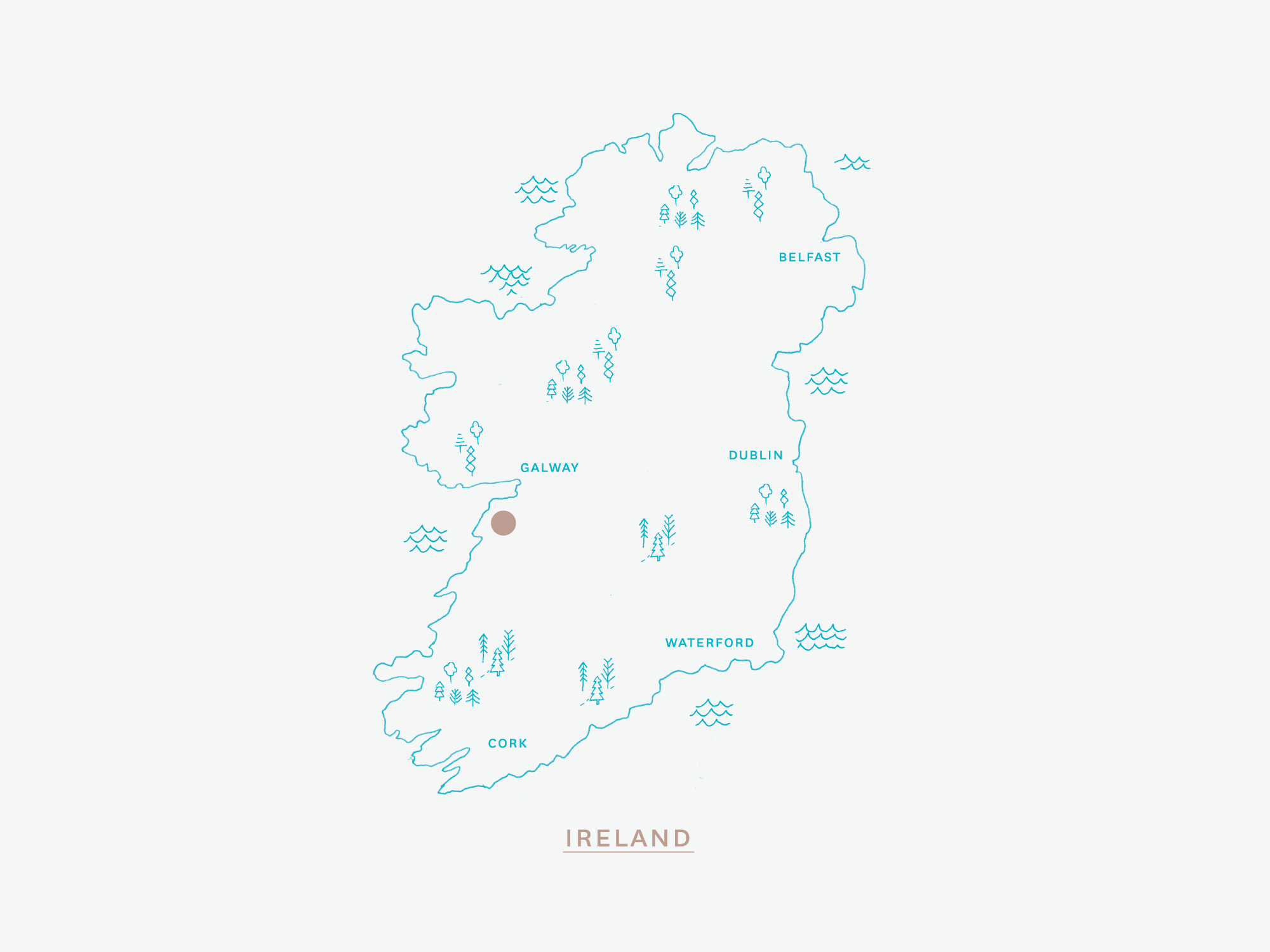
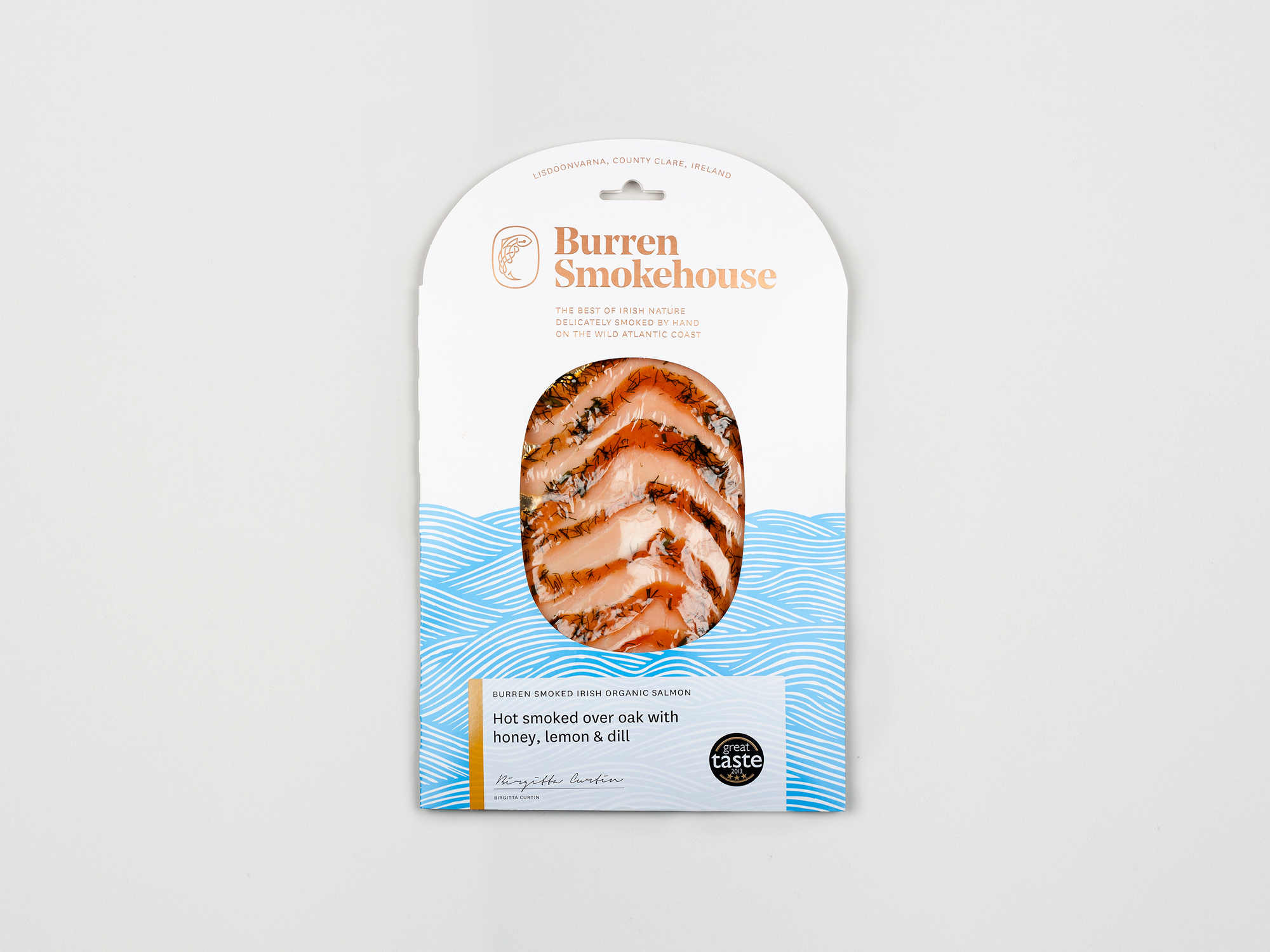
While the quality of the product was world class, how it was being presented was far from it. The challenge was to bring the packaging and presentation in line with the product, and in the process to give the brand the confidence to place themselves within a more lucrative and international context. Our core strategy was that the product really had to shine. Their previous packaging, and that of many of their competitors, was so busy that the salmon showing in the pack window goes almost unnoticed. We also wanted to highlight the hand made nature of the product and the importance of nature in the process of making it.
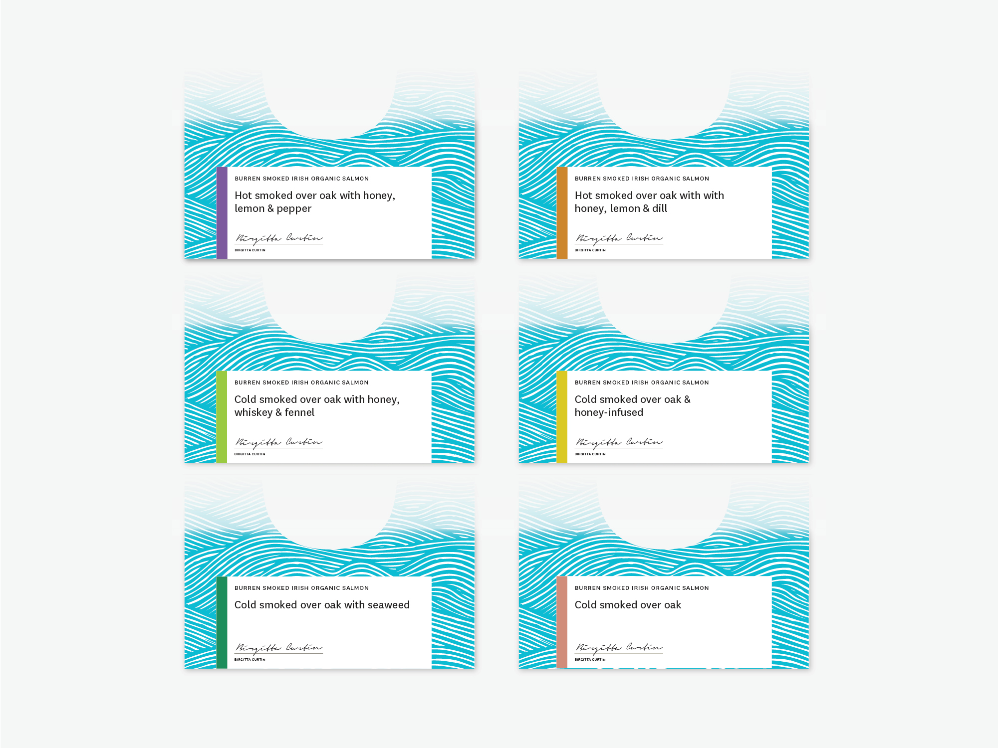
We developed a signature pattern of a rough sea, drawn in scraper board by illustrator Brian Gallagher. This communicated the story while making sure we didn’t distract from the unmistakable colour and texture of the product. We redrew their existing salmon icon and placed it in an oval shape which was also used for the pack window and top. This was combined with clean typography, foiled in rose gold on a crisp white and blue pack. The design is consistent across multiple pack sizes. These are finished with a colour coded sticker that illustrates the range of products that they sell.