Business Post
Designed by Archie Heaslip at CI Studio
Creative Direction: Mel O'Rourke
Type Design: Max Phillips
Categories: Print / Identity / Typeface / Editorial
Industry: Commercial
Tags: Typography / Publishing / Newspaper / Rebrand
Following a strategic review of the Sunday Business Post brand, it was agreed to drop the Sunday from the papers title and to put everything under one name, Business Post. Part of our research included consumer testing.
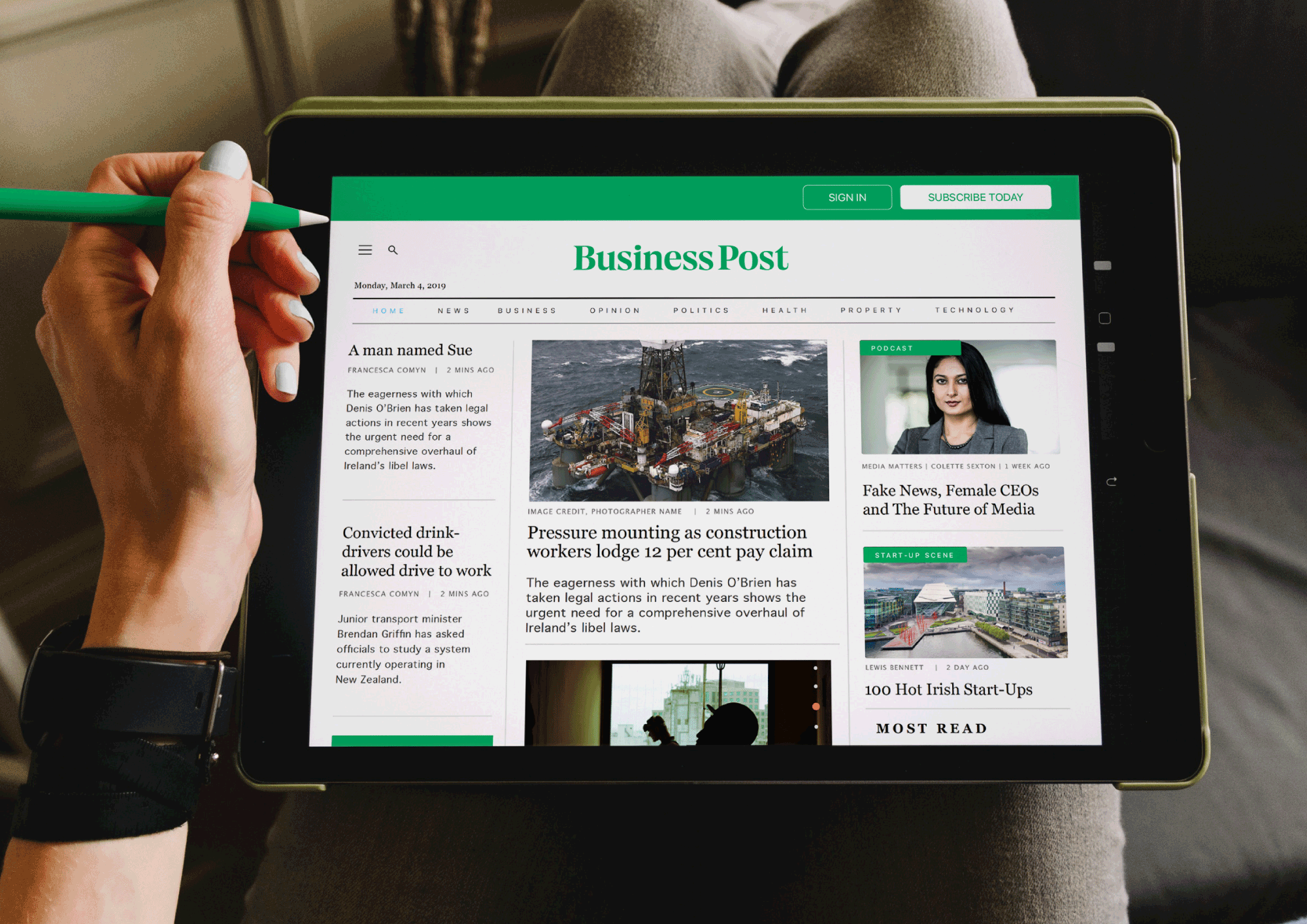
A key commercial objective of the project was to align plans for an expanding digital offering, with the existing events/exhibition business and their most visible product, the paper on Sunday. We also needed to allow for future diversification and expansion.
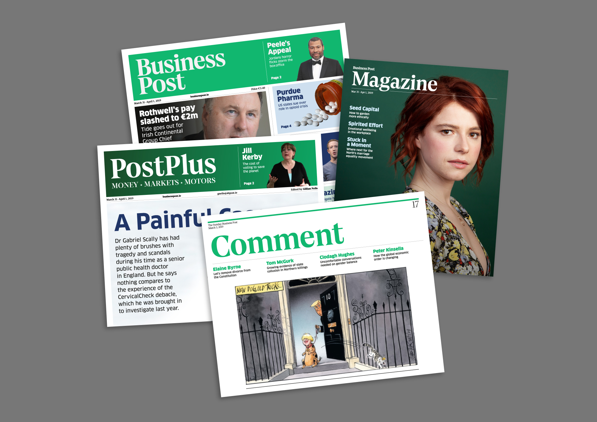
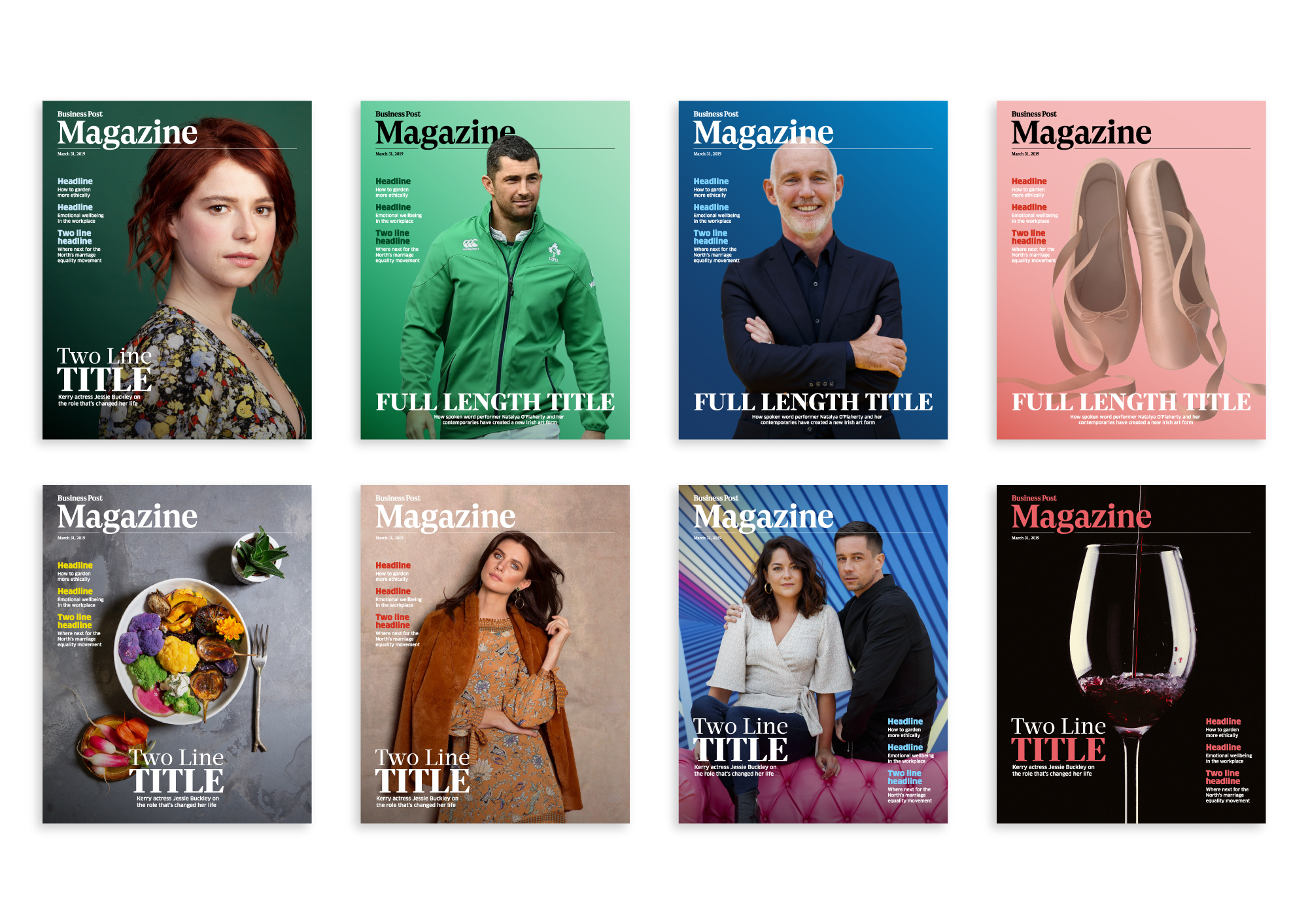
One of the main components of the brand change was the redesign of the paper, to make it more contemporary and fit with being an international business news organisation, albeit in an Irish context. All of its corresponding sections and the magazine itself had to be closely aligned so that they felt like a family of publications with all of the key graphic elements considered carefully throughout.
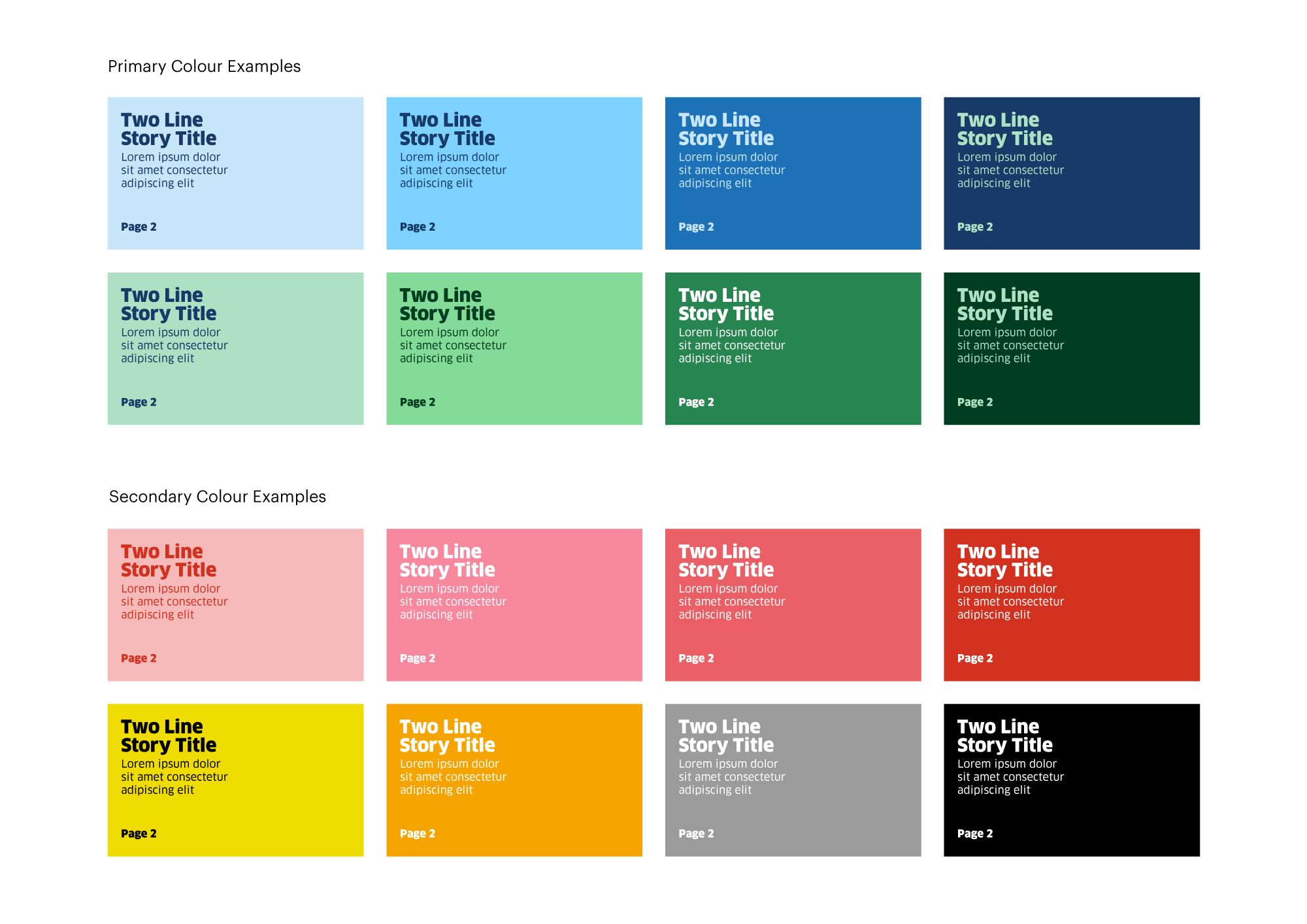
How the inside sections of the paper were viewed on the front page was also a major consideration as this area within and around the nameplate is valuable real estate and any wrong decision on placement can have an impact on consumer purchase. A customised headline typeface BP Edition was designed to bring a visual cohesion across the identity while a new brighter colour green and a complementary colour palette was introduced along with a fully revised layout for the overall paper and its corresponding publications.
Working with the Business Post design team, the paper was reformatted in compliance with international newspaper layout and design standards. A huge undertaking and incredible amount of work, testing and retesting on both traditional and digital platforms for a seamless transition between both. Project also included the design of various promotional pieces.