Coke Lane Pizza
2025
Designed by Sarah Moloney at Sarah Moloney
Categories: Identity
Industry: Commercial
Tags: Food and drink
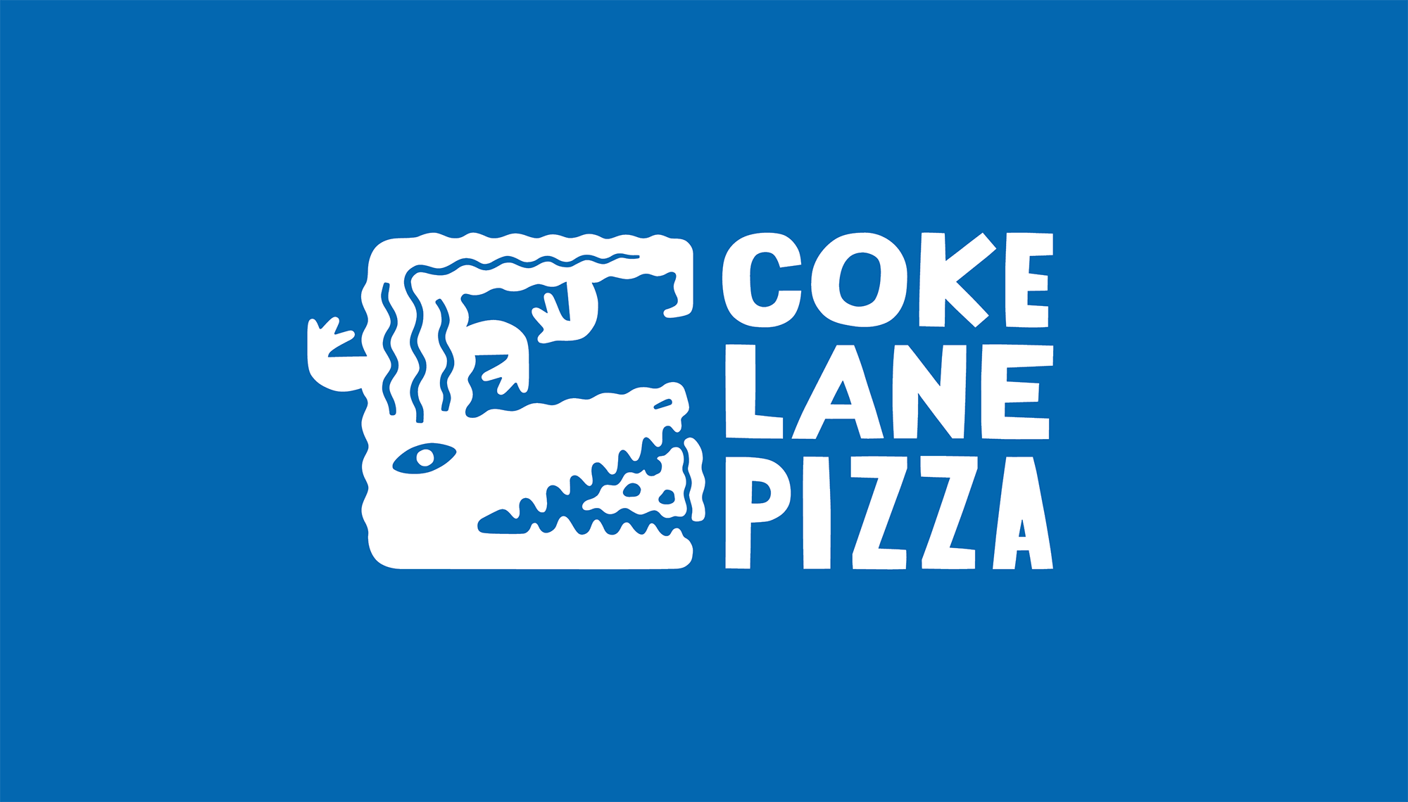
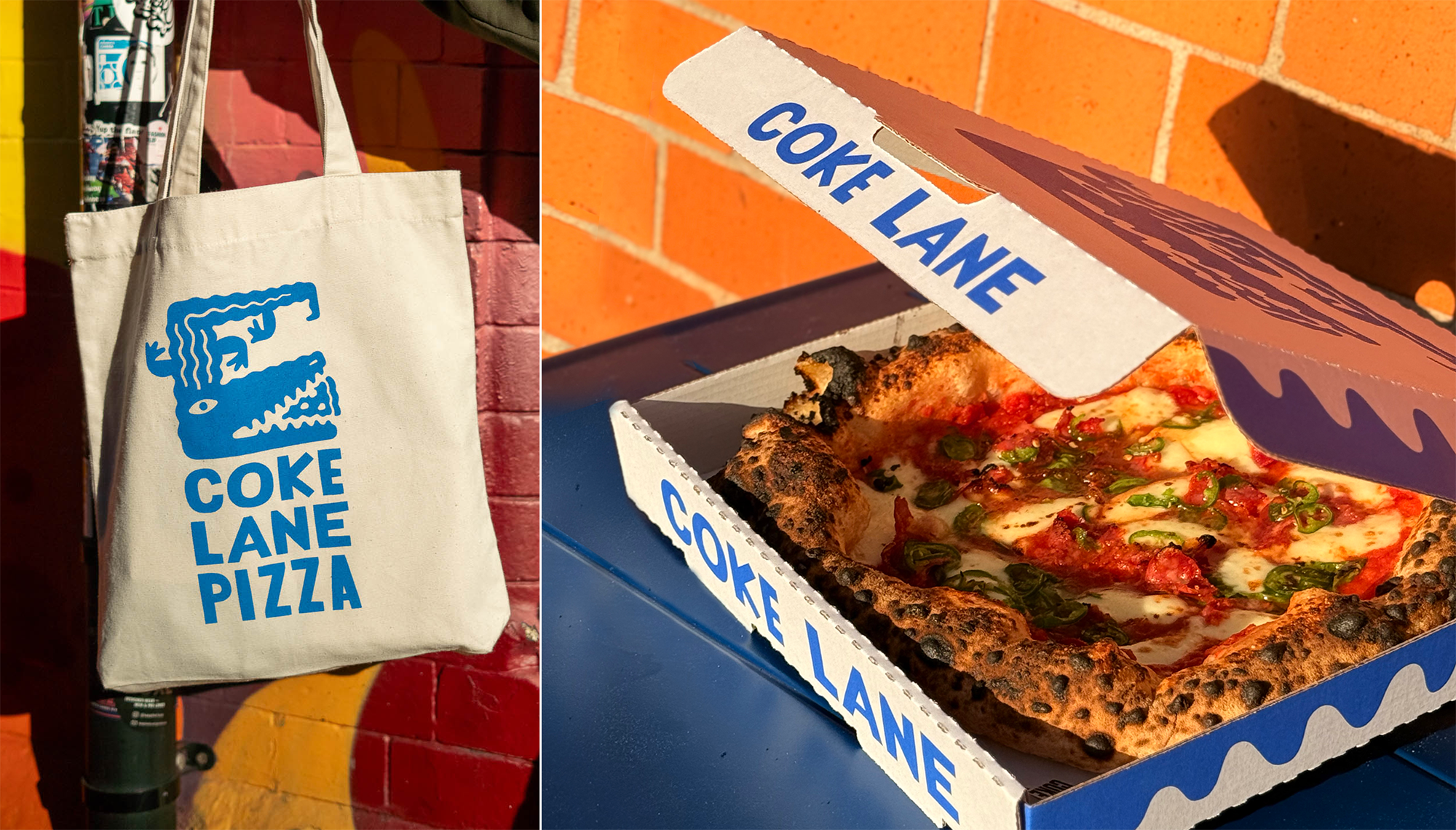
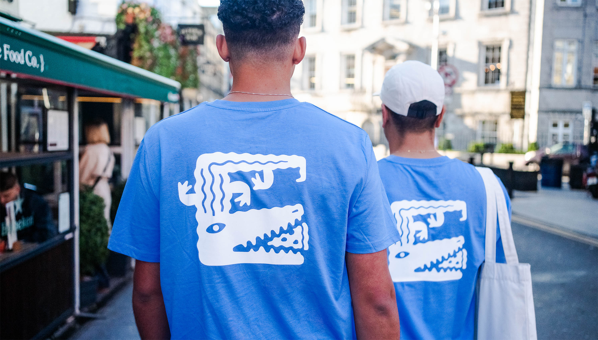
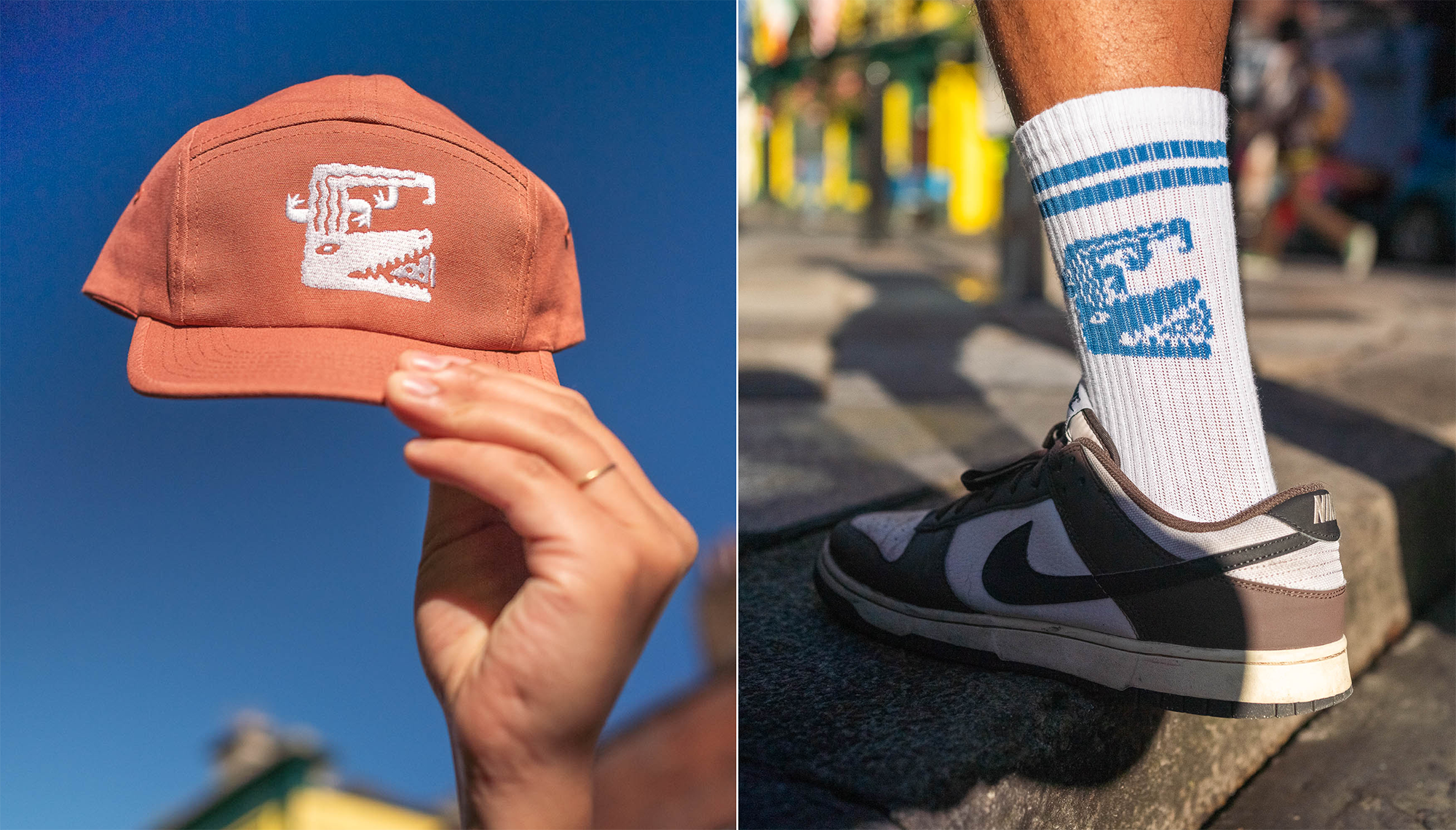
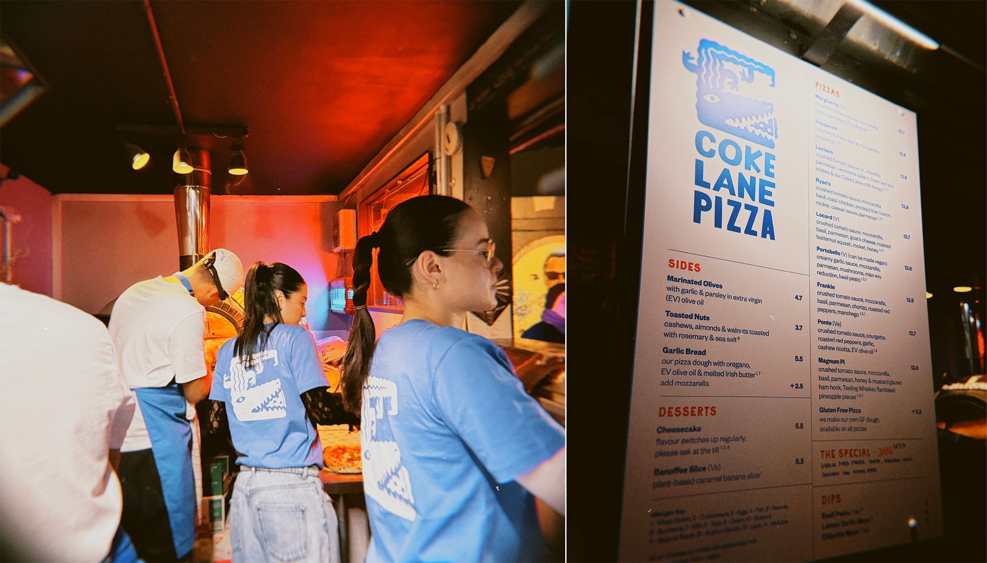
I worked with Coke Lane Pizza to create a new look and feel for the brand. The new logo features a crocodile snapping a slice as it's mascot. The croc was the perfect symbol as it is both fun and a little edgy, but also communicates that Coke Lane Pizza is serious about good food!
The symbol is accompanied by hand drawn typography – this was chosen to give the association of being an independent business, creating fresh, hand-made food.
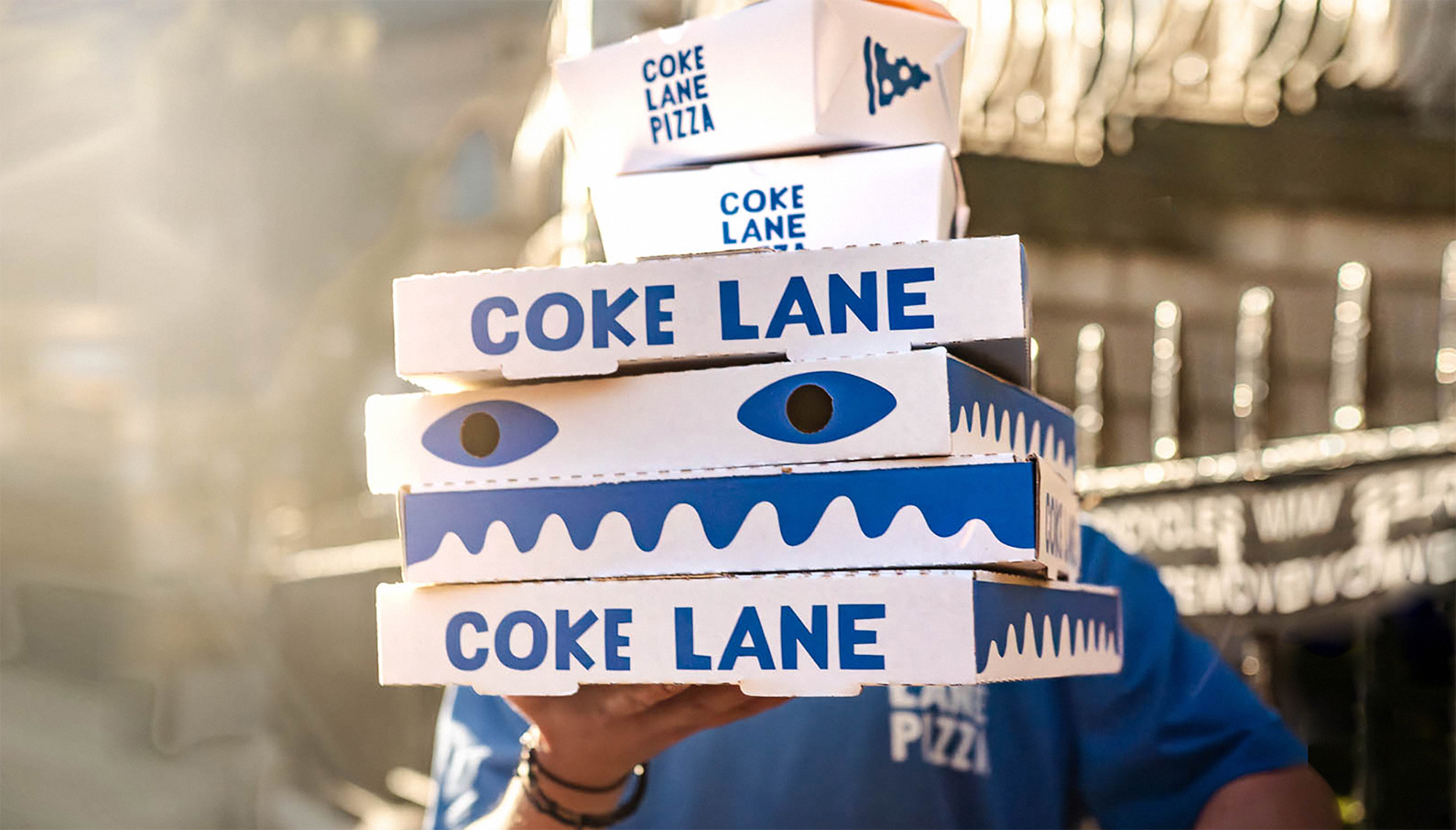
The main blue colour of the palette is bright and visually arresting, while also complementing, and elevating, the colour of the food. Features of the crocodile were used in the packaging in a fun way – the teeth run along the sides of the box, while the eyes are visible at the back – making the box itself seem like a crocodiles head.