ID2015 Programme Overview
Designed by David Smith and Clare Lynch (Design) at Atelier David Smith
Copywriting: Eoghan Nolan / David Smith
Content Editors: David Smith (Atelier) / Alex Milton (ID2015)
Print and Production: Plus Print Ltd
Categories: Printed Publication / Print
Industry: Corporate
Tags: Typography
Mentioned in:
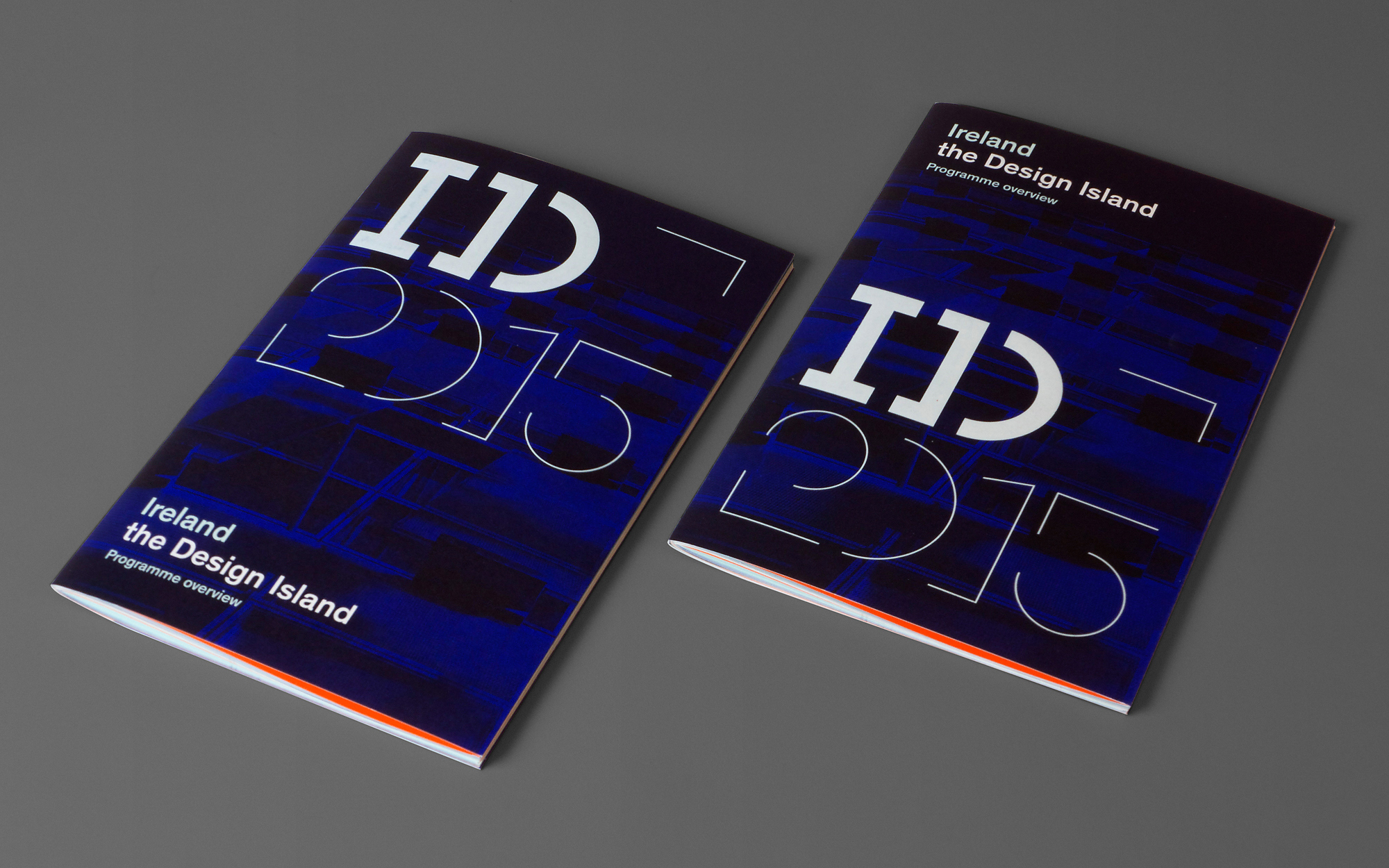
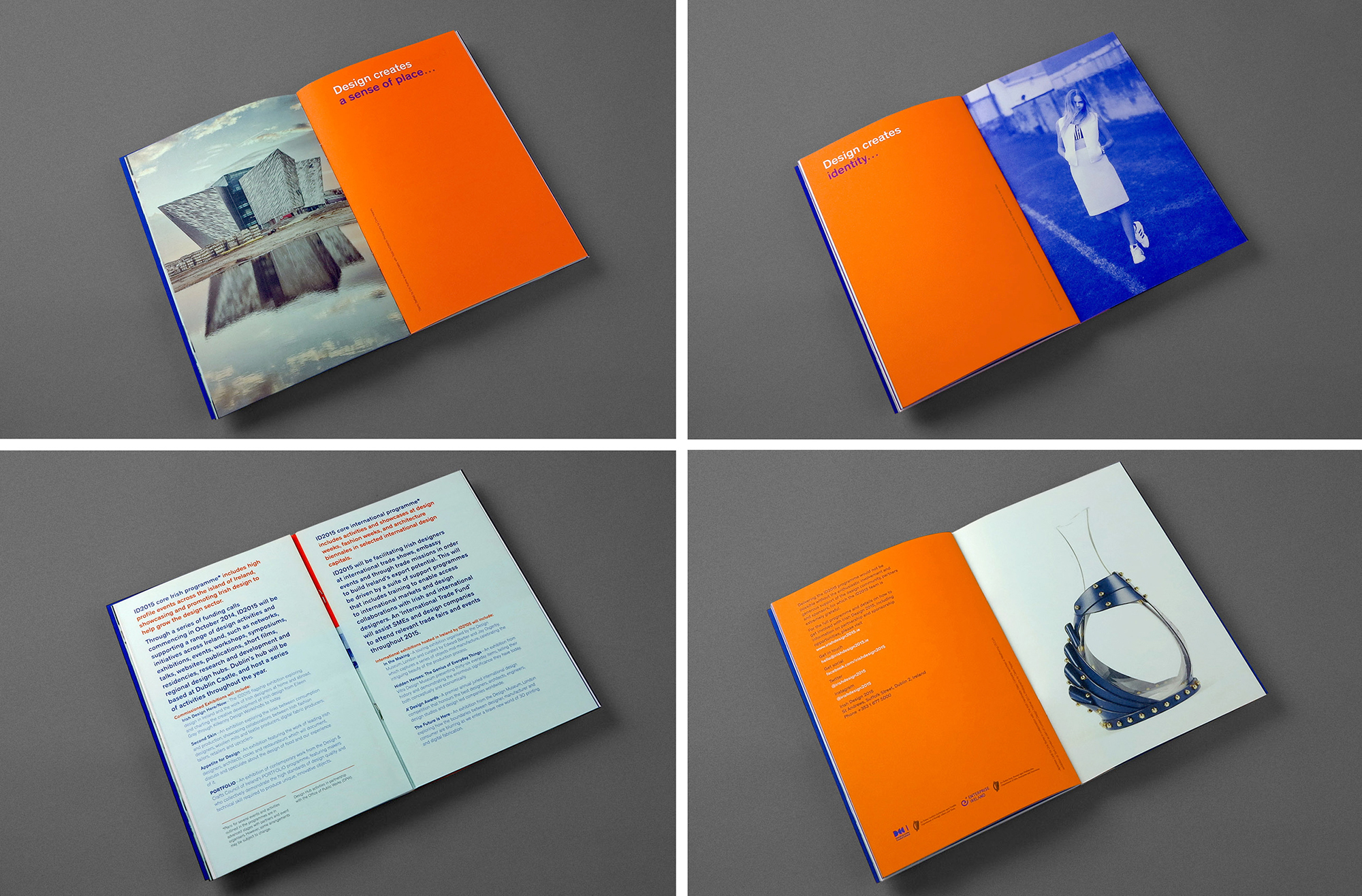
The ID2015 Programme Overview was the first (and arguably the most important) publication produced by ID2015 following completion of design work on their Visual Identity and marking the launch of 2015 as the official ‘Year of Irish Design’. The publication needed to lightly reflect the programme's strategy and ambition, articulate a vision and provide a snpashot of the then nascent programme of activities for 2015.
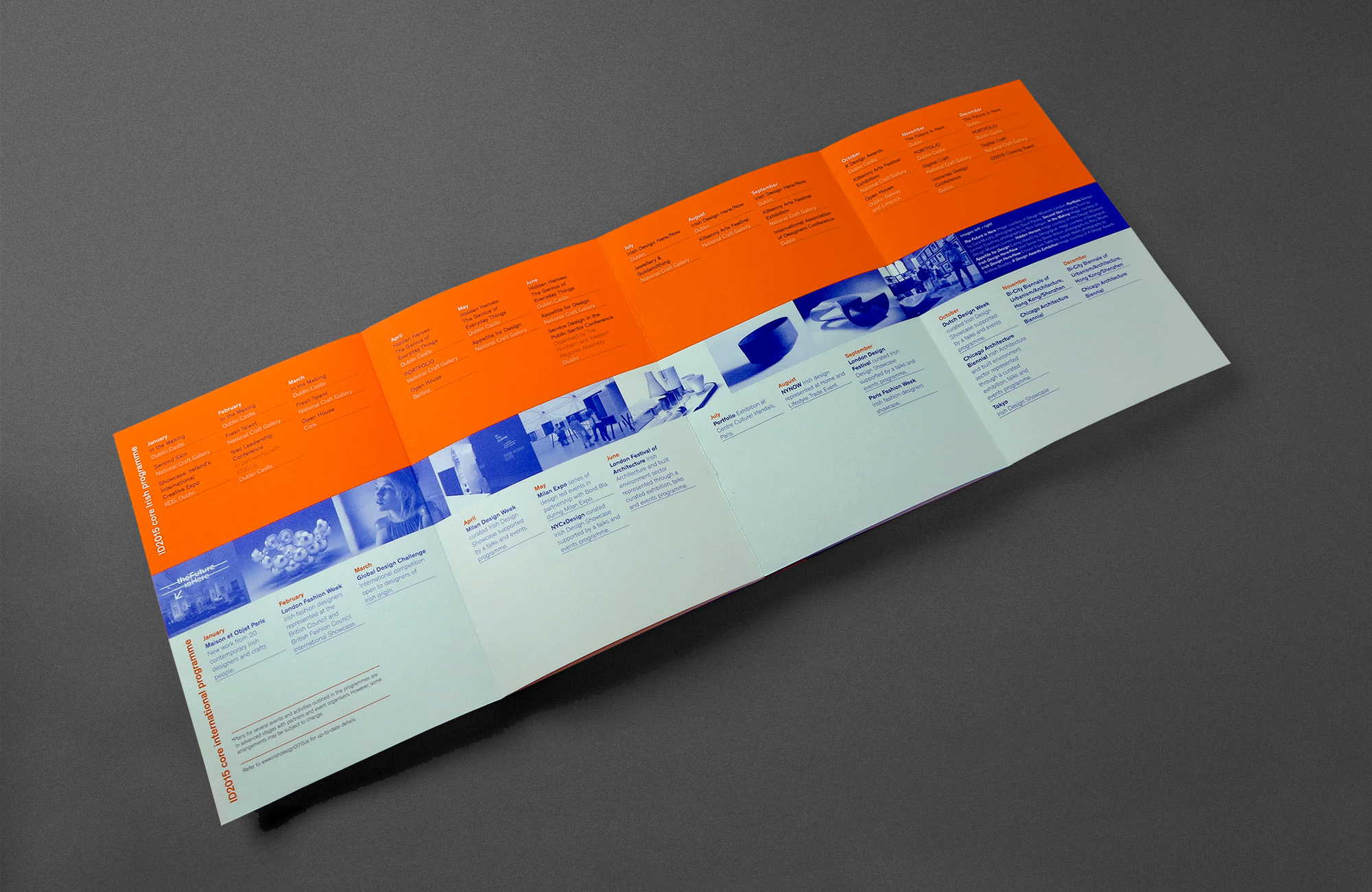
In producing a distillation of the overarching strategy of the Year of Irish Design the publication uses a simple but sophisticated graphic and editorial approach to communciate the mission to the broadest of audiences. For simplicity and accessibility the use of colour and typography heavily draws upon the graphic vocabulary of designer Dick Bruna and his Miffi series of books yet closely follows the ID2015 Identity Guidelines with regard to colour choice (Electric Blue, Turquoise Blue and Bright Orange) and typography. The brochures are printed using CMYK + 3 custom inks mixes. The bold juxtaposition of contrasting colour fields (Blue/Orange) and the juxtaposition of images of iconic Irish design with solid colour fields is further extrapolation of identity principals. The (literally) centrepiece of the brochure is a ‘4pp throwout’ — a visual timeline of proposed activity for 2015. The finished booklet has a foil-blocked 8 page dust-jacket.