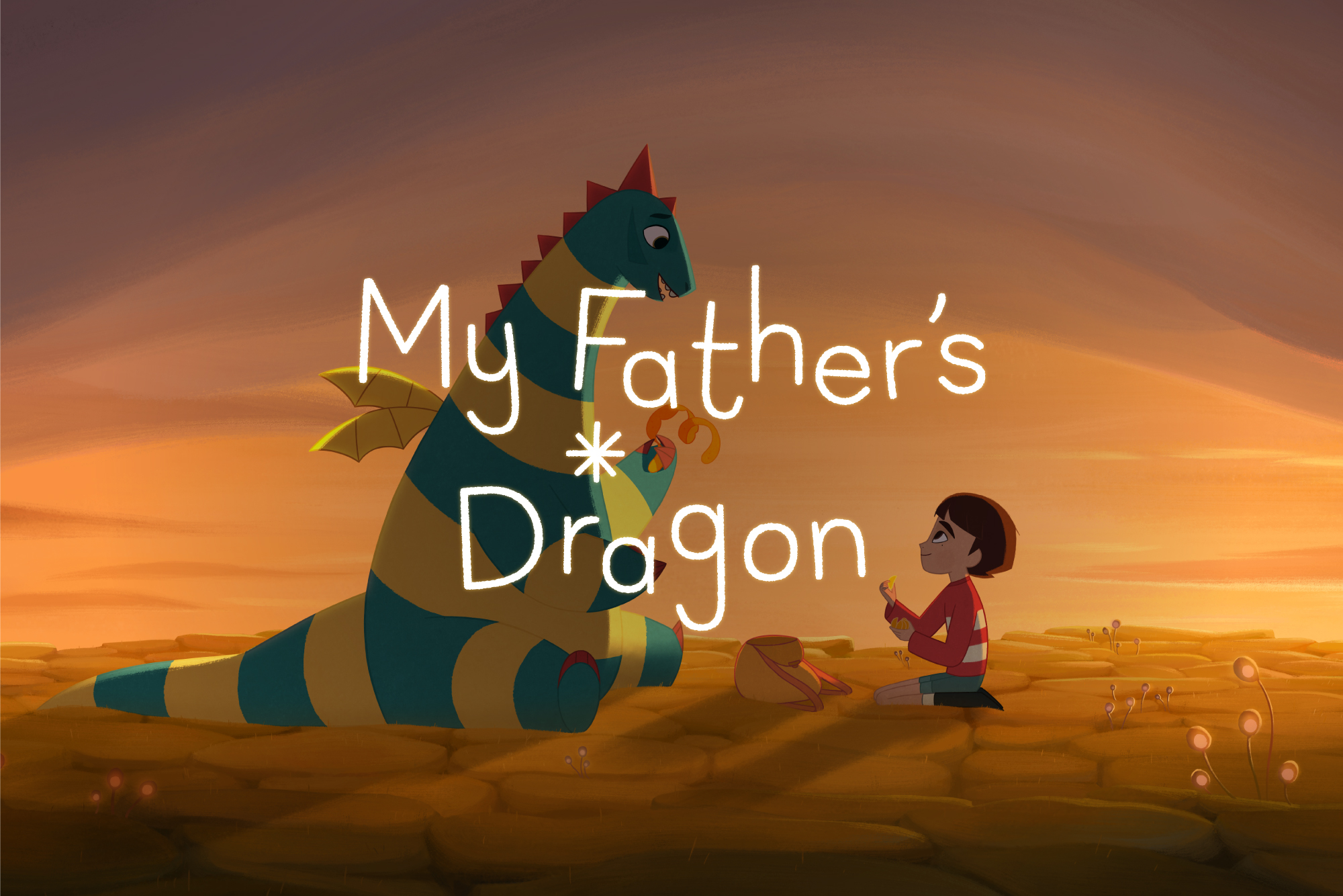
My Father’s Dragon
Designed by Archie Heaslip at CI Studio
Creative Direction: Mel O'Rourke
Industry: Cultural
Tags: Film / Typography / Digital
My Father’s Dragon is an exquisite Netflix film inspired by the Newbery-honoured children’s book from author Ruth Stiles Gannet. Struggling to cope after a move to the city with his mother, a young boy Elmer runs away in search of Wild Island and a young dragon who waits to be rescued. Elmer’s adventures introduce him to ferocious beasts, a mysterious island and the friendship of a lifetime.
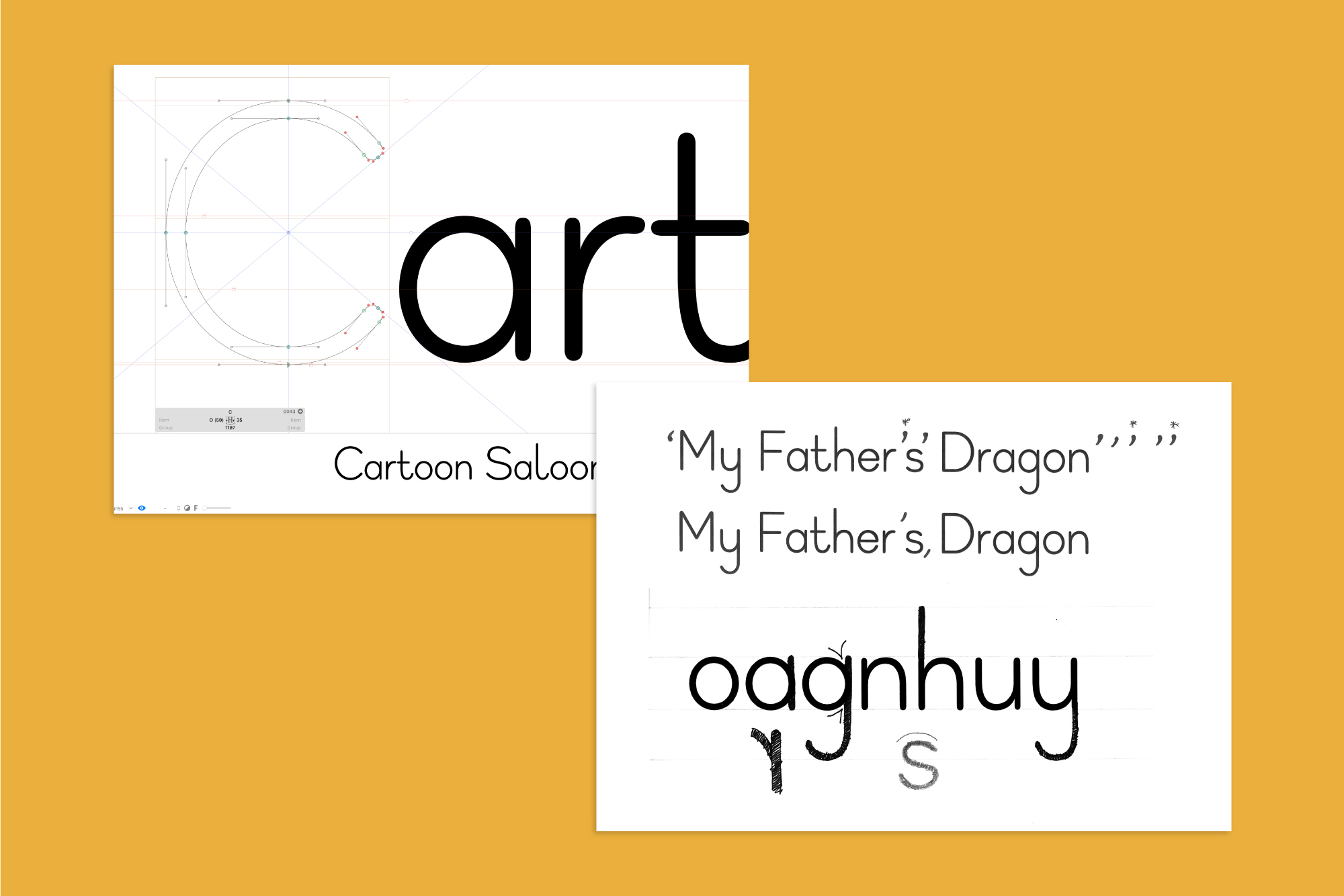
Collaborating again with five-time Academy Award-nominated animation studio, Cartoon Saloon, we designed a custom OpenType typeface for the film which we named Elmer after the main character, based around the studio’s original ideas for the main title card, end titles and credits.
We developed the full typeface in 5 styles; for usage on title cards (Elmer Title Regular and Bold), with much more pronounced ascenders and descenders for credits (Elmer Regular and Elmer Bold) and for body copy (Elmer Text) where the ascenders and descenders needed to be shorter for more condensed blocks of text.
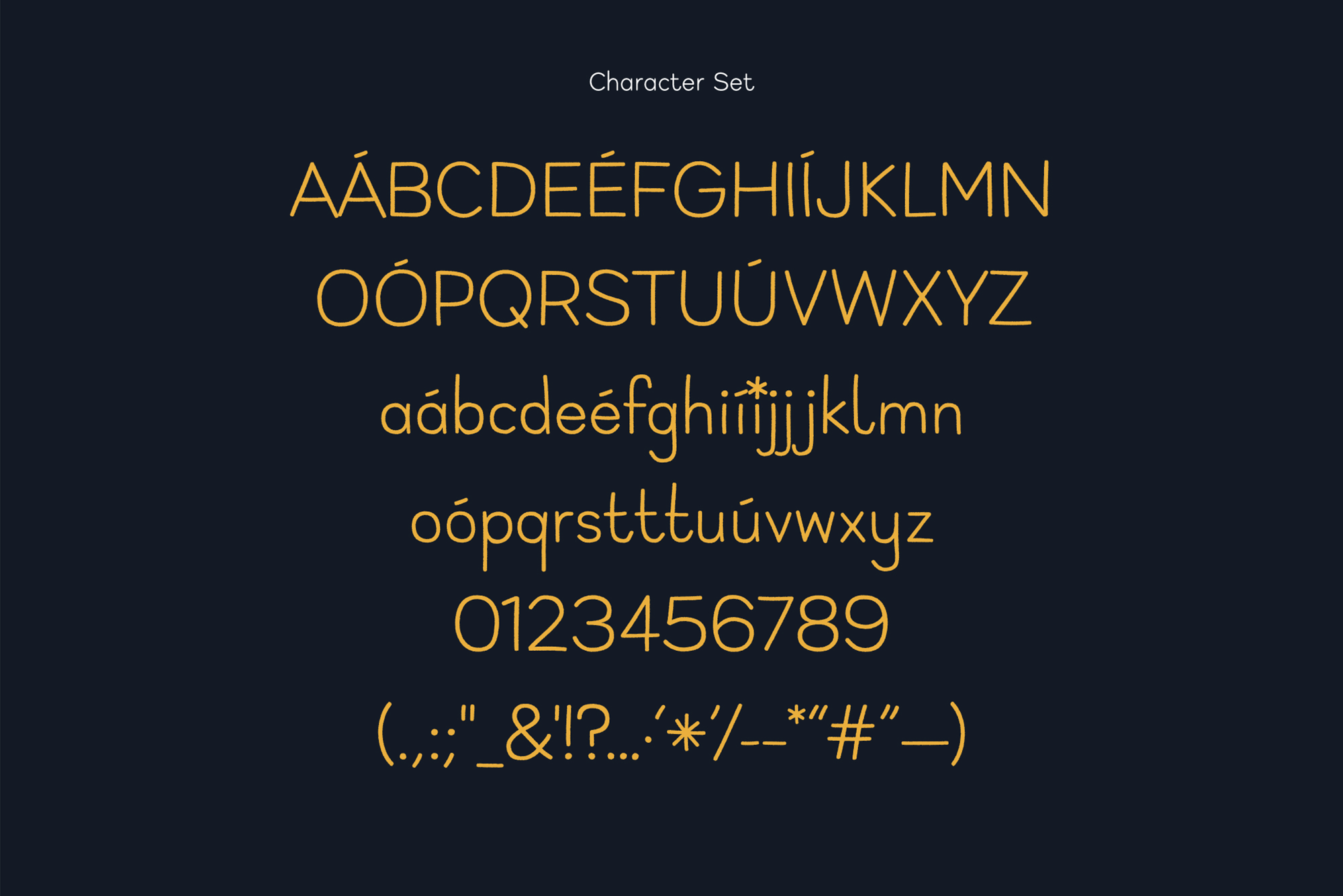
We also designed an extensive character set to support English, Danish, French and German versions of the film and included alternative character sets which could be used to add personality to text or for when certain letter combinations were causing spacing issues.
My Father’s Dragon, property of Netflix.